

by Molly Jane Kremer, Arpad Okay, Clyde Hall and Jarrod Jones. Every minute of this job is an absolute pleasure, and that’s due in no small part to our ability to enjoy and scrutinize works from the finest artists living on this planet today. As 2018 walks out the door, we take a moment to tip our hat one last time to the incredible work these people put out this year. We are forever grateful.
THE BEST ARTISTS OF THE YEAR
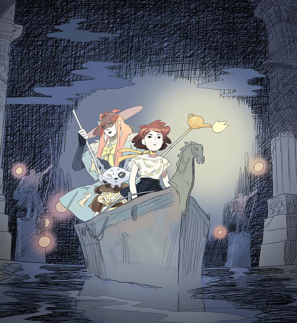
Loïc Locatelli-Kournwsky. (‘Persephone’) The foundation Loïc Locatelli-Kournwsky’s delightful artwork is built upon is lush storytelling. Persephone is about a daughter of the world’s most skillful warrior wizard. It’s about a girl who loves gardening. Its world is also split in two, one land an Attic metropolis, the other a nocturnal acropolis. Locatelli sews seeds of atmosphere.
And it is done with style and grace. Heavily detailed and steeped in flavor, thoroughly stylish, his locales and characters come off as developed but uncluttered. The linework is light, flowing, sketchier than the European aesthetic it very much belongs to, but still controlled. The colors are quiet and optimistic, solidifying the finish on Locatelli’s illustrations, giving Persephone markedly cartoon feels.
Even ancient ruins project vitality. Hardships hit home while keeping clear of the dour. The monsters look slick, the heroes and villains even cooler.
Locatelli’s character and costume design is imaginative, understated, and distinct. Fashion is huge, quirky, sometimes cutie-pie, sometimes fearsome. Loïc draws it bubblegum Hellboy, Mike Mignola meets manga. Behemoths and boyfriends.
The realm of Eleusis radiates urban hubbub sunshine, Mediterranean retro, the timeless aesthetic of Hergé, of Kiki’s Delivery Service. Hades, on the other hand, is the solemn structures of Doré, fallen columns and unholy houses, Mervyn Peake period piece palaces. Locatelli makes his cities as much characters as his characters.
Plus the man loves a good wizard fight. Melee battles that last for pages, Arthurian martial combat that pulls no punches. Not pulpy bursts. Spicy. Legendary samurai-style showdowns. Locatelli takes Persphone’s combat scenes seriously. Never indulgent, always breathtaking.
The overall effect evokes the writing of Lord Dunsany: Locatelli takes a whimsical, modern approach to a story of eldritch magic. You could know Persephone, be her friend if you’re lucky (and earnest). But Persephone is pure fantasy. Locatelli’s artwork achieves both. — AOK
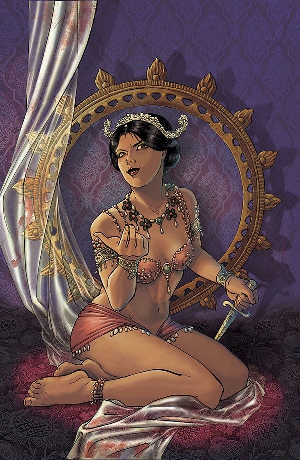
Ariela Kristantina. (‘Mata Hari’, ‘Fearscape’) Don’t judge an artist by the amount of her output. Ariela Kristantina’s 2018 projects were mainly the series Mata Hari from Berger Books/Dark Horse and covers for Vault Comics’ Fearscape. The result is limited quantity but unequaled quality. Mata Hari’s covers and interior art conveyed the gamut of ‘Margreet’ Zelle-MacLeod’s turbulent life. Scandal, innocence, war, espionage, squalor, and opulence inhabit the panels. Conflicting imagery shares the same page with contrast, but never felt jarring. The non-linear account of Margeet’s life was accomplished organically. A sense of beauty even in the direst of times permeates Kristantina’s work.
The title undoubtedly required a lot of work, in research and technique; writer Emma Beeby used a refined approach relating Mata Hari’s story. This may have guided Kristantina’s method, but it also illustrates her talent, integrating that vision to perfection. It’s a tale requiring nudity and violence, yet these elements are managed with uncommon taste. The research necessary for accurate details from various European settings over four decades must have been staggering. Military uniforms, fashion trends, and architecture are richly presented. Photographs of the predominant characters exist, their likenesses also represented.
This includes Mata Hari herself, and again Kristantina showcases the many sides of her personality without glamorizing her form. The story presents its subject, good and ill, as does Kristantina. No age lines are spared, no stress of living in a women’s prison minimized. The artist is true to her subject and history, from a storybook childhood devolved into poverty, to Margeet’s rise as a famed European performer, to her tragic days as an accused traitor.
Through it all, Kristantina maintains a poised style. As much as her fierce and beautiful renderings of Shiva remain forever in my memory, so will a child’s little goat cart. — CH
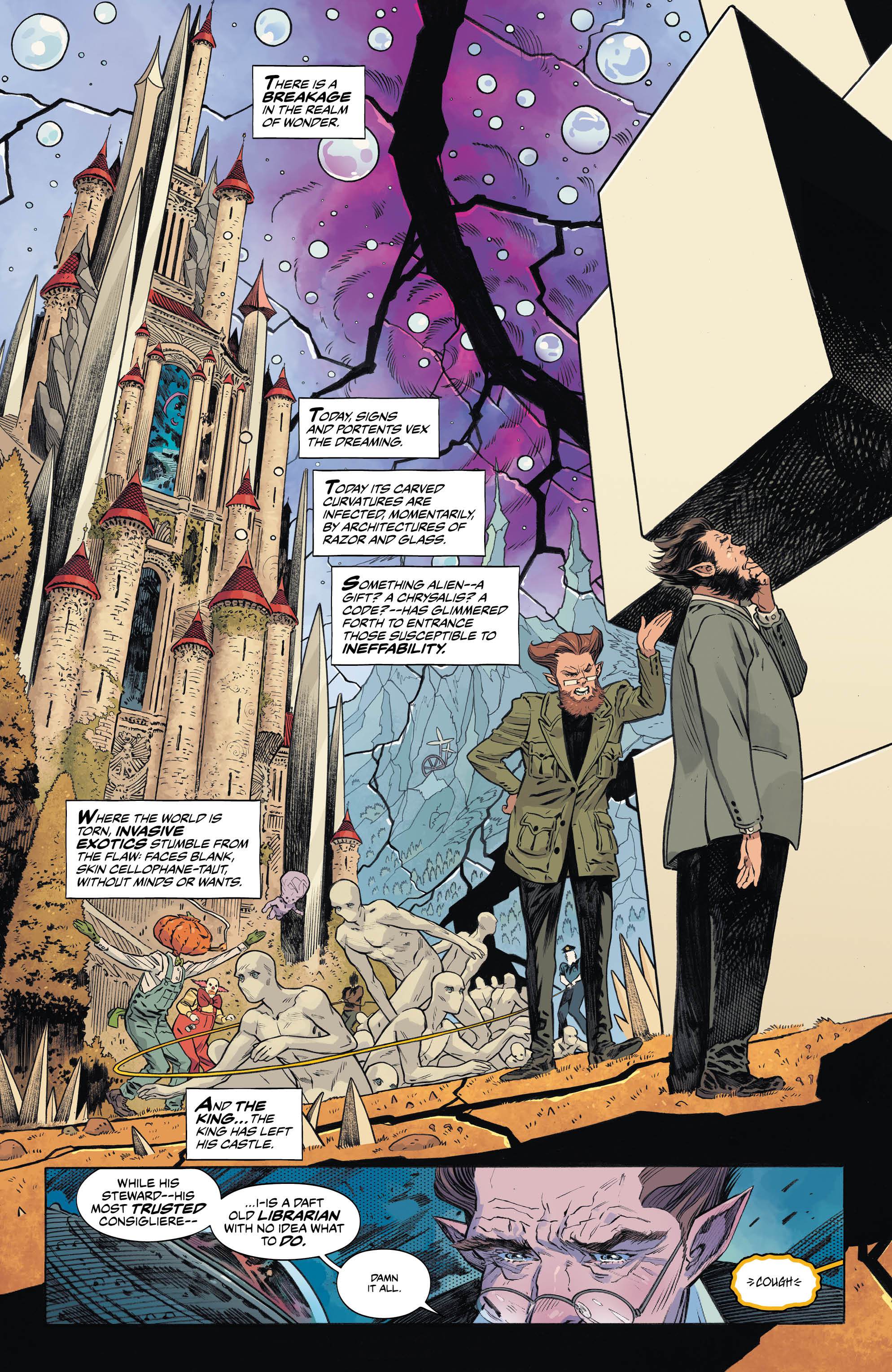
Bilquis Evely. (‘The Dreaming’, ‘Sandman Universe’ #1) Taking the artistic helm of the series that resurrected the world of Neil Gaiman’s Sandman is no small feat, but this year Bilquis Evely did just that. After having whet her teeth last year on a six-issue Wonder Woman stint, she is now, with writer Si Spurrier and colorist Mat Lopes, helping to bring back beloved Vertigo standbys in The Dreaming, whilst making sure that a few new ones — like The Dreaming’s salty new protagonist Dora — find their way just as deeply into our hearts. She’s completed five issues so far (if you count the overseen-by-Gaiman Sandman Universe one-shot), each successive one more jaw-droppingly beautiful than the last.
Evely’s art is phenomenally detailed, but she doesn’t let all that gorgeous rendering distract from going deeper, defining the soul of her subjects. Her storytelling is fluid and clear amid layouts both creative and whimsical. With Lopes’ help, her designs weave in the surreal and ethereal, yet still retain a certain realism — everything still looks solid, feels tangible enough to touch — just like a good dream should. Evely’s grasp of perspective and sense of space go a long way in communicating the substantiveness of these worlds. Whether Lucien is tiptoeing through the library or moping on the throne room’s swirling staircase, or whatever strange realm Dora wanders into, every room feels mapped out, every area lived-in, the architecture sublime in its expression.
It’s not all lofty artistic ideals though; Evely adds humor where she can, in Dora’s casual smirk, or the glimmer in Abel’s eyes. She even drew herself into The Dreaming’s third issue, as Lucien’s therapist, who was being impersonated by the villainous Glob. And as self portraits go, it’s a fairly remarkable likeness.
I’m not sure any other artist but Evely could have made The Dreaming this wondrous — at the same time so fanciful and frightening, with hints of the underlying gravitas that make this series such an undeniable and seamless return to the world of Gaiman’s Sandman. To be quite honest, I wouldn’t even want to see anyone else try. Because Bilquis Evely’s art is just, well… dreamy. — MJ

Tradd & Heather Moore. (‘The New World’) How do I discuss the 2018 output of artist Tradd Moore without his colorist partner-in-crime, Heather Moore? The answer is: I don’t. I’d be wrong to even try. While one is very much a proven master in their own right, together, Tradd & Heather are a veritable force of nature.
This year, The New World bombarded the comics scene with the Moores’ patented psychotropic insanity. Through their continued partnership, the Moores ensured that Aleš Kot’s post-nuclear romance was filled with all the punch, drama, and passion a neo-Shakespearean yarn ought to have. It was the future of comics, or at least it felt like it, made ooey-gooey flesh.
Tradd’s work on this book defies reason; his lines swoop then swoop again, then again. These lines form shapes that have no place in the natural world, yet they feel completely organic, alive and thriving in expertly-placed ink. His spaces are just as confounding as his characters, yet they both look as though they always existed — we’re only just seeing them for the first time now. This new world inside The New World unfurled acid-drenched Disney hallucinations that seemed to move on the static page held in our very hands. But what made Tradd’s work truly come alive was Heather’s colors.
The laser swords in The New World hummed because of Heather. Godzilla the cat looked especially snuggly through her work. You unconsciously flinched at the spraying blood that came from a well-thrown punch. Because of Heather, we now have an intimate awareness of the kind of swirling ecstasy that could bring Stella and Kirby together. Two star-crossed lovers that broke a whole new set of rules, rendered stupendously by exactly the same. — JJ

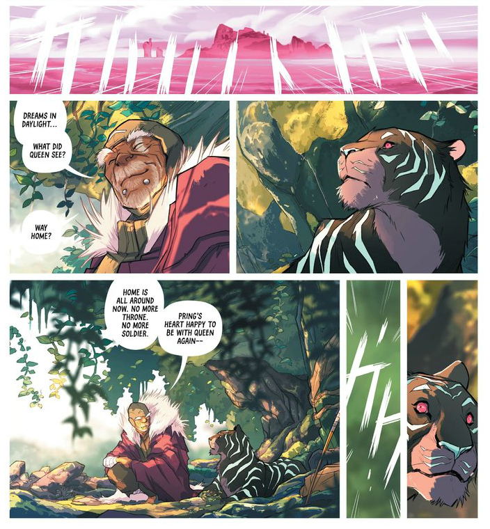
Msassyk. (‘Isola’) What Michele Assarasakorn — call her Msassyk — brings to Isola is a transfiguration from what could be a classic epic aesthetic to a vibe truly otherworldly. Msassyk colors the journey of a soldier and a tiger queen into lands unknown bold and spellbinding. Good colorists lift up the work. Great colorists shape a book.
Msassyk is a formidable example of the latter.
Verdant greens behind a screen of shadow, edged with gold. Msassyk communicates the feel of towering forest obstructing the sun, breathing life and truth into a fantasy setting. Isola begins like this, inspired riffs on the pillars of the genre.
But moonlight on stone or library by candlelight is just a taste, a counterpoint against the emotional reality that dominates the bulk of the series. Isola is a journey. A transition from magic hour to pure magic.
The world of armor and obligation is colored like the sphere we the readers walk. The sun sets on those lands and the Northern Lights rise. Each subsequent scene in Isola is shown to the reader through a gemstone of spring turning to summer.
Amethyst, garnet, aquamarine. One tone for dreams and places uncivilized and natural. One for man’s hubris, their reach toward eternity. One where they meet it. Msassyk paints Isola as holistic fantasy.
Miyazaki never did anything like this, yet I believe Isola feels Studio Ghibli iconic because of the color choices employed by Msassyk. Color is a character as much as tiger or hedge wizard or brother or lover. Color is an element of the story and the storytelling. The natural world and the spirit realm converge in a way we can never be but deeply wish we could. — AOK
HONORABLE MENTIONS
(Where we made room to love all over a couple more.)
Aditya Bidikar. (‘Isola’) The care and thought that Aditya Bidikar puts into Isola’s lettering is a triumph artistic rather than industrial. It’s the absence of line around the word balloons, like they’re cut from the page instead of laid onto it. The manga influence on tracking- the ample negative space around the letters. It’s the font itself. Tall. The subtlest spring. Elegant and clear and concise.
Perhaps it’s all of it. Isola’s lettering feels totally unique in the modern landscape of comics. It doesn’t read like a Western comic book. It’s something more. A fantasy language. Runes. Brutalist calligraphy.
It’s Bidikar.
And then add Bidikar’s sound effects, a visual language unto itself, part abstract onomatopoeia, part sound as motion and action. Isola captures something invisible as a physical presence. Bidikar is prolific and talented, bringing unparalleled quality to any book he’s on; Isola is the best at his best. — AOK

Gabriel Rodríguez. (‘Sword of Ages’) It’s the tale of a once and very future monarch. An epic as beautifully drawn as it is scripted. It’s a double delight because the writer and the artist of Sword of Ages from IDW Publishing is the same person, Gabriel Rodríguez. This could have been a mere revision of the Arthurian legend draped across a sci-fi setting. Instead, Rodríguez has fused several fantasy and science fiction elements into a complex and unique story that’s still familiar.
Rodríguez has a singular gift for rendering talking animals, alien races, medieval weaponry, and space opera tech to inherently belong together. It’s a savage tale, but one with heart. Rodríguez never lets one overwhelm the other in his depictions. Even in battle spectacles, his detailing of equipment, vehicles, and characters is unwavering. His art puts this adventure tale over the parapets like an atomic catapult. — CH

Matías Bergara. (‘Coda’) When I jumped headlong into BOOM! Studios’ series Coda this past spring, I was unfamiliar with artist Matías Bergara. I’m eternally thankful this was my introduction to his work, because he has skyrocketed onto my list of favorite artists since. If you’ve so much as flipped through an issue of Coda, you’ll notice why. Bergara is a phenom, a master storyteller, and he’s transformed a compelling plot by Si Spurrier into an absolutely enthralling, breathtaking tale.
With color assists from Michael Doig, every page is a stylized rainbow frenzy. There are a few double page spreads that might even make you gasp in appreciation of the colors alone. Bergara’s art is about more than the colors, however. His storytelling is smooth, his character design is unconventional but charming, plainly seen in the orcish beauty of Serka, or in the wild red eyes and gaping maw of Hum’s mutant pentacorn.
Matías Bergara is an artist I will be avidly following wherever he goes next, but for now I’ll relishing the four issues of Coda we have left. — MJ
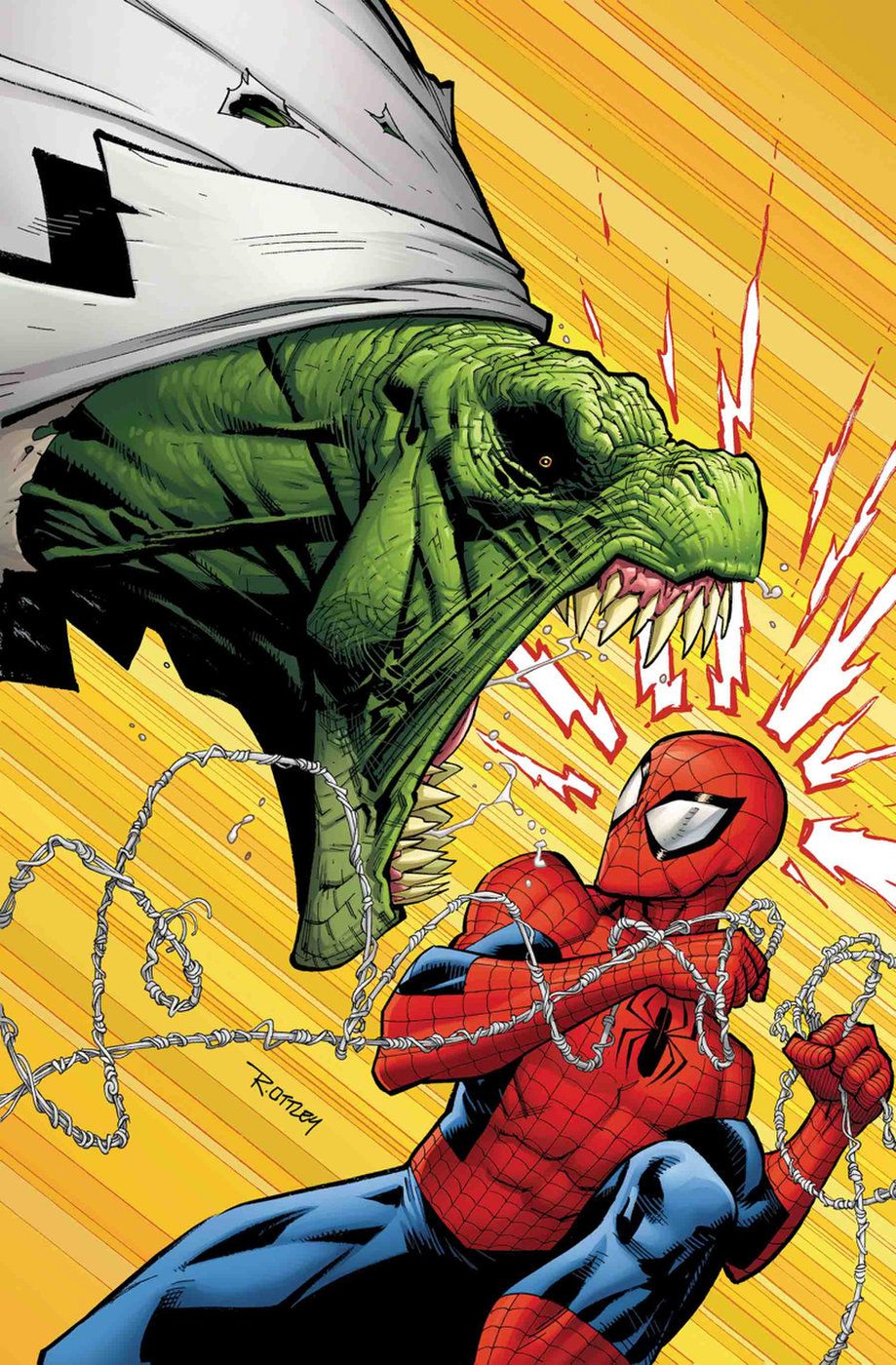
Ryan Ottley. (‘The Amazing Spider-Man’) Keeping certain intellectual properties alive and thriving after fifty-odd years can be a real pain in the neck, but when you tap artists like Ryan Ottley for your long-running, long-pajamas super-saga, you can rest assured that such anxieties are soon put to rest.
Once it became clear that Robert Kirkman & Ottley’s Invincible series was coming to an end, shrewd industry types were taking bets on what brave new shores Ottley would eventually land on. His slick, action-minded panel work made him the perfect fit for any number of A-list super-projects, but it was Marvel and its Amazing Spider-Man series that would ultimately secure Ottley’s talents. And what a terrific (and let’s be honest, obvious) fit it was.
Teamed with Nick Spencer’s spritely character work and Laura Martin’s optimistic color palette, Ryan Ottley’s opening arc, fittingly titled “Back to Basics”, blew away the dust from over a decade’s worth of increasingly convoluted Spidey stories. Paired with this year’s Spider-Man game from Insomniac and Sony’s Into the Spider-Verse, Ottley’s nimble, manga-infused take on the character makes the prospects of another half-century with the Web-Head seem not only exciting, it makes it feel right. (Side note: His versions of Peter Parker and Mary Jane Watson make my fanboy heart swoon.) — JJ
Who was your favorite artist this year? Let us know in the comments section below.


