
by Molly Jane Kremer, Arpad Okay, Clyde Hall, Brendan Hodgdon, Mickey Rivera, Jami Jones, Sara Mitchell and Jarrod Jones. Undercover is our opportunity to lovingly gaze upon gorgeous works from magnificent artists. This week, we revisit the 30 most striking, beautiful, odd and otherwise terrific covers that graced comic book stands in the year 2018.
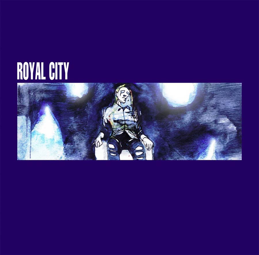
Royal City #9, by Ray Fawkes. (Image Comics)
JJ: Ray Fawkes taps into the bygone Bristol sound with his variant to Royal City #9. Jeff Lemire’s searing family drama is in the throes of its second arc, and we, the readers, are lurking in the past with him, searching for meaning. He’s calling it “Sonic Youth.” Every issue gets a variant, paying homage to the exemplars of 90s indie music. Fawkes got the Portishead cover, and it’s a perfect fit.
The iconography on display is breaking my brain. You know what that is. Dummy. A quintessential album, minimal, moody, magnificent. An arresting image, lost in a sea of deep royal blue. It’s here where Fawkes goes to work. He swaps Beth Gibbons out for a member of the Pike family. Easy. He constructs his piece around the framework of Portishead’s To Kill a Dead Man, a widescreen still of a lost short film. That’s tricky. (Trickier still is capturing Royal City‘s trademark flannel, but he did it, sneaking it into the piece when he thought no one was looking.)
Stage lights bounced around Gibbons in the original movie still. Stripped of context by the album cover, those lights captured her in ethereal, otherworldly menace. Fawkes harnesses that danger by cutting loose. Impressionistic swathes of white burst all over the frame, while Fawkes’ subject remains surrounded by a sinister aura of black. How did he pull it off? Who can say. Ray Fawkes’ variant becomes an instantly iconic cover with secrets to keep.

Kid Lobotomy #4, by Tess Fowler and Tamra Bonvillain. (Black Crown/IDW Publishing)
AOK: “O great goddess of gentle hedonism. Put myrrh upon thy head and clothing of fine linen upon thee.” Celebrate donut, cronut, churro, and milkshake. Pie, cake, sundae, may your Gobstopper last unto forever. Let the minibar never run out. Let the hangover never come. Your brows are ambrosia. Your wings the height of subtlety. If that is blush, foundation, or simply the roses of your cheeks, we’ll never know, we’ll never tell. Ottla, you truly are perfection.
Have you looked into who Ottla is in relation to Franz Kafka yet? I love when side characters have mystery to them, I love it when they get their due, and this issue promises to do both. What better way to exalt Ottla than place her heavenly body in an asteroid belt of confections? Tess Fowler has treated us to a cover that is simple, witty, iconic, peerless.

Legion #1, by Bill Sienkiewicz. (Marvel Comics)
JJ: Bill Sienkiewicz’s variant to Legion #1 is a nightmare in repose. Here we have David Haller, mutant. Son. Telekinetic, pyrokinetic, omnikinetic. His powers are… well, you know. So are his personalities. And from this image, the toll of David’s abilities — not to mention the toll of having a veritable community located right behind his eyeballs — seem to have taken him down a grim narrow road.
David is living his life in shadow. Sienkiewicz casts a mood by enveloping Legion in shades of rust and nightshade. The rust symbolizes decay, perhaps of the mind, and most certainly of the spirit; while the darker navy hues indicate a turmoil coming from within. And there, right before us, a crude scrawl, a child’s terror slashed across a notebook page. Is the face we’re looking at David, or some demon lurking in the recesses of his mind? Surely, Sienkiewicz’s cover seems to say, it can be both.
Wonder Woman #40, by Jenny Frison. (DC Comics)
MJ: Jenny Frison’s Wonder Woman variant covers have been murdering us with painterly gorgeousness — twice monthly — since issue #7. She’s stayed on the title longer than any other Rebirth variant artist, giving her time to refine her already masterful take on the character and the chance to fully expound upon her interpretation of Diana of Themyscira. Frison’s vision, not to mention her consistency, remains nothing short of astounding.
Frison makes this issue’s cover all about contrasts. The stark white space of the background is set against the warm golds and pinks of Wonder Woman’s face to beautiful effect. Diana’s hair, as though lifted by a soft breeze, moves up against the slow descent of Silver Swan’s feathers, leading the viewer’s glance up to an ice-blue eye. I hope Frison remains Wonder Woman’s cover artist indefinitely; her talent visually elevates the comic to one of the best-looking DC books on the stands. Twice monthly.

Ice Cream Man #2, by Nimit Malavia. (Image Comics)
JJ: Nimit Malavia. Hot damn. W. Maxwell Prince and Martin Morazzo’s horror anthology is only two issues deep, but it’s never looked this tasty. Malavia’s variant to Ice Cream Man #2 is a psychedelic sweet tart. It makes my eyes drool.
Waffle cones, cookie sandwiches, and a river of sprinkles swim around a marble goddess sculpted from sorbet. And there, dancing off into a sugar-coated oblivion, fudge bars the color of a Turbo Rocket. I’ve gained weight just staring at this thing. I can practically taste the colors.
Speaking of, those candy colors evoke a sense of danger. There’s peril that comes with overindulging, and Malavia is content testing your decadent limits. That blue raspberry queen seems to be leaning forward from her bed of strawberry glaze, fingers reaching out to someone. Her next victim, perhaps. Singing that Archies siren song. “Honey,” she coos. “Sugar, sugar.” There are worse ways to go.

The Mighty Thor #705 by Stanley Artgerm Lau. (Marvel Comics)
MJ: There were a bevy of amazing covers for this week’s penultimate Mighty Thor issue, and choosing anything over art by Esad Ribic, Jee Hyung, or Russell Dauterman & Matt Wilson would be an excruciating decision on a good day. But Stanley Lau’s variant really stood out, and with good reason.
Lau is known for his cheesecake-y pin-up style, but manages here to keep the character from any overt sexualization—proving that drawing someone both strong and sexy can in fact leave the male gaze at the door.
The image is suffused in bright, glowing tones, affirming (and reveling in) the religious aspects of a character who is the Goddess of Thunder. Jane looms tall above us, resplendent in all her godly glory, her blonde locks spilling from her helmet. This is one of the best variants of this (or any) Thor series, and a fitting tribute for the almost-end of The Mighty Thor.

Saga #50 by Fiona Staples. (Image Comics)
BH: It feels right that Saga’s contribution to Image’s Artist Appreciation cover month would arrive with its landmark 50th issue. After all, this book (with respect to Brian K. Vaughan) owes so much to the tremendous work of Fiona Staples. A front-and-center celebration of her talents at this milestone feels appropriate.
Just as appropriate and essential to this celebration is the cover’s subjects, the family at the center of Saga. While the simple moment of familial bliss depicted here seems almost intentionally contradictory to the violent and sexual nature of the series as a whole, it really does speak to the emotional core of this long and winding story. Because through it all, the guiding light of Saga has been the love of this family, who stands unbowed through prejudice, tragedy, and failure. And while Alanna, Marko, and Hazel have had precious few moments of genuine peace that we’ve seen, it’s gratifying to see them happy and together like this, if only on a cover.

Motor Crush #11 by Cameron Stewart and Tom Muller. (Image Comics)
JJ: You can almost hear a synthetic hum when you look at Cameron Stewart’s cover to Motor Crush #11. Chords by Tangerine Dream, beats by Aphex Twin, attitude by Au Pairs. It’s a portrait by night, a study in scarlet. Stewart lets us catch a glimpse of his subject’s profile, just a hint of danger in there, somewhere. Then a neon arrow flashes across the eye and like that — they’re gone. So much movement where there should be none at all.
Of course, what brings this beaut together is the eagle eye of Tom Muller. Without designers like Muller, trade dressing would be a hopeless bore. Here he frames the book’s logo dead center, bottom of the image. For a piece such as this balance is crucial; something as innocuous as a trademark sign could throw the whole enterprise into shambles. It’s here where Muller endures; he tucks the pesky trademark inside the “Motor” and calls it a day. An act of anti-conformity, of sheer defiance. There’s something about that detail sets my heart ablaze.
An aside: Originally I wasn’t completely sure if that inverted triangle was a Stewart or a Muller innovation (it was Mr. Stewart), but ultimately it doesn’t matter. That it structures this piece so gloriously is a testament to how well these two artists work together.

Mister Miracle #8 by Mitch Gerads. (DC Comics)
CH: War and marriage, war and marriage, go together like gangbusters in the hands of artist Mitch Gerads. Or in the case of this cover, maybe war and parentage. Calling the shots in a devastating battle of the planets while navigating the domestic challenges of husband and father would drive anyone to their knees, so Scott Free’s genuflection under the weight of responsibility is understandable.
Gerads creates impact here with an unsettling double dose of effect and emotion. The swirling, sweeping firestorm that pins Mister Miracle in his servile position, at the mercy of forces greater than himself is compositional perfection. Weapons loom in the eye of the militant maelstrom, one poised precariously over the smoldering remains of an abandoned plush toy. The vulnerabilities implied here are heightened by that plushy being a Batman doll, the effigy of a very human hero.
The current Mister Miracle series is dark and heavy, but with breakthroughs of sunlight which often come from Scott’s home life. As a mixture, that’s not as comforting as it may seem. Happiness, stability, parental joy may be what he fights for, may make him fight harder, but the threat to all he cherishes always looms. This cover is a model in miniature of the narrative edge the creators and their audience tread with every issue.
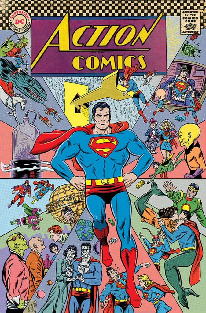
Action Comics #1000 by Michael Allred and Laura Allred. (DC)
CH: This epic milestone comes in cover variations for every decade of Superman’s publication history. A whole gallery of choices, each entry rendered by industry worthies, but Mike and Laura Allred’s 1960s homage made my Silver Age inner fan’s heart sing. Indeed, the artists Allred distilled the very essence of my childhood Man of Tomorrow, all the elements that first made me a fan back when. For those who’ve forgotten their juvenile love of fun in the funny books, or for later generations who in the glow of modern enlightenment dismiss that output as contemptuous Comics Authority pap, I must beg to differ.
Comics titles of that era were a beautiful pastiche of child-appropriate tales, imaginatively realized and rendered into the most bizarre, the most surreal, sometimes (intentionally or not) the most child-inappropriate stories and characters to ever flout censorship’s finest moral compasses. Not until the Vertigo imprint were DC readers treated to brilliant and entertaining absurdity rivalling the Legion of Super-Pets, or the imperfect pathos of Bizarro World tales, or the inherent horror of an alien powerhouse-ant emperor Red K hybrid. Not to mention the mixed couple romantic explorations of a Kryptonian and a mermaid.
The Allreds have always understood this, their work at times a logical extension of the Silver Age’s boldly exquisite outlandishness. Checkerboard border in place, they have united the barrel-chested Boring and Swanderson Superman style and paid honor to all 80 Page Giant covers past with a heaping helping of giant Fortress keys, cities in a bottle, and Imaginary Tale denizens. Of all the #1000 cover artists, the Allreds may have come closest to capturing the elusive true spirit of their decade.
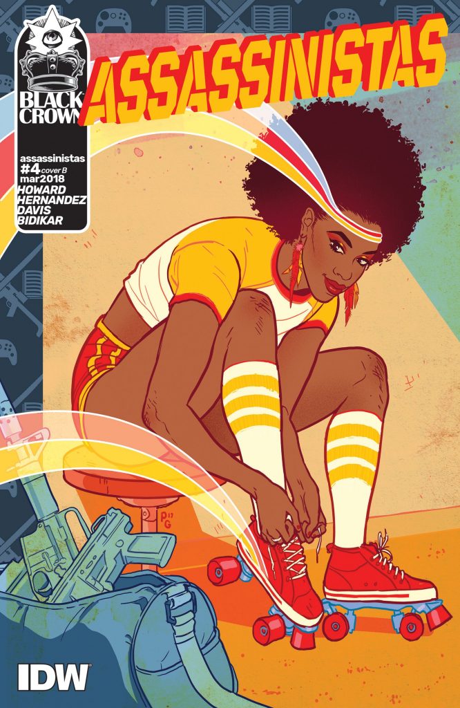
Assassinistas #4 by Paulina Ganucheau. (Black Crown/IDW Publishing)
JJ: Music and mayhem, that’s what Black Crown has brought back to comics. An attitude, a mission, a strength. A light. It’s attracted several incredibly gifted creators, all of whom have gladly lined up under the jet-black awning outside the choicest party in the industry today. This week, it’s Paulina Ganucheau’s time to shine.
Here, Ganucheau takes us back. When? Ask Tini Howard: “Then.” Take one look at Assassinistas‘ Octavia, much younger, much groovier, lacing up a pair of skates as Yes no doubt blasts through the rink just outside this stunner of a cover, and you have an idea of when. Helps that Ganucheau doesn’t skimp on the vintage details. Head bands bleed stripes across the image, evoking dreamlike memory of carefree days. The colors are a blast of after-school specials and Whatchamacallit wrappers. The dings and scrapes signify that, even then, Octavia was a warrior. Ready to hit back.
Her destiny is still years away. For now, thanks to Paulina Ganucheau, Octavia wages a different kind of war. On the roller rink.
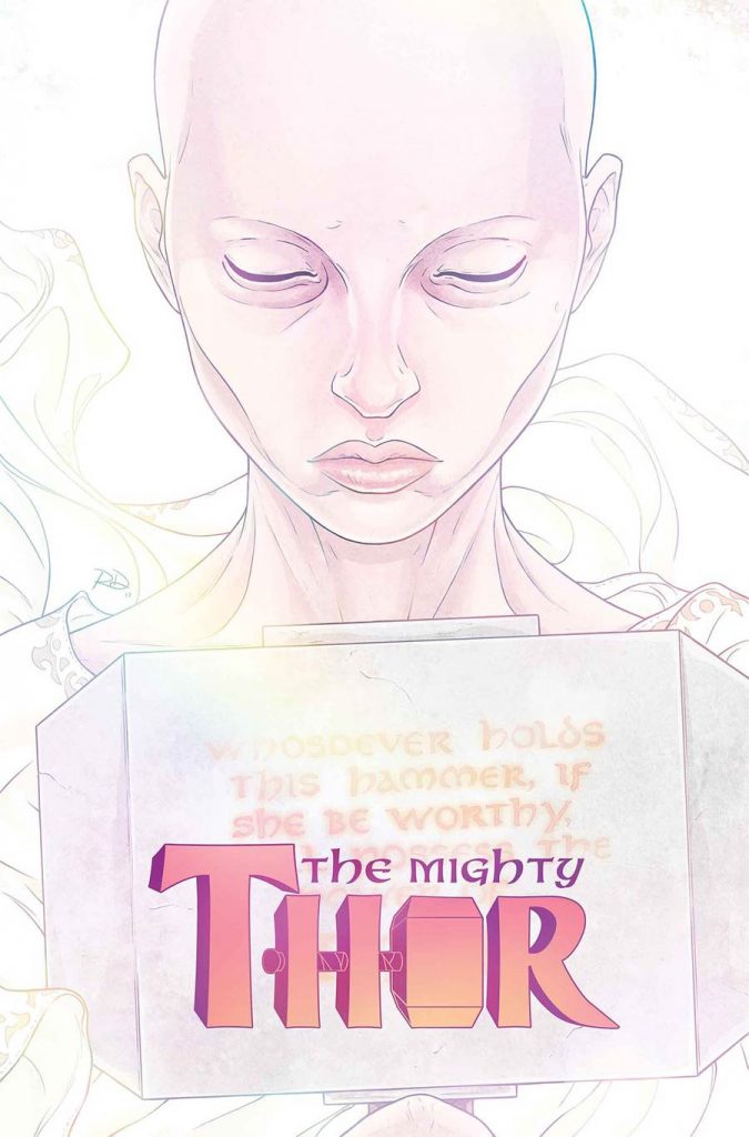
The Mighty Thor #706 by Russell Dauterman. (Marvel)
MJ: The best ongoing superhero comic in publication bowed out beautifully with its 706th issue. The Mighty Thoris ended. (No, I’m not crying; it’s just dusty in here.) Russell Dauterman’s mighty art talents have graced the covers (and even some of the variants) of all thirty-eight issues featuring the Goddess of Thunder, each one of them worthy of acclaim. I’ve written about it before (because c’mon), but the cover to issue 706 has an especially graceful resonance. Why? For one, it’s a poetic visual echo of Thor #1’s cover. That was, for most of us, our first glimpse at Jane in the Thor helm (though we wouldn’t discover that it was her til issue #8).
Issue #706’s cover sees Jane without that helm. Though her placement is a direct reference to Thor #1, the imagery of and around her is the complete opposite. Instead of a set jaw surrounded by a thunderous display of shockingly blue-white lightning bolts (Matthew Wilson’s colors cannot be oversold), here Jane is Jane in all her human frailty, as we’ve rarely seen her on covers. Her chemo-induced baldness and gaunt cheeks replace the goddess’ glamorously blonde veneer. She is suffused in a soft white glow, posed as though in a coffin for funerary viewing. It’s a little morbid, and more than a little sad. (The storyline was called “The Death of the Mighty Thor”, after all.)
But it is a beautiful tribute to one of the best comics out there, and to a character who has come to mean so much to so many. Farewell, Jane Foster. Verily.

Punks Not Dead #4 by Dilraj Mann. (Black Crown/IDW Publishing)
JJ: Music, that’s what drives Black Crown. The humming rhythm of some esoteric track, scorching senses, making knees weak. That’s the lifeblood of this juggernaut imprint, potent enough to keep it moving with a momentum that leaves others gasping for breath. History plays a part, as well — music history, comic history, both on full, blistering display with Dilraj Mann’s variant to Punks Not Dead #4.
Tell me you don’t see Jaime Hernandez in there. You know the cover. “The Night Ape Sex Came Home To Play.”Love and Rockets #24, December 1987. Considering who’s running this ship, Mann’s crimson and ink-black cover — with blasé attitude to burn and bass strings in our faces — can’t be a coincidence. (Don’t forget: Hopey was a bass player, once.) Even if it is, Mann’s personal style provides its own kind of verve, its own voice, its own iconography. Here Mann presents twin devils, a duo who appeared seemingly from nowhere and beguiled all within ear (and eye) shot. Who took zero prisoners, no compliments — only cash.
I generally cannot stand posting covers with trade dress in this feature. With Black Crown, the way that it wraps its banners around every cover, perfectly hued, expertly placed, maximum slay — I wouldn’t have it any other way.

A Walk Through Hell #1 by Andy Clarke and José Villarrubia. (AfterShock Comics)
MR: When we see cop lights our preservational instincts kick in and we scope out our surroundings and our situation. Is there blood? Was someone hurt? Did someone die? Society created police lights as much to draw attention as to deflect it. It’s our way of delineating the collapse of common order, our way of indicating that something has gone wrong.
The take away from this cover to A Walk Through Hell #1 is that something fucking big has gone wrong. Artist Andy Clarke and colorist José Villarrubia manage to whip up a sense of dread and imminent danger with just two main elements: the splattering of cop cars and officers, and a gigantic warehouse with an open door. The high angle perspective gives us all a hint at just how much trouble might be waiting for us in that building, which looks to be nearly the size of a city block. The ice-blue of night isolates the lights and figures even further. Those brave souls heading straight into the darkened maw of the unknown are in for something much bigger than any of them. This cover is a perfectly executed minimalist tease, revealing nothing specific while giving us just enough to be nervous about.

2021: Lost Children #1 by James Stokoe. (Statix Press)
MR: This young savior, bedecked in sadness and frailty, is all mind, but in that mind is the power to lift cars, trucks, and grown men screaming into the air. The meek but inwardly powerful child is a trope as old as the X-Men (and probably older), but it speaks volumes about what we expect from the younger generation: a way out of the mess we created.
This cover’s artist, James Stokoe, has worked on stuff like Godzilla: The Half-Century War and Secret Wars: Battleworld. He is the man to hire when you need creative scenes of wanton destruction and carnage. A big part of artfully rendering chaos, as Stokoe knows, is effectively balancing it. In this case, the violence is brushed behind the leading figure, who appears to be levitating forward with steadfast but weary determination. The carnage is afterthought, collateral damage in a fight against a much bigger enemy on whom our hero’s eyes are immovably set.
2021: Lost Children, a sci-fi comic by French writer Stéphane Betbeder and artist Stéphane Bervas, is about four psychically-abled kids who have to save the city of Detroit from the clutches of a madman. The young heroes age at an accelerated pace every time they use their abilities, which explains the sadness beaming from this young person’s face. Instead of going to school and watching cartoons and playing video games with their friends, they have to go out into the city and break shit all day just to save our sorry asses from ourselves.

Dazzler: X Song #1 by Bill Sienkiewicz. (Marvel Comics)
JamiJ: Dazzler takes the stage once more in this Bill Sienkiewicz variant to Dazzler: X Song #1. Sienkiewicz demands you give Alison Blaire the attention she deserves, like the star she is. This is a return to Dazzler covers for Sienkiewicz, having painted the covers for issues #27 through #32 of the original Dazzler series. His love for the character is crystal-clear.
This cover is a callback to the classic, halter-top disco queen using her mutant powers as a way to enhance her stage show. A blinding light radiates from the page, daring you to ignore the figure holding this nova in her hand. The woman on this cover isn’t the Dazzler we know now, seasoned and rocking with a punk band; this is a performer lost in her own reveries. Dazzler glows, bathed in tones of red; her shape draws the eye across the page, allowing Sienkiewicz to light the image from the top down, beginning with the prismatic glow dancing in Dazzler’s palm. The slight haze towards the bottom of the page is well used — is the haze an effect on the page, or are we truly dazzled by this Disco Queen?
This variant is a testament to Sienkiewicz’s talent and experience. Here you’ll find depth, passion, and a woman who takes center stage wherever she is.

Harley Quinn #44 by Bilquis Evely and Mat Lopes. (DC)
SM: Harley, Harley, Harley. You mischievous minx. You fox in the hen house. You girl in reaper’s clothing. Where are you taking me? And why does it feel so good?
Like a moth to the flame I am drawn into the soft glowing center of this cover. Harley Quinn is a beacon guiding me home, and she’s the light before the teeth of an angler fish. She’s warm and seductive in the middle of something sharp and cold. She’s my dangerous leader. I am sucked in. Instantly, I’m under the impression that I also have a hood on. It’s pulled around my eyes like blinders, and I’ve forgotten about the darkness that surrounds me. All I see is Harley Quinn letting me in. Like a child falling into a drawing with Mary Poppins, I too have fallen into this cover.
There are two ingredients at work here that have cast this spell over me. First, there’s the beautiful glow. If your eyes aren’t literally twinkling with stars right now, your screen is broken and you need a new phone. Second, as if the coloring wasn’t hypnotizing enough, check the hexagonal pattern created by the precisely placed hoods. They’re an assembly of honeycombs — a hive in disguise. The pattern bounces your eyes around like a pinball, but the coloring will always bring you back in. To the center. To Harley. The Queen Bee radiating.

Red Sonja #17 by Tula Lotay. (Dynamite)
SM: A soft, meditative Sonja is a sight to behold. How can you not become forlorn yourself while sitting here with her? She is decadent, solemn power. She is torn contemplation. Gazing over this image, I can’t help but feel nostalgic. This cover looks worn, like an old photo that’s been loved. A photo from the generation just before you, one that survived every family move. The hotspots on her cape and around her hands like light exposure after years of sunlight shining onto where it hung on the wall.
In this upcoming issue, Sonja must face whether or not she keeps her sword. Posed with this dilemma, no wonder she’s looking so wistfully pensive. I can’t help but think of Hamlet. There’s the classic image you’re probably picturing right now of the Prince of Denmark holding the skull, contemplating whether ‘tis better to live or to die. For Sonja, her sword is just as intrinsic to her life as death was to Hamlet’s.
While we usually see Sonja fairly exposed, she owns that exposure like she owns her sword—fiercely. Here, however, Sonja’s exposure is vulnerability. No lean muscles, no overflowing *ahem* body parts. Just a girl on a throne wondering what in the world she’s supposed to do next. To possess, or to return, that is the question.

Batgirl #24 by Joshua Middleton. (DC)
MJ: A few months ago, DC made the intelligent decision to remove the title and trade dress from their variants. Artists can now take advantage of the entire cover space for their work, which has led to some gorgeous pieces by Jenny Frison, Mark Brooks, Francesco Mattina, and my personal favorite Joshua Middleton, on variants for both Aquaman and Batgirl.
In a storyline dealing with villain Two-Face—that most Gemini of Arkham inmates—Middleton has incorporated Harvey’s themes of duality into this cover, slicing it in two halves to lushly illustrate life versus death.
On the left side, half of Babs looks out at the reader with a piercing stare, her blue eyes almost clear. She’s in full costume surrounded by a smattering of soft pink roses, and a splash of her red hair roils across the center. The colors towards the bottom fade out in brushy strokes, while the right side is clearly delineated for its full length: that of the left side of a skeleton, matching up perfectly with the left illustration. The linework on the bones is very distinct, and the colors are similarly soft within a much more limited palette. Instead of roses here we see white funerary lilies, with an actual bat, perfectly rendered with wings unfurled, to parallel the Bat-symbol on the left side.
And, like a halo, Two-Face’s coin rises behind Batgirl’s head: and of course on the right, the scratched, “bad” side of the coin crowns the skull, while the clean end of the coin lies behind Babs’ bright hair. This cover is a beautiful piece of art that also serves as a stunning memento mori.

Pearl #1 by Alex Maleev. (DC)
JJ: Alex Maleev went and outdid himself for his variant cover to Pearl #1. Least he could do for a friend, Brian Michael Bendis, whose first DC-published Jinxworld debut drops this week. It’s an on-brand primer for Maleev’s Scarlet, out later this month. It’s also an expertly realized portrait. A study in phosphorescence.
Maleev presents the subject as a sculpt, hard edges, surfaces rubbed raw. He frames her diagonally, bars of melancholy caught in corners that are worlds apart. And that blue? It’s echoed in Pearl’s eyes, but look closer. There’s a glint of fury there. Defiance. It draws you in. Between those swathes of blue, a cloud, reflecting the sunlight radiating from that inverted Louise Brooks bob. It makes me squint as it catches the light. Catches fire, more like. As red lines dance across her back, her expression narrows. Contemplating… what? Fight? Flight? Violence. Someone will likely bleed tonight. And it will be exquisite.

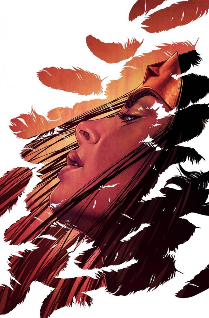
Wonder Woman #53by Jenny Frison. (DC)
MJ: Amid the buzzing humidity of August, artist Jenny Frison has given us two breaths of fresh air. Her last two Wonder Woman variants have riffed on vintage travel posters that pop with vivid color, and this week’s variant for Wonder Woman #53 captures Diana as we rarely see her: on holiday, away from the stresses of superheroing, and gleefully partaking in sun and fun.
The bright, flat, highly saturated primary colors emanating from this cover immediately bring to mind the clear unfiltered sunlight of a steamy equatorial coastline, and are a departure from Frison’s frequent sepia-infused palette. While those tones do lend a grace and solemnity to previous covers, this cover’s vibrant blue sky contrasting with the red brilliance of Wonder Woman’s top makes for a radiant seaside vision.
To complete the vacation ensemble, a wide-brimmed floppy sun hat frames Diana’s beaming face as she clasps a fruity drink. The last time Frison drew Wonder Woman this joyous was her variant for #47, where she and Supergirl indulge in ice cream cones. I appreciate Frison’s apparent delight in ensuring Diana treats herself every once in a while—especially since every one of her variant covers is already such a treat for us.

Action Comics #1002 by Patrick Gleason and Alejandro Sánchez. (DC)
CH: Citizens live and work in the shadows of their city, and even in comic book reality it tends to be the case. Most famously, Batman thrives in Gotham City’s gloomy, crime-ridden decay as he does a brisk business in justice. But how often is a vital, sprawling urban center eclipsed by one resident and made to live in his shadow? Metropolis may be the Big Apricot, but the impact Superman has on it is undeniable for both good and ill. It enjoys his protection, but also suffers ongoing attacks from his enemies and collateral damage from the battles that ensue. Even in real life, the situation is a mixed blessing. Metropolis, IL, the only settlement in the United States named ‘Metropolis’, has seen its share of both ennui and enrichment by being identified with its fictional native superhero. The benefits have, at least, outweighed the negatives in modern times.
The cover for Action Comics #1002 by Patrick Gleason and Alejandro Sánchez grants that two-edged sword unusually candid form, with Superman’s shadow composing his town. The familiar Daily Planet is centered jointly to compliment the hero like franks and beans, death and taxes. It’s a great composite of defender and Homefront, but the inkiness splayed across both leaves little doubt that either accepts their role unscathed. That, punctuated by Sanchez’s subtle color work, ingrains a refreshing moodiness not always present when depicting the shining City of Tomorrow. The leaning of the buildings, the irregular window placements, all hint at imperfection. Coupled with the watchful Man of Steel figure, the composition forms a symbiotic relationship that’s iconic, but not necessarily ideal. It’s jarringly appropriate, a combo of shiny, caped theatrics tempered by somber and darker ramification.

The Punisher #1 by Greg Smallwood. (Marvel)
JJ: The armor may be gone but Frank Castle is still a war machine. Mafiosos and street punks have long feared the Punisher and the Marvel Universe’s more notorious ne’er-do-wells have only just begun to feel their pain; Frank Castle has a taste for richer blood now, and he’s decided that in order to break the back of evil he has to start from the top down. He doesn’t have the Stark-tech to back him up against the likes of Baron Zemo but look him in the eye right now and tell him he needs it. Go ahead. Make his day.
Greg Smallwood does atmosphere like no other. This subway has just seen a fight, oh brother has it seen a fight: Blood spatters the tile and black gunpower chokes the close air. There are only two people left in this fight and Smallwood makes sure we know intimately who gets to win. We’re a criminal now, a violent, angry thing who made a move against the fucking Punisher and now we live between seconds. Time has slowed. We find ourselves staring directly into the smoking barrel of Castle’s gun and suddenly we find religion. Our eyes dart to the “Manhattan & The Bronx” sign with an arrow pointing to a far away place we would rather be. But Frank’s Lundgren-esque grimace and the blood of our friends on his hideous skull t-shirt say it’s not to be. Nothing will ever be, not for us, not anymo—

Euthanauts #2 by Nick Robles. (Black Crown/IDW Publishing)
SM: Tether: n. the utmost length to which one can go in action; the utmost extent or limit of ability or resources. Tethered to the ground. To the ones you love. To life. To reality. A lifeline to the surface. A chain to hold you down. A harness. A tourniquet. A noose.
In Euthanauts, a tether is the person who remembers you when you’re dead. Without a tether, you’re not a euthanaut. Without a tether, you’re just dead.
The art within the pages if Euthanauts is dense, like mercury. I follow the words and images effortlessly, hypnotically, as if I were watching the mercury swirl in a wine glass right before my eyes. It comes as a shock, as you can imagine, to then be presented with this cover. The red haired man whose name I do not know but whose funeral practices I have become familiar with. The moth who dances around whenever death is near. Tethers tangling with him. And… nothing. White space. Negative space. It’s frustrating. Euthanauts, you’re supposed to be filling that void of death with the glowing moths and the colors that swirl in the wine glass. If I’ve got a tether, then death is supposed to be full of beauty. If death is not a process, but a place, then why have we gone here?
This cover makes me realize that I’m not just going to get beauty if I want to be a Euthanaut. Maybe there are consequences to traveling between life and death after all. Maybe we’re in danger.

Superman #3 by Adam Hughes. (DC)
JJ: Stop right there and marvel at this DC stunner from Adam Hughes. Superman is under new management these days and Hughes is along for the ride, knocking out new, innovative images for this brave Bendis era. Goodness, his creativity. A building in flames, its residents flee in terror, this looks like a job for Superman. But instead of bombast Hughes pulls in for the intimate, examining the fleeting seconds when a person makes that life-affirming choice between doing nothing and saving the day.
It’s a portrait of first response, when all seems lost yet hope remains. The shock of red in the back is what makes it. The primary colors, the sheer button-down barely obscuring that world-famous ‘S’, the innate handsomeness of its subject, it all comes together in a vibrant blast of pop art. It’s practically a Warhol. It reminds us that urgency still means “move your ass” even for those who move faster than a speeding bullet. The second the raging light of the flames hit Clark Kent’s spectacles, you know he was already tugging at his necktie. You just know. Hughes considered a moment of transformation and allowed us to appreciate the selflessness of one of the world’s finest.

Curse Words #16 by Charles Soule and Ryan Browne. (Image Comics)
JJ: It would most certainly seem that Charles Soule has such things to show you. I know not from what wild place the concept behind this variant cover for Curse Words #16 originated—whether it was Mr. Soule’s idea or some machination from Words artist and known madman Ryan Brown, who can say—but I am so, so happy that it’s here. Inside the mind of this lawyer and best-selling writer lies the heart of an artist.
A lot of folks, including Charles Soule, possibly, will downplay this cover as some sort of whimsy, or joke, but don’t let them. Soule’s been conjuring adversity, profanity and outright insanity for sixteen issues and, alongside co-conspirator Browne, Curse Words has become one of Image Comics’ crown jewels. A book with talking koalas, aging hipster wizards, and demons named Sizzajee requires a certain amount of energy on its cover, not to mention a sense of wonder and abandon. Soule’s variant accomplishes both.
A lot of this energy comes from Browne’s colors, but under all that godly technicolor is the fun Soule clearly had in knocking this sucker out. The cover radiates mayhem, a knockout punch that leaves stars in our eyes. It screams across the land that Curse Words is some of the most fun you’ll ever have reading a comic—but most importantly, it underscores the wonderful collaborative efforts of two of the best creators in the biz, a study in mirth-making brilliance.

Batman: Damned #1 by Lee Bermejo. (DC Black Label)
JJ: In Batman: Damned, the legacy of the Dark Knight is on the verge of becoming a smoldering ruin. The Joker is dead, finally dead. And it looks like Batman is the one who done it.
Lee Bermejo’s interior art on Batman: Damned is downright legendary. Career-best stuff. But for the cover of this DC Black Label debut, Bermejo went and outdid himself. Pulled something elemental out of the blackness, nursed it, loved it… until it took on a life of its own, lit its own candle in the far reaches of reason. It’s here where Bermejo stokes the coals. Charcoal and smoke, a grimace and a grin. A demon wrestling with man, and the man letting it win. What we’re looking at is a fire just before it catches, that glimmer of madness before it becomes an inferno. This isn’t the Batman we’ve known. This is something more, something both horrible and magnificent.
So let’s say it’s true. The Joker is truly dead. If that’s the case, then Lee Bermejo just not-so-gently reminded us that a little bit of him will always live on inside Bruce Wayne’s demented mind, his dead eyes forever burning from a dark, quiet place. And that precious line the Batman has sworn to never cross has been kicked over with the dirt from his own damned grave.

Venom Annual #1 by Bill Sienkiewicz. (Marvel)
JJ: What is Venom? A beast. A being. Not of this earth, not for the faint of heart. A hulk of veins, muscles, fangs, attitude. A brute. A big blazing bastard. And Bill Sienkiewicz just gave him his very own Presidential portrait.
What do you see? Murder. Red-hot and wet. We’re in the thick of it now, in the moment when Brock’s all the way gone and the symbiote is getting its thick, scratchy licks in. You don’t see a lethal protector. You see a monster. A maniac. A razor-sharp bear trap of fatality, gone euphoric with the slaughter. And in these final seconds, just before we become a spray of steaming arterial havoc, we pause in awe of this… this. A butcher. A beauty.
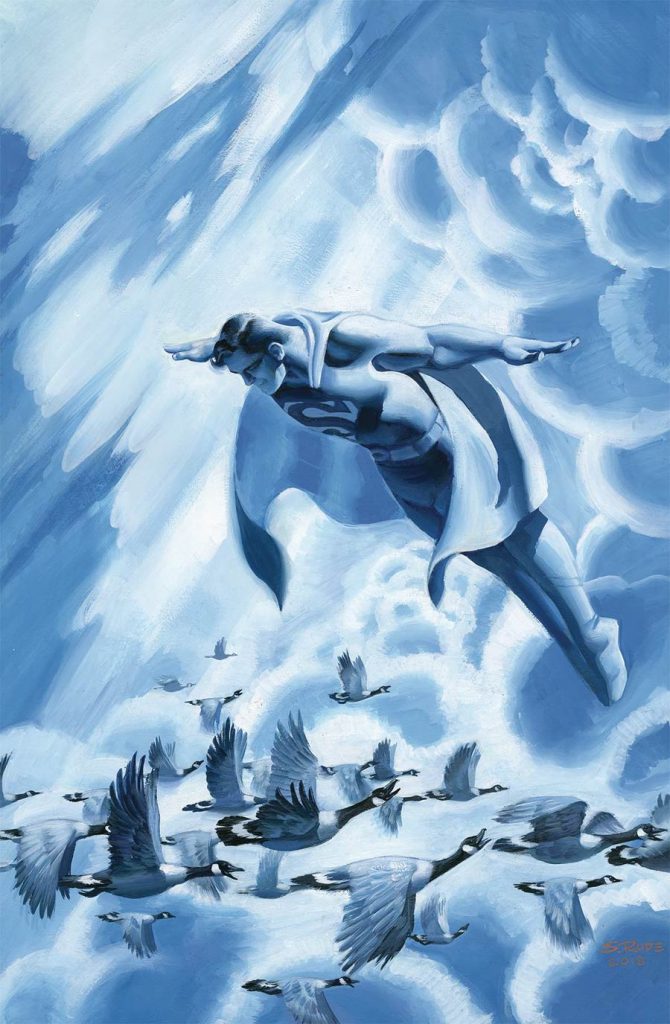
Action Comics #1004 by Steve Rude. (DC)
MR: Looking at this cover, you can almost imagine the first time Superman had a moment like this. I’m not talking about any of his clumsy initial attempts at defying gravity. There’s absolutely no sense of struggle in Superman’s face here, no sign of a concentrated effort or novelty. And I don’t mean the first time he figured out how insanely cool it is to zip through the air without wings. This cozy two-tone cover isn’t trying to make a show of anything, despite the fact that it depicts a man floating in the sky.
What I’m talking about is all in the face. Like a happy old man, Supes is content to watch these south-bound geese live out their routine. They’ll make a return trip soon enough, and do it all again next year. You can see by his expression that something about the sight of this living clockwork feeds his heart.
I imagine the first time Superman had a moment like this he had just woken up from a 2 day nap. He was recovering from the fight of his life, having just barely pulled off a last minute gambit that saved his hometown, his loved ones, and everyone else on the planet including every goose. It’s sunrise.
Feeling rested enough, and perhaps not sure what to do with himself yet, he jumped into the sky, flew around for an idle hour just trying to let his mind fall back in order, and then caught sight of something stunning none of us could hope to see from the same vantage point: the ethereal glow of a distant city, a cloud of starlings twisting to avoid him, or just a bunch of geese going about their business. Something quite simple that stands for something quite deep, a microcosm of the vast planetary rhythms he’s listened to every day since he was a kid, that reminds him why he went to all the trouble in the first place.

Amazing Spider-Man #10 by Phil Jimenez (Marvel)
BFH: Yes, this is indeed an Amazing Spider-Man cover. Nope, he’s not anywhere to be found on it. But what you will find is a tremendous homage to a top-tier X-Men run from one of its artists, Phil Jimenez. It is a stunning tableau, one that captures so many of the grace notes that made the Grant Morrison New X-Men era such a delight for so many. There are glimpses of many fan-favorite characters from Morrison’s run, and not just the central team members like Wolverine and Beast (both of whom Jimenez succinctly and beautifully represents here). Even newer characters like Fantomex and Xorn are winked at, along with the imposing Magneto statue signifying the doomed nation of Genosha.
Of course, all of these details are built around one central element, perhaps the most significant of Morrison’s run. A Phoenix-powered Jean Grey looms with great malevolence over the regal, couture-friendly Emma Frost, who has a fallen Cyclops literally brought to heel beneath her. This relationship dynamic, one that shaped the X-Men for over a decade after, is one of Morrison’s great legacies with the Merry Mutants. It’s fitting that Jimenez gave it central billing on this cover. That Jimenez also continues to be one of the all-time greats when it comes to illustrating beautiful people also reminds us of the subliminal sex appeal of this particular love triangle.
But even with all the imposing nods to tragedy and relationship psychodrama, there is one other detail that Jimenez chose to use that I find very satisfying. It’s the long line of mutants, the actual new X-Men, mustering in the background behind Emma and Scott. They serve as a reminder of Morrison’s other major X-legacy, of his expansion of the mutant world and his emphasis on them as a collective and a community. And Jimenez, even amongst all the fire and anguish, has made sure to keep that aspect alive in this piece.
Which covers from this year were your favorite? Let us know in the comments below.


