
by Arpad Okay, Clyde Hall, Mickey Rivera, Sara Mitchell, Lauren Fernandes, and Jarrod Jones. Undercover is our opportunity to lovingly gaze upon gorgeous works from magnificent artists. This week, we revisit the 20 most striking, beautiful, odd, and otherwise terrific covers that graced comic book stands in the year 2019.

Coffin Bound #3 by Dani & Brad Simpson. (Image Comics)
JJ: The world as depicted in Coffin Bound hurts. Sharp angles, scorching heat, zero respite—and enemies. People who want you dead and have the time and the means to make it happen. Live a day of Izzy’s life and feel the tension iron wrinkles across your brow, feel the last few embers of innocence burn out in your eyes, your gaze forever alert, pensive. This is not a place for the weak. The weak wash right the fuck out.
Dani’s lines on the cover to Coffin Bound #3 convey pain and hurt and the anticipation of both. It plays arts and crafts with the contents of Dr. Frankenstein’s workbench, assembles a blasphemous mockery of the human body, and strips away the dignity of living as vultures rip away flesh from a rotting corpse. It’s beautiful.
Brad Simpson goes Herbert West with the colors, adds dimension and shape and texture—makes the image extra gross, a living, pulsating thing. The graying flesh of the subject’s forearm peels back, a cage door revealing the ghastly contents within. With hair black as jet waving in the navy background, we know this is Izzy’s prize, Izzy’s property—and now, Izzy’s project. It’s disorienting, nauseating, and one of this week’s finest covers.

Ice Cream Man #14 by Paul Rentler. (Image Comics)
CH: He was a fixture, tending neighborhood ice cream parlors which stand now only in collective childhood memory. But this Ice Cream Man serves up bugs more than brownie sundaes. He scoops double-dipped nightmare, not Neapolitan. He’s nostalgia, with a razor twist in the gut.
Paul Rentler’s collage cover for Ice Cream Man#14 plays on remembrances of pulpy comic book adverts and imagery, mixing toothsome dread from mind’s eye comfort confection. The Ice Cream Man’s deviant expression is fit for any Pat Boyette Charlton horror villain.
An insectoid stampede up one starched and spotless uniform sleeve joins the skeletal horror latched to the other, welcome anchors for our grisly host. In the background, innocuous Kit Cat Clocks, parachuting plastic soldiers, Charles Atlas, and Rick Starr the Space Ranger bear witness to wrongness. Even their multitude is peppered with EC undead, dismembered bloodshot eyeballs, and ominous Scissors for the Drifter. Fittingly, the Comics Code Authority is given a shallow burial.
Rentler shows horror as a many-layered Thing, worming into fondest fantasies of Better Old Days. The ghastly, he suggests, wriggled through those back-when pages all along. We were just too naive and too greedy for our weekly comics parfaits to notice.

Martian Manhunter #8 by Joshua Middleton. (DC)
JJ: Joshua Middleton’s latest Martian marvel is a cosmic map of swirls and arcs that leads to absolute treasure. It delivers J’onn J’onzz to his true North, an iconic image from an artistic series famously overloaded with them.
Like most Middleton, there’s more than just a variant splash at work here. More than a paycheck. I don’t know the artist’s thought processes are like these days, but J’onn has rarely ever had it this good, being a subject for one of the best cover artists working today who also seems to have tapped a vein of undistilled inspiration.
It’s evocative of peak Struzan, from the days when the upcoming Lucasfilm joint could have been months away but the one-sheets as painted by Drew were more than enough to inspire hopes and dreams until opening night. It has those nostalgic bonafides to be sure, embedded in the alien DNA of our Martian hero, right there, crackling with magentas and jades worthy of Amblin.
And then there are the details, inventive, inspired. Inventive: The arc of gleaming light, forming our little blue dot and leaving the past—the Red Planet—spinning away from us, towards memory. J’onn’s shoulders square at the apex of this arc, framed expertly, a new type of Strange Visitor for our contemporary lives. Inspired: That glint in the eye of the humanoid John Jones, whose steely gaze seems to be thinking of his red home, gone, never forgotten. The essence of J’onzz, captured magnificently, almost too good for a variant cover.
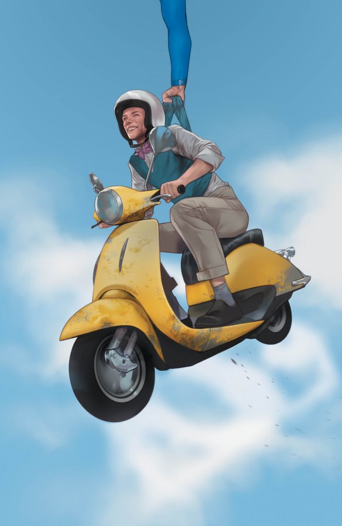
Superman’s Pal, Jimmy Olsen #2 by Ben Oliver. (DC)
JJ: What a ridiculously wonderful thing this is. A mid-morning sail through the skies of Metropolis in that true, ought-to-be-patented James Bartholomew Olsen style. Being an ace photog for the world-famous Daily Planet newspaper, not to mention being Superman’s pal, can (and often does) bring calamity to the young man’s life. Reckon it’s times like that when it pays to have a sonic signal watch.
Zee-zee-zee. Ben Oliver’s variant to Superman’s Pal, Jimmy Olsen #2 has a carefree zeal that matches his subject. Olsen’s various jaunts through comicdom over the ages have ranged from the ludicrous to the poignant, and Jimmy’s doofy grin has led us through them all. Here is no different, as our resident Man of Steel takes time out of his day of alien invasions and death rays to help Olsen out of a jam and Jimmy’s loving every second of it. Pretty girls are likely watching, and our guileless chum (check the oversized helmet, the high-water khakis, and that legendary bow-tie) is definitely aware of the situation. So Oliver slaps that doofiness all over Olsen’s cherubic mug.
The grin’s infectious. Oliver’s Olsen glides overhead and over both the ludicrous and the poignant towards a level of twee that is fittingly obnoxious. Like “Yakety-Sax” played through a ukulele, you can’t help but succumb to the natural charm of this. The more impressive display of super-natural powers is gently nudged out of the cover, sure, but it’s deliberate; Ben Oliver wants to position Jimmy Olsen as the center of our attention and affection, and I’m a sucker for it.

Marvel Tales: X-Men #1 by Jen Bartel. (Marvel)
CH: “The green one is Bill, and Don is blue.” I almost missed the lobster on first viewing this retro-fantastic Jen Bartel composition. Inside are reprints of X-Men #58, Fallen Angels #2, and Uncanny X-Men #272. Mostly, Bartel sticks to giving us the Neal Adams versions of those 1969 X-uniforms, including Angel’s. By today’s standards, his doesn’t exactly fit with the others, including the best Marvel Girl up to that point. (Decide on a color, willya, Warren?) But to the 7-year-old comic book fan that was me, the Avenging Angel was unspeakably cool.
Bartel, in her adept way, has appropriately repackaged the coolness here. Her simple line quality lets the colors breathe. The textured power blast manifestations grant cohesiveness and join the lower border nicely, tying everything together. Stuffed shirt Scott sporting the least-updated version of the classic team costume defined his character in those early years. Yet Bartel burnishes his holdout suit to shimmer alongside Lorna and Jean and Bobby. With lessened black bands on Angel’s cuffs, even his prismatic wardrobe works.
Including the psychic mutant lobster Bill from Fallen Angels completes the nostalgic enchantment. It’s a labor of love that makes celebratory 80th Anniversary issues worthwhile.
Doom Patrol: Weight of the Worlds #2 by Nick Derington. (DC’s Young Animal/DC)
JJ: Trip the light fantastic with the stars of Doom Patrol. What we’re looking at here is a cheeky bit of business courtesy of Nick Derington, an enthusiastic, winking thing that pays lip service to the critical adulation its streaming tie-in has soaked up over the past months. It greets you, air-kisses both your cheeks, calls you “dah-ling” and continues its saunter down the crimson carpet, leaving you dizzy.
It’s all champagne effervescence and gee-whiz glamour. Derington is an ace at characterization and his cover to Weight of Worlds #2 is the summit of his powers: Pride, sass, kindness, innocence, it’s all there, a glorious example of the wonderful peculiarity that is DC’s Young Animal imprint, not to mention Derington as a draftsman.
The composition is perfection, nine characters soaking up the limelight with plenty of space to be themselves, to smile, to preen, to flex, to shine. Somehow, it isn’t busy, isn’t messy. How this is so, you got me. As far as DC iconography goes, Nick Derington just nailed it with this cover, capturing the zeitgeist of Doom Patrol‘s current comics moment while simultaneously rocketing its characters beyond the stratosphere like the stars they are.

Snow, Glass, Apples by Colleen Doran. (Dark Horse Comics)
LF: Colleen Doran has shuffled the deck. She has drawn a card and placed it before me.
At once, I am pulled into the center of the card. The Queen stands there, at the center of a vortex created by the curving patterns in her robes and gown and the arching design across the top right corner. And the red. The blood, oozing from the heart, staining the hem of the Queen’s gown and drawing my eye back up to her face.
The Queen’s face is cold. Resigned. A sunbeam crown atop the head of this monarch does nothing to brighten or warm the image. I know, as I stare down at the Tarot card before me, that this will not be a happy story. There will be no singing woodland creatures, no lovable dwarves full of merriment dancing in the trees with a benevolent princess. There will be no happy ending. Cards adorned in such frigid hues of blue, black, and blood don’t foretell endings where a happy couple rides into the sunset.
There will be horror in these pages. A story Neil Gaiman once retold. And now Colleen Doran has gathered it, reimagined it, and delivered it. Page by page, card by card.
Until we forget what “happily ever after” ever really meant.

Ryuko, Vol. 1 by Eldo Yoshimizu. (Titan Comics)
JJ: “Ryuko is a maniac work.” Eldo Yoshimizu said it, and one glance at the remastered cover to Ryuko, Vol. 1, I believe it. It’s a cover that belongs in an art gallery, somewhere where beautiful people quietly observe beautiful things. It’s probably spent some time existing in such a place. This screams danger. Fluid, exciting, beyond making sense, it’s that good.
In Ryuko, danger is everything. It’s double-fisted grenade launchers and chaotic blurs across the face and upper torso. It’s James Bond intrigue, the international, cosmopolitan kind, where mink stoles only scarcely obscure the knives underneath, where vengeance holds dominion over all. Ryuko is helicopters and lingerie and furious anger and this cover, staggering as it is—is only the eye of the hurricane.
Yoshimizu lets watercolor flow over a sea of blood. It makes our eyes swim, all gentle-like, even though the red is blasting trumpets into our corneas. The bike skids on invisible pavement, those leather stiletto boots kick up unseen gravel, she’s all leopard print and determination and exquisite lethality. This image almost doesn’t do the interior havoc justice, but in a way that makes the experience of Ryuko so much better. When you crack the spine of Vol.1 and find your jaw on the floor, you’ll finally have an intimate knowledge of what art really does to you. So submit to it.

Wonder Woman #72 by Jenny Frison. (DC)
AOK: Diana wears a cloak that is solid stone. A single piece textured background gives Jenny Frison’s variant cover for Wonder Woman the elevated, fine art sensibilities that lifts a comic off of a spinner rack to place it on a bookshelf. A promise of magic.
Move away from the impossible wall and the Lasso of Truth, glowing, forms a kind of occult signet. Marble, cut away into person, holding a rope of glowing neon. Look at her eyes. This is Wonder Woman in a Kenneth Anger film, at maximum Twin Peaks.
Everything about Wonder Woman that is iconic is thought on and made beautiful and fascinating. The light from her lasso gives painterly texture to tiara and bracelet. Arms crossed, passing through, wrapped in, and wielding the pure colors that are hers. It’s inspired, mysterious, and powerful.
Eve Stranger #1 by Dilraj Mann. (Black Crown/IDW Publishing)
AOK: It isn’t the flip of the hair or the angle of the earring, it’s the shoelaces whipping against a leg that shows you the speed at which Eve Stranger plummets through the sky towards midtown. At dusk, the buildings below are colored blueberry. The line of horizon tips back forty-five degrees.
The lines Dilraj Mann lays down are the spare, thin contours normally synonymous with European style. Long, arching curves and extra attention to the seams and folds in clothing. Empty space on the person, busy work on the setting; a marble statue in the acropolis.
What I feel looking at this cover, however, are the modern indie masters instead of the aged Mediterranean. Witness the Chris Ware tenderness given to all those buildings. This is Life Magazine’s Rena Titañon cover story, the New Yorker gone punk. Genre-smashing Hawkguy vibes. Mann promises Eve Stranger is the coolest when there’s trouble.

The Empty Man #7 by Vanesa Del Rey. (BOOM! Studios)
MR: You want to feel at home in that station wagon. Everything around it has gone to shit. Sitting there among the bones and entrails it screams out at you, telling desperate stories of cross-country adventures, family outings, picnics, nuclear families, cheap gas, paved roads… a world that still makes sense. The bloody handprint on the rear windshield dampens your hopes.
This is about more than just a wrong turn. This is about more than society collapsing into chaos. The cover to The Empty Man #7 is about complete alienation from everything you know to be normal. The horrible creatures that rule over this place left that car there to remind you just how alone you are.
If this cover had a soundtrack it would be a wet static drone, the amplified and distorted gurgle of meat being pushed through a grinder, the slow crunch of bones being shredded. Artist Vanesa Del Rey’s hazy, sickly red hell-scape suggests painful bodily exposure, a body that’s been splayed open and stretched across the land. Yet there’s no decomposition, no desiccation. Everything is moist, warm, and utterly nauseating.
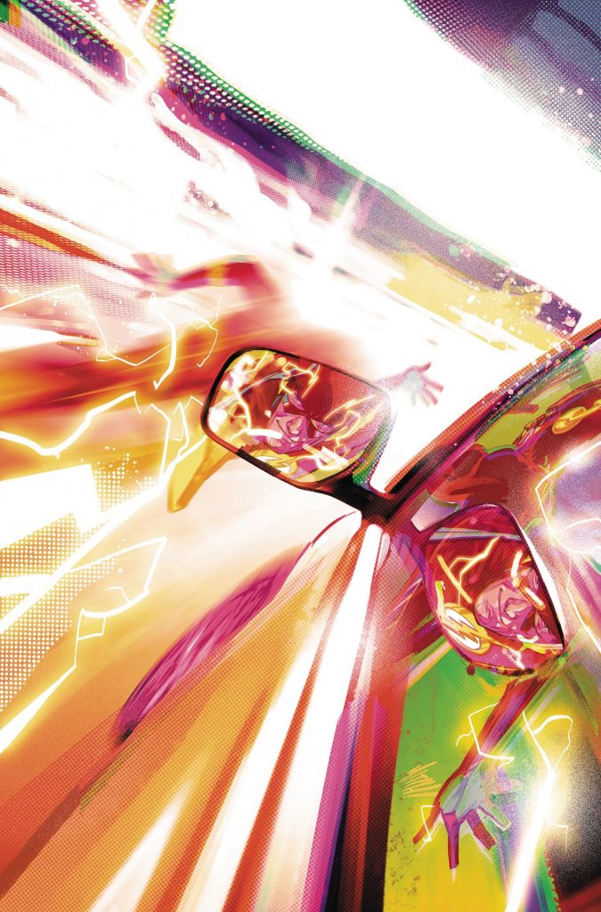
The Flash #69 variant by Mitch Gerads (DC)
CH: On Twitter, artist Mitch Gerads said his variant cover for The Flash #69was inspired after a viewing of Spider-Man: Into the Spider-Verse. Great artistic expression incites more of the same, and Gerads’ work here is Exhibit A. It’s a masterful display of perspectives, reflection, and speed masquerading as graphic euphoria. Gerads plays with motion-capture freeze frames, simultaneously blending velocity to limits of human perception. Speed nigh-demanding a superheroic panic stop nanoseconds hence. It’s a lightning and scarlet package of raw, motion-lined glamour.
The window glass and rearview deliver coequal, static images of Flash amidst his electrified smoke and mirrors momentum. Were Gerads’ rendering left smooth, the consistency would become a moonbeam, an illusion. He prevents that by grounding the composition with varying textured grain. It makes the car tactile, the surrounding night corporeal, but vanishes in headlights and in the glare of Flash’s energy arcs.
Barry may or may not be generating 1.21 gigawatts here, but Gerads displays incontestably the challenge for any mortal coping with a speedster of this magnitude. His mic drop cover grants renewed respect for those hapless charter members of the Rogue’s Gallery.
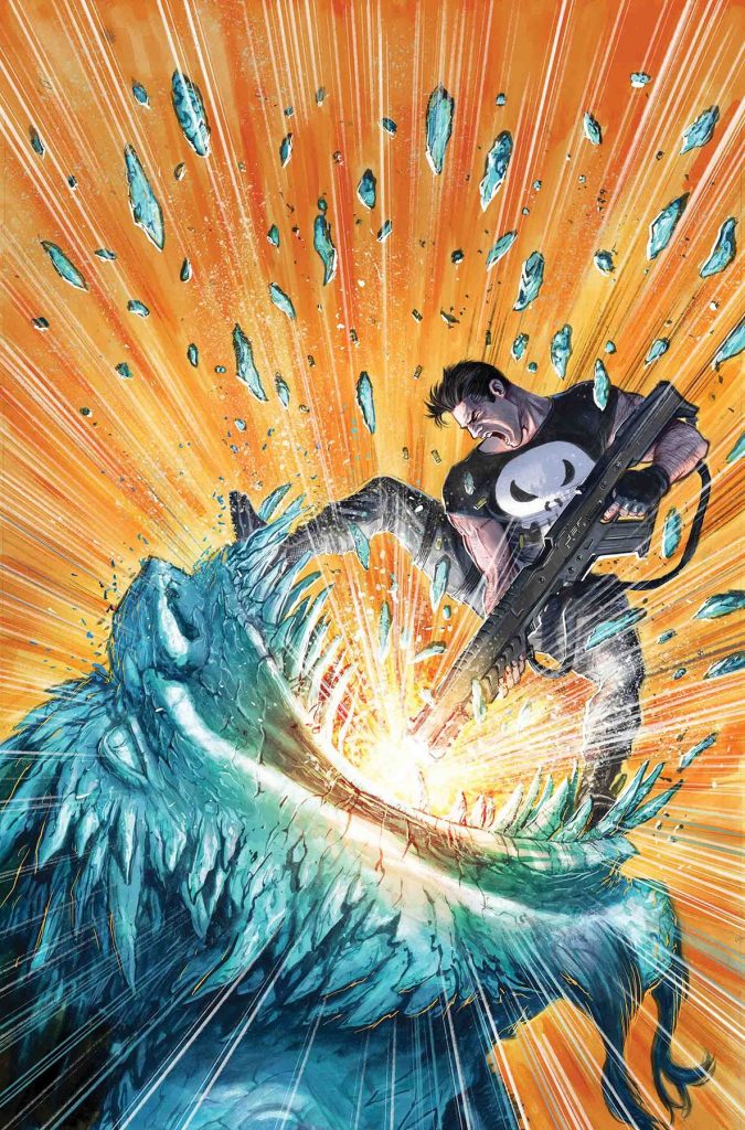
War of the Realms: The Punisher #1 by Juan Ferreyra. (Marvel)
MR: The first thing you’ll notice is the muzzle flash: A blinding starburst of actualized pressure released from the barrel of a gun nearly as big as its wielder. Frank Castle and a stony mythological beast with sharp stony teeth are mid-orbit around that flash like constellations brawling around a sun. If you took the fight away this cover would be quite serene. There’s a sunset beauty about those perfectly straight rays of light shooting outward in a circle past every edge of the frame.
The choice placement of that magnificent firearm reminds us that Punisher is the archetypal comic book hero for the brooding aggro-bro inside us all, who yearns to prove how big and valorous their gun is. Frank Castle is just some dude with a massive amount of willpower. A veteran who is damn good with guns and military gear and is good in a fight. A marine, for sure, but a mere mortal with no X-genes or divine lineage at all. As much as this mouthful of firepower must hurt this monster, worse may be the embarrassment of having been bested not by an Asgardian Hero or God, but by an exceptionally tough guy from Brooklyn.

Superman #10 by Adam Hughes. (DC)
JJ: It’s a train just like any other, in a city beyond any standard reckoning. Busted, standing still, leaving its passengers to stew over the prospects of cooling dinners and prolonged soaks in the tub. But in a city such as this, whenever there’s a delay, take a breath. Maybe two. You can always count on a hitch from a friendly stranger. Wearing a cape and bright boots to match. He’ll get you where you’re going, but fast. Welcome to Metropolis, U.S.A.
It’s a marvelous feat given Rockwellian charm courtesy of Adam Hughes. Hughes is the current variant steward of the Superman magazine, capturing the terrific aspects of a world-famous character in lovely, literal fashion. This week: More powerful than a… well, you know.
The artist depicts strength and power though the illusion of motion, achieved via excellent blur effects and other special techniques. Hughes lets the headlights of the evening express illuminate the taut musculature of our savior as he ferries a cadre of spectators towards hearth and home. Boots kick up the rail’s pebbles—we’re really moving now—and look! A speeding train parallel to this fascinating spectacle has added a bit of challenge to an already peculiar commute. Heck, why not—Hughes makes a race out of it. Our grins widen a bit more.

Mirror #10 by Hwei Lim. (Image Comics)
SM: Over the past three years, Mirror has asked the question—do you have to be human to be a person? And over the past three years, through the eyes of Hwei Lim, we’ve traveled across the vast universe and into the minds of characters coming to grips with their identities, wrestling and rebelling, trying to answer that question.
Hwei Lim is nothing if not ambitious. Mirror has been a luxuriously beautiful endeavor, with stunning covers worthy of a place on the mantle. Her covers have been dense with color, texture, and emotion. So it’s funny that today, with the long-awaited final installment of the series, we get a pallid palette. Funny because Mirror has taken place in the not-so-human world full of magic and mystery and the richness of color that comes with it; today we find ourselves amongst humans and their pleasantries, and it’s washed out the life.
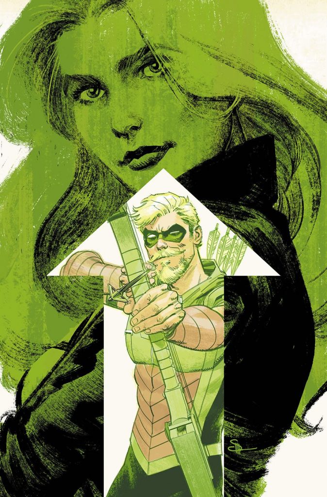
Green Arrow #50 by Evan “Doc” Shaner. (DC)
JJ: Couples in comics face the same inevitable pratfalls in romance as IRL paramours such as you and me. (Perhaps not you and me, but me and my significant other. Hi, MJ!) Intrusive third parties angling for a relationship’s accelerated decline, life changes that send people careening down different paths, and irreconcilable differences that occur naturally when two human beings—with all the nuances, habits, and personality “quirks” that come with them—decide to make a go of things, all of these issues can often split intimacy in twain.
One thing us real-life folks don’t have to worry about rending our passions into ruin is comic book cancellations, which is what currently besets Oliver Queen and his intended, Dinah Lance. It’s a romance that’s been rocked to its core many times before, though stories in Heroes in Crisis and this Rebirth-sprung Green Arrow series have sent our favorite vigilante lovers on a scary path that may not resolve in a way we romantics deem fit—and there’s no more book to read after this.
Doc Shaner, providing us with a variant cover hat-trick this week (see also: Batman #66 and Young Justice #3), doesn’t skimp on that sentiment in his emerald valentine to Green Arrow #50. It’s a poignant, expertly rendered study that encapsulates decades of storied ardor between our favorite archer and the legendary Black Canary—and the barriers that often separate them. Even though the stark white reed shoots Oliver directly to the core of Dinah’s affection, they’re deliberately set apart. But Shaner, ever the draftsman, shows us that the direction of the arrow points to the path the Green Arrow will always follow. Shaner reminds us that, when it comes to the Black Canary, Oliver’s aim will always be true.
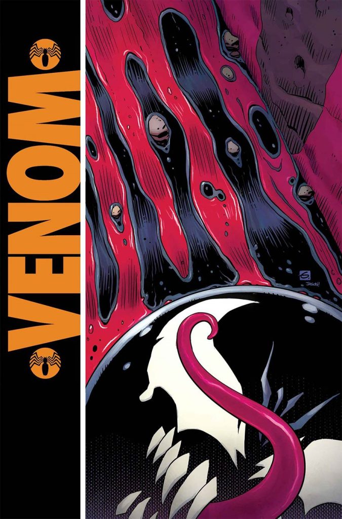
Venom #11 by Dave Gibbons. (Marvel)
JJ: File this under “things that make you go ‘hurm’.” Dave Gibbons’ variant to Venom #11 has me caught in a tailspin. It’s perfect: absolutely cheeky, expertly realized, simultaneously unprecedented and totally obvious.
The genius of it is the subtlety. Venom is currently running Eddie Brock through every conceivable torment and plot twist you can imagine. So Gibbons throws Eddie right where we like him: in the gutter, his heart beating a torrent of worry and despair right down the drain where monsters lurk and sharpen their teeth. His very life, represented by crimson, runs alongside the inky blops of his pet symbiote over a discarded piece of tie-in merchandise, that famous flopping tongue cutting across its sphere in the same place where once there was but a single drop of a comedian’s blood.
The details, they cut deep. Where Gibbons’ first Watchmen cover was a Satanic bloodbath of pop culture subversion, his Venom variant is a valentine, meant to warm hearts and draw eyes to one of Marvel’s strongest books published today.

William Gibson’s Alien 3 #4 by Tradd Moore. (Dark Horse Comics)
AOK: A sexuality recognizable but foreign to our own. The smooth phallus of a head is the one uncluttered space on this cover. The proboscis is engorged. The whole xenomorph is in a rare position of obedience, ribbed thighs ride a curving, sectioned stingray spine of a tail. Boudoir colors, of bruise, of insides.
Techno-organic. Run your hands along its carapace and not only will you find ridges, veins, webbing, but buttons, switches, inputs waiting for a plug. What is Alien but us at our most base, our most animalistic: an unknowable, awful body hardwired to replicate. Aesthetic and philosophy link hands here, in this inspired tribute to the essence of HR Giger’s dark dream.
The star beast floats in space, inside an egg, a TARDIS, a tab of acid on the tongue, one where vents, nodes, ridges, nodules, texture reflective of the alien’s body falls away from the eye, swirling into forever, knotted over itself. Giger would have his monster fit perfectly into a niche in the background, but Moore has it gliding like a drop of oil on the surface of water, reflected and reflecting the total chaos beneath.
This is perhaps the finest piece of Alien-related art I have ever seen. Tradd Moore understands the essence of evil, the impossible act of pulling the thread of man through an utterly inhuman eye of the needle. It is Moore, his lines, his style. And it is the idea of Giger, not reinterpreted, but reborn.

Dick Tracy: Dead or Alive #3 by Michael Allred and Laura Allred. (IDW Publishing)
CH: “Look at that. Yeah. Come get some, boy.” – Curly Bill Brocius (Powers Boothe), Tombstone, 1993.
For their cover for IDW’s Dick Tracy: Dead or Alive #3, Laura Allred and Michael Allred give Tracy his Wyatt Earp moment. A big yellow trench coat may seem like a perfect target for a chopper squad of torpedoes. That’s only true, though, if you can hit the figure sporting it.
In the film Tombstone, a shootout based on an actual incident illustrated the value of a bulky coat as defense. The confrontation at Mescal Springs (or Iron Spring, or Cottonwood Springs, historians differ) showed Wyatt Earp (Kurt Russell) breaking cover in a crossfire to cut Curly Bill in half with a shotgun. All the while, a band of outlaw Cowboys blaze away at the advancing lawman. In real life, Earp withstood the onslaught without a scratch. His hat was hit by five rounds, one boot heel was splintered, and both sides of his duster along with the coattail were riddled.
Our favorite flatfoot is having the same sort of day, especially his poor coattails, but with his own two-fisted, blazing .45 response. We’ll take it on faith that the perfect red circle behind the detective is lighting, not blood. Or not his. Part of the psychology at play in both scenarios might be the lawmen’s shared reputation for hitting what they shoot at. Their bullets are fewer, but they strike true. The bad men? Not so much.

The Green Lantern #3 by Liam Sharp and Steve Oliff. (DC)
JJ: You got to love Grant Morrison. I don’t think another writer in DC’s payroll would quite get away with the “cop of the cosmos questions the Creator” angle. It’s just another reason why The Green Lantern is one of the more indelible ongoings you should be reading right now. It’s weird, it’s daring, it’s utterly goofy, and I love it.
Oh yeah, and here comes God. Well, there’s certainly a version of the deity on the cover of one of DC’s most high-profile books, now isn’t there. And it appears he’s found himself in a spot of trouble with the space coppers. Liam Sharp’s stunning, European sci-fi work makes TGL stand out from the character’s storied runs of years past with weirdo alien designs and stretched-to-credible-limits humanoid limbs and torsos. For his big-time crack at drawing the G-O-D, Sharp delves into his mythological roots and comes up with the ultimate shorthand for theological visual catch-all. And his version of the Big Guy Upstairs doesn’t look too happy to be here.
Check the (celestial) body language: the shepherd has set aside his crook to address the small, bleating member of his flock. Whatever brought Hal Jordan, Green Lantern, to the Pearly Gates must be a real whopper, because this act of defiance ain’t gonna score points with Saint Peter, no sir. You want the keys to the Kingdom, you daren’t demand of your Creator. Yet Hal Jordan dares. (He does that.) There’s no way I didn’t buy this issue just for the cover. I wonder what my dear, devout, departed grandma would have made of this.
Which covers from this year were your favorite? Let us know in the comments below.


