

By Don Alsafi. Last fall, Marvel announced that they had commissioned indie cartoonist Ed Piskor for an ambitious miniseries called X-Men: Grand Design. The artist had made a big splash in 2013 with the Eisner Award-winning Hip-Hop Family Tree, published by Fantagraphics, in which he documented the early artists and movements of the hip-hop music scene. Grand Design, we were told, would purport to do the same thing for the first four decades’ worth of X-Men stories, distilling over 8,000 pages of individual comics into one hopefully cohesive narrative.
Still, many of us wondered: What would that even look like?
Now that it’s here, we have our answer. And it is glorious.
 X-Men: Grand Design #1-2
Words, art, colors & letters by Ed Piskor.
Long-running stories? Or a long-running story? In the late 1970s, indie artist Dave Sim had been writing and drawing his Conan parody comic Cerebus for a couple years before he had a (possibly drug-fueled) bit of inspiration. Superhero comics, by virtue of being continuous publications from an ever-changing stable of creators over multiple decades, simply don’t make sense when viewed as the story of a single character or team. There’s never a long-range plan in place, which is why the Superman comics of the 1940s have virtually nothing to do with the Superman comics of the ’60s, or ’90s, or beyond. And while the narrative cohesion of Sim’s eventual 300-issue epic may be open to debate, his ambition and intent remains noteworthy.
Superhero comics have very occasionally attempted similar goals over the years, if in a far more distilled format. The 1980s saw Marvel Saga and The History of the DC Universe, both works aiming to condense multiple decades’ worth of their respective lines into an easy digestible and interweaving whole. Though interesting experiments, however, they both ended up rather dry in the execution. It wasn’t until 1994 that Kurt Busiek & Alex Ross delivered a more narratively satisfying example in the groundbreaking Marvels miniseries – although to do so they had to create a new POV character, and then simply backgrounded the major Marvel events as developments unfolded in the periphery of his life. (In other words, it was a bit of a cheat.)
With Grand Design, on the other hand, Piskor is giving himself no such easy out.
Interior page from ‘X-Men: Grand Design’ # 1. Art by Ed Piskor/Marvel Comics
The connections are there – if you look. Ed Piskor has gone on record as having been influenced from an early age by the X-Men comics in their heyday, and what he’s produced here is clearly a labor of love. He began work on the project in early 2016, and one can imagine that much of the last two years was nothing but research, research, research. After all, just laying out the superheroes’ various adventures, one after another – as Marvel Saga did, for instance – isn’t going to add up to a satisfying whole. What do the escapades of Marvel’s mutants when they were teenagers have to do with the coming of the Phoenix in later years, or the eventual discovery of an island nation of mutant slaves more years after that? Not a lot, really.
Or at least, not on the surface.
What Piskor has done, though, is to look at all these separate eras, with their seemingly disparate plot beats and paradigm shifts, and ask himself: What if they weren’t so disconnected after all? In the 1960s, for example, the occasional (now-obscure) villain or two would turn out to be an alien because… well, comics. It’s an easy eleventh-hour plot twist for writers who needed to crank out a new story every month. On the other hand, Piskor posits, maybe the fact that the X-Men kept encountering these various extraterrestrial menaces wasn’t just a coincidence! What if there was a common element to their previously-unrelated stories – one that wasn’t just similarly-themed, but which acted as natural foreshadowing to a certain Phoenix-shaped development looming on the horizon? What would that look like?
And that’s just one example.
To be sure, certain segments of fandom may cry foul at the liberties Piskor occasionally takes in reconceiving this history – and he’s made it easy for us to see when that happens. Each issue features two pages in the back of the book citing the original sources of each detail, so the reader can tell that there’s some rewriting going on when Mesmero (who debuted in 1968) is shown as one of Magneto’s evil mutants capturing the island of San Marco (in a story from 1964). But, to be frank: So what? Revising past stories to reveal some hitherto-unknown discovery – a.k.a., retroactive continuity, or the “retcon” – has been part of the DNA of superhero comics for as long as most of us can remember. So why not employ that same trope in a work designed to actually conceive of the bigger picture?

Interior panel from ‘X-Men: Grand Design’ # 1. Art by Ed Piskor/Marvel Comics
The most avant-garde Marvel in years. Each issue of X-Men: Grand Design features 40 pages of comics, which is twice the normal amount of a monthly superhero book. However, don’t be surprised if it takes you much longer than two comics’ worth of reading to pore through!
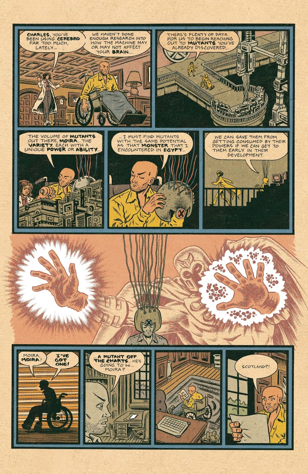
By the very nature of this project, it’s a very dense read. Most modern comics take several pages to set up a situation, several pages for a fight scene, etc. Since this is essentially a history of the X-Men, on the other hand, the space constraints are radically different: Piskor might devote two pages to the entirety of Charles Xavier’s childhood, one page to the X-Men’s discovery of the Savage Land, or mere panels to showcasing the first time the team broke up (and what its members did). It’s poles apart from the usual form of superhero storytelling, and one that likely wouldn’t work outside of this very specific aim – but while the vast and ever-reaching scope can be at times dizzying in its breadth, it’s never once dry or boring.
And what’s more, the comic looks like nothing else on the stands. Piskor’s art style is clearly descended from the underground comics masters of the ’60s and ’70s (like R. Crumb and Gilbert Shelton), his first major work was with American Splendor‘s Harvey Pekar, and the figures seen in these pages are distinctly superhero icons as drawn from the pen of an indie artist. But Piskor also goes the extra mile in terms of production and presentation: The page backgrounds are not white but instead approximate yellowed newsprint; colors and shading eschew the modern solid-coloring made possible by computers, but instead employ old-school Ben-Day dots; and panel borders are almost all thick, solid blacks (the exception being Jean Grey’s dream sequence which deliberately evokes the style of Windsor McCay’s Little Nemo).
The combined effect is a look, and a style, that may not appeal to everyone. But at a time when more and more comics readers are looking for something new – something they haven’t seen before – this is perhaps the most arrestingly distinctive superhero comic in years. The fact that it’s being published by one of The Big Two is nothing less than astonishing.

Interior panel from ‘X-Men: Grand Design’ # 1. Art by Ed Piskor/Marvel Comics
Just the beginning. X-Men: Grand Design #1-2 is simply the first third of Ed Piskor’s ambitious project, and he pleasingly wraps up this first act after the events of 1970’s X-Men #66 (at which point the original comic was cancelled). We can thus expect the next installment to pick up around the beginning of the “All-New, All-Different X-Men” era, and the heights of the fondly-remembered Claremont/Byrne collaboration.
The only downside is that with Piskor taking the auteur approach, and handling every single element of the comic – from writing, to art, to colors, to lettering, to production – it’s quite obviously going to take a while between acts. (Although in a bit of good news, Piskor just this week tweeted that the next two issues should be ready by the summer, rather than their originally projected timeframe of “late 2018”.)
However long it may happen to be? It’ll surely be worth the wait.
10 out of 10


