
By Molly Jane Kremer, Andrew Stevens, and Jarrod Jones. Our Week In Review serves to fill in the gaps our frequently verbose comic book coverage leaves behind. Each week, we take a brief look into the books that demand attention.
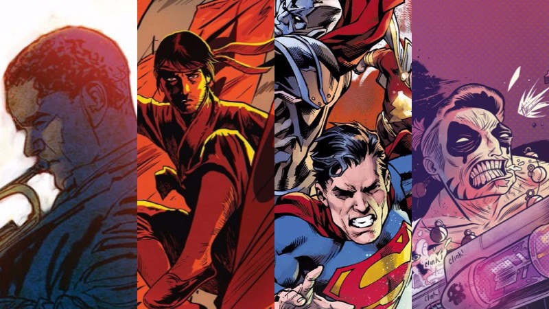
 The Fade Out #6
Image Comics/$3.50
Written by Ed Brubaker.
Art by Sean Phillips; colors by Elizabeth Breitweiser.
AS: I’ll admit it. The superhero mainstays have never made their way onto my weekly pull list. I realize that sentiment trumpeted all over a comic review website might come across as a bit iconoclastic. However, my aversion stands not as an indictment of the genre, but rather my lack of familiarity with DC and Marvel’s respective canons. But, when Dashiell Hammett walked into the middle of The Fade Out, like he did with this month’s installment, I had my first glimmer of the feeling comic book fans I know must get when Crisis on Infinite Earths or Civil War erupts and crescendos. (Count me noir obsessed, though it’s not exactly a novel or minority position given that almost everyone — even Marvel — gets in on it.) The Fade Out extends beyond genre and frames our long, winding path towards moral darkness.
The Fade Out operates with the full force of both its genre and its protagonists. A noir is an internal story, one of complex emotions and existential dread, and with that Brubaker doubles down on the most internally self-loathing of all characters: writers. As Gil and Charlie maneuver within the epic whodunit, they’re offered an opportunity to think about their actions as plot. And, late in the issue, this is just what Gil meets up with Hammett to do: they meet under the guise of a murder story Gil’s at work on, and joy quickly follows with Hammett serving as the voice of guidance and wisdom to a blacklisted drunk. Given Hammett’s own time as a Pinkerton investigator and godfather of the genre, he stands as an ideal advisor. (As an aside, my favorite line about Hammett comes from James Ellroy, “Chandler wrote the man he wanted to be — gallant and with a lively satirist’s wit. Hammett wrote the man he feared he might be — tenuous and skeptical in all human dealings, corruptible and addicted to violent intrigue.”) The single panel where Gil turns darker, the horns of the rain-soaked genre blast us deeper into this noir love affair.
As ever, Phillips and Breitweiser nail the Chinatown cityscapes and establishing shots that we’ve come to expect from this series, while still enlivening the pages with portraiture that exercises the period pallet with the flair that marks this creative team’s style. I spent much of my first afternoon with the comic flipping back through the pages and admiring the panel work, coloring, and pacing. As if those factors weren’t sufficient enough, The Fade Out’s back pages deal with the racial progress in cinema and the legacy of Our Gang (later to become The Little Rascals). Within the narrative we get the embodiment of one of those child actors in the character Jack “Flapjack” Jones, who graces the cover of this issue. Coupled together we’re informed that our read of The Fade Out has reached far beyond a mere escape. With Brubaker at work, we know this book sets its sights higher.
9.5 out of 10
 Secret Wars: Master of Kung Fu #1
Marvel Comics/$3.99
Written by Haden Blackman.
Pencils by Dalibor Talajić, inks by Goran Sudžuka, colors by Miroslav Mrva.
MJ: While Secret Wars: Master of Kung Fu very obviously takes place within the world of the Secret Wars crossover (it’s got that Secret Wars logo on the cover, and the BATTLEWORLD banner across the top and everything), once you start reading it feels contentedly separate from that universe-crushing behemoth. This will undoubtedly change as the event moves inexorably forward, but for now, Master of Kung Fu simply retains the Elseworlds-y, natural feel of a good reimagining. If only the Convergence tie-ins could stand on their own this well…
As of yet, there isn’t much character development; the book relies more on readers’ reactions to seeing new, kung fu-ized versions of well-known characters, and instead spends its time establishing a tremendous reinterpretation of the city of K’un Lun. In doing so, there’s a lot of exposition to get out, but writer Haden Blackman manages to keep it from sounding clunky: the three-page introduction related through a drunkard spelling it out to a dog helps with that too.
The art team of Dalibor Talajić, Goran Sudžuka, and Miroslav Mrva is incredibly well-suited for the story. The opening pages have the look and feel of fairy-tale illustration, and work beautifully against the narration explaining K’un Lun and its ancient workings. Sudžuka’s inks are strikingly expressive, and ensure that an aesthetic and emotional realism remains — nothing gets too cartoony, even upon the arrival of dragons and unsheathed swords all a-flame.
The fight scenes are excellently choreographed, which could have something to do with penciller Talajić being a practitioner of the martial arts himself. The layouts too are incredibly eye-grabbing, and show an epic, cinematic flair. All in all, owing more than a little to the classic Drunken Master kung fu films, Master of Kung Fu #1 still makes this retelling of Marvel mainstays feel original and fresh. Even if it didn’t have that irresistible Secret Wars attraction, this would regardless be a comic in which to delight and revel.
8.5 out of 10
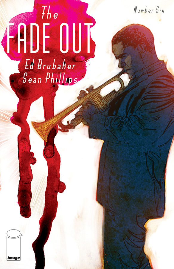
 Convergence #7
DC Comics/$3.99
Written by Jeff King and Scott Lobdell.
Art by Aaron Lopresti and Mark Morales; colors by Peter Steigerwald.
JJ: *scans the horizon* Anybody still there? Oh, hey! How’ve you spent your summer away from DC? Oh yeah? Get out of here. No, you didn’t! Oh. Oh, you actually did. Well, then. Good for you. *cough* Hm? Oh, me? No, no I didn’t get to enjoy my summer because I was too busy reading DC Comics. Yes, all of it.
I have a question concerning DC Comics’ crossover/event Convergence: Is it June yet? And yes, I have a calendar. I know it’s not June yet. And I know precisely what I signed up for, an eight-issue weekly series where an untested writer dove right into seventy-five years worth of comic book history to achieve nothing more than the appeasement of his publishers, men and women who were in the midst of a nation-spanning move and required the necessary breathing room to make it happen. So there’s really no one to blame here but myself. My passion for the brightly-colored superheroes DC Comics owns means that I’m doomed to digest whatever half-baked concoction they see fit to conjure.
And it looks like Convergence #7 brought the antacids. With Aaron Lopresti and Mark Morales on board for visuals, the penultimate chapter of Jeff King’s (literally) all-over-the-place cosmic-saga is infinitely easier to swallow: Lopresti and Morales cook up a pretty killer double-page splash featuring a multiverse worth of superheroes that belongs on any young DC fan’s bedroom wall. What makes Lopresti and Morales keeping the aesthetic score all the more impressive is colorist Peter Steigerwald’s prickly attention to the details: each incarnation of every superhero and villain contained within Convergence #7 (and, my god, are there a lot of them) boasts their era-appropriate color scheme. (To editor Marie Javins, this creative team deserves a raise. Make it happen.)
That kind of reverence is refreshing, if not a little bittersweet. As we watch all the heroes we’ve grown up reading hurtle through the pages in their fully realized glory, there’s a nagging feeling that this might be the last time we ever see these characters again. With yet another reboot right around the corner, the DC Universe is becoming more unrecognizable than ever. And with sales (and really corny marketing gimmicks) being DC editorial’s primary focus, things look to be changing for the worse. Considering everything long-standing DC fans have been through with these super-people, one can’t shake the feeling that everybody — superhero and reader alike — deserved better.
5 out of 10
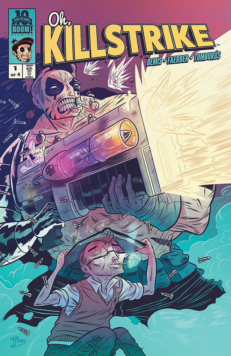 Oh, Killstrike #1
Boom Studios/$3.99
Written by Max Bemis.
Art by Logan Faerber; colors by Juan Manuel Tumburús.
Ah, the nineties. As a comic fan who didn’t really get on board with the medium until college (after 2001 for me), I sadly missed out on those oft-recalled — and oft-besmirched — Liefeldian days of yore. But fear not: having worked in comic shops for the past seven years means I’ve had to get my hands dirty (literally–those back issues bins get dusty as hell) in my fair share of X-Men #1s, Shadowhawks, DeathBlows, Cables, and… oh you know the stuff. In other words, I’ve been sufficiently filled-in on how dreadful comics were in the nineties.
Oh, Killstrike #1 will let you in on all this info as well, and much more humorously than I. Max Bemis seems to know firsthand the epic silliness that was superhero comics then, and he could have a bit of nostalgia for it. Well, maybe not nostalgia: more like a healthy in-hindsight view of the one-dimensional, anatomically-incorrect, rage-and-vengeance machines that populated funny books back then.
Bemis has constructed a humorous takedown (or homage, if you will) to this era with Killstrike, who is, as protagonist Jared puts it, “the worst-written, most uneven caricature of a human being ever set to graphic fiction.” And of course, as Jared is unearthing his old copy of Killstrike, the eponymous anti-hero somehow squeeeezes out of the comic book, asking Jared for someone to seek vengeance against. (“VENGEANCE.” is, in fact, the first word he utters. And the fourth. And the eleventh.)
What follows is both very funny and very engrossing, as we’re pulled into Jared’s little life, just like big goofy Killstrike. Artist Logan Faerber has a delightfully idiosyncratic art style, practically the exact opposite of your Liefelds or your Larsens. He makes Killstrike look just as weirdly shaped and incorrectly-proportioned as he should be (super tiny feet! No neck! An inordinate amount of pouches and serrated knives and abdominal muscles!), and this lumbering monstrosity standing next to normal-sized Jared is an incredibly entertaining visual.
Faerber’s art, with Juan Manuel Tumburús’ colors, is extremely expressive, and very appealing. It reflects the perfect amount of comedy and depth from Bemis’ script, resulting in one of the most entertainingly postmodern superhero satires in recent memory. Even if Gen13 and Youngblood weren’t your jam twenty years ago — but especially if they were — this is an impressively engaging series that is not to be missed.
9 out of 10
Agree? Disagree? What comics did you read this week? Let us know! Comment below!


