
By Molly Jane Kremer, Scott Southard, and Jarrod Jones. Our Week In Review collects our thoughts on the comics that demand attention. Do you have a deep-rooted desire to know what we think about all your favorite books? Well. This is where you need to be.
 The Spirit #1
Dynamite Comics/$3.99
Written by Matt Wagner.
Art by Dan Schkade; colors by Brennan Wagner.
SS: Right now, I can’t help but think of my grandfather. The pot roast and mashed potatoes he loved, the Buicks he always bought (like a true geriatric), his deep love of Shatner’s Captain Kirk, the drab browns of his cardigans… Visiting his house lit the senses with artifacts of the past. He was always excited to retread through old television shows, books, and comic strips with his grandkids. He was the first to introduce me to The Phantom, Dick Tracy, and more topically, The Spirit. The hours we spent shuffling through old newspapers and collections are some of the fondest memories I have.
And it’s here in old memories where Will Eisner’s newly rebooted The Spirit revels. On one hand, a lengthy introduction is provided for newcomers in the form of a front-page newspaper article loaded with exposition. After being introduced to the setting and major players, the dialogue on the first few panels lets us know we’re safely stowed away in the pages of a 1940s comic strip and we’ll seemingly be following the communicative guidelines, if not the format, of the times. Lines like “get a handle on the smuggling epidemic” and “I’m scrammed! You betcha..!” fill the book from cover to cover. While it very neatly keeps us in a specific time and place, I almost came away feeling like I was looking into a readymade snow globe of an era rather than a place that was based in any true reality.
What we’re looking at is simple, and the blanket statement that I wanted to write, but didn’t, “similar to watching Cheers reruns, it requires little critical thought,” might be overly reductive, but I think it’s important that we examine the reasons we come to comics in the first place. Because while much of the comic world is moving forward with steady progress (see Marvel), it seems as if there is plenty of demand for throwbacks and rehashes of old properties (see Batman ‘66, The Shadow, etc.).
If we’re just looking for entertainment and a reaffirmation of our brain smarts (the hollow elation of feeling clever or recognizing a veiled reference), then maybe these reboots and throwbacks are exactly what we need. But if we’re looking to think, to grow, to learn when we engage with the things we consume, then maybe more heavy lifting is required from them. I don’t mean to be condescending or condemning, because there is a great place for cleverness and callbacks, but to use nostalgia as a driving force makes me (maybe unfairly) question the skeletal structure of an entire intellectual property.
And maybe I just didn’t like this particular issue (I didn’t), and this is a reaction to a lack of plot movement, some pretty uninteresting art (barring the amazing cover by Eric Powell), a titular character who is MIA, and no driving force to read the next issue. Maybe I expected more out of Matt Wagner. There are plenty of examples of interesting, confrontational, and just plain great reboots out there (Airboy is wrecking what I thought I knew about postmodernism, see below). But I think it’s a symptom of a greater issue that’s been bugging me as well as a number of other readers out there. Maybe this content, and the content of the past was new and interesting to people in my grandfather’s heyday, but things progress. Maybe (definitely) this is something that needs a broader forum with more well versed folks involved armed with a longer word count, but damn it, I want to be challenged by the art I consume, not simply placated by nostalgia.
4 out of 10
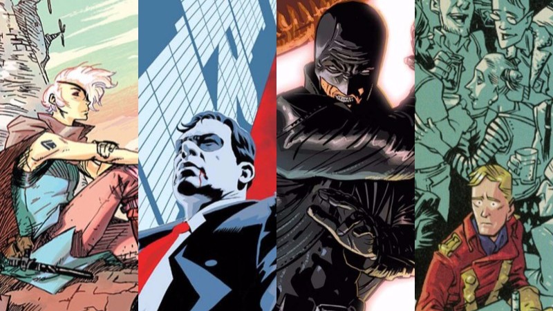
 The Spire #1
Boom Studios/$3.99
Written by Simon Spurrier.
Art by Jeff Stokely; colors by André May.
Boom Studio’s diverse creator-owned lineup has a new addition this week by the already tried-and-true team of Simon Spurrier and Jeff Stokely. Their previous co-creation, the tremendous miniseries Six-Gun Gorilla, was an amalgam of sci-fi, western, and pulp with some decidedly modern twists. Their new release, the exceedingly readable The Spire, also draws upon numerous genres, but is immensely different — both in good ways and bad.
In The Spire, we have a very intriguing premise: a city in the middle of a vast desert, built upon multitudes of tiers, full of both humans and “sculpted”: oppressed mutants more often called “skews” or “chimmers” (our dauntless protagonist, as one of them, rattles off an entire list of their typical epithets at one point). The book’s setting is certainly fantastical, with a hint of both steampunk and cop drama. It’s surprisingly street-level in a way that few fantasy stories ever dare to be, centered around a compelling murder mystery that seems certain to play out over the course of the series.
The comic mainly follows an eyepatch-wearing captain of the city guard named Shå (she also happens to have long, prehensile tentacle-strands that erupt from her back at will), who introduces us to the city and its inhabitants in her initial search for the murderer. It’s a very captivating location, but what’s outside the city walls – the Nothinglands – is just as mysterious as the goings-on inside.
Artist Jeff Stokely’s style is inventive, expressive, and well-suited for this imaginatively gritty comic. His creative character designs enhance the book immeasurably: there’s of course Shå and her creepy string-like appendages; also, the messenger Gargs, who look like angry-old-man-pixies constantly pooting green gas; and all the other “sculpted” the reader encounters, especially Wud: a soft-spoken tree-like being, who wears fake glass eyes to keep the racist humans less unsettled.
Stokely’s manga influences are unconcealed in these lovely pages; one can easily see the work of Brandon Graham reflected in the creature-weirdness, and in the architecture – interior and exterior – of the Spire itself. André May’s colors are an excellent complement to Stokely’s inks, adding depth, beauty, and at times, an additional element of the eerie.
Portions of the book get very talky at points, countless stage-whispers and asides crammed within overlong conversations. These remarks are lettered in a smaller, greyer, italicized font, and can get extremely distracting from the main lines of dialogue. While it can read as snarkily cute (and was probably intended as such), it gets old real fast, making some dialogue scenes pretentiously drag in places where they should snap. Streamlining the dialogue, and removing some of those “witty” flourishes, is the one spot of improvement this issue could use.
Despite those hiccups, the issue is well plotted and paced, and visually captivating. There’s a huge amount of story stuffed into its 28 pages, and somehow nary an exposition dump can be seen. Honestly, any book featuring gangs wearing doublets and feathered tri-corner hats speaking in prose as they mug you, will always be a must-read for me. But this is also an incredibly organic first issue that pulls you in immediately, brimming with possibility, with a grim and socially-aware undercurrent bubbling up beneath.
7.5 out of 10
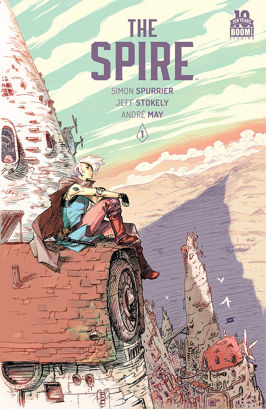
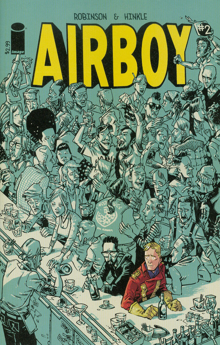 Airboy #2
Image Comics/$2.99
Written by James Robinson.
Art by Greg Hinkle.
When I opened the first issue of Airboy and looked at the title page, I literally whispered to myself, “goddamn, this is pretty.” Then I turned to a blank page followed by a full-page comic portrait of the author sitting naked on the toilet. I said “goddamn” again and fell in love.
The metafictional line in comic books is very thin and often abused. On one side, breaking the fourth wall can be a magical, mind-melting experience (Grant Morrisson’s fat middle finger to all structure in Animal Man), but on the other, it can become tiresome and sound like an over-intellectual high school freshman that gets beat up for correcting the jocks’ grammar (which is most of us here at DoomRocket; but hey, at least we’re self-aware).
Airboy treads that line well. It’s the Louie of comics. It’s ultra-confessional, making the characters (and creators in turn) likeable by announcing every single unlikeable thing about themselves, many times in subtle ways, cutting off other characters’ dialogue or the complete lack of sympathy in facial expressions. It becomes hard to extract the real Robinson and Hinkle from the fictional ones, and even with the Hunter S. Thompson levels of hedonism, that’s always a compliment.
Once we’ve passed the initial giggly shock from the newest iteration of this copyright-lapsed property, we start to dig in and actually meet the character known as Airboy. The juxtaposition of his World War II “good guy” values and the creative teams’ inability to function in modern society is brilliant, as both sides are caricatures of something very true and human, which is seemingly the point of the whole book: to amplify the darkest and brightest parts of being alive in today’s America.
This is exemplified profusely in Hinkle’s art. While the majority of the pages take on a melancholy black and blue, Airboy shows up in a vibrant full color palette of red, gold, navy, and brown. A multidimensional showing, if you will. The contrast is fun, but also offers us an interesting visual cue to denote the differences between the character Airboy and the “real world” he’s stumbled into.
This is definitely a way if not the way to reboot a comic that’s long been in the public domain. Robinson uses smart, jaded conversation to give insight into a generally shrouded and idealized world of comics, while revealing the drudgery that’s a part of any occupation. Hinkle is a madman, creating an entirely identifiable world full of depression, hopelessness, and the humor necessary to bear all that weight. The story itself is very particular to these two creators, but it quickly becomes something that I can empathize with, because I’ve felt the way they feel and done (some of) the things they do.
It’s refreshing to see an author respect his audience enough to mess with format and functionality while telling a story with honesty. To maintain a semblance of a superhero story within a metafictional memoir is notable and a superb showing of dexterity from a man who portrays himself as a barely functional adult. We all struggle to live up to the standards of everyday life, but sometimes — especially in the case of Airboy — a little of the extraordinary shines through.
9 out of 10
 Midnighter #2
DC Comics/$2.99
Written by Steve Orlando.
Art by Alec Morgan; colors by Romulo Fajardo, Jr and Allen Passalaqua.
JJ: DC Comics better be on their knees kissing the sandy beaches of Burbank for Steve Orlando, because Midnighter might be the best, most consistent series they’ve had since Grayson.
Consistent, at least, in terms of storytelling. Orlando’s irreverent, polished, and (can I say this?) sophisticated storytelling chops have provided Midnighter a far more glorious series than I ever felt he merited. As far as art is concerned — and it’s only fair to bring it up — that’s an entirely different beast.
With only a single issue under her belt, series artist Aco (or Anne-Catherine Ott) is already on the bench. (Despite DC’s solicits, posted over two months ago, saying otherwise.) That means Midnighter #2 is already off its game, even when it’s boasting Orlando’s top-notch work and Alec Morgan’s pinch-hitting fill-ins. (Two issues in, and the prospect of a collected volume is already a disharmonious thing.)
It’s a glaring distraction, but one that can be set aside once Orlando gets down to business. There’s a deluge of dangerous biotech that needs a-wrangling after all, and M (can we call him “M”?) is our stalwart huckleberry. Orlando does Midnighter a justice by keeping its world loosely wrapped around Tim Seeley and Tom King’s Grayson, which gives Midnighter — and, by extension, Orlando — an opportunity to carve out his own place from within the DCU. Dick Grayson may have only just survived the wonder and horror that is the God Garden, but the insanity that comes from it is strictly M’s business. So naturally his clean-up efforts require the utmost attention. (A Moscow rendezvous orbits around M’s 9 to 5, and we finally see how his connection to the God Garden thoroughly loused up his Good Thing with Apollo.)
Frankly, I’ve never seen Midnighter’s potential for a solo series (superficially I’ve always considered him to be a more social Batman by way of a severe leather fetishist), and now that Midnighter is no longer able to go to the places he once enjoyed back in his Wildstorm days (and DC ain’t shuffling him away to Vertigo), it would seem that M doesn’t have a whole lot to work with. But Steve Orlando has proven with these first two issues that he doesn’t squander an opportunity to make any character truly breathe. It’s all in how M handles himself: for a guy who can see what’s immediately around the corner, Orlando makes sure that M takes care to appreciate where he is now.
7 out of 10
 We Stand On Guard #1
Image Comics/$2.99
Written by Brian K. Vaughan.
Art by Steve Skroce; colors by Matt Hollingsworth.
MJ: The Canadian National Anthem “O Canada” ends with the line, “we stand on guard for thee.” It’s a line that’s repeated multiple times for effect during the song; it’s also the Canadian Army’s motto (or rather, the Latin translation of the phrase is). But if you’re of the ignorant-American, non-hockey-watching sort (like myself) you might have had to google that phrase (like I did) when We Stand On Guard, the new Image comic from Brian K. Vaughan, Steve Skroce, and Matt Hollingsworth, was announced in January. (I blame the U.S. public school systems, personally.)
Writer Brian K. Vaughan has added twinges (and sometimes more) of the political in previous works, most notably in his Wildstorm series with Tony Harris, Ex Machina, and in Pride of Baghdad with Niko Henrichon. We Stand On Guard is in a similar vein, chronicling a future war between the United States and Canada, refreshingly told from the perspective of our friendly neighbors to the North. Healthy criticism can only come from an outside viewpoint, and like all good science-fiction, this looks to be the sort that will comment on modern society (and on the U.S.) while telling its futuristic – and not entirely unbelievable – tale.
Returning after a long stint of storyboarding for a bunch of huge Hollywood films, it truly is a treat to have artist Steve Skroce back in comics. His art is gorgeously detailed, and his storytelling skills are unparalleled. Skroce seamlessly communicates a stark, snowy silence next to Vaughan’s bombastic, extremely well-choreographed action sequences (one is eerily reminiscent to the AT-AT takedown in Empire Strikes Back).
The characterization throughout the comic is superb, from young Amber’s wide-eyed shock, to her impassive coldness as an adult. Each character in every panel expresses what they’re saying – or not saying – perfectly. Even Skroce’s meticulous backgrounds are noteworthy: mountains and pine trees fill the majority of his panels, and explosive battle scenes complete the rest. Matt Hollingsworth’s colors are restrained and quiet for most of the book, fitting the arctic location, and the hushed calm of much of the art and story. Aside from Amber’s strawberry-blonde hair, muted blues dominate the pages, contrasting with brightly violent action when it bursts onto the pages.
Vaughan has a knack for writing scads of interesting and involving characters, even bothering to fully flesh out those in the periphery. All six introduced members of the Two-Four, the Canadian squad of freedom fighters stumbled upon by protagonist Amber, are given distinctive personalities, but the book’s thirty-four pages only leaves room for familiarity with a few. This is an excellent first issue, telling a solid, enveloping story in itself, while leaving tons of interesting questions and tantalizing possibilities dangling for later elucidation. And while it takes place in neither my home nor my native land, this comic is going to have me pensively humming “O Canada” for a good while to come.
8.5 out of 10
Agree? Disagree? What books would you like to see us review in the future? We wanna know! Tell us all about it in the comments section below.


