
By Molly Jane Kremer, Scott Southard, and Jarrod Jones. Our Week In Review collects our thoughts on the comics that demand attention. Do you have a deep-rooted desire to know what we think about all your favorite books? Well. This is where you need to be.
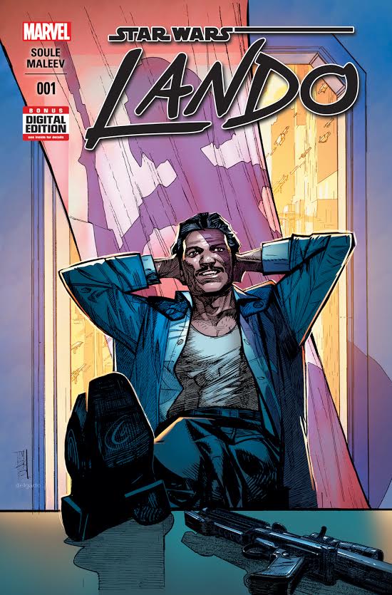 Lando #1
Marvel Comics/$3.99
Written by Charles Soule.
Art by Alex Maleev; colors by Paul Mounts.
MJ: Amidst Marvel’s fervent remapping of Star Wars’ non-movie canon, they’ve smartly kept it short and simple: a couple ongoings, a couple miniseries, each focused on one character. (Except, of course, for its flagship title.) It’s very heartening to see the most recent character in a featured miniseries to be none other than Lando Calrissian, incorrigible rogue, gambler, and the original series’ only prominent person of color.
Akin to Jason Aaron’s remarkable characterization in the Star Wars main series, writer Charles Soule has an uncanny handle on Lando’s voice. Amidst the ten other comics he currently writes (that’s actually not too much of an exaggeration), he’s done a seamless job of turning Lando into an Ocean’s 11-esque heist flick that happens to be set in the Star Wars universe. It has its femme fatale; it has its “one last score”; it has its seedy underworld crime bosses; it even has its requisite “getting the crew back together” trope. It hits all the right buttons in all the right ways, and it might have seemed cliché if it weren’t taking place amid starships and blaster guns instead of the Vegas Strip. Mr. Calrissian suits this story perfectly, and this story suits him.
Alex Maleev’s art is a beauty to behold – and his likeness of Billy Dee Williams is sharp without looking lightboxed – but many panels are full of faces that don’t elicit much emotion. Though the series certainly hasn’t reached its peak tension, further reaction from our protagonists needs to happen to create necessary suspense. Maleev’s original character designs are creative and well-conceived: the impish creatures flitting around crime boss Papa Toren are consummately creepy. Paul Mounts, though not one of Alex Maleev’s usual colorists, shines in this issue, moving flawlessly between scenes of sunshiney blue skies and the flatter, moodier dens of criminals.
A few more established characters than just Lando show up: the unexpectedly loquacious Lobot has a lot of time on-panel as Lando’s right hand man, and we learn more about his head implants as well as his brotherly relationship to Calrissian himself. Mainly, however, we encounter characters and settings not from the movies, and Soule gives himself a comfortable amount of room to spin his own yarn. With Lando in the lead – a character who has (or, well, had) much less non-movie canon history than the holy trinity of Leia-Luke-Han – we have a character ripe for rich development and expansion.
Marvel (or Disney… both?) has been very discriminate with the creative teams they allow to work on their Star Wars properties, and that care has paid off in a series of very consistent books, each with very distinct tones. Now with Lando, we have a title that retains a high quality while remaining wholly and completely within A Galaxy Far, Far Away. Marvel and Disney are treating this franchise with the loving attention it deserves: now if only they could think up some series’ titles that aren’t beholden to a lead character’s name…
8.5 out of 10
 Strange Fruit #1
Boom Studios/$3.99
Written by J.G. Jones and Mark Waid.
Art by J.G. Jones.
SS: So, I’m having a tough time parsing out which caveats in this book are the most important to point out, and which ones can be set aside for now. Strange Fruit #1 and the concepts surrounding it are dense, layered, and heavy, and the way that this book and its creation fit into modern society just adds more layers to the already thick, oniony mess we find ourselves picking through.
Expositional intro first: Strange Fruit is set in 1920s Mississippi, because if you had to pick the most racist place and time in American history, 1920s Mississippi would almost certainly be in the top 5. And this seems to be the goal: throughout the setup of this first issue (and there is a lot of setup without much clarity, but we can forgive most first issues for that), we’re introduced to mobs of white men expressing angry, violent intentions toward groups of black men and women. The violence escalates until Klan members raid a “benevolent” white senator’s plantation in search of a black man, Sonny, falsely accused of theft. (To be clear, this is an unskippable moment of problematic storytelling comparable to the elementary school glossover of “oh yeah, Thomas Jefferson had slaves too, but he was nice to them.”) They chase Sonny down with the intention of lynching him, until an enormous, naked, black male alien crashes to Earth and drives off the would-be killers. Sonny clothes the alien in a discarded Confederate flag, and the issue ends with both men posing triumphant.
It’s a pretty straightforward storyline, even with the whole bit about aliens, but very little character depth has been shown (I know, first issue, but with heavy topics come critical eyes). We could certainly dig through all of the issues at play, because authors Jones and Waid are absolutely trying to do something moving and profound here, and are laying the emotional affect on thick. But there isn’t much to say besides what’s been said.
As a white male writing about two white male authors writing about centuries of racism and black history in America, I feel like I am unqualified to say much here. A few things that I think are relatively straightforward are as follows:
– J.G.Jones and Mark Waid are also fairly unqualified to talk about racism in America.
– The first point is blatantly obvious in things like the aforementioned stereotype of the “benevolent slave owner.” Also appearing in Strange Fruit is the naked, aggressive black “savage” and a large group of black folks that don’t appear interested in hard work.
– The art is fucking beautiful. It’s painted and allows a quantity (and quality) of expression that I haven’t seen often, if ever, in comics. It’s also playful and inventive with its formatting.
– Jones and Waid seem to think racism is bad.
I don’t know what else to say. A lot of what is dubious or conflicting about this project can be summed up pretty well by a quote from John Metta: “The entire discussion of race in America centers around the protection of White feelings.” (The entire text can be found here, and is absolutely worth reading.)
Strange Fruit #1 seems to be setting up for a potentially interesting story about working through or overcoming or fighting against or maybe just dealing with racism in the early American South. As it is, it’s a mildly uncompelling, pretty problematic, maybe offensive look at the black experience in America, seen through the eyes of two white guys. There’s loads more to unpack about this book, and I hope the discussion continues.
5 out of 10
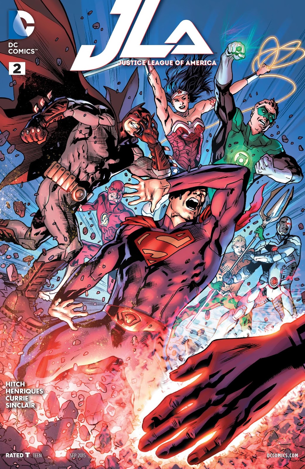 Justice League of America #2
Written by Bryan Hitch.
Art by Bryan Hitch, Daniel Henriques, and Andrew Currie; colors by Alex Sinclair.
JJ: When I wrote my review for Bryan Hitch’s premiere issue of Justice League of America, I made my peace with the book’s insistence that it ignore all the pressing matters of a post-Convergence DCU. Accepting it as a team book operating in whatever fringes remained from DC’s now-defunct New 52, I called it “a reasonably entertaining superhero book” and moved on with my life.
But something about the sheer ambition of Hitch’s work stuck with me, and for much longer than most superhero mashups tend to do these days. Why should a book that holds no bearing on the current state of — or the futures concerning — DC Comics’ pantheon of champions strike a chord when so many of these character’s solo adventures are entertaining us just fine without it? Can a book be both superfluous and essential at the same time?
The answer, of course, is yes. Back in the day DC told tremendous tales that bore no discernible significance in its wider universe that most folk remember fondly and talk excitedly about to this day. (Remember, if you can, to a time when Kingdom Come couldn’t be confused as canon.) Back then we called them “Elseworlds” (and a cup of coffee was only 75 cents). Justice League of America could be categorized as such a book, and almost certainly it would have, but one can’t shake the nagging presence of DC editorial guiding Hitch’s ambitions towards their own mandates and away from his own lofty ambition. Hell, that particular sentiment just might be the inspiration of this week’s cover: the hand of a god repels our altruistic heroes with a power that’s more effective than it should be.
Maybe that’s why the Justice League’s current issue at hand, the seemingly benevolent presence of the Kryptonian deity known as Rao, looks more suited for an SDCC display case than the stuff of dreams. There’s a tremendous disconnect between the Rao Hitch introduces us to in the book’s opening two pages (where the being is bathed in a terrible, all-encompassing red light, whose very touch makes Superman himself fall from the sky) and the Rao who makes his full splash-page debut (maybe Rao is choosing to emulate the heroes of Earth or Hitch is really into the Jim Lee House Style). Hitch’s ideas of deism in a contemporary world seem rather silly when the Big Questions are uttered by a walking action figure.
Big ideas seem to have a problem sticking in this book. Characterization is a difficult thing to grasp, especially when you’re dealing with seven of the world’s most powerful beings, but Hitch can’t quite get his ideas to to fit within the parameters set by these world famous personalities. So he does what any shrewd writer would do: he shifts the motivations and temperaments of certain characters to make his epic operate more smoothly. Because of this, the resulting actions have a troubling effect. (Notorious hothead Aquaman seems rather chill about letting Rao’s disciples spread the faith unchecked from within Atlantis. Maybe someone ought to show him some episodes to this last season of Game of Thrones, because… that ain’t gonna end well.)
Ben Affleck and Zack Snyder talk a big game in DC’s defense, calling the adventures of the League and its roster a “more mythic… more grand” display of superheroics than their competition’s offerings. (Affleck also said that the Justice League is “more realistic” in the same breath, but that’s something we can discuss at a later date.) If what they say is true, if the Justice League does indeed inspire thundering epics of legendary proportions, then the sheer ambition of Bryan Hitch’s Justice League of America is what they mean by it. This is what they mean when they say “mythic.” Now if only that felt true.
6 out of 10
 All Star Section Eight #2
DC Comics/$2.99
Written by Garth Ennis.
Art by John McCrea; colors by John Kalisz.
SS: So much of our favorite stories live in singular moments, iconic sequences where we come to better appreciate these stories as they unfold in fully realized and honest worlds. The drug dealer house in Boogie Nights. The motorcycle gang sequence in the first season of True Detective. The jailbreak in One Flew Over the Cuckoo’s Nest. The moments that let the fictional universe breathe a bit. The moments that can both be present in works of genius and amplify the works of genius concurrently.
The second issue of Garth Ennis’ love letter/circle jerk to DC Comics, All Star Section Eight, follows this hallowed path with 0% of the traditional solemnity and instead creates his own exemplary, epitomic scene. Through the book, we’ve followed the seven members of Section Eight on their journey to join the Green Lantern Corps and invoke the presence of Green Lantern himself, where he would subsequently fall into their ranks as the eighth member. After a very little (and hugely misguided) effort, the culmination takes place in a crappy tourist shop. While Section Eight’s cringe-inducing leader, Six Pack, (in a good way, I swear) attempts to return the Green Lantern t-shirts he’d purchased for the team (ignoring a strict ‘all sales final’ policy), a good ol’ fashioned street brawl begins to destroy the city streets just outside the tourist shop’s window. An enormous robo-dinosaur with a lightsaber tears through innocent civilians until go-to Green Lantern, Hal Jordan, shows up to fight back. The setup and ensuing battle take up nearly four pages and the juxtaposition between the two superheroes (one inside haggling return policy, one outside saving the world) makes for some really brilliant comedy.
This is all to say, I think Garth Ennis made a really funny joke.
Not that the rest of the issue was superfluous. There were plenty of good old fashioned DC references (a solid Kyle Rayner callback in there), a pretty delightful, if unnecessary, Dogwelder origin story to open up the issue, and a strangely sad and truthful depiction of the delusions that come with an episode of bombastic blackout drunkenness. And if I were to criticize this issue for anything (besides it’s immaturity, disgusting imagery, lack of real heroes, and fart humor, all of which I would never criticize), I think it’s the fact that the story is all very birdshot and scattered without a clarifying sense of continuity. Since so much of the insane is happening at once, nothing ends up happening, and if the series should continue on as this fun romp through comic history, something is going to have to happen.
But realistically, for now I can sit back and watch some heroes fight to save the world and some heroes drink to get drunk in tandem. Because in the disconnected moments of such a silly property, we can now look at a much larger, sillier world that lives and breathes in unison.
7.5 out of 10
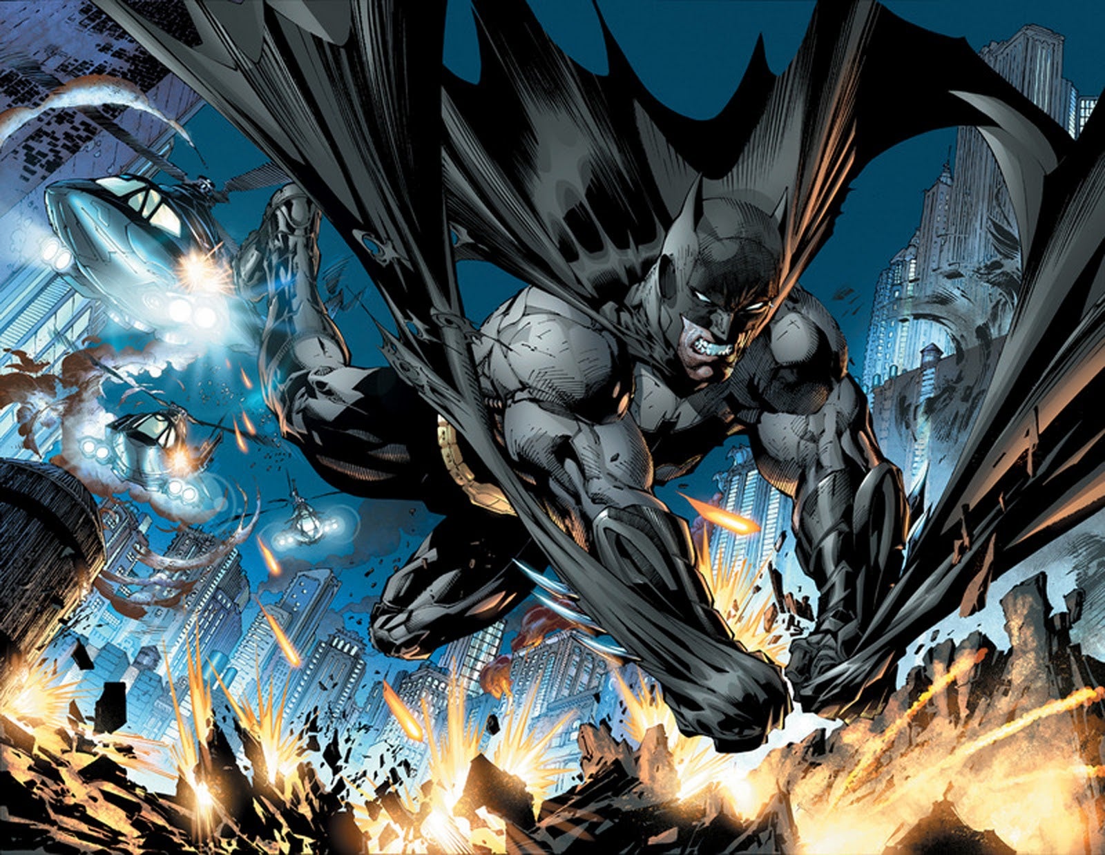
 Batman #42
DC Comics/$3.99
Written by Scott Snyder.
Art by Greg Capullo and Danny Miki; colors by FCO Plascencia.
JJ: *holds cover at arms length, turns it sideways* Y’know. I’m still trying to suss out what the hell Jim Gordon’s armored suit is supposed to be. Underneath that overgrown tin shell he’s still sporting the cowl, but let’s face facts: those pointy ears never really recalled an actual bat, at least not in any explicit way. Over the decades, the “ears” were systematically whittled down into severe, triangular points; the natural result of artist after artist streamlining Batman’s look over the course of time. What was once very bat-like became something else entirely.
So I try not to give Greg Capullo’s metallic, wingless moth (or is it a bunny?) too much hassle. After all, Gotham City will always need a Batman, and I’m just glad, at the very least, that he doesn’t look like this. And to pick apart the new armor is to stand right beside the point anyway; when a story not only overhauls the Batman’s look for the sake of something new, but provides a completely different purview of Gotham City than anything we’ve ever seen before, well… clothes don’t make the man.
When you think about it, there’s really nothing to fear at all. The bold new world offered by Scott Snyder and Greg Capullo isn’t a brand-new Gotham City. This is the exact same Gotham haunted by the Court of Owls, the same Gotham that bears the scars of Joker’s endgame. This is the world we’ve always known, and if you’re willing to accept it, you’ll find that Gotham is feeling different in a good way. It feels brighter. And even though we have all the reasons in the world to despair (the Batman is dead, after all), Gotham City feels more optimistic than ever.
Though somebody ought to tell Jim Gordon that, huh? After last month’s boffo premiere, Gordon’s first day on the Narrows beat has him disciplining himself in a manner he thinks the real Batman might find appropriate: he mutters about the heroic things he lacks as he hurls Batarangs at a target he’ll never hit — not with that attitude, anyway — fixating on how he doesn’t even have a Batmobile. (Though that particular problem gets sorted in due time.)
But, as somebody once said, it’s not who you are underneath; it’s what you do that defines you. Sounds trite, I know (where did I hear that from?), but Scott Snyder’s no fool. He’s not going to draft a gooey, “all I need is me” storyarc for Gordon (though there is a bit of that in there). Gotham City is still a veritable Hell on Earth, and the past decisions the man made as an officer for the GCPD are finally coming back to haunt him in a very profound way. (Commissioner Maggie Sawyer — which, yes! — tosses out the tantalizing line, “you have your very first super-villain, Jim.”)
Intriguing character depth, bombastic superheroics (doled out by the infinitely great Mr. Capullo), and not one, but two “– the hell?!” mysteries? This is truly the Batman book we need right now. Snyder & Capullo aren’t merely promising a new era for the Batman. With this bold new direction, they mean to thoroughly deliver.
9 out of 10
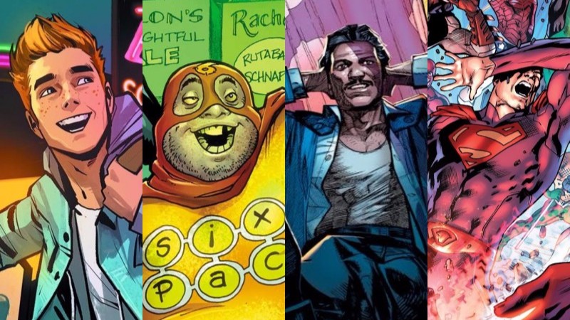
 Archie #1
Archie Comics/$3.99
Written by Mark Waid.
Art by Fiona Staples; colors by Andre Szymanowicz with Jen Vaughn
MJ: I wonder if the 2010s will be known, in the annals of comics-history, as the Relaunch Age. Since DC renumbered their entire line of books back in 2011, and since Marvel seems to have developed an allergy to any series with numbering higher than 40, Archie was one of the oldest uninterrupted books on the stands. Archie reached issue #666 last month before the numbering was brought back down to #1 for Mark Waid and Fiona Staples’ new reimagining of Riverdale’s iconic high schoolers, and it’s a book well-deserving of such a monumental launch.
Lately, companies have shied away from use of the various “R” words (y’know: reboot, relaunch, reimagining, retcon…) despite scads of new #1s. (The Big 2’s editorial comments continually vary between “It’s not a reboot” and “It’s a soft-reboot”.) But Archie #1 wants you to know it’s a brand-new reimagining so much, they printed it on the back of the comic itself. The instant recognizability of most of Archie Comics’ output can be both a blessing and a curse: as a brand, that kind of uniformity is great marketing, but it can also pigeonhole both content and readership. The huge success of the horror-reimagining Afterlife with Archie, featuring gorgeously pulpy (and very non-house-style) art by Francesco Francavilla and a supremely creepy story by Roberto Aguirre-Sacasa proved a large modern audience for Riverdale stories definitely exists, and that a new look and feel was only inevitable.
The creative team of Mark Waid and Fiona Staples was an inspired choice for Archie #1. While Fiona Staples on art – with her excellent facial expressions (indispensable for a high school-set comic), fashion (see previous), and storytelling in general – was a no-brainer, Mark Waid was a more intuitive choice. I wouldn’t have guessed the Daredevil and Flash scribe, more a master of adult-oriented drama, would be one to pen such compelling and realistic teen interaction.
Archie himself narrates the story, with first-person, breaking-the-fourth-wall word bubbles addressed directly to the reader. (It does, however, get a bit too meta when he tells us to tweet relationship advice at him, going so far as to give us Archie Comics’ Twitter handle in doing so.) We see various Riverdale mainstays (there’s Betty of course; Jughead is still inexplicably wearing that crown; recent cast-addition Kevin Keller has tons of panel-time; Reggie is still a total skeeze) in a very high school-centric tale involving lots of guitar-playing, heartache, and Homecoming dance ballot-stuffing. Waid and Staples have captured Archie’s classic, lingering timelessness, and evolved it into a refreshingly contemporary read.
My one gripe is that of all the main characters, Betty had the least amount of lines despite a lot of time on-panel. While I realize this book isn’t titled Betty, I hope future issues make her more human and less of an obscure object of desire. If it’s modernity this book is striving for, that area is the best possible place to start, especially with a certain brunette looming large in the background.
Visually, this book is miles away from the traditional Archie house-style, but in terms of content, it’s not too far from the high school hijinks (minus some of the slapstick) the publisher has been cranking out for decades. In Archie #1, the Riverdale crew has simply been refined and recalibrated, and made more realistic (and appealing) for modern teen readers. And as far as those “R” words go, these three are music to my ears.
8 out of 10
Agree? Disagree? You know what to do! Let us have it in the comments section below.


