
By Molly Jane Kremer and Jarrod Jones. Our Week In Review serves to fill in the gaps our frequently verbose comic book coverage leaves behind. Each week, we take a brief look into the books that demand attention.
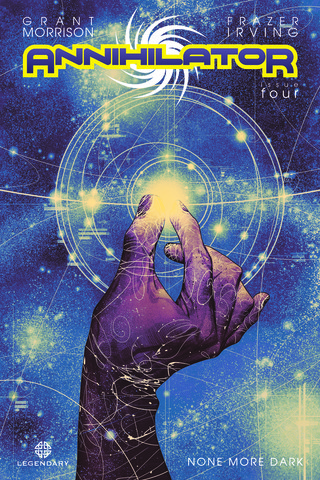 Annihilator #4
Legendary/$3.99
Written by Grant Morrison.
Art by Frazer Irving.
JJ: It doesn’t require much suspension of disbelief to understand that Ray Spass is an unbelievable asshole. For four issues we’ve come to understand almost every human frailty that blights Annihilator‘s main character, and even though Ray’s more, um, quirkier attributes should make the fellow quite repellent, the small miracle of Grant Morrison and Frazer Irving’s stupendous mini-series is that Ray’s plight still resonates. We’ve all made mistakes. We’re all fuck-ups, in our own way. Who are we to judge Ray Spass?
With Annihilator #4, that judgment falls square on the shoulders of Luna Kozma, an ex-girlfriend of Ray’s who just so happens to strike more than a passing resemblance to Max Nomax’s doomed lover, Olympia. Her very presence sheds more light on Ray’s past exploits, the utter decadence he entertained, and his brutal approach to basic human decency. Is it a mere coincidence that the woman Ray profoundly wronged years prior just happens to be the inspiration for the saga that will save all of existence? Is Ray the unrepentant shit-heel everyone (even Ray’s own creation, Nomax) believes him to be? Does any of this make sense? These are the questions Morrison raises in the issue, and all of them are pertinent. As it is with anything the Mad Scotsman commits to the four-colored world, everything counts in Annihilator.
Morrison’s manic energy is brilliantly conveyed through Frazer Irving’s engaging and absolutely gorgeous artwork. (Sequences where Nomax – from within Ray’s mind – attempts to create his own universe feature art that is simply some of the best this year has seen.) The contained color palate with which Irving employs gives Annihilator a visual distinction, causing the book to stand out among the more generic offerings from certain other companies I could mention here. One wonders how Annihilator will ultimately end, but with men like Grant Morrison and Frazer Irving at the helm one thing’s for certain – it’s certainly gonna be pretty.
8.5 out of 10
 Rumble #1
Image Comics/$2.99
Written by John Arcudi.
Art by James Harren; colors by Dave Stewart.
MJ: Rumble #1 is writer John Arcudi and artist James Harren’s first Image Comics outing, and is yet another stand-out first issue from the groundbreaking publisher. Much of their past work has been at Dark Horse, and while Arcudi boasts a decades long-resume working on high-profile funny books (two of his creations went on to become major motion pictures), this is one of relative-newcomer Harren’s first forays into the realm of comic book interiors. The result is a visual treat.
While the plot toes the lines of intelligibility, the comic has a haunting, intriguingly eerie quality that still envelops and drags you in whole, assisted greatly by James Harren’s incredible pencils. He has a natural knack for storytelling, a gorgeous inking technique, and he draws wonderfully expressive, uniquely exaggerated characters. The action sequences have great movement; they’re absolutely kinetic in every sense of the word. Harren excels at two things: architecture, and providing a very real sense of space. His character design is flawless as well: the two (assumed) demons we meet are grotesquely, creepily beautiful, with rows of enormous teeth jutting out of places where they really shouldn’t, featuring veiny, misshapen arms with almost intestine-like embellishments. The art featured in this book is art to get lost in, and very enjoyably so.
The comic mainly follows a bartender named Bobby who gets dragged into a mysterious (and seemingly magical) conflict after a hulking scarecrow-dude with an even bigger sword (and I do mean big – like anime-sword big) comes after a patron. It mostly takes place within the backdrop of a deliciously derelict urban landscape, and Dave Stewart’s colors imbue the unnamed city with a grimy, sooty darkness, while giving the fight scenes splashes of brightness for an added oomph. While the who’s and why’s aren’t exactly clear yet, we can excuse the aura of mystery surrounding this premiere issue. As the series continues with the promise of more of Harren and Stewart’s explosively great art, Rumble #1 certainly has this reader hooked.
8.5 out of 10
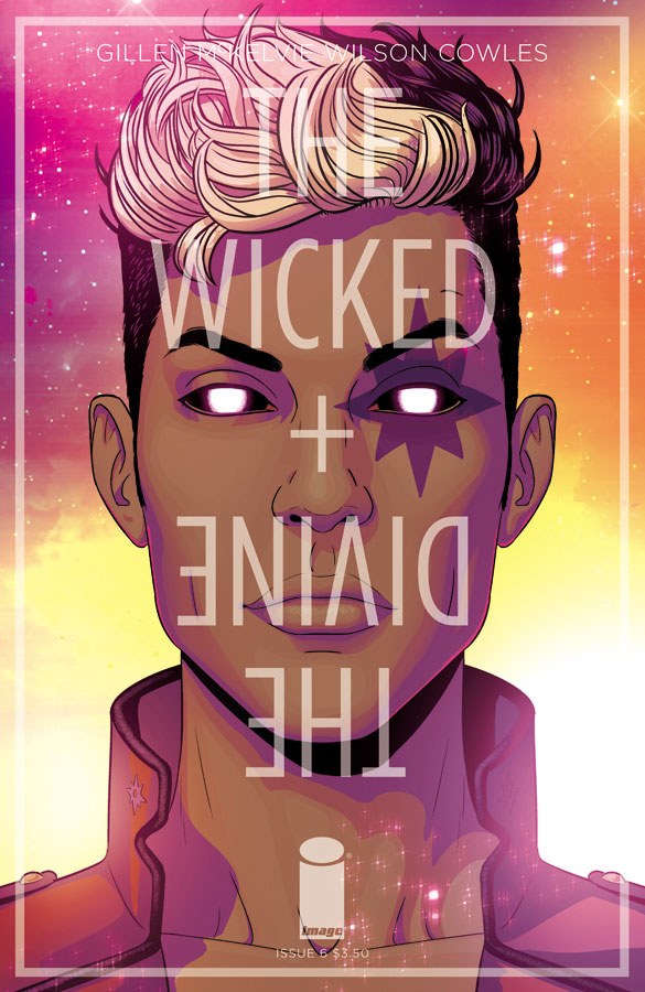 The Wicked + The Divine #6
Image Comics/$3.50
Written by Keiron Gillen.
Art by Jamie McKelvie; colors by Matthew Wilson.
JJ: It’s certainly no secret that the last few issues of Kieron Gillen and Jamie McKelvie’s The Wicked + The Divine have stuck in my craw something awful. (“… either there is still monumental space for this book to weave a deeper mystery with a tremendous payoff, or Gillen is making it all up as he’s going along,” was what I remember saying.) But it seems that with issue #6, quite a few of my gripes have been sated, with Gillen and McKelvie finally tightening their focus on our main protagonist, Laura, someone who had – up to this point – yet to be an individual that the reader could really connect with. (That still doesn’t change the fact that Luci is dead, and grumblegrumblefuck.)
That’s reassuring, and it helps me realize a fundamental truth about Kieron Gillen as a writer: even when it seems that he’s flying off the handle, always give the man the benefit of the doubt. The Wicked + The Divine #6 delves far deeper into Laura’s life than ever before, giving nuance to a character who had once only been defined through her obnoxiously en vogue hairstyles. (Though there is still some of that too.) Gillen’s newfound focus on Laura gives WicDiv strength, and that strength arrives right in the nick of time, because there’s a mystery to solve.
Jamie McKelvie’s art is… well. Jamie McKelvie’s art is fucking great, 100% of the time, and this issue proves no different. Armed with Matthew Wilson’s befuddlingly phosphorescent colors, McKelvie punches in to toss out some of comics’ strongest and most consistent artwork available. However this spectacle plays out I’m sticking around. Because The Wicked + The Divine is a book that checks itself when it becomes too unwieldy, and even when it does, it’s still a book that never, ever apologizes to anybody.
8 out of 10
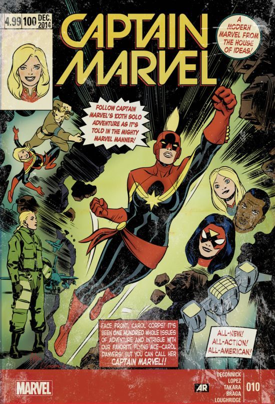 Captain Marvel #10
Marvel/$4.99
Written by Kelly Sue DeConnick.
Art by David Lopez, Marcio Takara & Laura Braga; colors by Lee Loughridge & Nick Filardi.
MJ: Captain Marvel has been consistently fun since writer Kelly Sue DeConnick rebooted Carol Danvers as Captain Marvel in 2012. The newest issue, while labeled as #10 in the current volume, is touted on the cover as “Captain Marvel’s 100th Solo Adventure”, and boasts thirty pages containing three interconnected stories told from three different characters’ points of view, and drawn by three different artists.
The stories unfold from letters sent to Captain Marvel – still on duty in deep space – from her loved ones still on earth.The first two stories (told from the perspectives of Carol’s adorable and adoring young friend Kit, and Carol’s bff Spider-Woman, respectively) are lighter and cuter fare, explaining the escape of Carol’s recently incarcerated nemesis Grace Valentine, made possible by an impressive influx of mind-controlled rats. Series regular artist David Lopez pencils the Kit entry, a story as fanciful and exuberant as you’d expect a tale told by an elementary-schooler to be. The Spider-Woman story, beautifully illustrated by Marcio Takara, has the added flourish of tiny rats scampering about in the panel gutters.
The final story, featuring great art by Laura Braga, focuses on Rhodey’s letter (and War Machine coupling up with Captain Marvel is yet another of Marvel’s more recent good ideas). Far more dramatic than the other two, the sequence has Rhodey foiling Valentine’s dastardly plans, while displaying Braga’s talents in a few lovely pages towards the end with an imagined-reunion of the couple, embracing against an astral backdrop. This issue is a good starting place for those with a sudden (movie-related) interest in learning about Carol before her big-screen debut, giving a basic introduction to everyone before they dive fully into the comic book. To say nothing of the fact that it’s just fun as hell.
8 out of 10
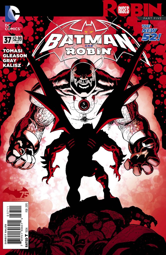 Batman and Robin #37
DC Comics/#2.99
Written by Peter J. Tomasi.
Art by Patrick Gleason and Mick Gray; colors by John Kalisz.
JJ: An Apokoliptian showdown between the lord Darkseid and the goddamned Batman would be reason enough to take a peek inside Batman and Robin #37, but we all know why we’re here. Someone’s coming home with Bruce Wayne, and it sure as hell ain’t Kalibak.
Robin Rises is coming to an end, and Batman’s nigh-suicidal endeavors are finally bearing fruit. After his balls-out assault on Apokolips in last month’s issue, the Dark Knight has finally arrived on the doorstep of the dark planet’s evil New God, Darkseid. Anyone who ever wondered “who wins in a fight between Batman and Darkseid” would do well to pay attention now, because that answer – as utterly ridiculous as it is – is about to be provided.
Thankfully, this titanic tussle has meaning behind it: Peter J. Tomasi has been sewing the seeds of this epic ever since Grant Morrison offed Damian Wayne way back in Batman, Incorporated #8, and Bruce Wayne’s dire motivations to reclaim the life of his fallen son have culminated in this fire-scorched confrontation.
However little those motivations are reflected in any of the other current Bat-books, Robin Rises still matters, and through the diligent work of Tomasi and artist Patrick Gleason, it’s damn fine entertainment, as well. The artist’s muscular pencils give strength to a story that is as blatantly absurd as anything going in comic books today. And because Tomasi and Gleason are old hat at sticking a solid landing, the second to last chapter of Rises even bothers to inject some real heart to all of this nonsense. And that makes the revolving door of death something worth walking through.
8 out of 10
 Miles Morales: The Ultimate Spider-Man #8
Marvel/$3.99
Written by Brian Michael Bendis.
Art by David Marquez; colors by Justin Ponsor.
MJ: It’s a little mind-boggling that Brian Michael Bendis has written over 200 issues of Ultimate Spider-Man (in its many, many volumes) and even despite two different characters having worn the webs, he still manages to keep the book fresh and relevant after all these years. It’s arguably due to his deep concentration on development of character, and this issue is a prime example of it. (Although the cover is a complete sham; we don’t see Miles in costume at all, and neither Hydra nor S.H.I.E.L.D. are mentioned once.) Despite this (because at this point, I’m genuinely surprised if a cover actually shows something that takes place within the comic), the comic is a helluva read, drawing on Bendis’ crime-thriller strengths.
After a long absence from his son, Miles’ dad Jefferson is back, having left when he found out Miles’ main (crime-fighting) after-school activity. The entire issue consists of Jefferson telling his son about his past, and takes place 25 years in the past: Miles’ dad and uncle Aaron (sporting an amazing John Oates-ian mullet/mustache combo) get involved in some shady business in late-80’s New York and New Jersey, and the creative team manages to make an extremely thrilling and compelling plot despite the fact that we only see our titular Spidey on the last page. A young and dashing Ultimate Nick Fury even makes an appearance, attempting to recruit young Jefferson into becoming a double-agent (it’s still unclear if it’s for S.H.I.E.L.D. or not) among the criminal underworld.
Artist David Marquez and colorist Justin Ponsor have great success in showing us the skuzziness of late-80’s New York City, emphasizing the darkness and muddy shadows (with a splash of neon) as they frequent nightclubs and all-night poker games. Marquez keeps the hair/fashion/cars all in the correct era, and Ponsor even adds some dotted zip-a-tone shading for that added retro feel. It’s also extremely enjoyable to see Marquez keeping Jefferson recognizable as himself in both his younger and older years, throwing in a nice resemblance to Miles too. Keeping a comic this reliably good after fourteen years is a rarity (to say the least) in this industry, and makes this comic one to depend on as a stellar addition to any pull list.
8.5 out of 10
Agree? Disagree? Which books would you like to see us review in the weeks to come? Let us know in the comments section below.


