By Brendan F. Hodgdon. Tone is a remarkable thing. It can make two stories with the same plots into massively different things (just ask Austin Powers: Goldmember and Spectre). Comics, in particular, are a medium that allows for really exciting approaches to tone. The nature of the medium allow for a greater flexibility than people might otherwise accept from film or TV.
But this flexibility doesn’t always present well at the Big Two, where everything has to somewhat fit together in a cohesive world. This is one (of several) areas where Image has the upper hand on its main competition. Because there is no overarching universe, creators can be as wild and uncompromising as they want, particularly in regards to tone. Even within their own books, there can often be a lot more freedom for creators to be as capricious as they like from page to page, as the series sets up its own expectations rather than building on decades of storytelling.
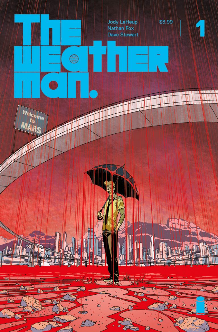
This is as apparent as ever in The Weatherman, the new sci-fi series from Jody LeHeup, Nathan Fox, Dave Stewart, Steve Wands, and Tom Muller. They juggle tone in a madcap way and in the process create a lively and unpredictable new series that should have no problem standing out in Image’s lineup.
$3.99/Image Comics
Written by Jody LeHeup.
Art by Nathan Fox.
Colors by Dave Stewart.
Letters by Steve Wands.
Design by Tom Muller.
Would You Like To Know More? The tonal agility of The Weatherman, combined with its colorful and stylized world and characters, very much reminds me of the cinematic work of Paul Verhoeven. Its very reality is heightened, yet the underlying foundation is much more bleak and bitter than its cartoon aesthetics would suggest. This speaks to the comfortable fusion that LeHeup and Fox have created, and how the art and script play off each other to capture the nuance of their world.
And what a world it is. The cartoonish, over-the-top design choices made by the art team (including Fox, colorist Dave Stewart, and designer Tom Muller) lend the book a ton of appeal right out of the gate. Their character designs are full of personality, and the overall shape of their world adds a distinct flair to classic concepts. The unique look of the series, in addition to taking the edge off the darkness of the story, also lends it a George Lucasian level of depth. Every panel feels like there’s a bunch of great, unexplored backstory behind it, which bodes very well for the series’ longterm storytelling prospects. I suspect the creative team will be able to mine this world for a lot of great story beats, and continue to look like a million bucks while doing it.

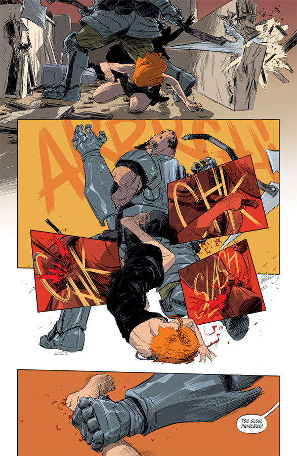
Interior page from ‘The Weatherman’ #1. Art by Nathan Fox, Dave Stewart, and Steve Wands/Image Comics
Who Am I? Perhaps the biggest obstacle to the series in this first issue is the primary meteorologist himself, Nathan Bright. It can be difficult to draw readers into a story when the main character can’t remember his own past, and even more difficult to set a character arc in motion. But of course, without the amnesia we wouldn’t have a story in this case. It’s a challenging Catch-22, but one that LeHeup’s script navigates well.
To some degree, LeHeup is able to put deeper character concerns for Nathan on the backburner, as there is so much to set up in this first issue in terms of the worldbuilding anyway. But even with that, he finds little details (like Nathan’s relationship with his dog, Sadie) to help humanize and ground the character, so his plight has greater impact. On top of that, LeHeup smartly uses his other characters to give Nathan’s life context and provide emotional stakes in the story beyond Nathan’s own. Overall, LeHeup is able to have his cake and eat it too; he keeps his protagonist a mystery while still involving us emotionally in his tale.
Watch Your Tone. The worldbuilding and the character details are blended together by Fox’s stylized aesthetic, and by the tone. And as I suggested earlier, the tone of The Weatherman can sometimes come across as wacky, making the darker beats all the more jarring. But at the same time, the heavier moments never feel out of place. Rather, they feel as shocking and painful as they might in real life. The tragedy that has befallen the world, and the violence that is visited upon Nathan, feel at odds with Nathan’s antics on TV. But ultimately, that’s life, and it’s something that this creative team has captured in distinct and imaginative genre fashion.
The careful balance of tone, style and character is essential to the telling of any good story. But in the case of The Weatherman, the tone is going to be the real make-or-break factor to this series. Can they maintain the tension between bleak and adventurous? Can they nail the emotion through a heightened, absurdist aesthetic? If the work in this first issue is any indication, the answer is most likely yes.
8 out of 10
Before: ‘Death or Glory’ a high-octane journey with larger, more philosophical things on its mind


