
By Molly Jane Kremer, Clyde Hall, Brendan F. Hodgdon and Jarrod Jones. Undercover is our opportunity to lovingly gaze upon gorgeous works from magnificent artists. From DC’s iconic Trinity portraiture to the pop phosphorescence of ‘West Coast Avengers’, here’s what we’re loving this week.

Action Comics #1002 by Patrick Gleason and Alejandro Sánchez. (DC)
CH: Citizens live and work in the shadows of their city, and even in comic book reality it tends to be the case. Most famously, Batman thrives in Gotham City’s gloomy, crime-ridden decay as he does a brisk business in justice. But how often is a vital, sprawling urban center eclipsed by one resident and made to live in his shadow? Metropolis may be the Big Apricot, but the impact Superman has on it is undeniable for both good and ill. It enjoys his protection, but also suffers ongoing attacks from his enemies and collateral damage from the battles that ensue. Even in real life, the situation is a mixed blessing. Metropolis, IL, the only settlement in the United States named ‘Metropolis’, has seen its share of both ennui and enrichment by being identified with its fictional native superhero. The benefits have, at least, outweighed the negatives in modern times.
The cover for Action Comics #1002 by Patrick Gleason and Alejandro Sánchez grants that two-edged sword unusually candid form, with Superman’s shadow composing his town. The familiar Daily Planet is centered jointly to compliment the hero like franks and beans, death and taxes. It’s a great composite of defender and Homefront, but the inkiness splayed across both leaves little doubt that either accepts their role unscathed. That, punctuated by Sanchez’s subtle color work, ingrains a refreshing moodiness not always present when depicting the shining City of Tomorrow. The leaning of the buildings, the irregular window placements, all hint at imperfection. Coupled with the watchful Man of Steel figure, the composition forms a symbiotic relationship that’s iconic, but not necessarily ideal. It’s jarringly appropriate, a combo of shiny, caped theatrics tempered by somber and darker ramification.

Wonder Woman #53 by Jenny Frison. (DC)
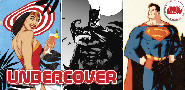
MJ: Amid the buzzing humidity of August, artist Jenny Frison has given us two breaths of fresh air. Her last two Wonder Woman variants have riffed on vintage travel posters that pop with vivid color, and this week’s variant for Wonder Woman #53 captures Diana as we rarely see her: on holiday, away from the stresses of superheroing, and gleefully partaking in sun and fun.
The bright, flat, highly saturated primary colors emanating from this cover immediately bring to mind the clear unfiltered sunlight of a steamy equatorial coastline, and are a departure from Frison’s frequent sepia-infused palette. While those tones do lend a grace and solemnity to previous covers, this cover’s vibrant blue sky contrasting with the red brilliance of Wonder Woman’s top makes for a radiant seaside vision.
To complete the vacation ensemble, a wide-brimmed floppy sun hat frames Diana’s beaming face as she clasps a fruity drink. The last time Frison drew Wonder Woman this joyous was her variant for #47, where she and Supergirl indulge in ice cream cones. I appreciate Frison’s apparent delight in ensuring Diana treats herself every once in a while—especially since every one of her variant covers is already such a treat for us.

Batman: Kings of Fear #1 by Bill Sienkiewicz. (DC)
JJ: Batman is 99 flavors of Dark Knight deliciousness. From Batman ’66 and Batman: TAS, to Mazzucchelli magnificence in Year One to whatever the hell it was Ben Affleck was trying to do just a couple years back, there’s no single version of him that holds supremacy over the other. Personally, my preferred sauce is whenever Bill Sienkiewicz takes a stab at the mighty masked manhunter. Batman: Kings of Fear #1 hits stores this week, and DC has seen fit to spoil our eyes with a digitally rendered variant from the master himself. Pardon my drool.
Perched atop a hideous gargoyle against an eldritch moon—otherwise known as “the Batman’s natural state”—our grim hero scans ahead for vile misdeeds to smash. Sienkiewicz leans into the character’s gothic origins, but keeps the Batman modern: His belt is a militarized statement of intent, packed to the brim with exploding pellets, gas capsules and razor-sharp batarangs, his chest emblem primed for a post-Rebirth Justice League roll call. But it’s his cape and cowl that makes my knees weak; it drapes our dauntless Dark Knight in otherworldly blackness. It makes this man more, a demon to be feared by wrong-doers everywhere, a living shadow. My Batman.

West Coast Avengers #1 by Lauren Tsai. (Marvel)
CH: The classic West Coast Avengers title once breathed fresh, uninhibited life into the primary team and their legendary status as Earth’s Mightiest Heroes. While just as ‘mighty’, the WCAs reflected their California-setting cool, had a more liquid roster, and owned a freewheeling style that endeared them to readers. Moon Knight, Living Lightning and Darkhawk might have had trouble becoming recruits for the main team, but they felt right at home in the West Coasters. And the group still managed to win the day as often as their staider counterparts back in the Avengers Tame East Show, including run-ins with the likes of Ultron. Can the new WCAs bring forward a new, unique flavor with their series?
The variant cover for #1 by insanely talented artist Lauren Tsai is a clever start in that direction. Her style embodies an offbeat tone fostered by this roster of heroes, assuring that today’s WCAs will be handling their duties in a fiercely different manner than either the Old School group in New York or their own West Coast predecessors. Dual-ing Hawkeyes Clint Barton and Kate Bishop, Kate’s boyfriend Johnny (codenamed Fuse), Gwenpool, Quentin Quire AKA Kid Omega, and Miss America/America Chavez reflect a wide range of powers and talents and backgrounds. Drama there may be, but this character mix should also be fun, and Tsai emphasizes that aspect with double-dip cones and Razor scooters. It’s all given a fittingly light-n-bright color palette and gathered beneath a distinctive logo like a birthday present sporting a festive day-glo bow. If the book matches the wrapper, casual comic shoppers will feel the waves of chic emanating as they reach for their weekly pulls.

Hit-Girl #7 by Skottie Young. (Image Comics)
BFH: Given the violent absurdity of the Hit-Girl concept and the tone and style of Skottie Young’s creator-owned material, it’s frankly shocking that he hasn’t helmed the current Hit-Girl series outright. While we might have to wait a bit longer for that development, in the meantime we have this whimsically gory cover to satiate us.
Young pays homage to Jeff Lemire and Eduardo Risso’s tale of the Great White North in vibrant style, showing Hit-Girl standing astride a blood-and-snow recreation of the Canadian flag. It encapsulates the friction between the offend-all-comers violence at the heart of Mark Millar’s creation and the calm, likable energy of our northern neighbor. In the middle of it is Hit-Girl herself, with an ever-steely demeanor and her complement of oversized weapons. It’s a stark summation of this crazy fable, from one of the great artists in the industry.

The Punisher #1 by Greg Smallwood. (Marvel)
JJ: The armor may be gone but Frank Castle is still a war machine. Mafiosos and street punks have long feared the Punisher and the Marvel Universe’s more notorious ne’er-do-wells have only just begun to feel their pain; Frank Castle has a taste for richer blood now, and he’s decided that in order to break the back of evil he has to start from the top down. He doesn’t have the Stark-tech to back him up against the likes of Baron Zemo but look him in the eye right now and tell him he needs it. Go ahead. Make his day.
Greg Smallwood does atmosphere like no other. This subway has just seen a fight, oh brother has it seen a fight: Blood spatters the tile and black gunpower chokes the close air. There are only two people left in this fight and Smallwood makes sure we know intimately who gets to win. We’re a criminal now, a violent, angry thing who made a move against the fucking Punisher and now we live between seconds. Time has slowed. We find ourselves staring directly into the smoking barrel of Castle’s gun and suddenly we find religion. Our eyes dart to the “Manhattan & The Bronx” sign with an arrow pointing to a far away place we would rather be. But Frank’s Lundgren-esque grimace and the blood of our friends on his hideous skull t-shirt say it’s not to be. Nothing will ever be, not for us, not anymo—
Don’t forget to share your favorite covers from this week in the comments section below. Best response wins a pack of DoomRocket stickers!


