

By Clyde Hall, Brendan F. Hodgdon, Rachel Acheampong and Jarrod Jones. Undercover is our opportunity to lovingly gaze upon gorgeous works from magnificent artists. From Jen Bartel’s neon-lit ‘Blackbird’ cover to Cara McGee’s sublime variant for ‘Euthanauts’ #3, here’s what we’re loving this week.
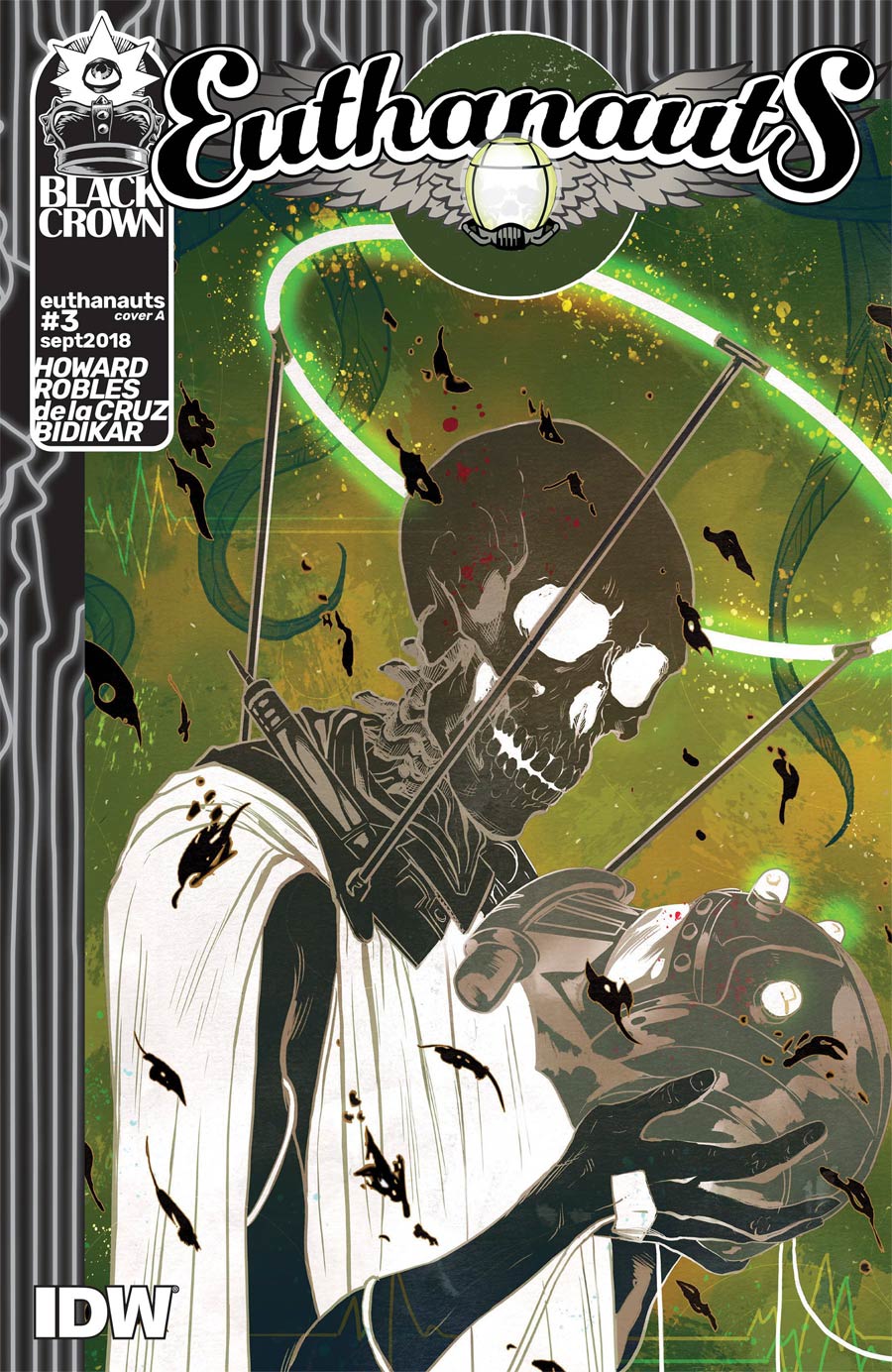
Euthanauts #3 by Nick Robles. (Black Crown/IDW Publishing)
CH: Writer Tini Howard has taken on a task few comic pros have dared with Euthanauts, the third issue in the series coming out this week. She’s chronicling an adventure that, unlike fighting supervillains or overthrowing an evil Star Empire, all her readers will undertake: Death. And she credits artist Nick Robles with co-creating the journey. In part, his covers have merged the themes of exploring a fatal, final frontier alongside the grisly human concepts which linger when considering the physical destination of a grave. It makes for macabre imagery, but imagery that embraces those trappings transcended, just one part of the trip. It comes naturally to him; his rendering of Linus and Charlie Brown taking down an evil Great Pumpkin is a worthy audition for taking part in voyages of the Styx ferry Demise.
While his skeletal subject could be a Horseman in search of an apocalypse, the trappings for his cover art on issue #3 are anchored in technology. The skeleton’s glowing halo is less religious iconography and more a bulwark holding the deceased’s link to a yet-living mortal. The figure retains chemical drip lines. And if one inverts the color scheme, that figure becomes a more traditional skeleton found in college classrooms, draped with raven shroud, and gripping what resembles a modified Imperial helmet. The blend works effectively in its transposed cover state to both earn a place among the many October issues with spooky themes, and display how distinctly different this series is from any of those.

Blackbird #1 by Jen Bartel. (Image Comics)
RA: If you are not familiar with the artwork of Jen Bartel yet, where have you been? Think of it as eye candy without overindulgence. Bartel is most notable for her cover work for nearly every leading publisher in comics, but for Blackbird she takes on full interiors in a new creator-owned series with writer Sam Humphries and an all-star creative team. Jen’s cover for this premiere issue further validates why her artistic style is amongst the most in-demand and only continues to get better.
Alone on the cover is a young woman who appears to be out of her teens but not quite into adulthood. She glares over her right shoulder with a look that instantly informs you that she constantly endeavors to balance the known and the unknown in her still-young life. The purple shadow coming in over the hot pink hue of her back and face allude to the possibility that an abundance of this story will reveal itself in the neon-lit storefronts and streetlights of the night. Looking at this cover is almost parallel to watching neo-noir films set in Los Angeles. Will this modern fantasy be told from a side of the City of Angels not often seen?
What I like the most, besides her use of color, is how Jen illustrates eyes. Her eyes convey the contradiction of those in-between years; she’s no longer naïve but still treasures a few sentiments of youth. That over-the-shoulder look is an eclectic assortment of emotions, thoughts, intentions, earrings. As we become more familiar with Blackbird, Jen Bartel will continue to distinguish her ability for instilling color and attitude, both of which hold the aesthetics of these books we love to read aloft.

Border Town #2 by Ramon Villalobos and Tamra Bonvillain (DC Vertigo)
BFH: It only feels like yesterday that Eric Esquivel and Ramon Villalobos debuted Border Town and left a smoking crater of awesome in the middle of comicsdom, yet here we are with the release of issue #2. In case the contents of the first issue were not enough to sell you on this great new series, Villalobos and colorist Tamra Bonvillain are here with this sweet cover to make sure you keep reading.
Here Villalobos blends the traditional and the modern, mixing lucha libre mask and fanny pack and indigenous headdress in a vibrant evocation of the culture clash that plays such a crucial role in the story. Plus, y’know, the chupracabra in the foreground. Bonvillain brings great eye-catching color to the whole composition, the purple markings against the green skin of the monster against the earthy browns of the clothes surrounded by the deep red of the cape. As we saw in issue #1, Villalobos and Bonvillain complement each other very well. This cover confirms they are an art team to watch.

What If… ? X-Men #1 by Rahzzah. (Marvel Comics)
CH: You can usually look at comic cover art and come to an understanding of how it was accomplished. Brush strokes, collage pieces, photos versus lifelike rendering, watercolor bleeds, splattering. But the work of artist Rahzzah on this week’s What If… ? X-Men #1 is the kind of composition that defies any attempt at grasping ‘how’ and simply is.
Many of the artist’s past covers have sublimely combined fantasy and fantastic science with figures done in hyper-realistic fashion to set a specific tone or mood. (Rahzzah’s Punisher Annual #1 (2016) is still one of my favorite modern Halloween-themed covers for this reason.) Here, the realism of Domino (check out the gloss from her nails, that crooked smile) and Cable (all age lines, battle scars, and distressed tech) contrasts with the cyberscape background. Even as the network codes through binary processes and splashes of color, those functions become dream images dredged from electric sleep. With the perilous Matrix reality proposed for this book’s EXE/men, the blending is ideal.

Euthanauts #3 by Cara McGee. (Black Crown/IDW Publishing)
JJ: In Black Crown’s Euthanauts the afterlife is real. The Great Beyond lies just out of our reach, but it is absolutely there. Waiting for all, beckoning to some. That sounds scary, I know. Cara McGee knows, too. So for the third issue variant of this utterly spectacular series, Cara chose to acquaint us with the divine.
There’s Indigo Hanover. Call him Indi. Framed by chrysanthemums, tulips, and a mop of gorgeous red hair, Indi embraces the mortal fears that plague every thought we ever had of death: isolation, finality, pain. All of it given form and stripped down to the metaphor-evaporating bone. And Indi gives it a hug. He’s tender to it, kind.
McGee’s character work slays me. Indi’s eyes flash with life, beguile us. They’re designed to be intriguing, but it works. His pouty lips curl upwards into a smile, as though a joke was coming. A joke about being afraid without being mean about it. Just as the curtain draws on this mortal coil, Indi wants to lighten the mood. Eternity beckons. Time to party.
Don’t forget to share your favorite covers from this week in the comments section below. Best response wins a pack of DoomRocket stickers!


