

by Arpad Okay, Clyde Hall, Mickey Rivera and Jarrod Jones. Undercover is our opportunity to lovingly gaze upon gorgeous works from magnificent artists. From Becca Carey’s Bosch-esque ‘Buffy’ variant to Alex Garner’s ‘Teen Titans’ cover, here’s what we’re loving this week.

Buffy the Vampire Slayer #1 by Becca Carey. (BOOM! Studios)
CH: Becca Carey’s art always stands apart. Outside the box. Outside the factory gates where boxes are made. Her addition to the variant covers for Buffy the Vampire Slayer #1 is no exception, but it is exceptional. When considering Buffy’s high school years, the temptation would be to populate a cover with The Slayer and her entourage. Or a Slayer’s Rogues Gallery. Or both, in conflict fit to be pitched.
In their promotions for the series, BOOM! Studios has used the tagline “High school truly is Hell.” Carey crafts that very sentiment into a composition showing how it’s not merely student body rhetoric for Buffy and her classmates. It’s literal.
Sunnydale High’s sparkling and radiant halls beckon, framed in the lazy sway of palm trees, promising the finest California educational opportunities. Just below the greeting card image lies the Hellmouth, a gateway where barriers between the mortal world and the infernal are weak. Carey’s gone an appropriately Renaissance route depicting the nether realm. The ‘Hellmouth’ device had a latter heyday then, envisioned as a gaping, monstrous maw devouring the unfaithful. Or those on the opposing side of an earthly conflict.
Carey’s channeled Reginald Mount topside, and Hieronymus Bosch below to create a perfect representation of the Hellmouth concept as it exists in the Buffyverse. She illustrates the dark forces without relying on deep shadow, too. Some beings drawn to the Hellmouth’s power and aiming to misbehave became valuable allies, so black and white are minimal here. Now I just want Becca Carey to do a companion piece of the Cleveland Hellmouth.
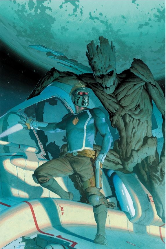
Guardians of the Galaxy #1 by Esad Ribić. (Marvel)
MR: There’s nothing like a good old throwback to the classic sci-fi art of decades past. Esad Ribić is a master of the heroic mode, specifically its most important aspect: The badass pose.
For Guardians of the Galaxy #1, Star-Lord is hamming it up. You can smell the smug wafting off of him as he puffs his chest out and gazes into the distance. In any other context Groot’s cold stare out at the audience would be read as intimidating. Here though, I feel like he’s knowingly looking out at us as if to say “Take a look at this asshole.” It’s like a staged shot, as though Star-Lord, the famous space bandit, commissioned Ribić to capture his glory for all time.

Teen Titans #26 by Alex Garner. (DC)
JJ: Time to tip our hats to the stewards of Teen Titans and The Flash for making sure that the continued existence of the two men named Wally West never got too confusing. (It’s looking like this novelty is coming to an unceremonious end in Heroes in Crisis, but we needn’t worry ourselves about that right now.) The Flash Family will always have room for the many big-hearted speedsters that come zipping their way. They’re not about to let a pesky think like continuity get in the way of making a hero feel at home.
So meet Wally West. Kid Flash. Again. For the first time. It’s complicated. But it’s also awesome.
And those gorgeous artist variants DC puts out every month? A perfect showcase for the talents of Alex Garner, who has diligently provided poster-ready portraits of each member of the current Teen Titans, who is now providing us what might be the greatest still image of the Fastest Kid Alive.
This cover is all movement and moxie. Wally zooms along, driven by unnatural powers and the need to do good in the world. But he’s still a kid. And let’s pretend for a moment that young Wally was moving so fast that the membrane between our reality and his was weakened just enough that—if only for a split-second—Wally caught us gazing in wonder through the comics cover. What would a Teen Titan do in this instance? A wink. A finger-gun. And he’s gone.
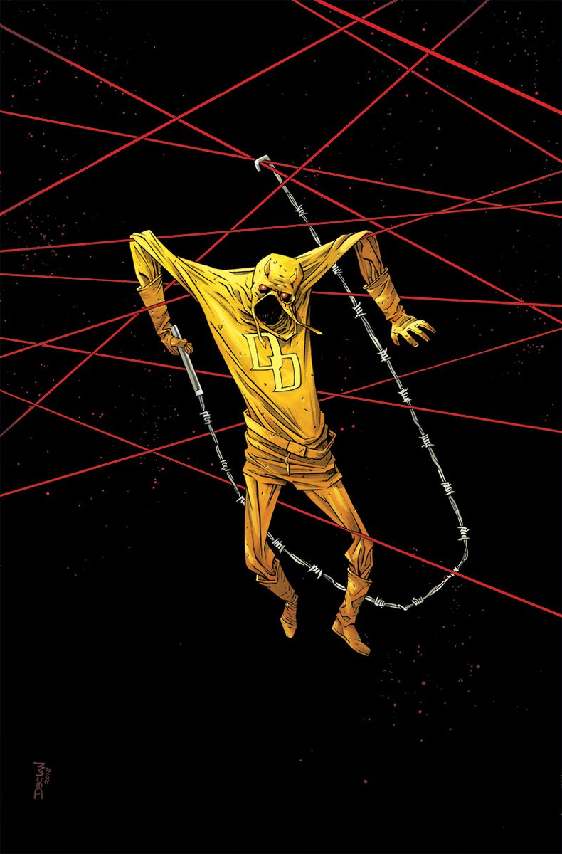
The Man Without Fear #4 by Declan Shalvey. (Marvel)
AOK: An empty suit doesn’t hang together like that. This is the skin of a flayed man, a flag flown by evil to declare that Hell’s Kitchen has been conquered. Declan Shalvey has tapped into ancient imagery to haunt us. Behold the yellow ghost.
Be held by bloody eyes. The horned hood robbed of man becomes a gaping maw. Matt Murdock’s superior ochre epidermis is strung up in a spider’s web of red cables, a nefarious cat’s cradle, and there is only one road through. The starless mouth of the Devil. The silent scream of absence. In the dead center of this horror, there is a hole.
Demon skin caught in a net. Maybe it’s the simplicity, maybe it’s the sinister atmosphere, but I’m feeling a touch of Frank Miller, a hint of Soft Self Portrait with Fried Bacon by Salvador Dalí as featured on the cover of Sleep’s debut record.

Friendly Neighborhood Spider-Man #2 by Bryan Hitch and David Curiel. (Marvel)
JJ: Thwip, thwip, thwip. I love how Bryan Hitch approaches the daunting complication that is the human anatomy and says “let’s do better.” We humans can train to be as limber and flexible as we want, but when you slap us in tights and ask for a superhero pose, we can look pretty damn goofy. So Hitch elongates limbs, torsos, fingers, whatever, to maximize his superhero majesty.
To wit, this beaut of a cover. Spider-Man can bend, contort, twist in just about any way you can dream up and has done as such for almost sixty years. From Ditko to Pichelli, from Bagley to McFarlane, Spidey’s run the posing gauntlet. Hitch likely had that in mind when he rendered this vertigo-inspiring variant to Friendly Neighborhood Spider-Man #2. So what does he do. He takes a clean, simple approach to a storied pose—Spider-Man in mid-swing, pre-thwip—and somehow induces the rolling wave of euphoria that comes with things like the first dip of a roller coaster, or a plane just leaving earth. His Spidey rolls with gravity while simultaneously defying it, rotating in mid-air in a way that makes my head tilt involuntarily just to take it all in.
Then there are the colors. David Curiel’s gone and matched the optimism found in Friendly Neighborhood Spider-Man with a splash of blue brilliance. I don’t quite know where the sun is supposed to be in reference to the horizon, or the color of the sky, but it glints off of Spidey’s red pajamas in the form of molten steel anyway. It’s a glorious cover brimming with the energy of a warm spring day. The New York City skies are filled with superheroes, but there are few who compliment that level of sheer effervescence than our friendly… well, you know.
Don’t forget to share your favorite covers from this week in the comments section below.


