
by Arpad Okay, Clyde Hall, Brendan Hodgdon, and Jarrod Jones. Undercover is our opportunity to lovingly gaze upon gorgeous works from magnificent artists. From Michael Lark’s ‘Lazarus: Risen’ to Aaron Campbell’s ‘Dark Red’, here’s what we’re loving this week.

Lazarus: Risen #1 by Michael Lark. (Image Comics)
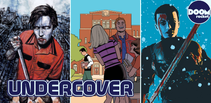
AOK: A bloody sword hangs above me, but I can’t see it for the texture of snow. The cover of Lazarus: Risen’s debut is a symphony in splatter. The snow coming down is that broad, thin flake that floats down like blossoms of frost. Also blooming is a wound, perhaps the viewer’s, for the counterpoint to the chaos of frozen precipitation polka dot sky is the veins of gore that seem to traverse every lit inch of figure.
The lighting here is equally magic. One side the night blue of sky, the other burning bright directional light from fire we can’t see. The center is a bar of black. A pocket at the corner of lips, half a face lost, impenetrable umbra swallows all but the edge of sclera. The image as a whole, bold, projects menace large and clear. But the tiny details make it. This is next level Lark.

Spider-Man: Life Story #1 by Greg Smallwood. (Marvel)
JJ: Few can spin a web quite like Chip Zdarsky and his latest Spidey saga Life Story is a whopper. “What if… Peter Parker aged in real time?” I presume that question includes the entire universe around him, too—aging and changing and living and losing, from the Swingin’ Sixties to the Nebulous Nineties and beyond. We can fathom the type of life Peter has in a perpetually youthful state, but a Spider-Man with all the ennui middle-age can dish?
For the introductory issue to this macro-drama, Greg Smallwood takes us all the way back to the days when Parker’s old life ended and his new one began. He strips away detail, heightens the contrast, produces a confection of eye-pooping color and deliberate lines. It’s a memory, and not an especially pleasant one; Peter has a good sulk with his Physics text, his eyes pointed at the freshly-clipped campus lawn. Flash Thompson, B.M.O.C, enjoys all kinds of shade (a bit of symbolic sophistication on Smallwood’s part, I might add) as our dear, departed Gwen Stacy looks past the jock and towards the brilliant wallflower engaged in the Lonely Man Shuffle.
Smallwood’s Marvel work has been exemplary but this Life Story snapshot is something extra special. It’s hard not to recognize the influences at play here—Steve Ditko, obviously, but there’s more than a bit of Jaime Hernandez and Charles Schulz, too—and see how they affect Smallwood’s craft, especially in light of the subject matter. Looking at this cover, we already know who Peter Parker is. Through Smallwood’s work, we have a bigger picture of how incredibly isolated he used to be, and how much he must isolate himself still from those who might one day love him.

Justice League #20 by Jorge Jiménez & Alejandro Sánchez. (DC)
BH: Over the last few years Jorge Jiménez has emerged as one of my favorite superhero artists. His ability to combine sleek, enticing character designs with kineticism and personality mark him as an illustrator with the potential to stand as one of the all-time greats. He is often aided in this by colorist Alejandro Sánchez, who consistently brings bright, vivid hues to their work to great effect. It’s no small pleasure to see them as one of the regular art teams on the Scott Snyder-penned flagship Justice League title. In the story arc just getting underway, it seems that Jiménez & Sánchez and Snyder have cooked up a plot capable of showing the artists’ abilities in full, and that mission statement is emphatically echoed in this stunning triptych cover design.
This gorgeous tableau (technically spread over three variant covers to this week’s JL) sees the current League lineup facing off against their dramatic alternate-reality selves. Jiménez, no stranger to Elseworlds riffs on classic characters thanks to his tenure on the Earth-2 titles, provides some fantastic new renditions of Superman, Batman, Wonder Woman et al., and those looks alone are worth the price of admission.
But seeing these characters in such dramatic motion, clashing with their traditional counterparts, highlights Jiménez’s ability to pack still imagery with energy and momentum. Sánchez gives both sides life with classic, bold color, instantly recognizable and eye-catching in every detail. And in the middle of it all is the classic villain Mr. Myxlplyx in all his impish glory, the chaotic focal point of this reality-shaking confrontation, standing out even with his diminutive stature thanks to Jiménez & Sánchez’s impactful work. It’s all bold, poster-worthy stuff. It should serve as Jiménez’s calling card for some time to come.

Dark Red #1 by Aaron Campbell. (Marvel)
JJ: Aaron Campbell’s cover to AfterShock’s latest bloody brou-ha-ha is giving me the Bisley feels. McKean, too. The kind of high-minded composition that expertly draws you in only to then rub your eyes in copper-blood anarchy. It’s the menial workaday blues given far more gothic sophistication than it probably should ever have, with Campbell doing his bit to make sure we get the bigger picture behind Dark Red.
For what promises to be a rowdy vampire tale set in the deep rural areas of the contemporary U.S., Campbell wisely plays it cool on the front. Our subject toils in slate-gray drudgery amid swaths of crimson MAGA caps and jet-black letters, which scream regurgitated political slogans pilfered from those half-coherent sound bites from the teevee. Behind him, an eternity of processed beef and cheese, candies and fruit drinks perfumed with the sweet promise of diabetes, the siren lies of the lottery, forever and ever. This could be the story of him. Damnation and donuts. Until the sun burns out.
Now look at his eyes. The monotony of mopping up yet another spill (at least it’s not barf, this time) reads clearly between the lines under them, but there’s more. There’s no life there, and it ain’t the daily 9(pm) to 5(am) toil at the local Fuck-Mart that stole the joie de vivre from him, neither. Now look at those lips. Did he spill all that blood or is he simply doing his duty for what has to be his cruel rat-bastard masters? *shudder* Cleanup in aisle 666.

Army of Darkness/Bubba Ho-Tep #2 by Robert Hack. (Dynamite/IDW Publishing)
CH: Robert Hack is gifted at creating covers from the sins of our misspent youth. Old comics ads. Tawdry romance novels. Lurid horror movie posters. The cardboard video tape sleeves of treasured childhood rentals. Given the cinematic grounding of Army of Darkness/Bubba Ho-Tep, the latter is a well-founded choice and Hack revels in the abundant detailing for his issue #2 variant.
From a perfectly presented tagline, to the cinematic Dynamite logo, to the “Be Kind, Please Rewind” sticker, Hack’s celebration of selections that once graced shelves of Hollywood and Blockbuster Video stores is complete. The authentic, shelf-worn framing of our heroes while Bubba Ho-Tep’s visage looms menacingly behind the pair of Kings radiates glorious, B-movie cheesiness. The duo’s depicted in the washed-out manner of dollar bin fare. Brandishing chainsaw prosthetic and Shotokan-poised walker, Ash and Elvis are prepared to package that life-sucking deadite, Ho-Tep, for a C.O.D. return to sender.
Don’t forget to share your favorite covers from this week in the comments section below!


