
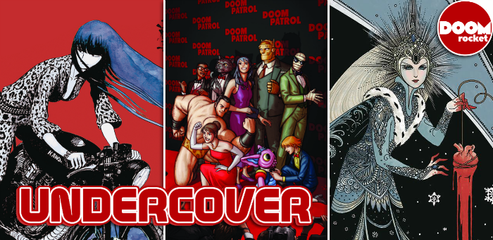
by Clyde Hall, Lauren Fernandes and Jarrod Jones. Undercover is our opportunity to lovingly gaze upon gorgeous works from magnificent artists. From Nick Derington’s red carpet roll-out for ‘Doom Patrol’ to Eido Yoshimizu’s remaster of ‘Ryuko, Vol. 1’, here are the covers we love the most this week.
Doom Patrol: Weight of the Worlds #2 by Nick Derington. (DC’s Young Animal/DC)
JJ: Trip the light fantastic with the stars of Doom Patrol. What we’re looking at here is a cheeky bit of business courtesy of Nick Derington, an enthusiastic, winking thing that pays lip service to the critical adulation its streaming tie-in has soaked up over the past months. It greets you, air-kisses both your cheeks, calls you “dah-ling” and continues its saunter down the crimson carpet, leaving you dizzy.
It’s all champagne effervescence and gee-whiz glamour. Derington is an ace at characterization and his cover to Weight of Worlds #2 is the summit of his powers: Pride, sass, kindness, innocence, it’s all there, a glorious example of the wonderful peculiarity that is DC’s Young Animal imprint, not to mention Derington as a draftsman.
The composition is perfection, nine characters soaking up the limelight with plenty of space to be themselves, to smile, to preen, to flex, to shine. Somehow, it isn’t busy, isn’t messy. How this is so, you got me. As far as DC iconography goes, Nick Derington just nailed it with this cover, capturing the zeitgeist of Doom Patrol‘s current comics moment while simultaneously rocketing its characters beyond the stratosphere like the stars they are.

Snow, Glass, Apples by Colleen Doran. (Dark Horse Comics)
LF: Colleen Doran has shuffled the deck. She has drawn a card and placed it before me.
At once, I am pulled into the center of the card. The Queen stands there, at the center of a vortex created by the curving patterns in her robes and gown and the arching design across the top right corner. And the red. The blood, oozing from the heart, staining the hem of the Queen’s gown and drawing my eye back up to her face.
The Queen’s face is cold. Resigned. A sunbeam crown atop the head of this monarch does nothing to brighten or warm the image. I know, as I stare down at the Tarot card before me, that this will not be a happy story. There will be no singing woodland creatures, no lovable dwarves full of merriment dancing in the trees with a benevolent princess. There will be no happy ending. Cards adorned in such frigid hues of blue, black, and blood don’t foretell endings where a happy couple rides into the sunset.
There will be horror in these pages. A story Neil Gaiman once retold. And now Colleen Doran has gathered it, reimagined it, and delivered it. Page by page, card by card.
Until we forget what “happily ever after” ever really meant.

Charlie’s Angles Vs. The Bionic Woman #2 by Jim Mahfood. (Dynamite)
CH: Many covers for this title would bring a gleam to the eyes of both John Bosley and Oscar Goldman, seeing their associates rendered in glorious, almost photographic, splendor. The Jim Mahfood variant to Charlie’s Angles vs. The Bionic Woman #2, however, captures in line quality and tone a 1970s mood that communes connectivity across the years.
The uneven chassis of a behemoth luxury sedan and the equally irregular representations of our heroines with their frames of voluminous tresses are vital, relevant criterion of the era. Mahfood’s style has been revised into a familiar form for children of the Me Decade. His work here resembles the art and design of Tom Yohe, Bob Eggers, Jack Sidebotham, and Rowland B. Wilson in their renderings for the Schoolhouse Rock! animation sequences. It fits.
While you can never judge solely by a cover, with people or comics, you must also puzzle over the bionic depiction Mahfood’s chosen for Jaime Sommers. It’s very cyber-enhanced, even for a person who’s part machine. Will the narrative include Fembots? Cyborgs at least have human foibles, frailties, and empathy. But Fembots? They’re one Teflon pump away from Cylons and Terminators. The OSI and Charles Townsend Detective Agency may both be putting in overtime (plus expenses) if Dr. Franklin’s mechanized androids play into the mix.

Ryuko, Vol. 1 by Eldo Yoshimizu. (Titan Comics)
JJ: “Ryuko is a maniac work.” Eldo Yoshimizu said it, and one glance at the remastered cover to Ryuko, Vol. 1, I believe it. It’s a cover that belongs in an art gallery, somewhere where beautiful people quietly observe beautiful things. It’s probably spent some time existing in such a place. This screams danger. Fluid, exciting, beyond making sense, it’s that good.
In Ryuko, danger is everything. It’s double-fisted grenade launchers and chaotic blurs across the face and upper torso. It’s James Bond intrigue, the international, cosmopolitan kind, where mink stoles only scarcely obscure the knives underneath, where vengeance holds dominion over all. Ryuko is helicopters and lingerie and furious anger and this cover, staggering as it is—is only the eye of the hurricane.
Yoshimizu lets watercolor flow over a sea of blood. It makes our eyes swim, all gentle-like, even though the red is blasting trumpets into our corneas. The bike skids on invisible pavement, those leather stiletto boots kick up unseen gravel, she’s all leopard print and determination and exquisite lethality. This image almost doesn’t do the interior havoc justice, but in a way that makes the experience of Ryuko so much better. When you crack the spine of Vol.1 and find your jaw on the floor, you’ll finally have an intimate knowledge of what art really does to you. So submit to it.
Enjoy this additional Undercover entry from weeks past, courtesy of DoomRocket contributor, Clyde Hall!

Spider-Man: Life Story #5 by Andrea Sorrentino. (Marvel)
CH: There are events in our lives that swallow us up, events so anticipated or remarkable that we feel dwarfed by the experience. We become fusions of unfocused faces, reduced to phantom onlookers caught and blurred in a hastily snapped photo. New Year’s Eve 1999 was like that. Heralded by Prince, intensified by Y2K jitters, we were just passengers on our little planet while its odometer did a milestone rollover. Even those possessed of great power fade in such epoch moments.
Spider-Man as envisioned by Andrea Sorrentino in his Spider-Man: Life Story #5 variant cover is not excluded. Becoming a quasi-silhouette washed white in the glow over Times Square, he swings apart while throngs on the street join into a jumbled, indistinct mass of coloration. The effect lessens slightly in application to the building facades and windows at higher elevations, creating a photographic facsimile. A body in motion, captured in sharp but ashen detail, surroundings bleared.
Backscatter and reflections of light peppered across the scene enhance the illusion. Low, jagged edges on both sides of Sorrentino’s composition reinforce the sensation of a transient, stolen instant ripped from some greater celestial timetable.
Don’t forget to share your favorite covers from this week in the comments section below!


