

by Brandy Dykhuizen, Clyde Hall, Lauren Fernandes, Kate Kowalski, and Jarrod Jones. Undercover is our opportunity to lovingly gaze upon gorgeous works from magnificent artists. From Johnnie Christmas’ ‘Tartarus’ variant to Brian Bolland’s ‘Metal Men’ ode to Andru & Esposito, these are our picks for June’s best covers.

Tartarus #1 by Johnnie Christmas. (Image Comics)
BD: Confidence, poise, tenacity, elan… while they skirt the edges, none of these words comes close to describing what’s staring back at us from the cover of Tartarus #3. We’d need to visit a few different languages to truly do this image justice, but that’s Johnnie Christmas, innit? Sometimes you just have to sit back and listen to his art.
The ancient and the futuristic combine frequently on Tartarus, and here is no exception. We see a breastplate with ornate, Viking-esque metalwork (a lovely shape, though it could be problematic in battle), with space-age white-hot glowing dragons wrapped around the shoulders. What’s timeless, though, is the woman who would just as soon eat you up and spit you back out as look at you. Vulnerable but unafraid, terrifying yet alluring—is that wink an invitation or a warning that she knows something we don’t? Either way, I’m here for it.

Batman: The Adventures Continue #1 by Dave Johnson. (DC)
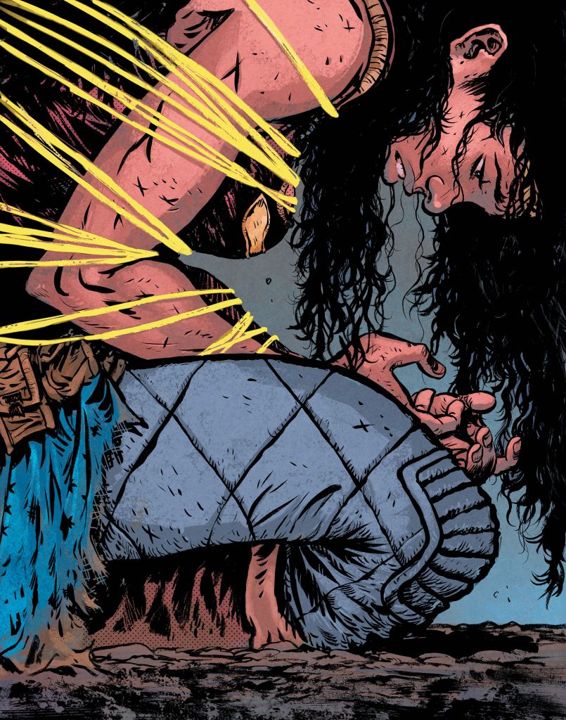
KK: The Caped Crusader of my youth has resumed his mantle, perching ever watchful in the night. The deep color palette and sharp edges of that Art Deco cityscape evoke an oh-so-familiar noir atmosphere and grit that had veered into a darker territory of Saturday mornings.
If this doesn’t evoke a strong sense of nostalgia in you, nothing will. For many of us, Batman: The Animated Series was the gateway into the world of comics. It’s fitting that the pillars supporting our hero feature the iconic and in some cases (looking at a certain pigtailed psychiatrist-turned-baddie) defining characterizations of the Dark Knight’s vast rolodex of villains.
This cover is a visual reprisal of the iconic stance at the end of the show’s title sequence (sans lighting)—but instead of staring off into the night, Batman cuts an ominous figure staring straight down at us, triumphantly announcing his return.

The Batman’s Grave #7 by Frank Quitely. (DC)
CH: He may have wonderful toys, but tech and armor do not the Batman make.
Bruce Wayne is not a chiropteran demigod despite what some insist. Mad computing power and Bat-Exoskeletons don’t secure the W.G.D. honorific. It’s earned by placing himself in the victim’s position and studying the scene, the crime, the violence, from their perspective.
Quitely captures the vulnerability with a grim and determined Batman, one cloaked and cowled in fabric. Supported not by a Batwing or a burgeoning utility belt but by empathic powers of observation. By being willing. Willing to stand against the evil mankind does, a flawed mortal barrier between the innocent and the predators.
Quitely’s Dark Knight reveals our arbiter intimately. The untended stubble, the haphazard mask repair, the rends in his mantle. Batman isn’t unscathed, but he is uncowed. Still determined. Still focused on delivering justice. This is The Batman criminals fear, not the shock-and-awe tech one. His terrible visage haunts the Gotham city rooftops of their nightmares. The man who won’t quit, who pursues despite the cost; the one who always keeps coming.

Killadelphia #6 by Jae Lee & June Chung. (Image Comics)
JJ: Through the shadows, they stalk. Vampires live amongst us in Rodney Barnes, Jason Shawn Alexander & Luis NCT’s Killadelphia, and they’ve dug up all sorts of raw, hideous American history from the deep, dark grave where some would like to see it stay buried. It’s a fascinating, often horrifying, frequently satisfying comic series from a team operating at the height of their powers. It’s only fitting such prestige should have an equally amazing cover to cap off its first colossal run.
Issue #6 sees an absolutely stunning variant from the impossibly-good Jae Lee & June Chung artistic team. Their subject: Abigail Adams, former first lady and looming threat to humanity’s future.
Abigail has adapted to the times. Immortality has hardened her resolve and eroded her soul, her hands lethal talons fit for ripping. Chung seeps a faint rot into her porcelain features. Burdened by her president husband no more, Abigail is free to explore her various appetites and ambitions. Fresh drink streaming down her chin and tears spilling from her charcoal-smoked eyes, Abigail dreams of a future of blood, fury, sacrifice, and power. It is horrible, unfathomable, beautiful.
Wonder Woman: Dead Earth #3 by Daniel Warren Johnson. (DC/DC Black Label)
LF: Sometimes art imitates life.
Daniel Warren Johnson’s variant for Wonder Woman: Dead Earth #3 is one such instance. Warren gives us a Wonder Woman on her knees, frustrated and lassoed in her own construct. In the tension of her fingers, clawed, grasping, we see the frustration and bitterness of every woman. In her clenched jaw, flexed arm muscles, we see resistance. In fact, the whole image is a pool of tension, of resistance, that we step into. It tastes like bitterness, like desperation, like despair. There is a hint of hopelessness, and you can see it in Diana’s eyes. She’s wondering if she should give up. If there is a point in continuing to fight, when all of the bad seems to be slowly eroding the good. The good, it seems, is turning to nothing. To dust, or a memory.
Why go on?
That is what Diana wonders, starting at her useless hands, at her skinned knees, at the ash-covered ground.
What Daniel Warren Johnson doesn’t show us, is that she will get up. She will rise, and do what she must, for the sake of the world. It’s who she is, and that may be a part of her frustration.
But it’s what makes her someone we aspire to be. And this moment of utter vulnerability from her connects us to this timeless hero in a way we desperately need these days. Even when we feel hopeless, we must go on. We must resist.

Metal Men #7 by Brian Bolland. (DC)
CH: While the regular cover of Metal Men #7 delves into the unlimited potential of a Metal Men-agerie, Brian Bolland brings forward a retro cover variant so closely aping Ross Andru’s and Mike Esposito’s combined style, it demands a doubletake. A double-and-a-half-take if I’m honest.
First thought: They used an original Andru piece, maybe an unused cover draft he sketched. Second thought: Wait, is it his? Must be, look at Doc Magnus. Only Ross-Esposito Will Magnus conveys that “genius skating the salt-rim of margarita madness.” Thought 2.5: Brian Bolland? His name’s right there. Enlarging the art, armed with Bolland’s name, I finally fathom his style as the mortar holding this illusion together. As tribute, it’s an achievement.
Where other masters like Alex Ross honor classic covers by placing his trademark realistic style directly on original framing, Bolland jumps those rails. He creates a unique layout, one reflecting accurately how Andru and Esposito may have imagined. If a masterful time warp brings smiles, the details deepen them. The Metal Men and Doc are airborne in the Rocket Disc, a revolutionary thought-controlled flying platform invented by Magnus and introduced in 1963’s Metal Men #1. Their ride lists as it’s pelted with Missile Men, classic villains from that same premiere. Lastly, Bolland’s arrangement of robotic heroes and creator clinging to that amazing Gaspar Saladino logo is the perfect prevention for disastrous disembarkation.
Don’t forget to share your favorite covers, from this month, from any month, in the comments section below!


