

by Brandy Dykhuizen, Clyde Hall, Mickey Rivera, Kate Kowalski, and Jarrod Jones. Undercover is our opportunity to lovingly gaze upon gorgeous works from magnificent artists. From Tradd Moore’s ‘X-Ray Robot’ #4 to Jorge Jiménez & Tomeu Morey’s ‘Batman’ #104, these are our picks for November & December’s best covers.
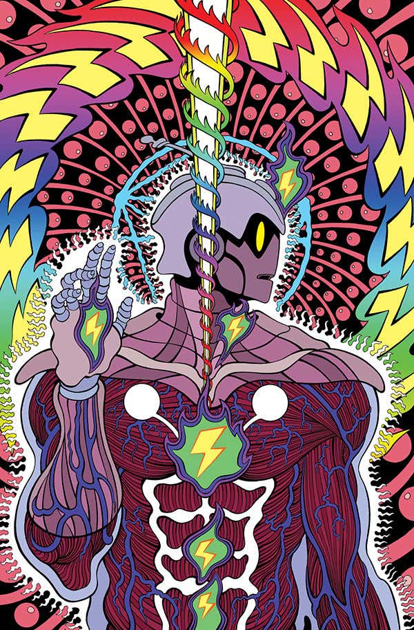
X-Ray Robot #4 by Tradd Moore. (Dark Horse Comics)
MR: To be quite honest, Tradd Moore’s work has always looked to me like someone blasted Mike Allred’s art with radioactive consciousness-expanding rays, so enlisting him for a variant cover of Allred’s new reality-bending opus is perhaps the only thing in the world that’s made sense this entire year.
Turning, winding, outwardly flowing, Moore’s variant to X-Ray Robot #4 is an homage to Alex Grey’s album art for Tool’s Lateralus. Like the original it has religious iconography vibes, which is always a good route when you’re trying to reference mind-breaking transcendent ideas. Also like the original (and most of Alex Grey’s work) Moore allows us to see right down to the meat and blood vessels that make this particular machine run, as well as the glowing effluence from the energies that reside within. I had no idea Allred was into this kind of stuff, but I’m here for it.

Action Comics #1027 by John Romita, Jr. and Brad Anderson. (DC)
JJ: Nobody fills a page quite like John Romita, Jr. His hulking heroes and vast villains bring a heft to comics that you can feel, actually feel, as the fictional earth cracks under the indescribable power of their battles. Absolute Unit vs. Absolute Unit. Giants that fly at each other. That Hearts of Darkness-double-gatefold-wraparound-cover, Mighty Thor-bellowing-“For Asgard!” kinda stuff that ought to be the aspirational model for all superhero comics.
You’d think that such brutish renderings would come packing a stunning lack of finesse. With Romita, not so much. Look at the symmetry on this cover. Our Man of Steel is down but not out, his mighty shoulders in a slump, his knees cracking terra firma as he falters. Romita uses both to frame the image. Prop it up. The symmetry shifts: Superman’s last good Kryptonian-blue eye darts upward to glare at his unseen foe, his other a mess of blood and bruise. His fists, one dropping into his lap, the other still gripped in defiance of defeat. This dude’s taken a beating but he’s not done. There’s a day to save, after all.
It’s that dolly shot into the ring we saw in Raging Bull. That second you realized George McFly was gonna take his swing at Biff Tannen. The exhilaration and exhaustion you felt when Rowdy Roddy and Keith David just would. not. Quit. in They Live. It’s that Kansan stubborness we love in Clark Kent, his dogged perseverance in the face of overpowering odds, when everyone else would have already thrown in the towel.
Or maybe it’s just a comic book cover? C’mon. When John Romita, Jr.’s at the pen, it’s always, always anything but.

Thor #9 by Greg Hildebrandt. (Marvel)
BD: Greg Hildebrandt’s variant to November’s Thor #9 is 50% God of Thunder, 50% Dio album cover, and will 100% get Rainbow in the Dark stuck in your head. (But hey, at least it will drown out that Mariah Carey Christmas song.) Thor straddles the Bifrost as if on stage, twirling Mjolnir as casually as Malmsteen in full shred mode. Visually, he’s the one thing standing between Asgard and the other eight realms, but his extended hand and comfortable smirk suggest he’s showing off for an audience rather than actively protecting his people. Gotta love that Thor guy.
This all comes as no surprise, of course, as Hildebrandt is a sci-fi/fantasy master, and his work has been known to appear on a metal album cover or two. His moody space lighting contrasted with garish Asgardian splashes of color makes me feel like I’m right smack dab at the gates of another world, ready to rawk.

Catwoman #27 by Joëlle Jones. (DC)
KK: Here is Catwoman as legend—a thief, a fighter, a creature of the night slinking through the shadows, jumping between rooftops. In this purple-hued cityscape, she’s emerged ready for the hunt, ready to attack her prey. She’s badass, framed against a cloud of exhaust atop a speeding car skiing along on two wheels, lassoing a guy with a bullwhip while another one bites the dust. Her face completely obscured and iconic cat ears pinned back, she’s a menacing leather silhouette. You don’t want to find yourself at the other end of her whip or worse, anywhere near her claws.

Catwoman #27 by Jenny Frison. (DC)
KK: Here is Catwoman as woman—Selina Kyle, glamorous playgirl with a feline fetish. This extreme closeup is a sensual image saturated in deep rosy tones. It is a classic glamour shot, face done up with heavy makeup, light gleaming in a focused beam off her mask, lips, and zipper pull. Her affectionate pet draped over her shoulder adds warmth and intimacy to the piece. But Selina’s eyes wander elsewhere, downward, her features held in a mournful expression. Here she is a tragic beauty—soft and contemplative, a 180° from her hardened reputation.
The vast differences in these two depictions as covers of the same issue, illustrated by Joëlle Jones and Jenny Frison respectively, prove Catwoman’s metamorphic nature. Each of these covers evokes such a different range of emotions. The first, fear and awe. The second, admiration and sympathy. These images are fractals, singular glimpses of who this sometimes hero, sometimes villain, is. Complicated and alluring, her ever-changing alliances and motivations are an essential part of Catwoman’s endurance as an iconic figure.

Buffy the Vampire Slayer #19 by Marguerite Sauvage. (BOOM! Studios)
CH: In space, no one can hear you slay which is likely a minor concern for your average interstellar vampire. They have challenges occupying their undead minds, like giving stars wide berths to avoid their destructive radiance and nibbling succulent necks under space helmet glass.
Marguerite Sauvage’s previous ‘Multiverse Buffy’ variant covers for the title included a Gothic Sense and Slayability (or Wuthering Hellmouths) entry and a groovy Swingin’ Sixties Slayer riff. For #19, Buffy Summers becomes a Spaceborne Slayer, the Celestial Chosen One, and Sauvage salutes several cosmic sources in her distinctive, clever style.
The fashionable, retro-futuristic EVA suits are worthy of any classic Amazing Stories or Captain Future cover, including Willow’s impractical environmental space skirt version. Buffy’s eyelashes possess an Æon Flux aesthetic, possibly the ability to snare flies as well. Slithering tentacles have been part of the variant series mainstay, the setting now lending them Elder Things legitimacy. Our Slayer’s beta ray Big Bad, however, raises a Hanna-Barbera countenance which somehow accents its fanged threat; this isn’t Brak or Moltar, and it will end your jump to lightspeed early given a chance.
Most impressive of all is Buffy’s weapon choice. Faith was given this distinctive knife by the Mayor, but it was designed by Kit Rae for the Gil Hebbin company in 1998 and marketed as ‘Jackal’. It’s better suited for the galactic rim setting than Mr. Pointy, because ‘Jackal’ was also used by Shinzon in the film Star Trek: Nemesis. How a slayer’s weapon ended up in the hands of the shadowy Reman leader remains unclear, but that’s what a Star Trek: Slayer official crossover would be for. That, and finally explaining how the insect-like neck-nesting parasites evolved from 20th century Earth pests in Bad Eggs (BTVS S2, Ep 12) to taking over Starfleet in Conspiracy (ST:TNG S1, Ep 25).

John Constantine: Hellblazer #12 by John Paul Leon. (DC Black Label/DC)
JJ: John’s feeling what we’re feeling, in that reliably extra Constantine way.
Yeah, John Constantine: Hellblazer has come to an end, much earlier for those of us who loved the series and those exceptional creators who made it happen for 12 absolutely majestic months. (Si Spurrier, Aaron Campbell, Matías Bergara, Jordie Bellaire et al., we here at DoomRocket salute you.) Hellblazer‘s cover artist, John Paul Leon, clearly swept up in this last-issue moment, decided to amp up the ennui us readers have been contending with since the issue dropped in November.
The drama, the anguish, it is much. Ur-Shakespearean. Biblical. In short, Constantine. Adrift in a void of his own making, John’s many dalliances with powers-one-must-never-fuck-with has resulted in entropy and all is dark.
Not all. John Paul Leon knows how to manipulate shape and shadow, and for this final issue of John Constantine: Hellblazer he puts his many skills to work. Dripping down Constantine’s de-trenchcoated arms we observe what can only be surmised as blood, draining from a deed most foul towards the onyx infinity beyond. The pain on John’s face is a portrait of agony, beyond the like that come with hangovers following a night drinking with demons or the regret that results from double-timing an especially formidable magician boy-or-girlfriend.
John hurts because we hurt. Only more. Taking the brunt for us mortal types, that’s why we’ll always love him.

The Immortal Hulk #41 by Alex Ross. (Marvel)
CH: Without Santa, visible snow, or carolers, Alex Ross provides a joyful, untraditional holiday season cover for Immortal Hulk #41. It’s fitting; 2020’s been an ongoing departure from our usual sleigh ride ‘round the sun. The interior story mirrors Ross’s approach, revisiting one of the Marvel Universe’s longest-running feuds in a Hulk vs. Thing battle unlike any previous.
The cover reflects the heart within Al Ewing’s story, and it is a heart three sizes larger than one could expect, with observations on faith and a timely reference to the Book of Job. That last one is not where we normally seek festive parallels, but then what makes the Ross cover any more tailored to holiday celebration?
His very style rouses nostalgic feels, and those fuel the tank of most festivals. For many, Ross is the Norman Rockwell of Pop Culture, but this cover has a more Richard Sargent spirit. Like Sargent, Ross leaves some comedic elements to the imagination. We don’t know what the waitress is saying to these two unusual travelers taking shelter in her diner, but we imagine everything from a brassy observation on Hulk’s enjoyment of the beans, to a friendly reminder on keeping things peaceable so the diner’s insurance rates remain manageable. The emerald giant’s expression and Ben’s clear concern over how his frenemy might respond inspire smiles.
Those shoppers pausing outside might as easily be taking in a Macy’s Christmas window display, though they exhibit an elevated sense of trepidation. The humor found in everyday, or in this case Marvel Universe New York City, circumstances comes through; without booths designed by Stark Industries, the seating exhibits stress marks from behemoth overload. Hulk’s trouser seams are also overburdened, gapped in several places. Maybe their server’s pointing out that no shirt and no shoes may be overlooked, but no pants is a problem.
Circumstantial, you say? Grasping for a holiday theme where one barely exists, you accuse? Not at all, because there is no better yuletide gift this year than Ross’s charming, heartfelt rendition of our ever-lovin’ blue-eyed Thing and his perpetual sparring partner, the Incredible Hulk.

Lonely Receiver #3 by Jen Hickman. (AfterShock Comics)
JJ: Jen Hickman has tapped into something quite undefinable with their work on Lonely Receiver. The digital romance thriller from AfterShock has explored the corners of our living spaces that we usually walk past every single day until that one terrible moment when our heart breaks. When wistful reveries of the way we were take the place of daily (and healthy) human interaction. Life in the future of Lonely Receiver is a mess like the lives we lead today, and I’m quite addicted to it.
See, in Lonely Receiver, love can arrive digitally, too. Not in that familiar, cathartic, quickly forgotten way—but that once-in-a-lifetime kind of mushy stuff that makes up the majority of our hopes and dreams. Yeah. Love via app. But don’t judge. In the sterility of Lonely Receiver, you take love where it comes.
Like life, digital romance fades. Lonely Receiver is a break-up book. But Hickman has found exquisite ways to convey the way we daydream when our heart aches, the most indelible presentation they’ve provided yet being this cover to Lonely Receiver #3. Lost in a sea of dreams we remember our first kiss, our last one and all the ones in-between, on and on into a warm oblivion of isolation and regret. And hope.

Justice League: Endless Winter #1 by Daniel Warren Johnson, Mike Spicer. (DC)
CH: Winter’s not only coming, it’s arrived C.O.D. in the Justice League: Endless Winter #1 variant cover by artist Daniel Warren Johnson and colorist Mike Spicer. Seldom do the struggles of demigods like Superman, Batman, Wonder Woman, et al. mirror our own. But having Jack Frost take a chunk out of our noses when the first hoarfrost winds blow in is an experience many of us are familiar with.
The superheroes get a similar wakeup call from Johnson and Spicer here. Superman’s taken punches before, but this one from the Frost King bestows a decidedly bloody Bruce Campbell chin elongation. Even Clark’s forehead appears frozen solid before being fractured by the blow. Meantime, Batman being held at arm’s length simultaneously should give the other League members pause. If their finest fall beneath the King’s icy embrace, what cold and lonely graves await them?
Our ancestors may have held winter festivals and celebrated surviving another year, enjoying the break from fieldwork with an eye toward spring’s promise. But this arctic onslaught avows nothing more than a bracing trip through Jack Torrance’s lethal hedge maze for humans and superhumans alike. Johnson makes a good argument for this Ragnarök Extinction Event with crazed, mystic Viking deities infused by kryptonite-irradiated ice.
Spicer’s color choices drain all warmth from the scene as well as from the heroes’ souls. The combined abilities of both artists appropriately bestow a white Siberian tiger stripe to the Frost King’s strike. Our everyday battles against nature, thankfully, are held on a more neutral footing, waged with ice melt and insulated boots. For the League, Johnson and Spicer deliver a vengeful, savage, and elemental threat, one bent on freezing the hearts of mankind’s bravest champions before shattering them.

Batman #104 by Jorge Jiménez, Tomeu Morey. (DC)
JJ: This is in all likelihood the last UNDERCOVER feature I’ll be running on DoomRocket for the foreseeable future. (Life moves on and sometimes comic sites do, too!) That might have a bit to do with why I’ve chosen Jorge Jiménez & Tomeu Morey’s glitzed-out, vertigo-inducing cover for Batman #104 as my final UC dispatch: It represents what the future of mainstream superhero comics can, should and is actually gonna look like, which feels like an optimistic note to leave on. (For now.)
Check out the perspective. It’s a hip-hop promo shot morphed into a spinner rack wonder. (DC’s reliably impeccable trade dress for its superhero line pushed this sucker over the top to become one of the more tantalizing comics on the stands in December.) What we have here are three martial artists ready to do what they do, motivated by radically different agendas, looking absolutely dynamite in the seconds before an inevitable skirmish.
In the foreground is our Dark Knight Detective puzzling over a clue, a mere nano-second away from surmising that what lays upon that gnarly subway car floor is most certainly a trap. Behind him is an unlikely ally, there for the mystery, ready to pivot from good to not-so-good when the guesswork stops being fun. Filling out our trifecta is the violent malefactor in the rear, likely the Batman’s intended quarry, ready to put a kit-bashed bat-bat through the right temple of Gotham’s Guardian. Things are about to get screwy.
This cover represents that last fortifying breath we take before things go wrong. More, it lives; you feel the charge of potential energy that vibrates inside the Olympian muscles of our hero, feel the air in that crap-tastic subway car shift temperature just as this bat-swinging baddie takes his shot. Jorge Jiménez has warped DC’s typically stoic house style into something dynamic, something fluid, something that smacks of the future and makes the anticipation for each new issue of Batman feel almost unbearable—precisely the stuff of great comic book covers.
Don’t forget to share your favorite covers, from this month, from any month, in the comments section below! Thanks for reading!


