

By Molly Jane Kremer, Brandy Dykhuizen, Arpad Okay, Brad Sun, and Jarrod Jones. Undercover is our opportunity to lovingly gaze upon gorgeous works from magnificent artists. Each week, we single out the most striking covers that grace comic book stands and gush all over them.
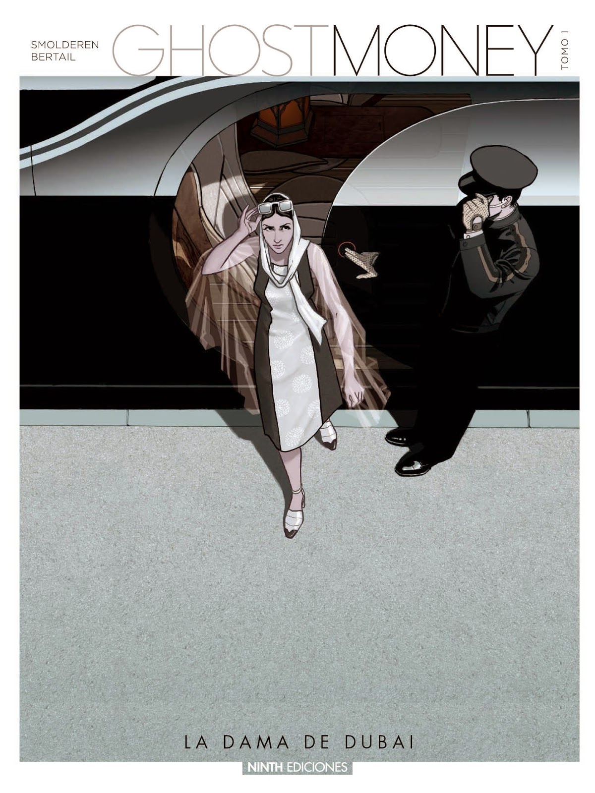
Ghost Money #1, by Dominique Bertail. (Lion Forge)
BSun: Dominique Bertail’s cover to Ghost Money #1 is a striking illustration expertly calibrated to convey a single message — luxury. From the ultra formal arrangement of icy grays and blacks to the barely acknowledged driver who isn’t even deserving of a face, every element is designed to make it clear that this woman is more important than we are. Her delicately patterned, vertically striped dress contrasts against the harsh metal and concrete of her surroundings, nearly abstract in their sharp-edged geometry. The man is anonymous, his figure literally merging with the vehicle he operates. To anyone that matters, he does not exist outside of the function he serves. But this contrast extends beyond even the confines of the cover itself. Placed next to lesser, more common books, with their garish colors and cheap spectacle, Ghost Money remains coolly aloof in its refined minimalism. It does not demand our attention, and by doing so it seduces us with a wealth of visual intrigue.
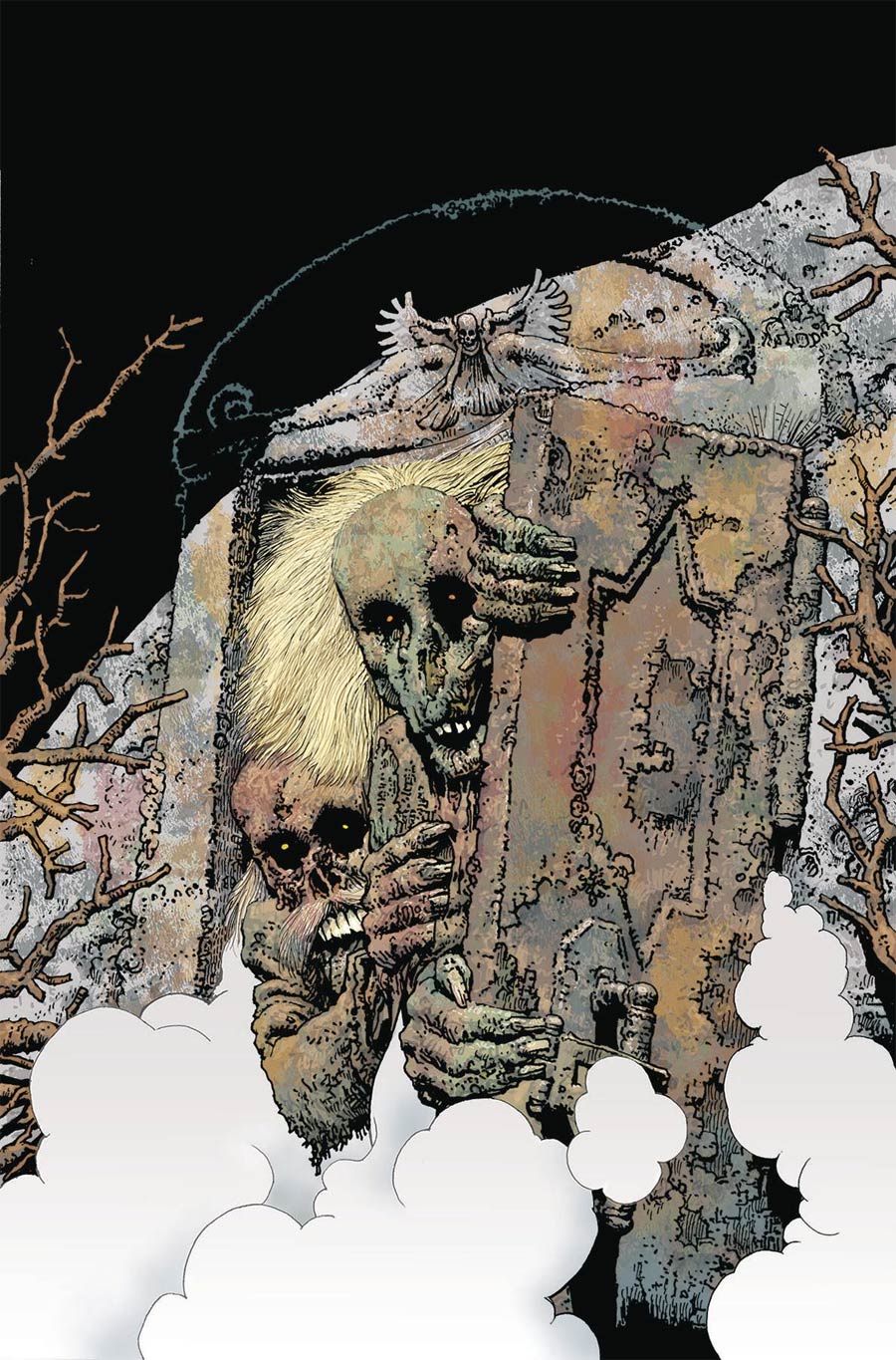
Shadows on the Grave #7, by Richard Corben. (Dark Horse Comics)
BD: From the anatomically ambitious Den collection to the glam-metal-horror mash-up of Meat Loaf’s Bat out of Hell album cover, it can certainly be said that Richard Corben has a busy mind. He’s hardly been holding back in his Shadows on the Grave series, with gored-out eye sockets and ghouls grinding ghastly chompers.
In Shadows on the Grave #7, it almost feels like Corben is having a chuckle at himself. The top and bottom third of the cover are coated almost entirely in black and white, respectively. The middle segment contains an arced mausoleum perfectly framed by finger-like branches – the whole thing is very rule of thirds. But fear not! Two undead entities peak out from behind the sepulchral door, ready to eat you alive or maybe just mock your recognition of art school elements. “Nah, JK; we’re still here and we’re gonna shred all over your basic composition techniques.” This is Corben, after all.

Gotham Academy: Second Semester #12, by Karl Kerschl. (DC Comics)
AOK: Karl Kerschl brings the bittersweet grandeur that a finale deserves to Gotham Academy. GA: Second Semester closes with #12 and, if you know Olive Silverlock, its cover is scary as hell.
Olive and Maps Mizoguchi are on fire. They look resigned to their fate, eyes closed, choosing to shut out the world in a final embrace. To take solace in each other. Flames lick hair, uniforms, extremities. They burn through the image itself.
One layer of bonfire is a muted pink plate that sits behind Olive and Maps. One layer lays on top of them, setting them ablaze, another color plate the same white as the bare canvas the image of the two is set upon.
The effect is the fire cutting holes through the friends. Eating them up as it would parchment, not people. As if, in a moment, the image of the two will disappear without a trace. Above and beyond, Karl. Minimal, touching, and haunting.

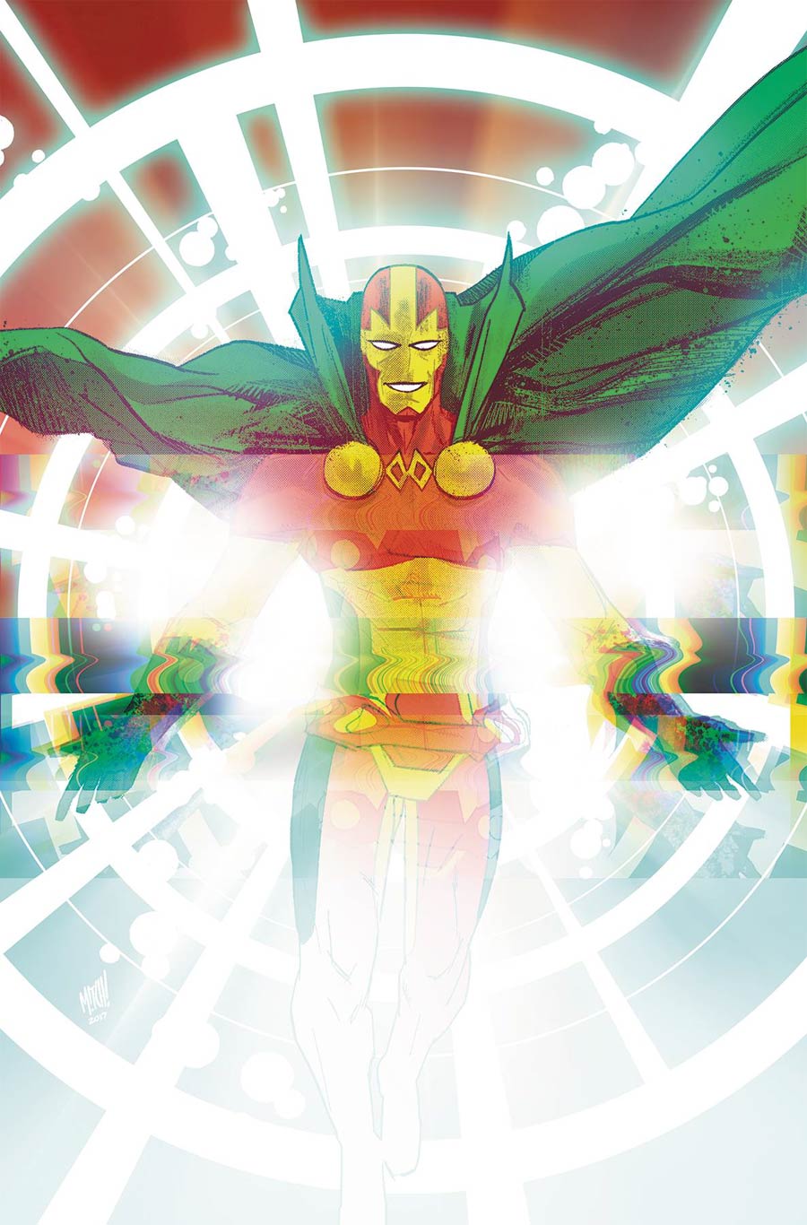
Mister Miracle #1, by Nick Derington and Mitch Gerads. (DC Comics/Young Animal)
MJ: Many Mister Miracle covers have featured its protagonist handcuffed, enchained, and in various forms of constraint (kinky). Nick Derrington’s main cover for Scott Free’s newest outing (written by current Batman scribe Tom King and illustrated by artist and frequent collaborator Mitch Gerads) doesn’t stray far from tradition: Mister Miracle on a stage in his super-saturated red, yellow, and greens, covered in a ludicrous amount of metal clamps and chains. He’s looking a little overwhelmed as he gazes out at the audience, which also happens to be in the direction of us, the reader. (Funny, that.)
However Scott is free and smiling on Mitch Gerads’ variant cover, which has the fuzzy, pixelated, semi-scrambled look of a pre-LCD television. There’s a little bit of Kirby krackle hanging out there too, blinding white instead of the usual inky black. Scott appears messianic here, his arms spread with a beatific smile, walking towards us out of a bright emptiness that threatens to engulf the page.
This is one of DC’s most anticipated new series of the year, and DC has certainly dressed it in style.

The Amazing Spider-Man #31, by Alex Ross. (Marvel Comics)
JJ: Behold Peter Parker in his natural habitat: disarray. Whatever our hero thought he was about to accomplish has flown out the proverbial window and into a terrifying white void. Speaking of flying through windows, there’s Parker now, hurtling outwards as the heat from an off-cover blast threatens to burn off what little remains from his Spidey suit. Peter’s had better days, that much is certain. But even when he’s getting his spider-butt knocked around, so long as Alex Ross is painting it Peter can at least be assured that he looks great when it happens.
And that’s it! Don’t forget to share your favorite covers from this week in the comments section below.


