
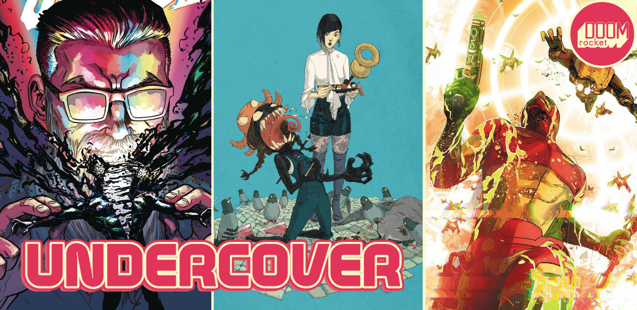
By Molly Jane Kremer, Arpad Okay, and Jarrod Jones. Undercover is our opportunity to lovingly gaze upon gorgeous works from magnificent artists. Each week, we single out the most striking covers that grace comic book stands and gush all over them.
Mister Miracle #2, by Mitch Gerads. (DC Comics)
AOK: Mitch Gerads makes art from complicated visions. The explosions in the sky swallow every corner of his cover for the second issue of Mister Miracle. Gerads paints with light. Miracle shines. He stands in shadow. He brandishes arms that glow with a power brighter than the lights above him. Gerads sneaks the deep into a tale told with a single moment.
Miracle breaks into the page through a cloud of glitchy color processing. He’s obscured by the spray of the pixelated waves he’s breached, resembling off-set printing in a digital medium. Intentionally scrambling the image of our protagonist, setting the reader’s view at an angle where the forces he is up against are plain to see. His face is hidden for the sake of making the scene more dramatic; it’s unorthodox but enticing. It works. It’s hard work. Gerads has crafted this cover into a promise of the sophisticated storytelling that waits inside.

Curse Words #8, by Ryan Browne. (Image Comics)
JJ: Look at that. I am over the moon for the rainbow of energy that’s currently splashed all over Wizord’s face on this cover to Curse Words #8 as I am simultaneously horrified that somebody had to get ripped apart to make it happen. What can I say about Ryan Browne. The man is a maestro. A wizard himself. God Hates Astronauts cracked open my scleras and stuffed them full of candy-colored mayhem. Curse Words is Browne giving his three-ring-circus aesthetic a considerable focus, applying it to the page with laser precision. Each successive issue has been a thrill. Each successive cover, a banquet.


Runaways #1, by Adrian Alphona & Ian Herring and Kevin Wada. (Marvel Comics)
MJ: Runaways was one of the best comics of the 2000s, one of the most original additions to the Marvel Universe in recent memory, and arguably helped launch the career of a li’l ol’ comics scribe named Brian K. Vaughan. Needless to say, we here at DoomRocket are stoked.
The series is relaunching from writer Rainbow Rowell and artist Kris Anka after eight years away–not to mention the tv adaptation on the way at Freeform–but the covers to the debut issue are absolute fire.
Every cover Kevin Wada draws makes my breath catch, his variant to Runaways #1 being no exception. Chase and Nico engage the reader with full eye contact. While Chase’s stare dares the reader further, Nico’s gaze is a little less sure, not convinced we’re ready for the experience. Loving details are snuck in, like Nico’s pinkies-out grip on her staff.
Everything about Alphona’s Venomized variant is perfect. A sushi snack interrupted by symbiote outbreak, Molly venom-ing out in her overalls and octopus hat. The shocked looks on the faces of surrounding pigeons contrasts delightfully with Nico’s nonplussed glance in the midst of her noms. Ian Herring’s flat colors bring out Alphona’s details, thoughtful and fine (the tubby raccoon on the ground, squeezing between pigeons to grab at Molly’s spilled rolls and tentacles is the pièce de réstistance).
Nico is wearing the same snazzy outfit in Alphona’s other incentive variant (man have I missed seeing this fella’s art on the regular). Thigh-high boots over floral patterned tights and high-waisted shorts. Each of the Runaways seems detached in this cover; though they are all in frame each seems lost in their own thoughts, apart though together. Except of course Molly, pointing out stars to Old Lace, a claw poised thoughtfully at her velociraptor chin. It’s more than fitting to start out his new series, so seemingly reverent to the original, with Runaways’ original artist on covers.

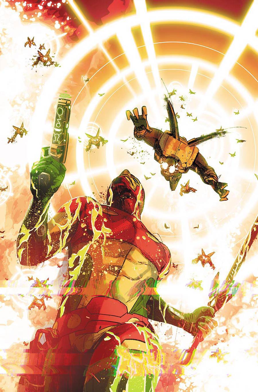
Mister Miracle #2, by Nick Derington. (DC Comics)
AOK: Despite a bold Mister Miracle front and center on the second issue’s cover, it was Nick Derington’s backgrounds that grabbed me. First thing I saw was the genius application of Kirby Krackle. Clouds of fire, filled with familiar dots. The ground is as much a tribute to the King as the sky. Derington boils Kirby’s style down to a texture. Armor packed so tight it’s polygons.
Then I stepped back and took in the pious, statuesque look of Mister Miracle himself. Miracle is somber while all around, Mars rages. His carnival costume is muted. Impossibly tall cowl and equally unlikely clasp countered by the antiquity of his mask and pose.
Derington gets it. His cover is a loving tribute to Miracle’s creator, but done Derington’s way: a Métal Hurlant modern aesthetic. The deconstruction of Kirby and synthesis of his trademarks into Derington’s personal style is inspired, informed, true to itself.
And that’s it! Don’t forget to share your favorite covers from this week in the comments section below.


