

By Molly Jane Kremer, Arpad Okay, Clyde Hall, Mickey Rivera, and Brendan Hodgdon. Undercover is our opportunity to lovingly gaze upon gorgeous works from magnificent artists. Each week, we single out the most striking covers that grace comic book stands and gush all over them.

Captain America #695, by Chris Samnee and Matt Wilson. (Marvel Comics)
CH: “Hail Hydra.” Few comic book utterances have led to the level of controversy this one did earlier in 2017. Captain America fans young and old took Marvel to task for their Secret Empire storyline. So I mentally accepted that Mark Waid was going to helm Captain America starting with issue #695 (resumption of classic numbering, even) as reaffirmation of Cap’s status as icon and hero’s hero. Then I saw the Chris Samnee cover, and it yanked my heart along for the ride.
The return of the archetype uniform and shield in red, white, and blue is augmented by an all-action splash incorporating logo, characters, and stars. Bold, clean lines and color purity evoke the elan of Alex Toth and the energy of Doug Wildey, in the best of both ways. Bad guys taking lumps, hero looking terrific distributing them; if you’re going back to formula, this is the way to do it.


Red Sonja #10, by Amy Reeder and Ben Caldwell. (Dynamite)
Amy Reeder has been a favorite artist of mine from way back, to the days when she was on the excellent Vertigo series, Madame Xanadu. She took some time off from art for a while, but seeing her back on covers like Red Sonja #10 (and on interiors of her creator owned series, Rocket Girl) gives me a rush of relief and happiness. Reeder knows how to frame this cover to emphasize Sonja’s toughness and determination. A warrior’s rage gleams in her green eyes, and the curl of her bloody lip suggests her opponent has seen their last sunrise.
As far as the variant goes, Ben Caldwell’s covers for this volume of Red Sonja have been… what’s the word for how a chef kisses their fingers to show how delicious a dish is? His cover for issue #10 is no exception. While some artists take the chainmail bikini and go as voluptuous as they can with the rest — often emphasizing her mercenary nature along with her boobs — Caldwell draws Sonja as petite, almost realistically proportioned. She’s also cute as heck, blowing a kiss at the reader, suffused with a lavender glow. Vanquished monsters and zombie dudes litter the floor behind her, looks of shock on their faces that this little lady has left them in such a state.

Spiritus #2, by Michael Kennedy. (Vault Comics)
MR: Michael Kennedy’s art for Spiritus has an expressive flatness that seems fit for a story that combines high-tech prison suspense with an undercurrent of social and philosophical probing. This cold flatness understates the inevitable violence, forcing you to think instead of feel. In this cover, Kennedy’s lines feel free but deliberate. They bend and lean with the action, creating a visual whirlwind that spins the viewer along with it.
Pictured here is a man who’s finally getting what’s coming to him. The unlucky bastard dodging the bullets is Marshal Reveles, a technician whose job it was to upload his assailant’s mind into a semi-sentient mechanical slave. But the newly escaped prisoner attacking him has a new perspective on life. New body, new eyes, and enough firepower to make sure she’s never locked up again. And, like her, we’re watching with cold detachment as Reveles squirms.

The Shadow/Batman #2, by Artyom Trakhanov. (Dynamite)
BFH: To be honest, a big part of this cover’s appeal for me is the reunion (of a sort) of writer Steve Orlando and artist Artyom Trakhanov, who collaborated so effectively in the underrated miniseries, Undertow. But even beyond that meta context, this is a wonderfully impactful cover, a big part of which is actually due to the colors. The light blue background and the liberal use of magenta really pop on the page, which sets this image apart from the usual moody shades one might expect from a cover featuring the Dark Knight Detective and the World’s Greatest Mystery. And if the color wasn’t enough, there’s also the dynamic staging of the image, with Batman swooping up at us as The Shadow looms in the background with malevolently pupil-less eyes. All in all, it’s really striking and atypical in the exactly way that I expect from a good variant cover.
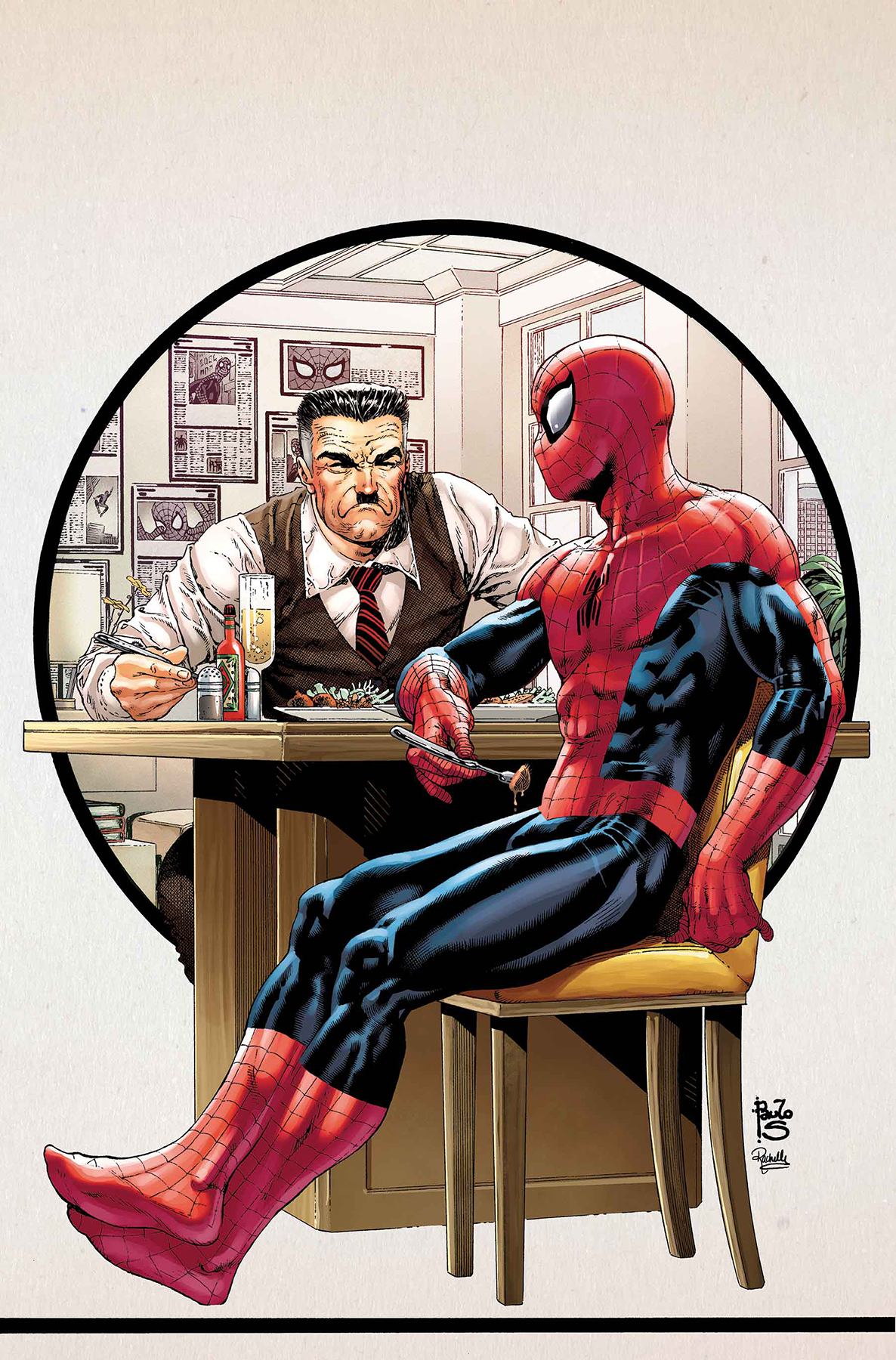
Peter Parker: The Spectacular Spider-Man #6, by Paulo Siqueira. (Marvel Comics)
AOK: Paulo Siqueira has got me thinking about J. Jonah Jameson on a level I’ve never reached before. What would Jameson be without Spider-Man? Imagine his office if you took away all the pictures and Spidey clippings. There are no diplomas, no awards. No photos with Robbie Robertson or Jonah’s son, the astronaut. I’m picturing the final scene in The Conversation.
Beyond the bulldog-mean mug, look at this lunch. Meatballs with salt, pepper, hot sauce. Is that a flute of champagne? Even Jameson at his most domestic is utterly absurd. Siqueira’s Norman Rockwell peek into the life of John Jonah Jameson Jr. is one I never knew I wanted.
Will Spider-Man pull his mask up to signature half-mast so he can take a bite of Jameson’s curiously seasoned gastronomical offering? Peter Parker has grown up with Jonah, surely he will recognize the lower half of Parker’s face, his voice, his mannerisms. Or will he? Jameson’s Spider-Zealotry is unfathomable: where Spider-Man’s concerned, he can’t see anything but red (with blue and some black accents).
And that’s it! Don’t forget to share your favorite covers from this week in the comments section below.


