

By Molly Jane Kremer, Brandy Dykhuizen, Clyde Hall, Jami Jones, and Jarrod Jones. Undercover is our opportunity to lovingly gaze upon gorgeous works from magnificent artists. From Joshua Middleton’s downright absurd variant for ‘Batgirl’ to Artgerm’s portrait of Shuri in this week’s ‘Black Panther’, here’s what we’re loving this week.

Batgirl #23 by Joshua Middleton. (DC Comics)
MJ: Joshua Middleton needs to always do Batgirl covers. This is his tenth variant for Babs’ ongoing series, and somehow it’s just as good (if not better) than those that have come before.
In the last few of his covers, his always varying stylistic choices have leaned into more detail. Comparatively, issue #23’s variant is a simple portrait. Which isn’t to say Middleton skimps on detail here, because it’s those details that make this image superb: the curls before Babs’ ear, escaping her cowl; the determined set of her jaw; her questioning yet determined glance. Everything about Barbara Gordon can be found here.
The negative space makes sure your focus remains right where it should be, and Middleton’s painterly textures (especially on Babs’ scarlet locks) add a slightly impressionistic flair to an already masterful piece. This may mark ten Batgirl variant covers for Middleton, but another ten times ten wouldn’t be enough.
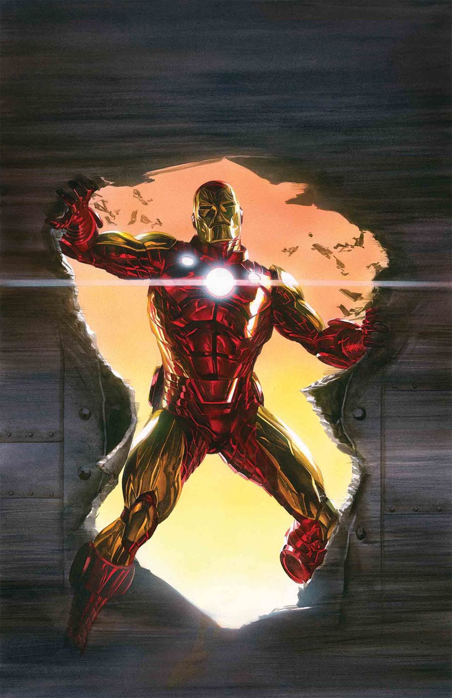
Invincible Iron Man #600 by Alex Ross. (Marvel Comics)
CH: He proved that superheroes in uniforms made of fabric with folds could look good. And he’s just as adept rendering impressive armor, so the choice of Alex Ross for a variant cover on Invincible Iron Man #600 is an appropriate one. Like several landmark issues in the title’s run, it’s a return to basic, superheroic gravitas and equal to the finest cover contributions of Gene Colan, Gil Kane, Jim Starlin, and John Romita, Jr. Ross revels in nostalgia but can also rise to the occasion when a modern iteration is needed, and he’s bequeathed both in this handsome version of the Golden Avenger. In the Colan and even Starlin eras, that term vexed me; he looked like a Yellow Avenger, though that sounded a lot less heroic. Also, how’d a guy encased in even advanced armor look like he was sporting spandex with a helmet?
Ross puts all that to rest. His Iron Man is golden, and his armor is streamlined, but clearly metallic plating, not fabric. The helmet even accommodates the wearer’s nose, while still retaining a classic shellhead appearance. It’s that kind of fantasy realism Ross excels at. Such a benchmark issue deserves no less.
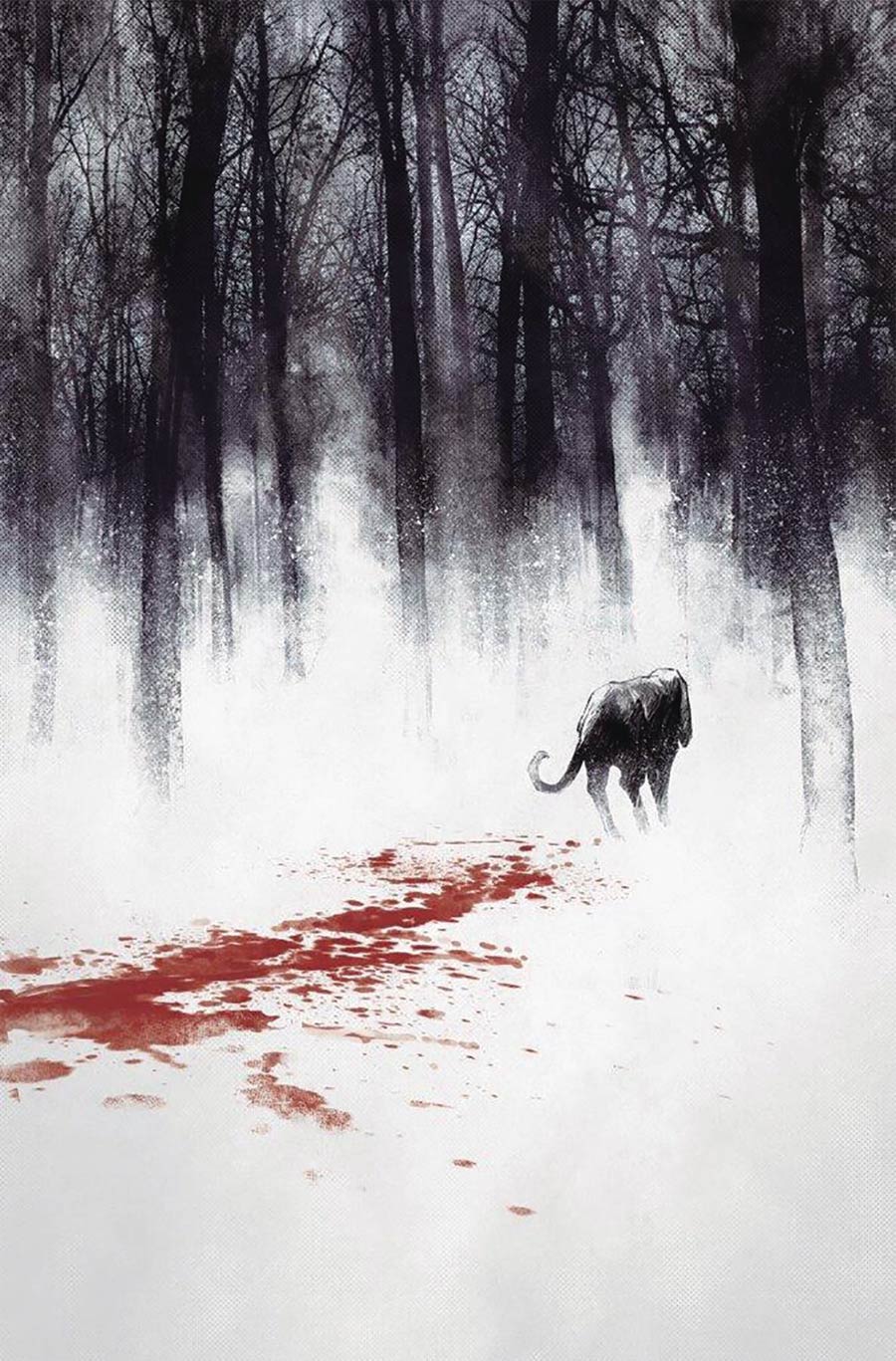
Animosity #14, by Rafael de Latorre. (AfterShock Comics)
BD: So Sandor the hound follows a trail of blood – stop me if you’ve heard this one before. Rafael de Latorre’s cover to Animosity #14 depicts a singular journey towards impending doom like no other. The red, black and white combo is one often used for high-impact, especially when showcasing extreme violence. But de Latorre uses it to highlight the convergence of a shift in tides. Life on Earth has been little more than bloodstain lately for Animosity’s crew. Behind Sandor, de Latorre shows the sanguine path of those who have fought before him. Ahead of him lies the dark, murky, tangled future. But his line of sight is whited out – a tunnel vision that comes partially from shellshock and partially from being blinded by your mission. It’s a cover that sticks with you all day.

Super Sons #16 by Jorge Jimenez & Alejandro Sánchez. (DC Comics)
JJ: Jorge Jimenez and Alejandro Sánchez’s cover to Super Sons #16 is a riddle to which we now know the answer. But when the February solicits hit earlier this year and it certainly looked like Super Sons was coming to an end, this cover — striking, iconic, characteristic though it might have been — came as cold comfort. “The end?” the cover dared ask us, as though the artists didn’t already know. Tucked away behind two heroes who have become nearly as recognizable as their respective poppas, a question. “The end,” a query with its own question mark drawing the eye upward towards an all but certain future. A visual ellipsis that promised to end with a punch in the gut.
With this week’s release of August’s solicitations comes catharsis. Super Sons, one of DC’s consistently great superhero series, will return. Now I get to enjoy this stunner of a cover in a different context. Instead of Damian Wayne bidding Jonathan Kent a fond farewell, his respectful salute instead becomes a tribute to a fight well fought, a demonstration of respect forged between two children who are fated to one day become legends themselves.
Now we know that “The end?” was just a ruse. Jorge and Alejandro were having a bit of fun with us. We just didn’t know it yet.

Black Panther #1 by Stanley “Artgerm” Lau. (Marvel Comics)
JamiJ: Marvel Studios’ Black Panther might have introduced Shuri to the world, but she has been roaring in the comics for years. She’s been Black Panther without the powers, she’s steered Wakanda through tough times, and most recently she has wandered the land of the dead, gaining new powers and insight. The Shuri on the cover of Black Panther #1 is the future of the bright star we saw on the silver screen this year.
Stanley “Artgerm” Lau presents Shuri as she is now, a competent and strong leader, with a hint to her powers of Animorphism, a recent development. “Artgerm” has found a way to keep her beautiful while conveying that she is more than a pretty face. Her jewelry gleams, her skin glows, and she stares into the future proud and confident. Artgerm also manages to give the whole piece a sense of movement, as if Shuri stands ready to throw herself into battle for what she loves. Warm tones provide heat to the piece, so much so that you can almost feel a breeze that brings no cool relief.
There is also an ethereal feel to this cover; it’s hard to tell if Shuri is standing in the land of the living or dead. Artgerm leaves that for us to decide.

Batman Beyond #20 by Viktor Kalvachev. (DC Comics)
CH: The gritty style of war comics strikes me as a natural fit for artist Viktor Kalvachev. His work often gives the impression that the protagonists, antagonists, and collateral damage crews have all wallowed in the dirt a bit before posing. His pencil and pen exhibit a consummate combat artist’s sensibility, and his charcoal and graphite manner of shading enhances that ‘caught on the fly, detail added later’ sketch quality. Not everyone could make that function for a superhero comic set in the bright and shiny future.
But given that his cover is for Batman Beyond #20, and that the future of Gotham City is still more epitomized with shadow than shine, his work lends a grim and grounded realism. The Bat-Sigil is splashed in the crimson of Jokerz blood, providing a balancing nucleus for the composition. It affirms that eras may change, but the need for Batman remains a constant.
Don’t forget to share your favorite covers from this week in the comments section below. Best response wins a pack of DoomRocket stickers!


