
By Molly Jane Kremer, Clyde Hall, Mickey Rivera, and Jarrod Jones. Undercover is our opportunity to lovingly gaze upon gorgeous works from magnificent artists. From James Stokoe’s ‘Akira’-esque variant to ‘2021’ to Fiona Staples’ leisurely cover to ‘Saga’, here’s what we’re loving this week.

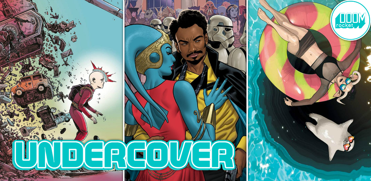
2021: Lost Children #1 by James Stokoe. (Statix Press)
MR: This young savior, bedecked in sadness and frailty, is all mind, but in that mind is the power to lift cars, trucks, and grown men screaming into the air. The meek but inwardly powerful child is a trope as old as the X-Men (and probably older), but it speaks volumes about what we expect from the younger generation: a way out of the mess we created.
This cover’s artist, James Stokoe, has worked on stuff like Godzilla: The Half-Century War and Secret Wars: Battleworld. He is the man to hire when you need creative scenes of wanton destruction and carnage. A big part of artfully rendering chaos, as Stokoe knows, is effectively balancing it. In this case, the violence is brushed behind the leading figure, who appears to be levitating forward with steadfast but weary determination. The carnage is afterthought, collateral damage in a fight against a much bigger enemy on whom our hero’s eyes are immovably set.
2021: Lost Children, a sci-fi comic by French writer Stéphane Betbeder and artist Stéphane Bervas, is about four psychically-abled kids who have to save the city of Detroit from the clutches of a madman. The young heroes age at an accelerated pace every time they use their abilities, which explains the sadness beaming from this young person’s face. Instead of going to school and watching cartoons and playing video games with their friends, they have to go out into the city and break shit all day just to save our sorry asses from ourselves.

Barrier #5 by Marcos Martín & Muntsa Vicente. (Image Comics)
CH: Recently I loved on the Barrier series and Image for bringing the digital comic to print, so it feels right to specifically praise artists Marcos Martín and Muntsa Vicente for the cover of its final issue. Their interior work, all in the landscape format, enriched the narrative with complex panel layouts utilizing that design, emotion-evoking character nuances, and an innovative presentation that layered additional significance to the story in ways I’ve never experienced. By contrast, their covers for the series have been austere, detailed yet fundamental in their approach.
Barrier #5 continues that basic thread, a complex starfield and a view of our world with geographical details of the land and the seas visible. Yet the view of Earth is askew and inverted from the usual perspective; north is south, south is north. It’s as brilliantly discomfiting as much as the interior story, and a barrier in its own right. The Barrier logo shatters in the light of the sun’s corona, overcome by illumination. Just like the protagonist’s experiences inside the book bestow understanding that lessens their barriers. The discomfort of both remains implicit, brightness of the halo difficult to gaze into directly.
By design, covers are intended to attract buyer’s attention and compel them to investigate the issue. But the sophistication of Martín and Vicente’s work exceeds mere marketing convention, gambling on intuitive elements to beguile their audience with something they may not initially place their collective finger on. That’s unflinching ingenuity.

Saga #52, by Fiona Staples. (Image Comics)
MJ: Memorial Day is behind us, it’s almost June, and (especially here in Chicago) summer feels like it’s already in full swing. This month’s Saga cover makes it seem all the more essential to grab a bathing suit, a pair of sunglasses, and head for the pool.
As always, Fiona Staples’ layout is stellar and her color choices gorgeous. The gleaming aqua-blue of the pool complements the candy-swirl colors of Petrichor’s inner tube, which in turn contrasts with her black-mesh goth-as-heck bikini. Staples is the sort of artist to know both what sort of bathing suit a character would wear, what they should wear, and to make it very fashionable — not to mention hot. And speaking of the heat, the shining glare of the sun on the waters’ surface almost causes an instinctual squint.
The dark and enormous drain lurking beneath the pool reminds us that in Saga (as in life) everything can’t and won’t be sunny and bright. But at least now when the darkness looms, we have the indelible memory of our fave friendo Ghüs floating in the nude whilst wearing heart-shaped sunnies.

Doomsday Clock #5, by Gary Frank and Brad Anderson. (DC Comics)
JJ: When residents from another universe start horning in on your action, that’s when you absolutely must look your best. For The Joker, the DCU’s resident court jester, his notoriously lethal shtick is no longer a novelty. He’s getting upstaged by two nobodies called Mime and Marionette, a lethal duo with a vaguely clown-ish disposition and a similar propensity for heinous violence. That simply will not do.
The Joker’s role in Doomsday Clock will likely reveal itself a chaotic one, as befits our mirthful malefactor. In this variant cover to the DC event series’ fifth issue, Gary Frank lets us have an unnerving glimpse of a performer getting into character. The Watchmen details are there, as they must — the Veidt compact and lipstick face the reader, logos out — but the character details are what make this image sing.
As he dolls himself up, The Joker’s spindly arms criss-cross; he’s striking a pose, maintaining his vainglorious aesthetic solely for himself. His wild-eyed expression is a sign of both sheer insanity and self-satisfied ardor. Brad Anderson applies splashes of green, purple, orange, red, and white — the tacky ensemble of a legendary villain, yes, but also a stark contrast to the ho-hum doldrums of his environment. This town, Frank & Anderson seem to attest, needs an enema.
I hear music when I look at this. For reasons I think are clear, the scene reminds me of that bit in The Silence of the Lambs when Q Lazzarus made an infamous aural cameo. What would The Joker listen to as he smeared red across his crooked lips? I’d like to think Robert Smith would be cooing in the room somewhere, but in all likelihood, it would probably be some hideous all-kazoo cover of “Yakety Sax”.

Lando: Double Or Nothing #1 by Joe Quinones. (Marvel Comics)
CH: Fresh from seeing Solo: A Star Wars Story over the weekend, the Joe Quinones Lando: Double or Nothing #1 cover rekindles some of the best parts of that cinematic experience. He’s captured the Donald Glover-as-Lando je ne sais quoi better than carbonite with a perfectly impromptu Imperial high society soiree-crash moment. The Calrissian cool quotient is amped by Quinones use of a perfect side-eye expression in regards to Stormtroopers, the elegant Twi’lek escort held in a suave embrace, and one of those custom capes from the Lando Collection concealing his blaster draw.
The atmosphere is charged with dangerous deception and duplicity. Sure, capes hide furtive movements, like the wearer arming himself, but may also provide cover for a Twi’lek pickpocket plying her trade. Meanwhile, the faces of the onlooking crowd include many familiar Star Wars profiles, as do the ships outlined against the starfield above. The Solo prequel was a nice bit of cinematic summer fun. Quinones has beautifully imparted the same essence with this cover.
Don’t forget to share your favorite covers from this week in the comments section below. Best response wins a pack of DoomRocket stickers!


