
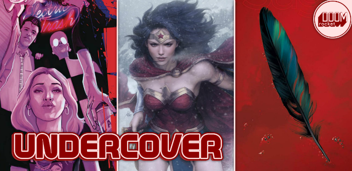
By Molly Jane Kremer, Clyde Hall, Mickey Rivera, Jami Jones and Jarrod Jones. Undercover is our opportunity to lovingly gaze upon gorgeous works from magnificent artists. From Ian Bertram’s variant to ‘The New World’ to Artgerm’s ice-cold ‘Wonder Woman’ cover, here’s what we’re loving this week.
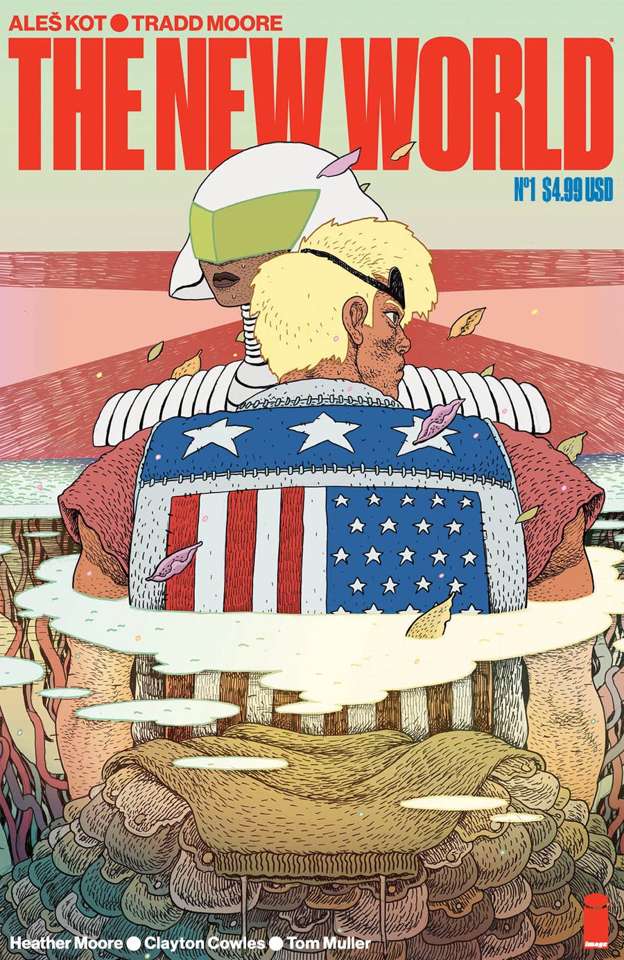
The New World #1 by Ian Bertram. (Image Comics)
MR: The New World #1 rebuilds the United States mainland from the ashes of nuclear devastation and then lets love bloom inside of it. The series’ star-crossed lovers are seen here not embracing, or even looking at each other, but locked in their own distant gaze, peering ahead at their own personal concerns. Cover artist Ian Bertram’s special brand of ornately stippled creepiness blesses every project he touches. His oddly caricatured figures and detailed linework conjures both classic underground comics and storybook illustrations. He’s taken a decidedly symbolic approach here, depicting the lovers wading through an abstract pool of clouds which hide a mysterious pile of satchels. The lovers are wandering in the middle of nowhere, blissfully unaware of how close they are to each other.
Though Bertram usually works in a much darker style, he’s appropriately turned up the color saturation on this one. The brightly colored cartoon style of The New World contrasts with the playfully frantic and anxious cyberpunk future that writer Aleš Kot has dreamed up. Bertram adds to this world his signature style, resulting in this strange but wonderful clarified grittiness.

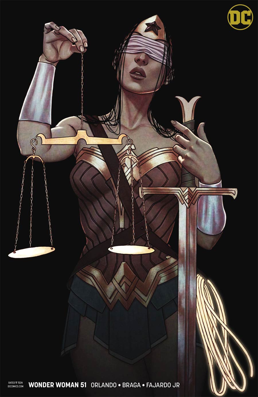
Wonder Woman #51 by Stanley “Artgerm” Lau and Jenny Frison. (DC)
MJ: Jenny Frison’s variants for Wonder Woman are consistently stunning. They’re on my best covers shortlist every week they’re released. So color me surprised when I couldn’t pick a favorite between her variant and the regular cover by Stanley “Artgerm” Lau this week.
Lau again diverges from the pin-up-y style that’s gained him such a huge following within the collector market. He depicts Diana in a power stance, a coiled spring gripping her sword hilt and poised to attack. Her commanding gaze meets the viewer in full as her cape billows regally behind her. The softness of the snow both contrasts and speaks to her harsh surroundings (Diana’s visible breath is also a nice touch), and emphasizes how even the bitter cold has little effect on this Amazonian demi-goddess.
Frison’s variant cover—another stellar full-page use of DC’s near-logoless variant format—sees Diana doing a low-effort, high-impact cosplay of blind justice (not to mention a wonderfully subtle callback to Greg Rucka and Drew Johnson’s “Eyes of the Gorgon” and “Land of the Dead” storyarcs from the mid-aughts, which featuring a blinded Diana). As always, Frison’s effortless use of texture, contrast and color is affecting and remarkable; this particular image brings to mind the palette and passion of baroque master Caravaggio. Frison and her prodigious talents are a literal treasure, and her covers have Diana looking as good as she ever has in her seventy-seven year history.

Multiple Man #2 by Marcos Martin. (Marvel)
CH: In his new series, Jamie Madrox might be a Multi-Universal Man of Mystery after filching a page from the Barry Allen playbook. But with new perspective comes a different set of priorities than his fellow dupes, and since there’s a hint of Peter David’s take on Madrox’s power (that each dupe represents an aspect of Jamie Prime’s personality), this Marcos Martin cover takes a deep and trippy turn.
What would transpire if this mutation manifested you as a duplicate who represented the non-conformist, rebellious nature of your Prime? Might all other doppelgangers be naturally, antithetically opposed to you? You’d be on the run, trying not to get re-absorbed, while working toward goals likely in conflict with your other selves, effectively a majority of one. Scary sci-fi stuff, as evidenced by the rendering of dissenter Madrox’s panicky expression.
Martin’s composed an image encompassing the entire concept as effectively as symbolic shorthand. The uniformity of his like-minded Multiple Men, a patterned wall of unyielding accord, tickles the viewer’s cognitive herd mentality, garnering considerable empathy for the odd-Madrox out. There are enough coinciding plot points in issue #1 to make Martin’s cover of a mutant at war with himselves an unnerving but engaging possibility heading into #2.
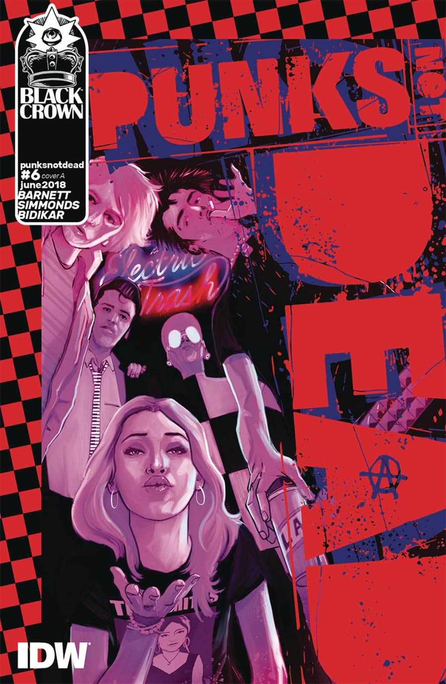

Punks Not Dead #6 by Martin Simmonds and Julian Dassai. (Black Crown/IDW Publishing)
JJ: Goodbyes, even temporary ones, are never easy. Punks Not Dead has reached its first-act finale, but its covers are playing it cool. There are tells here that say David Barnett and Martin Simmonds’ rollicking series is indeed sauntering back to the green room for the time being, but they’re delivered so casually you almost don’t want to make a fuss. In Julian Dassai’s variant, a rocker tips her spiked trucker’s cap in a fond farewell, a sweet violet valentine. Over in Simmonds main cover, we’re given a proper bon voyage in the form of a kiss.
Martin Simmonds unites our motley crew for the standard band shot. The artist gives it scuzz, sets a low dutch angle, makes it monochrome. Very 90s chic. He makes sure everyone’s making eye contact with the camera, something actual musicians are physically unable to do. Which is why this piece is so sweet; there’s Feargal’s best bud Syd, pinching off the last plumes of a spectral cigarette, looking off frame towards what is likely a very bright flashing light. The dude is a rebel, see, flouting convention even when we totally expect him to.
I’ll miss Punks Not Dead, but I know it’s coming back. You can’t keep a dead punk down. For Christ’s sake, it’s in the title.

Saga #54 by Fiona Staples. (Image Comics)
JamiJ: Minimalist covers are tricksy things that are often lackluster, or worse, boring, but when done correctly they can shock and inspire. For Saga #54 Fiona Staples delivers the latter with elegance.
A singular feather on a field of red at first glance seems empty. But even lingering on the image for a moment changes that impression. The surrounding crimson is no simple backdrop; variations in shade give depth and a weight to the color. Small bubbles breaking the cardinal surface hint at a fluid thicker than water holding the iridescent feather afloat. The title and credits bleed into the background unobtrusively, trusting that the stark cover will set the tone for the issue and make our eyes look closer.
There is an ominous note when you realize what you are looking at. It’s an uncomfortable cover for a beloved book that always manages to evoke a visceral response, daring fans to open the book and explore the contents—and, this month, a heart-wrenching surprise.
Don’t forget to share your favorite covers from this week in the comments section below. Best response wins a pack of DoomRocket stickers!


