

By Molly Jane Kremer, Arpad Okay, Clyde Hall, Brendan F. Hodgdon, Mickey Rivera, Jami Jones and Jarrod Jones. Undercover is our opportunity to lovingly gaze upon gorgeous works from magnificent artists. From the dreamlike beauties of ‘The Sandman Universe’ to the thrilling cover gallery for this week’s ‘Fantastic Four’ debut, here’s what we’re loving this week.
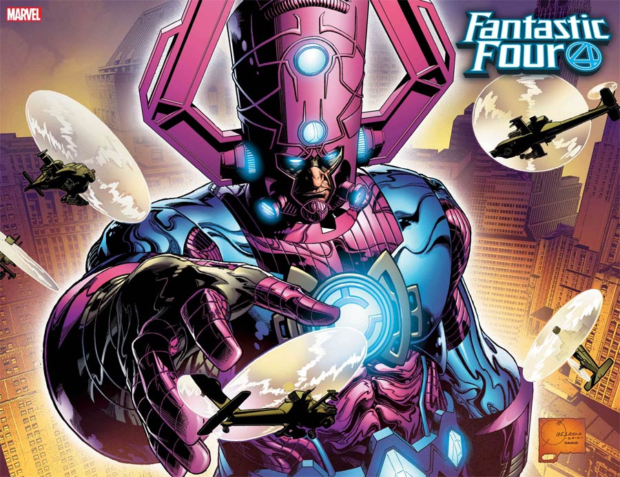
Fantastic Four #1 by Joe Quesada and Richard Isanove. (Marvel)
BFH: It’s only fitting that the triumphant return of the World’s Greatest Comics Magazine should feature one of its greatest characters in some capacity. Who knows how long it will take Dan Slott and company to bring Galactus to bear in their stories, but in the meantime this cover serves as a great tribute to the Fantastic Four’s iconic opponent.
It’s not often that you see Galactus the World-Eater depicted as what you might describe as “an absolute unit” and yet, here we are. Quesada & Isanove’s approach to the greatest cosmic threat in the Marvel Universe gives him an added sense of gravitas to accompany his already-horrifying reputation. Coupled with the usual detached expression and the squadron of helicopters buzzing about, this is a quintessential rendition of Galactus, the kind that will probably end up in a Marvel encyclopedia entry someday.

The Sandman Universe #1 by P. Craig Russell. (DC Vertigo)
MR: Clarity, not realism. P. Craig Russell’s illustration for the cover of The Sandman Universe #1 depicts the unreal with clear, musical lines, building an ephemeral solidity out of empty space. You don’t doubt that what you’re seeing is there, only that it’s possible. If it’s a dream you’ve never had one like it, with edges as sharp as the moon or the horizon.
There’s a flow, a pulse, a skating rhythm underlying this cover that you feel before you see: Daniel’s cascading robe; the tree bark rippling up through a noisy foam of leaves; the stairs that radiate like purple light beams from the side; blossoms that spread in a soft tessellated fractal over the bushes. The whole thing seems to be drawn on water, easily splashed away with a hand, easily broken by a light rain. Russell captures the energy of a fleeting fantasy and holds it there with ink and light.

Fantastic Four #1 by Art Adams and Peter Stiegerwald. (Marvel)
MJ: Fantastic Four #1 is one of Marvel’s most hyped relaunches of the year. But when you’re bringing back the actual World’s Greatest Comic Magazine, the hype has to be huge. There are twenty-eight variant covers for this comic—and they’re all magnificent, let’s be honest—but the Art Adams wraparound variant might be one of the best.
Originally penciled and inked as a private commission last year (and posted by his wife Joyce Chin soon after), the piece was a thoroughly expansive recreation of Kirby’s Fantastic Four #100. Yet, calling it a mere recreation won’t do it justice. It’s a proliferation of what the original scene depicted with four times the scope and breadth, including pretty much every Fantastic Four friend or foe you could possibly think of.
The original piece rightfully impressed Marvel, but to put it on a cover and give all that detail its full due, it had to be split up. So the upper half of the original piece is a wraparound variant for issue #1, and the lower half a wraparound for #2. And since being made an official Marvel Comics cover, the piece now features the beautiful, bold colors of Peter Stiegerwald, his varied tones giving it the proper cosmic scale.

The Sandman Universe #1 by David Mack. (DC Vertigo)
JamiJ: DC Vertigo is celebrating the thirtieth anniversary of the original run of Sandman by introducing a new Dream-infused line curated by Neil Gaiman. Composed of four upcoming titles and all emanating from this debut issue, The Sandman Universe #1, our return to the Jungian reality comes with multiple variant covers by accomplished artists translating their visions of the Dreaming into masterpieces of shared escapism.
David Mack’s variant ebbs, flows, rises and falls onto paper. His Sandman emerges from the Dreaming, a form of inks and washes, framed by an expertly placed mixed media mosaic. Frames act as windows into anonymous dreams, reminders that Sandman is not just an omnipotent Endless, he protects every dreamer in his realm—including you.


Fantastic Four #1 by Stanley “Artgerm” Lau. (Marvel)
JJ: When you’re a part of the relaunch to a classic superhero series, it’s vital you get the details right. For Artgerm, it’s another opportunity to stand out.
Four covers that could only belong together. Each a magnificent portrait of a classic superhero, an astute representation of its respective character. Set side-by-side-by-side-by-side, my tear ducts get put to work. There’s Reed Richards, dad to Franklin and Valeria, with a little more gray at his temples. There’s a new beard to scratch while he computes the boundaries of space, time, beyond. Reed’s intellectual cunning hasn’t lessened, nor, it seems, his ego; not even Eel O’Brian would dare attempt the “arms crossed and fists at the hips” power stance. Only he who defied Galactus would dare.
Then there’s Ben. Looks like he’d prefer you used “Mr. Grimm.” The Thing is primed to clobber in dramatic lighting, shadows obscuring his baby-blue eyes. Next is Sue, striking a pose that screams “the future” as she disappears before our very eyes. Artgerm imbues the Invisible Woman with the poise of Diana Rigg, confidence and power radiating from her steely gaze. And let’s not forget about Johnny.
Johnny, who never lost faith that his sister and brother-in-law, his niece and nephew, his family, were out there somewhere. Johnny, who lives between sunbursts, who wields supernovae like flipping a coin. Here his flame is on, his passions burning in the night sky. United once more with his people, Johnny burns brighter than ever. Play it cool, hotshot.
Look what Artgerm did. In crafting Smithsonian-level portraits of Marvel’s First Family, he gave us a new Masterwork.
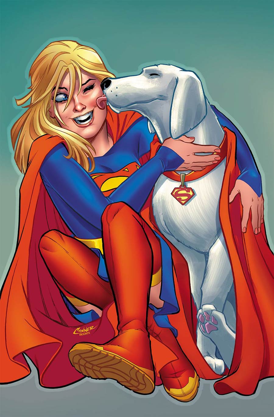
Supergirl #21 by Amanda Conner and Paul Mounts. (DC)
CH: Welcome to a turning point in the Supergirl title, with issue #21 launching the new creative team of writer Marc Andreyko and artist Kevin Maguire. There’s also a return to a past Supergirl trope: varying uniforms for the Girl of Steel, as she embarks on a journey far from the confines of Earth and into the spaceways. While the new togs aren’t submitted by fans as in past series, there was still fandom clamor when one of Kara’s new looks graced the previewed cover for #21. That hoodie fashion statement may not have been every reader’s cuppa, but it’s still fun to browse the Krypton Collection for 2018 to see a Super Family character no less an icon in her own right getting a makeover. And while the regular cover by Rachel and Terry Dodson introduced one new uniform in a bold splash of action, there’s also a lot of fun to love in this variant by Amanda Conner and Paul Mounts.
A girl and her super-dog sharing one of those Parent/Furbaby moments is a pleasant counterbalance to all that The Man of Steel pathos, and with Kara searching for information on primary black hat Rogol Zaar, I’ll take the chuckles when offered. Conner cites artist Wendy Pini of Elfquest fame as one of her formative influences, and the canine aspect here echoes the saga of those cool Wolfriders. Krypto’s one-paw-up sitting posture is the same exhibited by my own dog and he also shares the Lick of Superspeed power inherent to all pups, Terran or alien. Kara’s expression is no less sublime, like a red sunbeam of delight washing over the tender tableau.
It’s been said that Conner is especially partial to Mounts coloring her work, and this cover shows why. He’s wrapped it in a buoyant brightness that almost makes Kara and Krypto bounce to the tempo of a happy tail wag. Maguire is known for his mastery of facial expression, and I hope he takes Conner’s example to heart for his interiors, allowing Supergirl some smiles amidst the poignance.

Black Badge #1 by John Paul Leon. (BOOM! Studios)
AOK: What I admire about the illustration colossus that is John Paul Leon is his style has remained recognizable but also grown with time. Recent work by Leon has embraced the art of creation, and the process becomes a part of his work as texture. This Black Badge variant is a stellar example of the power in letting the mark of the brush remain in the picture. The helicopter, the flare and bearer, even the landscape embody Leon’s signature dance between high-relief inks and delicate details, but the boys who dominate the cover redefine his take on minimal marks to maximum effect. A hairline, a brow, the edge of a bow, spots here and there are retouched for definition, but large swatches of should-be-black crumble into the grain of the blank page.
Yet they don’t. The David Mack-ish multimedia touch is amplified by the sunset colors Leon plays with rather than a contrast in monochrome. The wash from violet to copper to gold takes the scouts along with it, face, sash, bolo and badge giving form to what should be the crepuscular abstract. There’s a sophistication to the process that immediately communicates to the audience that this isn’t a Wes Anderson troop adventure, but something that will fall closer to Lord of the Flies.
Don’t forget to share your favorite covers from this week in the comments section below. Best response wins a pack of DoomRocket stickers!


