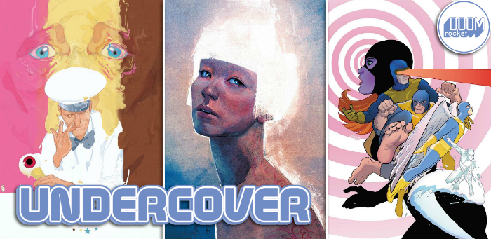
By Molly Jane Kremer, Clyde Hall, Mickey Rivera and Jarrod Jones. Undercover is our opportunity to lovingly gaze upon gorgeous works from magnificent artists. From Alex Maleev’s ‘Pearl’ to Joshua Middleton’s ‘Aquaman’, here’s what we’re loving this week.
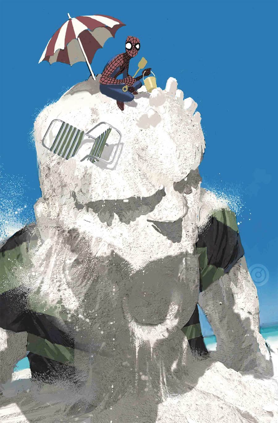
Peter Parker: The Spectacular Spider-Man #308 by Chris Bachalo. (Marvel)
CH: Chris Bachalo has said his career goal was to be a carpenter until it became apparent he suffered severe dust allergies. Woodworking’s loss was comicdom’s gain, and Bachalo’s detailed work in the medium leads one to ponder the sort of intricate carvings he might have done with curly maple, walnut, and sycamore. Other times, he just makes us grin. That’s the case with this week’s cover for Peter Parker: The Spectacular Spider-Man #308.
Under the often-comedic mastery of Steve Ditko, puny Parker could easily have subbed for Mac in that era’s most prevalent Charles Atlas comic ad. You know the one. Mac and his best girl having a leisurely day at the beach until a bully kicks sand in their faces and ridicules the 97 lb. weakling before Mac seeks the tutelage of Atlas, bulks up, and feeds Mr. Personality a fistful of knuckles. Fast forward to 2018 and Bachalo’s Pete is still pretty lanky, but thanks to Miracle Compound RSV (Radioactive Spider Venom), he can handle the sand-kickers of the world. Except maybe Billy Baker, who takes a dim view of Spidey making sandcastles out of his finely granular scalp.
At first, the art seems cartoonish. Simple beach standard bucket and shovel, minimalist uniform work down to a classic mix of animated mask expression sandwiched somewhere between Bug-Eyed Surprise, and Wonky Side Eye for the Spider-Guy. But take a closer look at the sandscape itself. Bachalo’s captured the shifting of Sandman’s form from powdery to grainy to gritty with such attention to aspect that it seems more photograph than rendering. It’s a comedic cover, yes, but given the powers of an adversarial Sandman, it’s also a fascinating, nightmarish display of potential destruction within an idyllic white dune wrapper.
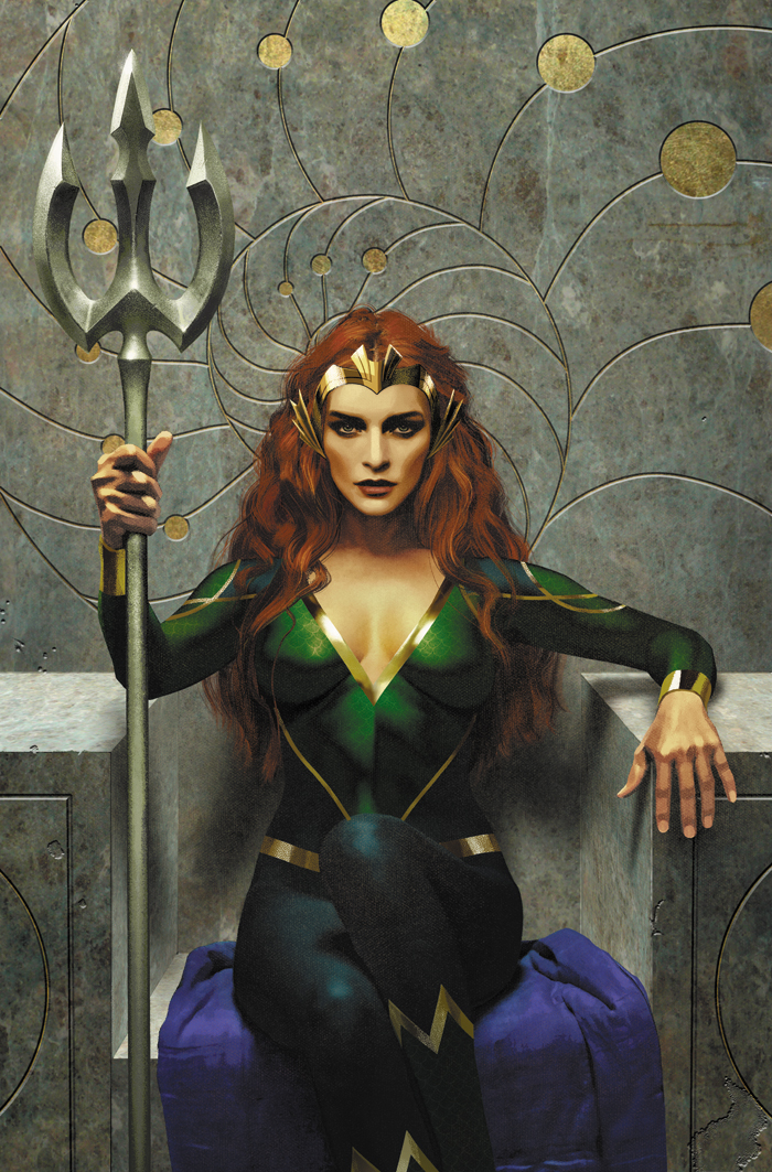
Aquaman #39 by Joshua Middleton. (DC)
MJ: I write about Joshua Middleton’s covers a lot. And while he shifts gears artistically from sketchy to painterly and everywhere in between, this week he’s gone for a style we haven’t really seen from him: photorealistism. In both his variant covers for Batgirl #25 and this masterpiece for Aquaman #39, the change in style would be almost startling—if it wasn’t still so got-dang pretty.
There’s a distinctive look to Middleton’s Mera here, maybe a little Elizabeth-era Cate Blanchett in the rise of cheekbones and swell of lips. The detail in his rendering of hair again stands out, the thickness of her red locks apparent in the tousled middle-part, it’s beachy waves. Few artists bother to capture how hair really looks—but Middleton does, with great care. He communicates a confidence in Mera’s hooded stare as she’s seated on the throne, an intricate nautilus shell design spiraling behind her head like a halo. One leg is slightly curled upon the other, as she gets comfortable on what must be a cold yet royal seat of stone masonry.
Joshua Middleton is a stylistic chameleon, constantly proving he can pull off any and all new techniques and designs with aplomb. I can’t wait to see what he tries next.
Ice Cream Man #6 by Christian Ward. (Image Comics)
MR: Christian Ward makes Neapolitan seem suffocating, sludgy. It has weight and thickness, like a fleshy mass that’s gone viscous. Being otherworldly, this cream is possessed. Its occupant can be seen staring out at us with desperate, terrified blue eyes. No matter how delicious he may taste outwardly, he is clearly not having fun in there. Christian Ward has melted him into tricolor agony.
The cover to Ice Cream Man #6 is as classy as it is campy. You could probably draw one of those Fibonacci spirals over it, with the golden ratio arc flying over those baby blue eyes, spinning up through the single scoop of eyeball, then falling in circles into the Ice Cream Man’s tight-lipped and sleazy grin. I commend Ward for depicting this comic’s arch-villain as the creepy old sweets peddler we all feared as children.
Pearl #1 by Alex Maleev. (DC)
JJ: Alex Maleev went and outdid himself for his variant cover to Pearl #1. Least he could do for a friend, Brian Michael Bendis, whose first DC-published Jinxworld debut drops this week. It’s an on-brand primer for Maleev’s Scarlet, out later this month. It’s also an expertly realized portrait. A study in phosphorescence.
Maleev presents the subject as a sculpt, hard edges, surfaces rubbed raw. He frames her diagonally, bars of melancholy caught in corners that are worlds apart. And that blue? It’s echoed in Pearl’s eyes, but look closer. There’s a glint of fury there. Defiance. It draws you in. Between those swathes of blue, a cloud, reflecting the sunlight radiating from that inverted Louise Brooks bob. It makes me squint as it catches the light. Catches fire, more like. As red lines dance across her back, her expression narrows. Contemplating… what? Fight? Flight? Violence. Someone will likely bleed tonight. And it will be exquisite.
Extermination #1 by Amanda Conner & Paul Mounts. (Marvel)
CH: Amanda Conner’s covers have made this a better summer. Across the Big Two, she’s consistently delivered giddy and gleefully charming work. It’s secured her a permanent place on my radar as a standard by which other ‘fun’ covers should be assessed. This week, her collaboration with colorist Paul Mounts for the variant of Extermination #1 trades a happy-go-lucky vibe for one of classic nostalgia. With a book so entitled, and given the dire nature of the regular cover, this fresh look at the classic X-team is appropriate. Even necessary.
The solicits claim that these gifted teens, initially united by Professor Charles Xavier and the very foundation for all the X-adventures since, find themselves skipping through time, marked for assassination, and holding the future of all mutantkind in their uncertain, youthful hands. It’s fitting to view them as they once were: The New Kids on the Superheroic Block. Conner’s basic and original uniform renditions of Marvel Girl, Cyclops, Beast, Angel, and Iceman lend them classic elegance while capturing each personality in flawless, artful amber.
Mounts’ color scheme and inky background (with each subsequent X-Man more lightly hued until the pristinely monochromed Bobby Drake) lends a dreamlike quality to the piece. Together, these artists have effectively seized an X-Memory and placed it under glass, preserved no matter what may befall these courageous mutants within the pages of this series. It grants longtime fans a sense of comfort, solace in the face of all these characters have overcome, and it serves as a salute to the heroic spirit they carried even when they were fresh-faced, unproven kids.
Don’t forget to share your favorite covers from this week in the comments section below. Best response wins a pack of DoomRocket stickers!

