
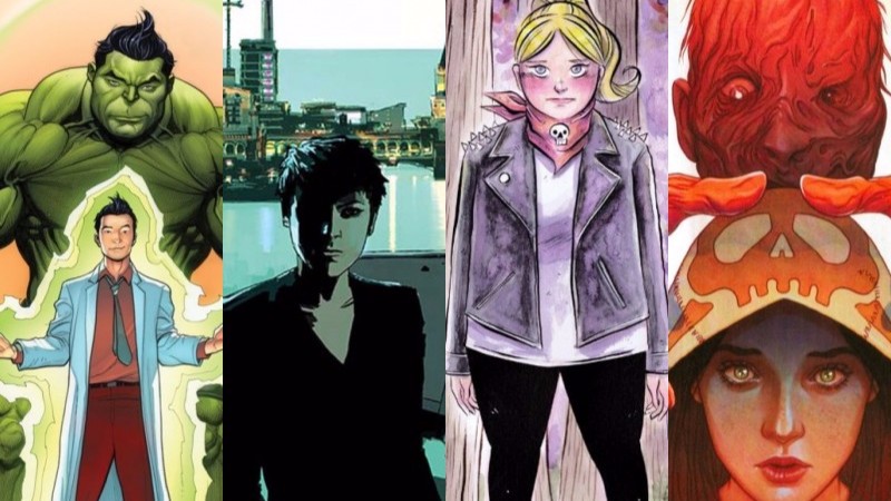
By Scott Southard, Arpad Okay, Brandy Dykhuizen, and Jarrod Jones. Our Week In Review collects our thoughts on the comics that demand attention. Do you have a deep-rooted desire to know what we think about all your favorite books? Well. This is where you need to be.
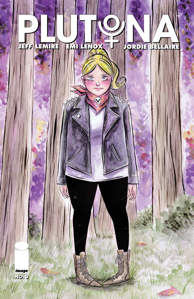 Plutona #3
Image Comics/$2.99
Story by Jeff Lemire & Emi Lenox.
Art by Emi Lenox.
BD: As far as coming-of-age stories go, finding a dead body in the woods surrounded by a touch of the supernatural is something usually relegated to a Stephen King sandlot, but Jeff Lemire has written a fantastic story about choices, peer-pressure and the speedbumps of learning how to navigate extrafamilial trust in Plutona #3.
For a comic where the eponymous hero dies more or less right off the bat, Plutona remains strikingly poignant: as seen through the eyes of middle-schoolers, our fallen guardian alternately inspires fear for what’s to come, and the fear that comes with understanding certain truths. Secrets from parents, secrets kept from friends, and the specter that one day the true colors of people we’ve come to trust, the fear that all will be revealed, is brought home more viscerally when we experience it alongside these kids.
As this group is faced with crisis, Plutona carefully digs into the nature of adolescence: the tough kids are naturally those who’d push for adult intervention, while the proverbial mama’s boy finds the allure of superhero blood too strong to pass up. After a mourning period, it’s the capespotting nerd who does ghastly things in the hopes that the results could turn him into someone far greater than himself, maybe even far more powerful than those who continue to bully him.
Through flashbacks and dialogue we may soon learn why the White Wasp wanted Plutona dead, but her legacy will inevitably lie in the conflicts between the children who discovered her body in the woods, or at least moreso than in literal battles in city streets. In mostly muted earth tones and sunset hues, Jordie Bellaire’s colors lend a retro feel to Emi Lenox’s deceptively straight-forward art. In what appears at first glance to be something stylistically similar to comics your parents picked up at the 5-and-dime, Lenox subtly depicts the less-than savory (but all-too realistic) aspects of home life for a rag-tag gang of kids, not to mention their heroes who covertly struggle to make ends meet at home. It’s hard not to love a collection of characters that includes a double-shift-working superhero single mom, a pre-teen boy with an abusive alcoholic father, and a doe-eyed blonde who attempts to keep her baby fat covered under a homemade studded jacket.
In the final panels, we see Plutona’s daughter witness her mother’s final battle. We do not yet know if she was privy to her mother’s actual death, or if she will choose to stand by her precocious advice (that to kill the White Wasp would make Plutona no better than her adversary), or if she’ll choose instead to avenge her mother’s death. It’s likely that everyone involved in Plutona will face more crisis in the immediate future, forced to make decisions far beyond their tender years.
7 out of 10
 Totally Awesome Hulk #1
Marvel Comics/$4.99
Written by Greg Pak.
Art by Frank Cho; colors by Sonia Oback.
JJ: Children have been born, raised to adulthood, made their own families, and have been ignored by their grandchildren in the time since Bruce Banner first flexed a gamma-irradiated bicep in The Incredible Hulk. And there have been some fantastic and exciting tales that have come from his tenure as Marvel’s Jade Giant. But maaan. For the most part? Banner’s been one mopey sonuvabitch.
More often, sagas about ol’ Purple Pants have concerned themselves with Banner’s Neverending Battle to contain the monster within. While there is certainly fertile soil there from which to grow stirring melodrama, that psychological turmoil has always — always — conflicted with what most everyone wants to see in a Hulk story: all of the smashing. So it goes without saying that Marvel’s All-New, All-Different initiative better bring something new to stands other than the age-old “Why me? Uh-oh. SMASH!“. Enter: Amadeus Cho.
With Totally Awesome Hulk #1, Amadeus Cho is the Hulk this All-New hullabaloo desperately needs. He’s refreshingly pumped about his new station in life (it appears that it’s probably his idea anyway), shifting from his more approachable frame to his no-ladder-needin’ green phase with nary a solemn caption of doom. This is a Hulk that lets his smashing do the talking for him: Cho has his inner monster (and the inner-demons that come with it) on lockdown, or at least it seems that way. There are glimmers of gamma-radiated rage simmering just under Amadeus’ cocky smirk, but he’s holding it down for the most part. Now if series creators Frank Cho and Greg Pak can put a lid on his numbskull horndoggery, this book might just plow through to the annals of Marvel greatness.
Greg Pak, one of two reasons why Action Comics remains one of the best DC Comics books out there, injects just enough heroism into Totally Awesome Hulk to make Amadeus a semi-likeable character. And artist Frank Cho’s muscular imagery is a perfect fit for a book like this. But their nineteen year-old supergenius better learn to respect the presence of women, toot-sweet: Here, he’s macking on a beleaguered beach babysitter, putting the moves on the issue’s big bad, and despicably balking at the mere suggestion that he was hitting on Banner’s cousin, She-Hulk. (“Dude, she’s, like, forty” was the line that made me toss the comic halfway across the room. “The fuck –?!” was then heard throughout DoomRocket HQ.) Frank Cho is a notorious instigator in the comics’ industry — our own personal Woody Woodpecker — but Greg Pak ought to know better. There are an infinite number of ways to characterize a heterosexual teenager superhero than depicting him only barely fighting the urge to hump the legs of every female he comes across.
Totally Awesome Hulk has the potential to be a top-tier Marvel title. Considering Pak & Cho are working with a marquee name, it’s only fitting that the subject matter found inside match our expectations. We want our totally awesome Hulk to be totally bombastic, totally cool, and above all else, totally not a damn chump.
6.5 out of 10
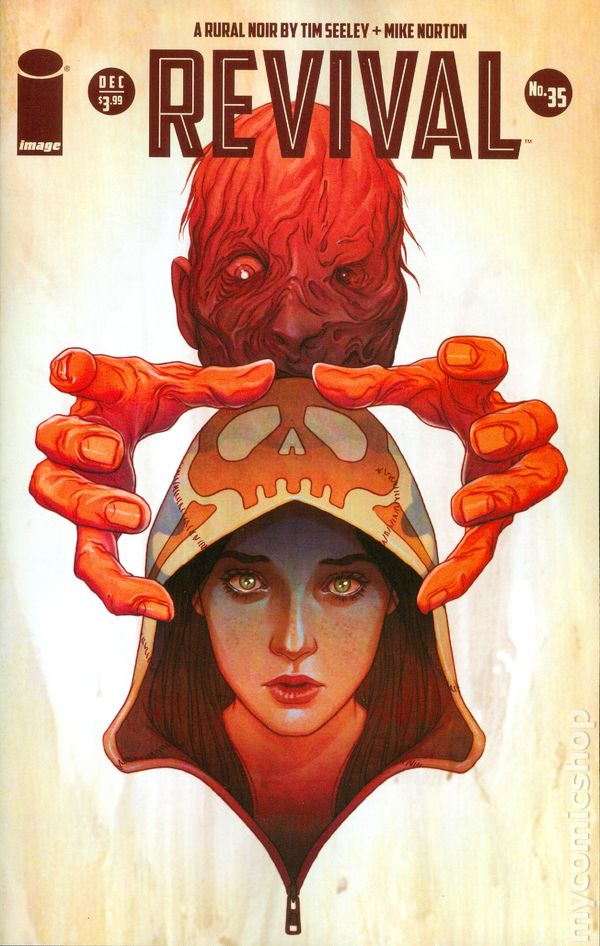 Revival #35
Image Comics/ $3.99
Written by Tim Seeley.
Art by Mike Norton; colors by Mark Englert.
AOK: Revival is at a turning point in the series. The situation Officer Dana Cypress once tried to control, a quiet epidemic of the dead coming back to life in her small Midwest town, has become a decidedly Federal affair. Autonomous undead people are kept in isolated lockdown, and the government is handling the secret invasion on home soil the best they can. Despite these paranormal times, what with all the walking corpses and demon spirits running amok, the biggest challenge for Dana comes in the form of a personal choice to stand by her family.
Tim Seeley’s story is horror by way of fantasy. Not just the return of the dead, or even the return of governance by the sword. Magic is recognized as a real part of the world. So Dana Cypress is pushing the envelope, not just by accepting that the dead walk the Earth, but by exploring the freshly exposed beyond that lies before her. Her sister Emma is one of the living undead under quarantine. What would you do if someone you loved was locked away from you in prison? Dana turns to a power greater than the laws of man: magic.
But the magical third to the weird sisters is the burned man. A classic monster, and what a concept: To plunge into fire, to die and to live on, that is the definition of Hell. Mike Norton’s art lets you look him right in his one good eye. It puts you in Dana’s mouth and under her fingernails. It’s flat and visceral, like those DC books of “Sophisticated Suspense” that broke the Comics Code and lead to the creation of Vertigo. Revival is modernized version of that — a blend of classic movie scares with contemporary horror’s grisly intensity.
Norton’s character design is absolutely top notch. The Cypress sisters have those tiny details that speak volumes, like Emma’s rag doll smile or Dana’s awesome bones and wings hoodie (very 90s but I would still wear it). It isn’t just the stars who are compelling, even the supporting characters are distinct, which in turn lends credibility to Seeley’s world. There is a utilitarian simplicity to the horror of the burned man that plays to the strength of comics. His voice in my head is perfect. It is inhumanly charred. And watching him digging a hole in the earth, I become so glad for comics, where you get to both see and imagine… the best of both worlds.
7 out of 10
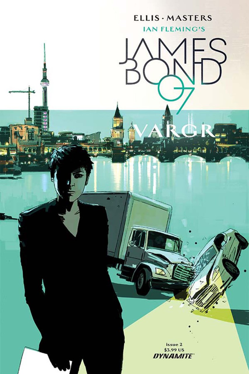 James Bond #2
Dynamite/$3.99
Written by Warren Ellis.
Art by Jason Masters; colors by Guy Major.
SS: The second best James Bond property of the year (hey, I loved Spectre, okay?) is moving along. The series (helmed by four men with the most James Bond names) continues into its second chapter at a pace worthy of a true Fleming story. A competent follow up to a stellar first issue, issue #2 fulfills its role as a setup piece for the rest of the series. I just wish that setup was more interesting.
There’s always a lull in Bond stories after the explosive introduction. Once the opening credit sequence ends, there’s an unavoidable dialogue dump that functions as narration, setting, and setup. Yes, exposition is needed to lay out the foundational circumstances of espionage and intrigue that prop up the rest of the action, but holy Hell is it boring. Even so, you have to hand it to Ellis: he’s telling a James Bond story, through and through.
James’ constant self-indulgence certainly makes him more human, but — as it typically is with the films — it becomes far too distracting before long. It seems in every panel he’s attempting violence, intoxication, or sex. While it’s refreshing to see him as something less than a Brosnan-esque superhuman, he occasionally comes across as your over-cultured, decadently disposed rich friend. I mean, he’s nice, and you like him enough, but he’s kind of obnoxious to bring around in public and a bit too self-absorbed at social gatherings.
While I love the portrayal of Bond as a slightly more realistic version of Archer, the art feels very much like a set of static images in succession. At times, the lack of fluidity harkens back to the staid sensibilities found in the latter years of the Silver Age, giving the book a very traditionalized feel. At others, however, James Bond #2 lays out a stuttering sequence of images, parsed into one slide after another. The images themselves are realistic and great to look at, but the lack of motion in a series that requires shark-like momentum creates a barrier that’s anti-immersive.
I don’t want to be condemnatory, but James Bond #2 is the part of the movie where you begin to glance at your phone. The first chapter was enrapturing, but the immersion level plummets during the benign disquisition that follows and has no chance of holding your attention. You inevitably come back lost and confused, but happy to see the action begin to roll again. It’s probably a necessary part of the story, but who would know? Here’s hoping the next issue will move past the tiring explanatory drone and get back to insurmountable odds and improbable explosions.
6 out of 10
Agree? Disagree? What books are YOU reading this week? We want to know! Tell us about those feelings of yours in the comments section below.


