
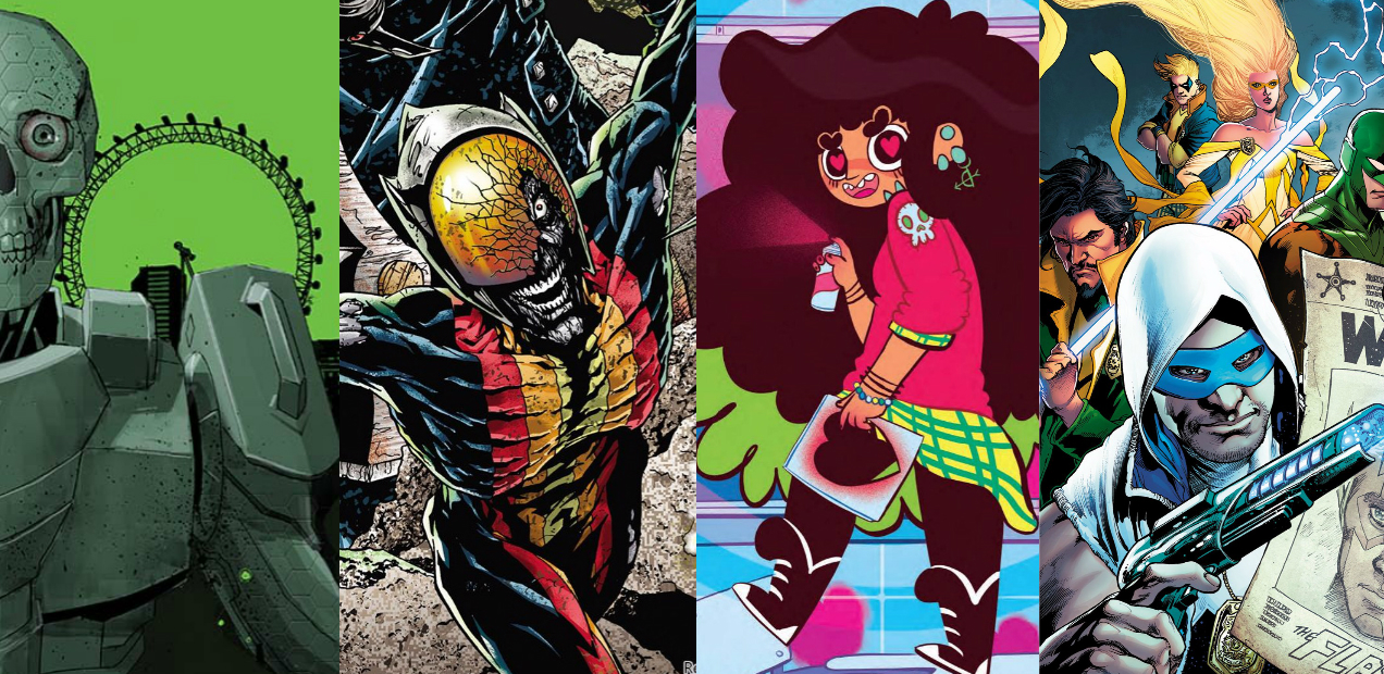

By Molly Jane Kremer, Scott Southard, Stefania Rudd, and Brandy Dykhuizen. Our Week In Review collects our thoughts on the comics that demand attention. Do you have a deep-rooted desire to know what we think about all your favorite books? Well. This is where you need to be.
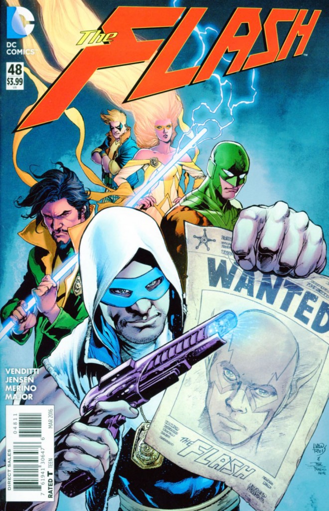 The Flash #48
DC Comics/$3.99
Written by Robert Venditti and Van Jensen.
Art by Jesus Merino, colors by Guy Major.
Letters by Pat Brosseau.
MJ: It’s been awhile since I’ve picked up a (current) comic starring the Scarlet Speedster, which pains me, as he’s one of my favorite superheroes, not to mention the star of one of my favorite TV shows. A change in artist brought this comic back into the realm of readability for me (the previous artist is on a tiny, personally subjective list whose art guarantees my avoidance of a book), and I was genuinely excited to be able to finally read a Flash comic again. Little did I know, the writing is just as good a reason to skip The Flash as the art had ever been.
Jesus Merino’s art is certainly (and unavoidably) a step up from he who came before, and a few pages are objectively exciting and dynamic in their layouts, but nothing can save such a lackluster script. This is a very chatty issue, and as such, The Flash #48 ends up moving at a snail’s pace. The general pacing of the entire issue is sluggish, almost extremely so, and establishes no sense of immediacy. For an issue that has the Rogues teaming up with the cops – and Barry Allen! – to take down The Flash, this should be some riveting stuff, but the small attempts at tension can’t be sustained. Adding insult to injury, only two female characters actually talk within the issue’s twenty story pages: one, a cop, says three words; the other, Iris, appears in two panels with three sentences of dialogue.
Any hankering for more of The Fastest Man Alive can be satisfied by rereading the excellent runs of Waid or Johns, or of Manapul and Buccellato. And of course there’s always the effervescent and excellent CW television series to tide us over until DC’s inevitable house cleaning. Sadly, The Flash’s current comic series is still definitely one to avoid.
5 out of 10
 James Bond #4
Dynamite Comics, $3.99
Written by Warren Ellis.
Art by Jason Masters; colors by Guy Major.
Letters by Simon Bowland.
BD: Warren Ellis and Jason Masters bring us a true-to-form James Bond romp, complete with the lovely Bond-isms you’d expect. From the onset of James Bond #4, 007 encounters a sexy villain with deadly hands (the aptly-named Ms. Reach), and delivers a completely groan-worthy quip on execution-style office killings. (“There’s a terrible joke to be made about getting fired here, but I won’t be the one to make it.”)
As good as those elements decidedly are, other aspects, like his conversation with the home office within earshot of Masters, leaves much to be desired. Here, James sounded more like little Jimmy, trying not to let his mum know where he and his pal plan on drinking Dad’s bottle of whiskey, rather than an agent conveying useful information during a mission snafu. Tension? Drama? Sapped away in all this dryness.
Jason Masters is a great artist – cold and unfeeling even in the most literal sense. I love Masters’ depictions of what’s going on inside the body during a bone-jarring punch to the funny bone, or in previous issues, a bullet ripping through flesh and spine. His depiction of outward motion can be a little muted and unsteady, though, which makes for a couple of awkward fight scenes.
All in all, Bond is always a treat, and Ellis and Masters have produced a solid comic designed to leave us in suspense by the end of each successive issue. This is a fun series for reading on a beach, paired with a Bloody Mary on a Sunday morning (I mean, I’m just guessing). And I definitely will be tuned in next time to see how our hero escapes the next predicament these creators put him through.
6.5 out of 10
 Jonesy #1
Boom! Box/$3.99
Written by Sam Humphries.
Art by Caitlin Rose Boyle; colors by Mickey Quinn.
SR: Valentine’s Day? Ugh. WORST. DAY. EVER. And so begins our introduction to Jonesy, the main character in Sam Humphries and Caitlin Rose Boyle’s new series of the same name. An angsty teen who loves ferrets and anime, Jonesy has a secret power: she can make anyone fall in love with anyone (or anything). Only thing is, sadly, it doesn’t work on herself. Really? C’mon! Or as Jonesy might say, “Jumpin’ Jehosaphat?!”
Many of us have memories of our middle and high school days, and the awkwardness holidays like Valentine’s Day brought with them. Here, Jonesy explains her school’s flower sale tradition and the ridiculousness that comes with decoding the many colors of carnations. Funny thing is, I had the same conversation about with my roommate earlier this week, as we went down awkward teen memory lane. And that is precisely why Humphries’s writing is so on point—it’s relatable for us adults or the teens that will undoubtedly be drawn to this book.
He does a great job contrasting Jonesy’s attitude and emotions against the other kids in her life, specifically her rival and most popular girl in school, Susan. What really makes this book pop is Boyles’ art and Mickey Quinn’s coloring. Each character we encounter has a distinct style, given unique details like accessories, piercings, and hairstyles. I love Jonesy with her giant black hair with green tips, multiple piercings, and bold eyebrows. The writing and art meld together nicely, aided at times with the use of emojis (“smiley poop” and “praying hands” both make an appearance). And yes, the appearance of those emojis could be perceived as a pandering attempt at cultural relevancy. Instead, it richly conveys intent more than actual words can in each situation.
In the first issue of Jonesy, Humphries and Boyle do an excellent job solidly setting up what is to come in the subsequent books. With Jonesy wielding this Cupid-esque power, what exact revenge will she take on the world? Will Susan be a part of her plan? How will she incorporate that adorable ferret, Rocky? Anytime a book leaves me with questions as curious as these, I know I’m hooked. But then, maybe I’ve just fallen under Jonesy’s love spell?
8 out of 10
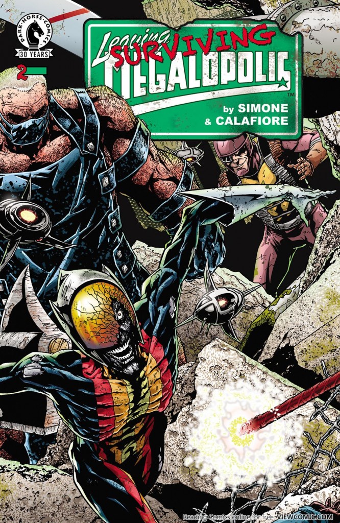 Leaving Megalopolis #2
Dark Horse Comics/$3.99
Written by Gail Simone.
Art by Jim Calafiore; Colors by Jason Wright.
Letters by Dave Sharpe.
SS: There’s a warm feeling that emanates from the pages of Leaving Megalopolis. Like that familiar sense of a snow day spent at home or the reminiscent stretch of road that fills the final miles to your hometown, Gail Simone’s quickly and effectively constructed universe of heroes and villains has that feeling of recognizable comfort, of a world you’ve known your whole life. And yet there remains a fresh sense of rediscovery.
Leaving Megalopolis successfully hits the beats of an action narrative with efficient rigidity (I particularly like the few pages documenting “the team getting back together”). The attentive and devoted reader’s brain knows how these tropes work, so it follows the story as it goes along, recognizing that certain emotions are going to resonate at a higher level than most slapdash superhero comics.
Simone is an icon at this point, and it’s really great to see her go back to the well that made her famous and make it work. The second go at Megalopolis is gaining momentum with the continued charm of its predecessor. The book plays with the dichotomy of constant war, violence and injustice, alongside a very real need for people to continue living their lives. It comes across as one of the most pertinent and biting critiques of modern society that’s on the shelves today. Leaving Megalopolis provides a little comfort to the reader while the tumultuous world around them keeps spinning with peril.
8.5 out of 10
Agree? Disagree? What books are YOU reading this week? We want to know! Tell us about those feelings of yours in the comments section below.


