


By Arpad Okay, Brad Sun, and Jarrod Jones. Undercover is our opportunity to lovingly gaze upon gorgeous works from magnificent artists. This week, we revisit the most striking covers that graced comic book stands in the year 2017.

Mister Miracle #4, by Nick Derington. (DC Comics)
AOK: I was struck by two sets of feels regarding Nick Derington’s fourth cover for Mister Miracle. The first was over his deep understanding of what makes Jack Kirby tick. As I’ve said in the past, Derington grasps iconic Kirby, breaks his influence down into elements, and reconstructs them into modern art that showcases their essence. Beyond the primary colors and odd geometrics, ancient angles in costumes that communicate something more godlike than superhero, in addition to a healthy appreciation for broad-faced women in capes, one of the key points of how Kirby reshaped comic books was the inclusion of depth. The man knew how to move the action out of the panel and into the space in front of you and here, in a cheeky, deceptively simple way, is Derington’s take. Barda’s fist. In your face.
Second is that Derington is just a ding-dang talented artist completely in his own right. His clear lines excite. His quiet compositions fill up the page with the subtle balance brought by the right amount of simplicity. It’s not easy to produce art so large and smooth and have it be so serious and sophisticated. I love Barda’s eyes. Her scales and circles. The black of her hair. Most of all, what this cover communicates. You don’t have to know her to know what she’s all about. Stunning, powerful, and elegant.
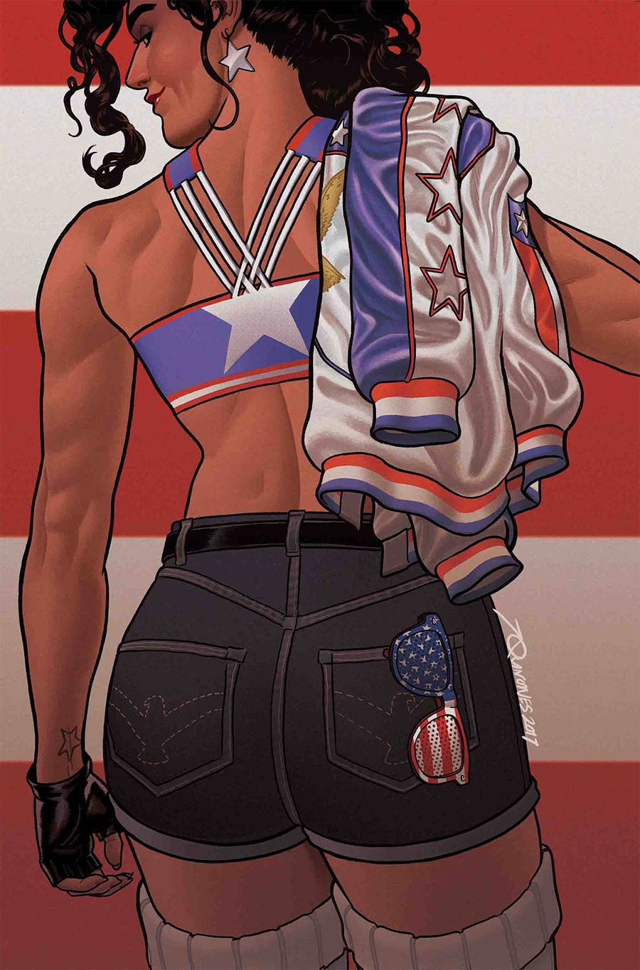
America #7, by Joe Quinones. (Marvel Comics)
JJ: America #7 is Joe Quinones adapting a working-class lament into modern-day commentary. It turns a world-famous political Threnody into a cheeky piece of comic iconography. Think Rosie the Riveter 3.0. Don’t forget: America isn’t just not-from-around-here, she’s literally from a place where “here” is itself a foreign concept. The entire Marvel series is an affirming reminder that there was never one way to become an American. Just show up and try to make it a better place. Through Quinones’ craft, America becomes more than a hero. America Chavez has been immortalized as an icon. The Boss would be proud.

Spiritus #1, by Michael Kennedy. (Vault)
BSun: It’s sometimes easy to forget that all created images (even photographs) are really just arrangements of abstract shape and color that our brains imbue with meaning. Usually, this cerebral decoding happens instantaneously and unconsciously, but when these elements are wielded by a skilled illustrator like Michael Kennedy, the results can be far more complicated and rewarding.
The cover to Spiritus #1, with its bold, swirling shapes of high-contrast hues, dances nimbly on the edge of form and pattern. Kennedy’s constantly overlapping organic blobs create a visual push and pull between coherence and flatness, as the robot’s features ooze seamlessly into the woman’s figure, merging them together in a field of intense indigo and electric aureolin. Though we’ve been trained to perceive this image as two distinct subjects, this dynamic visual tension unites human and machine as one, as if they’re occupying the same space, a single spectacular entity composed of flesh and metal.
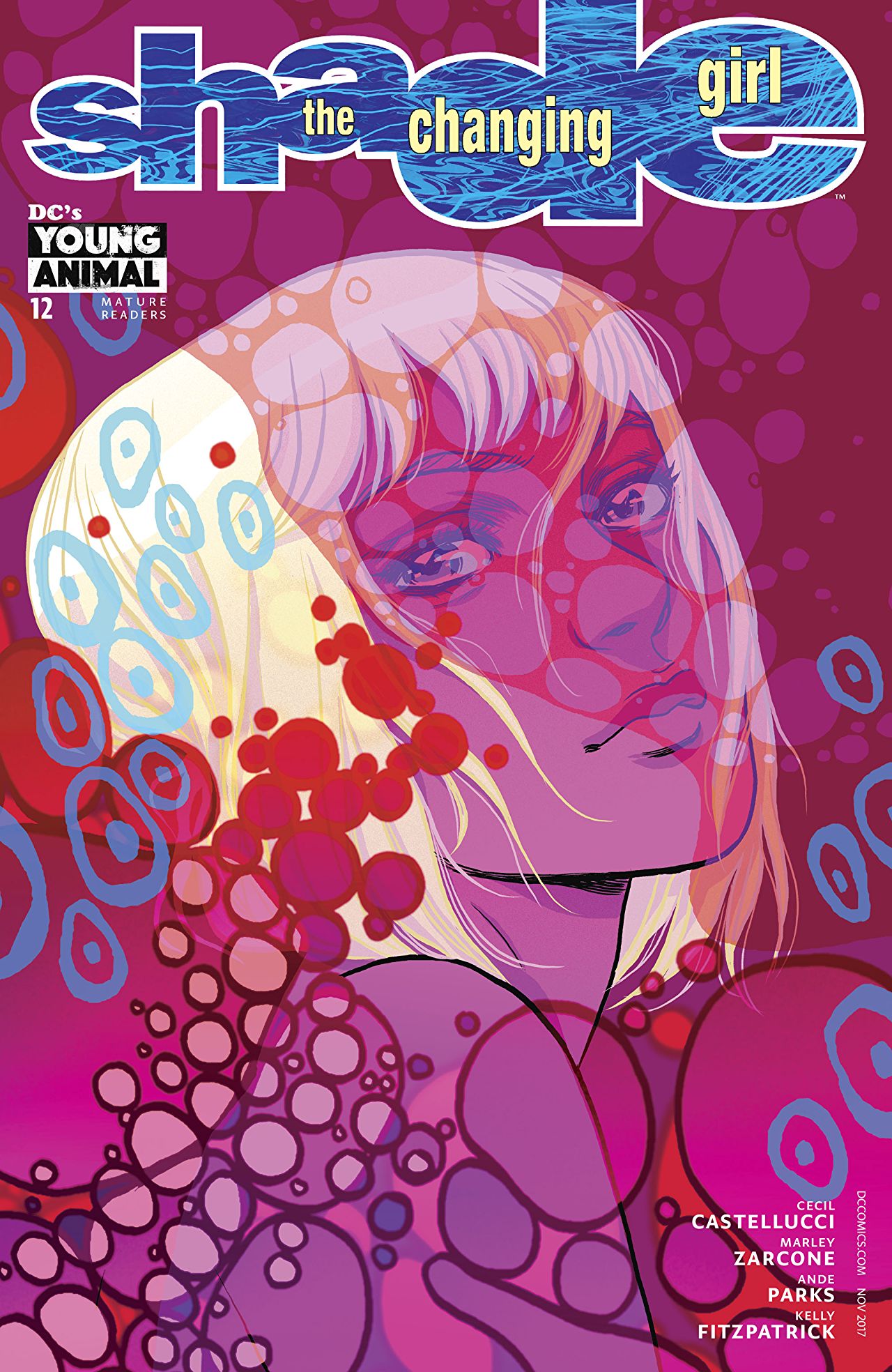

Shade, The Changing Girl #12, by Becky Cloonan and Matt Taylor. (DC Comics/Young Animal)
JJ: Shade, The Changing Girl is comics packaged with the boutique set in mind. For those whose lives are chipped fingernail polish, microdoses, and dog-eared copies of Artforum. And that’s disco. Because Shade is also comics for literally everyone else too. It’s a comic presented always with its best face forward, living its best life. Take Shade #12, for example. You’ll be glad you did.
In cover A, we set our eyes on a dream, courtesy of Becky Cloonan. Blotted orbs fizz up and around, catching the light of Megan/Loma’s shimmering Targaryen locks in some feverish eclipse, only to fade back into the darker blood-tinged hues behind the subject and beyond. Light from behind us catches in Loma’s eyes. Something is about to make Megan cry. Yet everything continues to swim in this deep red pool of being. All is.
Then there’s Matt Taylor’s cover B, IMAX poster-ready, a marvel. Here, Megan/Loma steps lightly, caught in the same mix of contentment, wonder, and sadness. Here is another dream, where creatures terrestrial and extra habitate together, as one, as none. The void behind and around them acquiesces to their neon-soaked energies, haloed around Shade, posed in some ultimate, idealized form. But that’s not them. It’s the eyes of Taylor’s piece, that’s where Shade lies. Twin covers. Mirror examples of ever stop, always go.

Darkseid Special #1, by Chris Burnham and Nathan Fairbairn. (DC Comics)
JJ: Out there in the deep expanses of the universe lurks a god of terrible power. Sitting on a throne contemplating our end. Energy crackles behind him and through him, ending just behind his cruel red gaze. He’s thinking, contemplating. Life. Anti-life.
There! The answers to everything, in the palm of his hands. The unyielding machinery about him, forged in his abominable image, bringing him — and us — ever closer to the Omega point. For now, to know him is to know mercy; to know him is to know our days are numbered.
Chris Burnham and Nathan Fairbairn are a team unparalleled. Their cover to DC’s Darkseid Special is more than an ode to King Kirby. It’s a valentine to evil, an iconic image of a despot that belongs in the annals of legend. Put simply, it’s rad as fuck.

Arya #1, by Crisalys. (Antarctic Press)
AOK: What’s the word for a future that’s already old? It might be Arya. Crisalys’ cover is a delightful array of retro details served on a sci-fi robo platter. This girl is living her best life. Check the kicks. Drinks in the mini-fridge. Nintendo DS. Succulents and other houseplants to keep it grounded, the influence of time spent at grandma’s house. Tube TV with rabbit ears. What kind of stations do you think it picks up?
Arya isn’t telling. An expression of annoyance implies the countdown has already begun. The cam in the platform she chills upon has locked its satellites on to you and the airstrike has been initiated.
Expect robots. Expect slice-of-life. Expect unique ideas with established roots. A post-everything a e s t h e t i c that loves its youth. Crisalys gives you huge imagination fodder with a few well-chosen pieces. I love it.
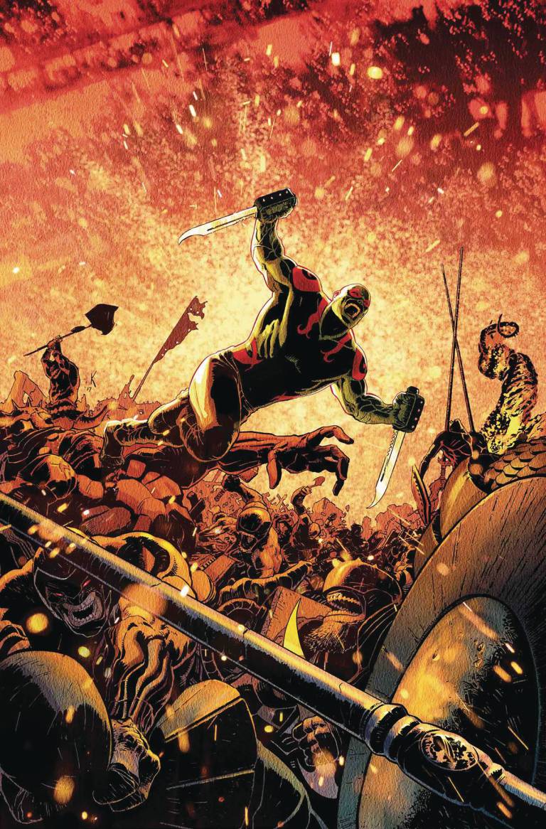
All-New Guardians of the Galaxy #7, by Aaron Kuder. (Marvel Comics)
JJ: All-New Guardians? All-out mayhem, more like. The thrill of abandon, that’s what Aaron Kuder brought to us this week.
The cover to All-New Guardians of the Galaxy #7 is an exercise in expertly-rendered pandemonium. Look at it: A landscape of brutality, monster smashed against monster as the world cracks under their tumult, the stars bleeding white light, threatening supernovae. And above it all, Drax the Destroyer, set in his natural habitat, lunging into the fracas blades glinting, teeth bared.
Oh, and check out the rock beast whose face Drax is using as a catapult. This is fury. This is fun. Aaron Kuder excels at both. Let him share his strengths with you.
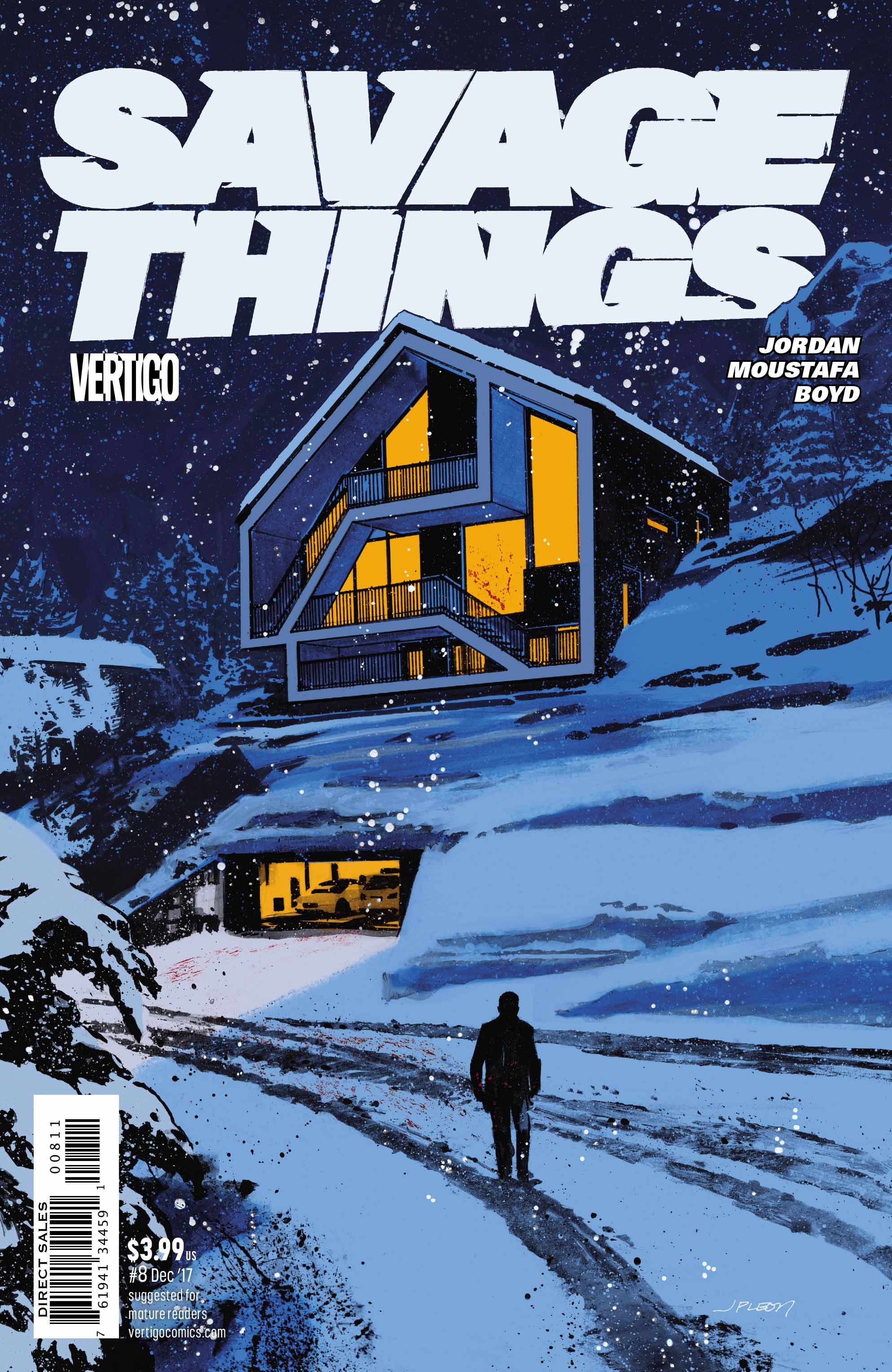
Savage Things #8, by John Paul Leon. (DC/Vertigo)
JJ: The cover to Savage Things #8 is a chilling thing. An act of horror slowing into the stillness of a crime scene.
Look at the use of color here. Centered around the house, a white-hot aura, there to signify how fresh this act of violence is. How recently it happened, how severe it must be. A blast of trumpets, a shock of sound, spiraling outwards into white noise. You’re stunned, but you don’t know exactly why yet. The image forces our eyes to lower to the entrance of a garage, where blood from a pair of boots melts into the snow outside. The whiteness begins to darken into a haze of slate. There’s the perpetrator, posture slumped, arms dangling at their sides. The sounds of violence have fallen to the quiet of nature. All is still.
Just listen. You can almost hear the crunch of freshly fallen snow now, the walk of a killer towards darkness. Brr.
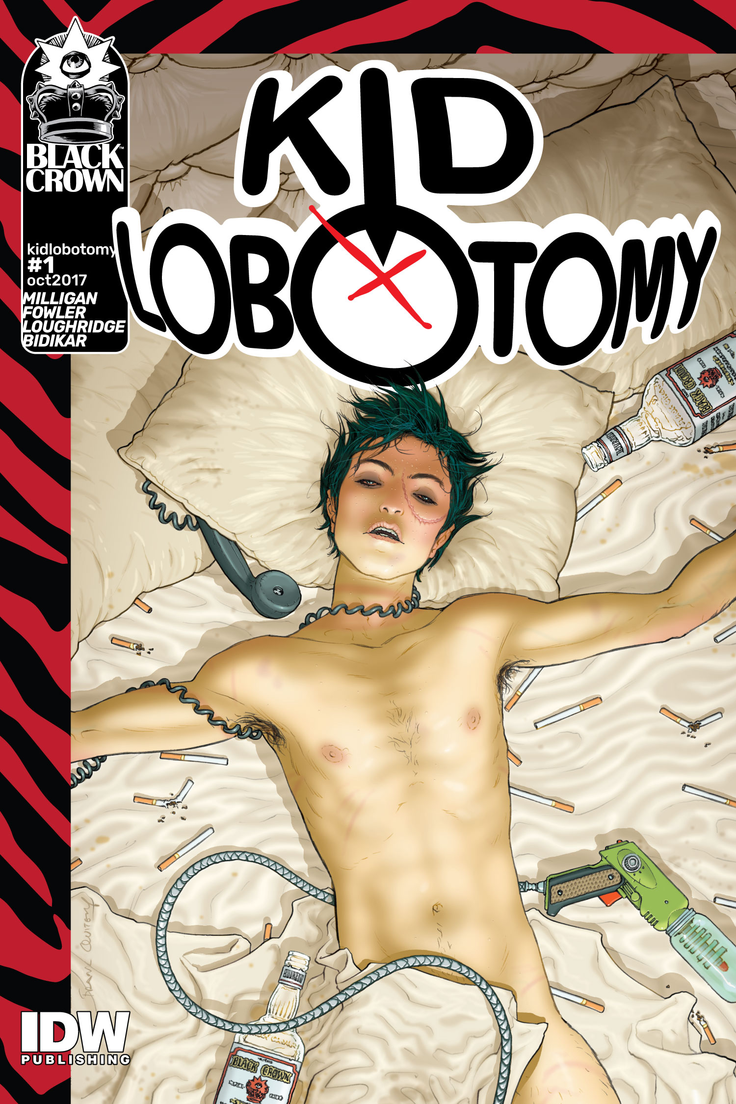

Kid Lobotomy #1, by Frank Quitely, Tess Fowler and Tamra Bonvillain. (Black Crown/IDW Publishing)
JJ: Kid Lobotomy is the talk of the town. The opening salvo of Black Crown, the flagship book of a bold new imprint — you’ve heard it from us before, and you’ve definitely heard it from everywhere else. IDW rolled out the red carpet for its new enterprise, so naturally the covers were gonna be pretty. Considering Shelly Bond was the editor doing the corralling, you just knew top talent were gonna give us their best.
Case in point: Tess Fowler does the heavy lifting in the standard cover to Kid Lobotomy #1. It’s an intro image, where we meet the eponymous Kid, sporting his propane raygun and fuck-with-me-at-your-peril attitude. Fowler surrounds Kid with his supporting players, denizens of The Suites, each of whom we’ll meet in time. Fowler imbues this image with the requisite lunacy, expertly placed at the edges of reason. It’s here where Tamra Bonvillain plays with our eyes, giving the hallucinogenic parts of the cover the same hues as everything else. A rock-n-roll group shot, given Kafkaesque form. Look deep enough, and you’ll find the madness that gives Kid Lobotomy its thrust.
Then there’s Frank Quitely’s variant. This is the mission statement of Black Crown, exemplified in one decadent pièce de résistance. Kid, arms splayed out in an exhausted, vaguely euphoric daze. Naked as the day he was born, lips chapped, sweat in beads all over his flushed forehead. It’s the details, oh my, the details. The red raw rub of the phone cord wrapped about his neck. The empty bottles of Black Crown leaving droplets all over the hotel sheets. He has the effortless rockstar hair going for him, the bloodshot eyes, and, of course, his trusty raygun, likely just as spent as he is. Quitely is a mad scientist. At the mercy of Bond, he provides us a beautiful Frankenstein.

Batwoman #8, by Michael Cho. (DC Comics)
AOK: Michael Cho is one of those guys whose art is instantly recognizable. A flawless minimalist, his illustrations are the definition of bold. He’s distinct. Not beholden to an era or style. Not easily comparable to other artists. Cho knows where to put details, where to lay down a ton of black (everywhere), what elements to include to elevate a character to maximum cool.
Case in point with his variant cover for the eighth issue of Batwoman. All Cho needs is red. The hair, the bits of costume, and the sky (save a pristine white circle of moon) are a flat crimson that plays dynamically with the solid black silhouettes and crisp white accents. Batwoman herself is joyous perfection, but check it: the cape claims almost a third of the page. The coil of rope she swings down on, another proof that basic Bat-Gear is the most iconic. And cradling it all is a Gotham City alleyway. Antennas, a fire escape, the symmetric angles of windowpanes. Cho grasps the essence of the Bat and gives you the where, the how, the who — what a who! — with such power and panache you don’t need the why.

All-Star Batman #13, by Rafael Albuquerque. (DC Comics)
JJ: Rafael Albuquerque has been busting his ass on this latest All-Star Batman arc. It isn’t enough for the artist to simply knock out the pages to Scott Snyder’s final run on his outside-the-box Batman saga. He’s been contributing its covers as well, not to mention its variants. (Don’t forget the mountain of other covers he has going on most of the time.) And yet his output hasn’t diminished Albuquerque’s quality. As a matter of fact, his years have hardened him into a one-man force of nature. It’s only fitting that this cover reflects his might.
This cover to the penultimate issue of All-Star is at once somber and thrilling. The wind howls against the Dark Knight, his cape pulling against the hero’s beleaguered shoulders as he prepares for a lethal strike from his opponent. The rain’s a deluge and lightning strikes too near, a blast of energy that scarcely fights back the darkness around them. The elements wage war on his senses. His opponent moves in for the kill. This could be how the Batman ends, out there beyond Gotham City.
It’s a cover that tells a tale black as pitch, a glimmer of hope in a burst of blue. It’s a cover that reminds us what we’re looking at, bathing our eyes in a wave of magenta neon. It’s perfect.
Which covers from this year were your favorite? Let us know in the comments below.


