
By Molly Jane Kremer and Jarrod Jones. Our Week In Review serves to fill in the gaps our frequently verbose comic book coverage leaves behind. Each week, we take a brief look into the books that demand attention.
 Superman #39
DC Comics/$3.99
Written by Geoff Johns.
Art by John Romita Jr. and Klaus Janson; colors by Hi-Fi.
JJ: Wow! *stretches arms* Ain’t it nice to not have the specter of a multi-part saga looming over our heads? Look at all this narrative space! And ooh, the breathing room! *takes a deep breath* Ahh. That’s good nectar.
Yessir, Men of Tomorrow is finally over, and with Superman #39 picking up literally one second after last month’s rather surprising cliffhanger, it’s clear that all of us – especially the Man of Steel – could benefit from a well-deserved breather. The discovery of a new superpower (and the subsequent loss of a new ally) has left Metropolis’ Favorite Son feeling rather contemplative (not to mention lonely). Fortunately, this book gives him plenty of time to think.
And time to eat. And time to work. And time to talk. “24 Hours” is a New52 Superman tale with a difference: There is no galactic oppressor goading our hero into action, there are no members of the Justice League horning in on the Big Guy’s action, and as far as the eye can see, there are no annoying sub-plots burrowing their way into the book, detracting from its overall quality. (Though there are two pages that bookend this installment with a glimpse into what’s to come once Convergence just hurries up and gets over with already, though they’re not a burden for the issue.) Instead, what we have here is an issue of Superman that takes place entirely in Metropolis, where Jimmy Olsen and Clark Kent get to pal around, ghost the Daily Planet bullpen, and eat hot dogs atop the newspaper’s building. It’s an issue that feels more like a Superman book than Superman has felt since the New52 began. And boy, is it great.
For better or worse, Geoff Johns knows how to tap into Superman’s wide-eyed naivete, and Superman #39 is a book that deals intimately with the emotional ramifications of a Superman willing to place his trust in those he cares about the most. Accepting the burden of knowing who Superman is when he isn’t zipping around the city, Jimmy Olsen finally matters for the first time in years. And this issue provides more than enough space for the Man of Tomorrow and his Pal to clear the air (once Jimmy gets over his initial – and totally understandable – incredulity).
Superman #39 is a fit companion piece to Greg Pak and Aaron Kuder’s marvelous Action Comics #40; they’re two books that take a necessary (and refreshing) detour in order to explore the many facets to the Man of Steel. Mark this month for the history books, kids: March 2015 was a great time to be a Superman fan. (Quite possibly the best in years.) Let’s just hope that the creative Super-teams of the future – whoever they may be – always remember this essential truth: Epics and sagas are always welcome, but it is vital that they bring our hero down to Earth, even if it’s only for a moment.
9 out of 10
 Red One #1
Image Comics/$2.99
Written by Xavier Dorison.
Art by Terry Dodson and Rachel Dodson.
MJ: Image Comics’ oversized debut issues are typically a treat: Getting thirty-two or forty pages in an ad-free, regular-priced premiere issue is a bit of a steal this day and age, especially when you consider how good most of the publisher’s output actually is. Sitting down to take in a new Image #1 is usually an event I look forward to, but disappointment was due. And Red One #1 is the first oversized Image debut that I actually wish had been shorter. Much, much shorter.
Written by Xavier Dorison and illustrated by Terry Dodson and Rachel Dodson, Red One is a visually compelling book, but it’s a mess in every other sense. The book’s dialogue is overwrought and exhibits a poor grasp on syntax, to say nothing of the English language (which may explain why Google Translate is thanked on the credits page). The plot itself is needlessly complex and badly paced, and is generally kinda dumb: Vera, the main character, is a highly-trained Soviet agent sent to the US to pose as a superhero (which sounds like a fun concept, right?)… But she’s sent here to embody pro-Russian propaganda by fighting a serial killer that the majority of Americans apparently think “is cleaning up the United States.” (And maybe it’s weird, but as an American, I find the idea that we’d nationally condone a fucking serial killer a liiiiittle offensive.) Additionally, nearly every male character is written as an utter creep, constantly hitting on, asking out, or otherwise ogling Vera, and – this is real – one of them literally peeps at her while she changes clothes. (She doesn’t seem to mind though, since she’s been written to be the straight man’s fantasy-version of a sexually-liberated woman.)
The lettering, by the typically great Clayton Cowles, is horrendous. The word balloons are poorly formatted, they don’t fit the flow of conversation, and are either far too tiny – containing a paragraph shrunk down to 8pt to fit – or entirely too enormous, threatening to swallow the few words inside of them whole. The art, however, is the Dodsons at their best: It’s fun, gorgeous, and well-executed cheesecake. It’s just unfortunate that the story they illustrate is dumb, plodding, and marginally offensive. If you choose to muck through all this ghastly verbiage – and I just can’t recommend doing so, despite the pretty Dodson art – the visuals will provide little comfort.
3 out of 10
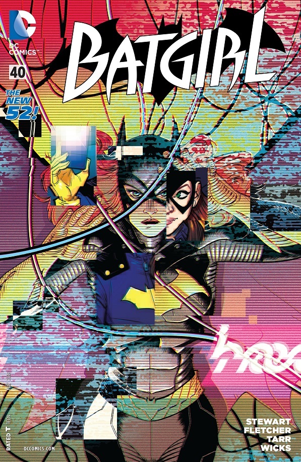 Batgirl #40
DC Comics/$2.99
Written by Cameron Stewart and Brenden Fletcher.
Art by Babs Tarr with breakdowns by Cameron Stewart; colors by Maris Wicks.
MJ: You may have noticed Batgirl was a highly contentious topic of conversation in the past week, but too much of it was about a cover that’s never going to see the light of day, and not enough of it was about this week’s excellent Batgirl #40. (The Batgirl: Endgame tie-in that came out on this double-Batgirl Wednesday is pretty great as well – a silent issue with spectacular art by Bengal – but that ‘un isn’t getting reviewed here.)
A myriad of floating plot threads from the past five months all connect in this issue, making an all-together extremely cohesive story, and a rewarding conclusion to the story arc begun by Cameron Stewart, Brenden Fletcher, Babs Tarr and Maris Wicks back in October of 2014. While those previous issues each read like self-contained done-in-one comics, a flashback sequence in #40 reveals that the big bad behind everything has been the now-sentient algorithm Barbara created (and lost): Turns out it was based on a brain scan of a much darker and angrier Barbara, when she was still confined to her wheelchair and aiming to fully eradicate crime… with extreme prejudice.
When Algorithm-Babs, describing Batgirl, drops words like “vanity” and “gratification”, saying that “Batgirl should be feared”, the writers make a cleverly allegorical presentation of criticisms the book originally incurred for their lighter, more playful take. This is Barbara moving on with her life, away from the darkness, and there’s no better way to show our heroine getting over the traumas of her past than by having her fighting (and outsmarting) the literal embodiment of their effects.
Babs Tarr and Maris Wick’s art (over co-writer Stewart’s breakdowns) remains dynamic, fluid and fresh. While panel backgrounds are at times a bit lacking, Maris Wick’s bold neons make them less glaring. However Tarr continues to pencil wonderful action sequences brimming with movement, while the book’s quiet, conversation-driven sequences are full of warmth and humanity. Additionally, it’s weirdly enjoyable to watch them make the algorithm’s digitized face slowly degrade as the issue progresses, from a semblance of (a very angry-looking) Barbara Gordon (its greenish tint ever-so-slightly reminiscent of Oracle’s pre-New52 mask-like sigil) into a grotesque, distorted image only tenuously recognizable as a face.
While the algorithm’s final scheme will feel familiar to anyone who saw last year’s Captain America: The Winter Soldier, the climax is still thrilling as hell, and seeing Barbara triumph over this dark, digital copy of herself resonates even further from all the added subtext of reclaiming and recovering her life from that darkness. The additional tease of a character becoming the new Oracle is merely icing on the cake. The Convergence break may mean a long two months until we get more Batgirl, but this team has proved they can make a book well worth the wait. Hurry back, Babs: the DCU is a brighter and more joyful place when you’re in it.
9 out of 10
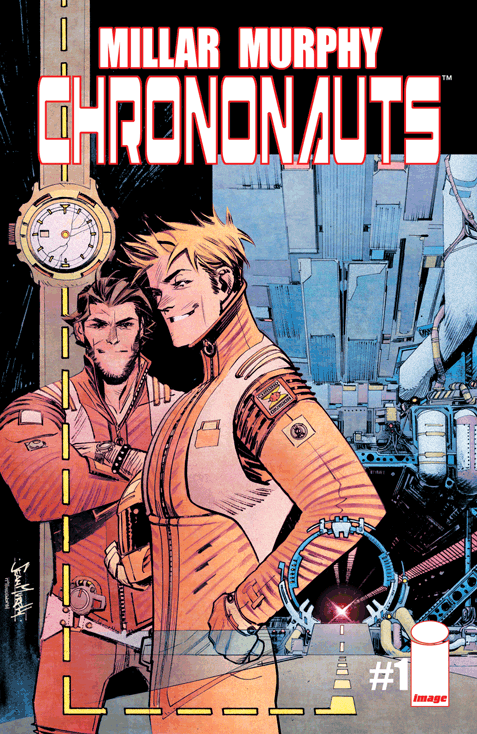 Chrononauts #1
Image Comics/$3.50
Written by Mark Millar.
Art by Sean Gordon Murphy; colors by Matt Hollingsworth.
JJ: Well, shit. It hasn’t been a week and the latest Mark Millar property has already been optioned as a film adaptation. Does it matter what I think at this point? Are you even reading this right now?
Despite that ludicrous piece of information there is still a comic book to consider here, and whether it’s written by Mark Millar or James fucking Joyce, assessing a book’s worth is what we do here at DoomRocket. So sit the hell down and commence to reading, fanboys and girls.
Chrononauts is yet another mini-series unspooling from the Millarverse (which, by the way, is an actual, interconnected thing), a book that features a pair of studly scientists peacocking in front of the entire world as they embark on the first manned mission through the timestream. That’s right: Time is the latest in Dr. Corbin Quinn’s conquests, a pliable, nubile thing that can be accessed, given enough persistent poking and prodding. Of the two Chrononauts, he’s easily the most tolerable; Dr. Quinn (which, hyuk) is a man motivated not only by ambition, but by the ghosts of his past. Millar provides Quinn with a vastly more interesting personality than anyone else in Chrononauts, and that’s a damn fine thing, because he keeps some pretty obnoxious company.
Quinn’s partner, Dr. Danny Reilly, is the kind of chad you’d spot at a local bar ‘n’ grill ordering Irish car bombs and hitting on anything with a pair of breasts. He’s the type-A science-hunk that would worship at the altar of Tony Stark, if only Millar could procure the character rights. Danny is there to provide Millar’s reliably exhausting macho subversion as Quinn’s #2, and there are moments where he is such a classic troglodyte that one can’t help but roll their eyes all the way into the back of their head. Danny either has a severe humbling coming his way, or Millar likes him just the way he is.
Co-creator and artist Sean Murphy renders the book’s characters with the appropriate posturing and smarm. His sharp visuals (aided by colorist Matt Hollingsworth) seem almost as if they’re meant to appeal to the basest, Maxim-reading demographic: Cars are drawn with muscular weight, the boys look like they only dress from Topman, and apparently they both find plenty of time to hit the weights in-between innovating the greatest scientific achievement the world has ever known. It’s this kind of idealized masculinity that probably made Chrononauts such an enticing proposition for Universal Studios. And you can bet it’ll be stunting the growth of young boys everywhere in a theater near you. And a lot sooner than you think.
5 out of 10
Agree? Disagree? What books are YOU reading this week? Let us know in the comments below.


