By Molly Jane Kremer, Scott Southard, and Jarrod Jones. Our Week In Review serves to fill in the gaps our frequently verbose comic book coverage leaves behind. Each week, we take a brief look into the books that demand attention.
Vertigo Comics/$3.99
Written by Neil Gaiman.
Art by J.H. Williams, III; colors by Dave Stewart.
MJ: For comic fans, there was never a doubt that a Sandman comic written by Neil Gaiman and featuring art by J.H. Williams and Dave Stewart would be anything less than phenomenal. And though it’s been over a year (or is it years, plural, at this point?) in production, who’s going to complain about delays when the finished product is this gorgeous?
Certainly not a jumping-on point (but then again, none of this miniseries ever really was), this is still the kind of universally-appealing comic book that could be appreciated separately: either just as prose, or just as a collection of multimedia paintings. But when the two are combined together, they produce something magical, beautiful, and, well, other. Even if you find Gaiman’s Sandman to be “not your thing” (which makes you, in my book, deserving of at least a raised eyebrow), Williams and Stewart’s art is deeply enveloping, bordering on hypnotic. It should not be missed.
An enormous amount of story is crammed into these pages (excepting the first and last pages, the entirety of the book is made up of massive and intricate double-page spreads), and where another artist might leave the reader disoriented amongst the panels’ twisty faux-chaos, Williams’ storytelling flair guides the mind and the eye successfully around and through his artistic marvels. Colorist Dave Stewart’s work is even more exceptional than usual, going from ethereal to gritty to cosmic to earthy, accentuating Williams’ seamless switches between wee filigreed details to spectacular, expressionistic washes of color. This is one of the most stunningly beautiful examples of sequential art you will ever lay your eyes on.
Gaiman’s grasp of the character hasn’t faltered in the years since his last foray into the Dreaming, and his writing style remains as captivating as ever. Combined with Williams’ and Stewart’s psychedelic space-paisley panel work and graceful visuals, this is one of the seminal comics of the decade. Miss out at your own risk.
9 out of 10
DC Comics/$2.99
Written by Jeff Parker.
Art by Brent Schoonover and Giancarlo Caracuzzo; colors by Kelly Fitzpatrick and Flavia Caracuzzo.
SS: It’s a funny thing, physical books in the age of computers and digital media. A funnier thing still is the juxtaposition of the ultimate throwback comic, Batman ‘66, being a pioneer franchise for DC’s mildly innovative DC2 imprint, which is producing interactive, self-expressive comics online. The vignettes are novel in their digital form (especially with the onomatopoeic “POW”s and “ZAP”s expressed audibly), but something just feels right to get these heirloom stories, two at a time, back on paper and in your hands.
Without being a faded retrospective or sad, sappy tribute, Batman ‘66 is a beautiful homage to the television series championed by Adam West. Jeff Parker knows the tone he’s aiming for, and sticks to his guns the entire way through, elevating the campy dialogue (“So few people realize what a real and ever-present danger quicksand is in our world, Robin”) and overly happenstantial situations (Batman consults his Witch Files before being confronted by a witch that resurrects Solomon Grundy). A lot of the plot moves without much cause (a sudden name change from Clayface, Solomon Grundy inexplicably trying to murder Batman) and there are plenty of character leaps that are completely illogical, but it’s totally ok. The natural laws of Parker’s world are laid out from the start, and he follows them thoroughly. It’s adorable.
Something that’s immediately noticeable about Batman ‘66 is the art and its direct integration of the old show into a comic book format. The character models are faithful to the original (Batman has drawn-on eyebrows!) but maintain a sense of being in our current era of comics. (Smart flourishes like the narrator’s voice planted on a bat symbol to introduce each scene are also a nice touch.) Both Schoonover and Caracuzzo do a respectively good job of holding a steady balance between the days of yore and the artistic advances made since those days.
While there’s a lot to praise here, it’s hard to fall head over heels for this book. It suffers from the same problems as its source material; Batman ‘66 is very silly and very shallow. Although that allows Parker to play around and offer us some harmless fun, it also impedes anyone from deeply caring for the self-contained short stories (they’re only about ten pages apiece, leaving little room for any true exploration) or parsing out the stories that are told. It’s a real shame to get the origin story and the demise of Clayface in one half of one issue, but again, the nifty little narrative arc of the old show dictates that each story must be tied up with a bow by the time it goes off-air, and Parker keeps the series following suit. For better or worse, we’re back to where we started.
7 out of 10
Drawn & Quarterly/$6.95
Written and illustrated by Adrian Tomine.
JJ:It’s been interesting to watch Adrian Tomine hone his craft over the course of twenty years. That’s right: Optic Nerve has been in publication for over two decades now (and longer than that, if we’re counting his primal, self-published comics, which we are). Just thinking about that might send some Gen Xers running for their Xanax, but ardent fans of the enthusiastically reluctant cartoonist know that each successive installment from this indelible series is a cause for celebration.
Because every installment of Optic Nerve is an exercise in sequential finery. For as long as the book has been on stands, Tomine has worked dauntlessly to ensure that no two issues are exactly the same, that each volume tells meticulously crafted stories about utterly broken people in new and challenging ways. His slice-of-life vignettes have the power to either make you chuckle uncomfortably, or crush your heart with oppressive poignancy. Optic Nerve exists because we need it to.
You see, Adrian Tomine is exactly like any other sincere artist; he just wants to make sense of the world through his work. Leaf through his collection of unpublished material (Scrapbook) and see the cartoonist attempt to collect the noise of this world in order to distill it. Sometimes he succeeds and sometimes he doesn’t, but the point is that Tomine tries. He ceaselessly strives to project the havoc we’ve wrought through the prism of his own experience, and though in doing so some might accuse the artist of being an unrepentant cynic, or an aloof observer (he publishes letters written to him without comment), Adrian Tomine is as thoughtful as any of us. And he’s one hell of an artist.
But if you’ve ever read Optic Nerve and came away from it thinking Tomine was an unrepentant cynic, well, Tomine has something to say to you: he agrees. Consider the final segment of Optic Nerve #14: “2014, Brooklyn”, a self-aware one-page glimpse into the artist’s life, addresses Tomine’s unwillingness to promote himself, even online. When asked why he didn’t respond to a fan’s adulation on Twitter, Tomine’s penned avatar shoots back that he’s not on social media, that he’s “morally opposed to all that stuff.” That elicits the same eye-rolling reaction the artist has no doubt suffered in life, but here Tomine has an opportunity to fight back by depicting his critics as a fedora-sporting v-necked scenester who calls the artist “kind of a dick” as he shoves a hand into the pocket of his fitted chinos. It’s a personal dig, sure, but this is Adrian Tomine’s world. This is his form of therapy.
With that comes a story told at times by an unreliable author. His characters are often unpleasant people stuck in an unpleasant world, folks who are prone to making bad decisions, or in the case of issue #14’s second segment (Intruders), prone to making utterly mystifying decisions. But no matter how hostile his environments can be, Tomine offers an opportunity for each of his creations to break out of their awful cycles. The damning thing about that is more often than not they choose to ignore it.
9 out of 10
Dark Horse Comics/$3.99
Written by Chuck Palahniuk.
Art by Cameron Stewart; colors by Dave Stewart.
SS: Remember when you were 16 years old? Looking for things to snap at, full of piss and vinegar, angry at the world? Knowing that everyone out there was duped by the system into a state of stasis that praises everything hollow and ignores the truth of the human condition and what it means to be alive? There is something piercingly genuine about those days of healthy distrust that shaped most of us in one way or another. But those days are largely looked back on with a load of self-deprecation and an incapacitatingly large amount of cringe.
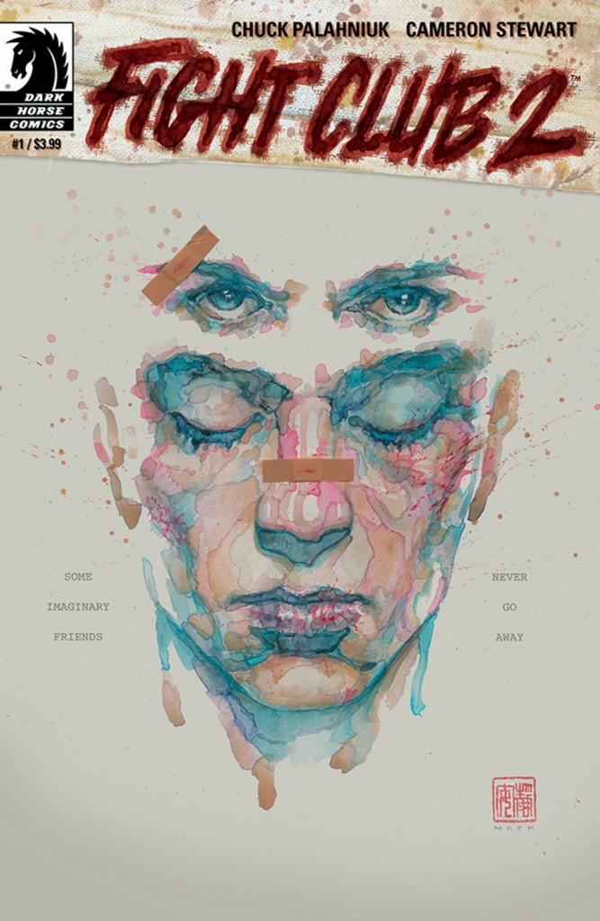
Well, whether you asked for it or not, the patron saint of countercultural teen angst has kick-started a “fuck the world” revival with Fight Club 2. Chuck “Surname Pronunciation Debatable” Palahniuk has launched a comic book sequel to his most famous book-turned-movie in the form of a Dark Horse comic. And the auteur is nothing if not consistent: set ten years after the events of the book (and written nearly twenty years after), Fight Club 2 follows the same anonymous protagonist (now going by the name “Sebastian”)/Tyler Durden and heavily broadcasts the same anti-consumerist, pro-destruction epithets we’ve previously seen sewn throughout Palahniuk’s canon.
Which leads to an inherent problem with critiquing a new comic by Chuck Palahniuk; Any critique of a specific work is more a critique of him as an auteur. He’s like Vincent Gallo, Ozzy Osbourne, or David Lynch in the way that their creations aren’t stand-alone pieces of art, but extensions of their creator. And when we view the new comic (and oeuvre) of Palahniuk, the seams become very visible. His anti-capitalist stance is commendable, but when only 1 out of every 10 lines means something and the rest seems to be a self-righteous decree, it’s hard to take his work seriously.
But, if we can sneak from beneath the long shadow cast by the book’s author, there are some interesting things in this book. Firstly, the art by Cameron Stewart is snarkily expressive and fits the mood (for better or worse) to a T. There are also some mildly innovative flourishes where 3D rendered objects (pills, rose petals) obscure some of the panels and text in order to highlight the fact that we don’t really need to see all of a news report or conversation to understand what’s being said. It’s a nice touch, if a bit heavy handed. While this works moderately well, some seriously pitiful and wrongheaded pleas for a mass-manufactured grassroots advertising campaign (“Prove your mettle with the following homework assignment: Use the phrase ‘Tyler lives’ or ‘Rize or die’ to guerrilla market the shit out of Fight Club 2”) are laid out on the inside of the book’s cover. It’s just an example of how this book has become a simulacrum of a franchise that was already treading a fairly thin line.
In the end, Fight Club 2 #1 starts out to be exactly what one would imagine. Our ham-fisted Hot Topic posterboy has extended the life of a dorm room staple, re-hashing themes and lines from the old production and attempting to resurrect a beloved, but caveat-laden property. To be fair, Palahniuk certainly stays honest to himself and his material and he’s great at doing what he does (without straying here), I’m just tired of what it is he does. Ultimately, I just wish he’d follow the first rule of Fight Club and stop talking about Fight Club.
6 out of 10
Agree? Disagree? What comics are YOU reading? We want to know! (No, really.) Tell us what’s up in the comments below.


