
By Molly Jane Kremer, Scott Southard, and Jarrod Jones. Our Week In Review collects our thoughts on the comics that demand attention. Do you have a deep-rooted desire to know what we think about all your favorite books? Well. This is where you need to be.
 Star Wars #7
Marvel Comics/$3.99
Written by Jason Aaron.
Art by Simone Bianchi; colors by Justin Ponsor.
MJ: Marvel’s Star Wars series, written by Jason Aaron, has been one of the five top-selling comics each month since the first issue’s blockbuster release in January. Here, with issue #7, we observe for the first time John Cassaday and Laura Martin’s absence from the art credits. This is also the first issue to not primarily feature the holy trinity of Luke, Leia and Han: we instead get an answer to the decades-long question of what exactly Obi-Wan spent his time doing on Tatooine in the long years spent waiting for Luke to grow up.
The issue is a portion of Obi-Wan’s diary as Luke reads it: a clever way to slide sideways within the overall plot for an issue, and to include a fill-in artist without disrupting the main story’s flow. Aaron deftly pens this narrative, going back and forth between Obi-Wan’s survivor’s guilt amid his hermitage; his attempts to distance himself from his more altruistic, ingrained (and attention-grabbing) Jedi impulses; and what he sees as his final calling: becoming Luke’s secret protector and guardian angel. The script is meditative and melancholy, and even a few spurts of action can’t mar its solemnity.
After the comparative realism of artists like John Cassaday and Darth Vader’s Salvador Larroca, Simone Bianchi’s stylized art brings a whole different experience to these books. In drawing Old Ben, Bianchi doesn’t strive for likenesses of either Alec Guinness or Ewan MacGregor. This isn’t necessarily a bad thing: aside from a few name-drops, the prequel trilogy isn’t exactly dwelled upon in Marvel’s Star Wars (at times it’s politely referenced, but not much more), and seeing Ewan MacGregor’s rendered face might have caused some dissonance in that respect.
Bianchi’s impressionistic art style suits an issue that functions as a journal entry; it adds an almost dream-like quality to the narrative, where the sharp, bordering-on-sterile pencils of John Cassaday would have been a bit too stark to achieve such an effect. Colorist Justin Ponsor catches the dusty glow in Tatooine’s dunes and blistering skies: at one point he nearly whites-out the planet’s twin suns in a bone-white sky, like two subtly bleached and desaturated cigarette burns hovering above the panel, creating an almost palpable effect of blinding light and heat. Later on, an action sequence in the desert night is richly colored in hues of purple, blue, and grey, never becoming muddy or hard to follow.
Artistic powerhouse Stuart Immonen begins his run as series artist with the next issue, the narrative focus returning to Luke, Leia and Han. This format of a single Obi-Wan issue, drawn by a marquee-name artist, and inserted between story-arcs could (and should) be a regular occurrence. Turns out that old fossil Obi-Wan makes for a damn compelling solo lead, which the movies haven’t (yet) taken advantage of. Jason Aaron’s grasp of these characters and their voices is unfaltering, and even this “fill-in” issue (if it could actually be considered as such) remains at the same high level as the rest of the series so far.
8.5 out of 10
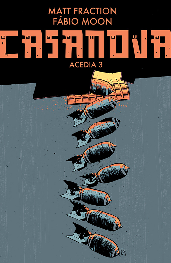 Casanova Acedia #3
Image Comics/$3.99
Written by Matt Fraction
Art by Fábio Moon; Colors by Cris Peter
SS: The postmodern ensemble piece has roots in mysticism, magic, and slight deviations from the day-to-day that draw attention to our regular livelihoods in ways that strict realism just can’t. Pynchon famously wrote the enormous and anarchic Gravity’s Rainbow about a multitude of folks tied together by war, violence, love, and each other. In reading further into Casanova Acedia, it’s hard not to notice the classic tropes at play as its machinations delve into deeper subject matter than mere bloodshed and wizardry.
First things first, Matt Fraction is killing it on all fronts these days. After putting a bow on Hawkeye and getting back to basics with Sex Criminals (there’s a review of that tucked just underneath this one — tl;dr: it’s great), it’s hard to imagine Fraction being able to put out quality work on a completely separate franchise. And in some respects, this is the lesser of the three. It doesn’t have the grandiose star power of Hawkeye, nor the loveable forthrightness of Sex Criminals, but that doesn’t mean there’s not something here. As we’re still early in the potentially life-spanning tale of Casanova, the groundwork being laid may ring a bit disconnected and jaunty. However, as more of the characters’ backstories are revealed, the more these flashes of nuance into the “Casanovaverse” (Image’s term, not mine) feel as if we truly are watching life itself play out, rather than hearing a story someone crafted for us. More Paul Thomas Anderson than Wes Anderson, if you will.
The Metanauts backup stories (written by Michael Chabon and drawn by Gabriel Bá) add to the overwhelming sense of a world that wouldn’t exist without a reader, and consequently, the gravity of the characters and their stories. In the third issue, we begin to see how these worlds function with a bit of crossover between the two. It’s as if the secondary narrative is an extra set of puzzle pieces to make the whole picture slightly clearer.
These lines of interconnectivity highlight the truths we all have in common. Fraction forces us to examine the continued coincidence and happenstance that surrounds us and to audit the deterministic interconnectivity of our lives. As Casanova Acedia moves along, it becomes more of an objective spyglass for the butterfly effect-type stuff that happens around us all the time.
It’s fitting that the third issue begins with a WWII bombing sequence and the miraculous/magical/bomb-manipulating survivor teeming through the rubble, because just like the work of Thomas Pynchon and myriad other postmodern authors, Casanova Acedia has been a patchwork of war-torn, glanced-at characters that are all somehow connected by the proximate violence. Tacked on top is a boatload of fantastical imagery and a negative space where the backstory should be. But that’s the point isn’t it? The lack of history and the chaos-turned-truth that proceeds it is where we find what’s really interesting.
8 out of 10
 Sex Criminals #11
Image Comics/$3.50
Written by Matt Fraction.
Art by Chip Zdarsky.
SS: Sex Criminals has always been about the characters. They all have their own quirks and idiosyncrasies (their defining “kinks,” if you will), and Fraction and Zdarsky do such a great job of portraying each individual in a way that stays true to its structure: The way Suzie crumples inward whenever she sits, or the self-winking looks Jon throws around after making the jokes only he finds funny… these flourishes multiply when we take a look at the loving, but incredibly flawed, relationship between the two of them, the relationship on which the entire comic is based.
Powerhouses of the scene, Matt Fraction and Chip Zdarsky have a shit-load of fun on this book. Their playful, but clearly deliberate and attentive, attitude comes across as honest (exemplified impeccably with the now-iconic black panels that hold a practical explanation of what would have been illustrated if they took the time to draw it), and that really lets the book breathe freely; not once do they smother their work with serious brow furrows or sex ed lectures. It’s a perfect balance of astute sex-positive storytelling and low-brow boner jokes.
So here we are, at a point where Suzie and Jon have gone through enough character-building theatrics to call for a setting change. We move location to Miami, and immediately the color palette shifts to the neon-pastel of Vice City, where everything is water, sky, and leisure suits (serious props to Zdarsky on the use of sunglasses and sport coats to make everything four times more fun). On top of the aesthetic changes inside the book, I can’t get over the porno mag plastic shielding that wraps the outside. Such a thoughtful addition of physical production value. Plus everyone at the coffee shop you frequent gets to form new opinions about you when you rip the plastic off of a book called Sex Criminals and linger on the big panel of a husky man with his dick in his hand, pink stars and fairies floating through the air. It’s a delight not found in just any comic.
All of this is to say that Sex Criminals is a book that found its groove long ago, and it’s now comfortable enough that it can play with itself (pun intended) as an established piece of work. The academically descriptive chapter titles/narrator lines jive perfectly with the mirthful and encouraging letters section that’s become a kind of old-school forum for folks to converse. All of this fits well with the main characters’ proclivity to address the audience for rhetorical support. This issue comes off as the first track on a band’s third album: a slightly less raw, bit more produced, much more fully realized version of what we all saw glimpses of from the start.
As a new arc begins with Sex Criminals #11, the drama is based less on the ups and downs of Jon & Suzie’s relationship and more on the makeup of new characters and how they function in the seemingly average world that we all inhabit (except for that orgasm-induced, temporally-frozen dimension bit). The genius here is how normal everything is: nobody’s perfect, and we have to take that as given. We have to keep moving forward in order to find the calming beauty of it all. Sex Criminals accepts imperfection while striving to be better. Lesson learned.
9 out of 10
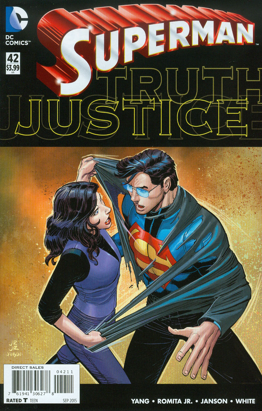 Superman #42
DC Comics/$3.99
Written by Gene Luen Yang.
Art by John Romita, Jr. and Klaus Janson; colors by Dean White, Wil Quintana, and Tomeu Morey.
JJ: It’s been done before. Except when it did, it meant something.
Don’t look at me like that. Have you been reading the Superman books for the last four years? In that time, when did Lois Lane ever matter? And don’t throw that “Psi-War”/Brainiac nonsense my way. Lois Lane has served a far more vital purpose over in Earth 2 than she ever did in the main Superman books. And that’s a damn shame.
It’s a shame mostly because this is the issue of Superman where our intrepid reporter finally uncovers the truth about her flaky, bespectacled colleague. (Y’know. Again.) But any drama that would have come with that has been thoroughly sapped by four long years of Lane’s consistent marginalization. She’s been in the periphery for so long, I almost believe there’s someone in DC editorial who owns a serious hate-on for the character. Of all the people who should have discovered Superman’s secret first in a post-New 52 world, it sure as shit shouldn’t have been Jimmy Olsen.
There are more problems that plague this present Superman yarn, and for any serious fan they’re impossible to ignore. Superman #41 — featuring the marquee creative team of Gene Luen Yang and John Romita, Jr. — was marketed as the impetus behind “Truth”, the latest discordant saga to stretch over the Super-books. Instead, Yang & Romita’s tale — which holds the reasons as to why Superman is now running around with little superpowers and even less hair — was released three weeks after the fallout had already been felt. (Molly Jane was far more kind with her review.)
That fallout has been a stirring, fascinating read over in Action Comics (and, to a lesser extent, in Batman/Superman), so to back up this narrative truck had better mean that we’re in for some serious drama once the ride’s over. And therein lies the glaring problem. That DC editorial decided to eschew a linear narrative for “Truth” means that any steam behind this story has already been expelled. With Yang pushing out the genesis of this tale in swift, monthly bursts while the future of “Truth” is happening now only causes further hiccups. If it weren’t bolstered by the corresponding Super-books, “Truth” would be a Superman story that just wouldn’t fly.
What doesn’t help matters is Gene Luen Yang’s squirrely dialogue, where everyone speaks in halting, awkward fumblings (the suffix –ish gets thrown around during moments when it’s least appropriate, and the major villain — more on him in a minute — keeps muttering “sort of”, in the book’s most glaring display of inanity). Any chance for real drama is constantly thrown to the wayside when it should be at the forefront of a tale such as this. (Superman is challenged by Lois as to why he would ever need to be “normal”, and instead of Yang exploiting the moment for maximum impact, he lets the Man of Steel hide behind some weak-ass rationale: “I just do.”)
Then there’s the big bad with the eye-rolling internet handle, “HORDR_ROOT”, an aloof slender man with a hovering mask who rules a top-secret facility in the clouds, where the only way to enter is through a Harry Potter-ian flying bus, and extortion is apparently a billion-dollar industry. (Superman, it seems, is but the latest victim in HODOR_ROOT’s machinations.) As far as sinister motivations go, Doomsday’s desire to destroy everything in its path feels like grand opera in comparison.
Yang’s negligible characterization only damns Lois Lane’s current paradigm further. He allows Lois brief, fleeting moments to give Clark minor lip service about duplicity, and then he shuffles her behind the blue-haired Condesa and caramel latte-sipping Olsen until it’s her turn to speak again. In building the mystery surrounding HORDR_ROOT (which is shockingly fun to type, by the way), Yang juggles his characters to employ them when they’re useful, and to let them linger in the woodwork when they’re not. That provides a Johns-ian blankness to his characters, all of which deserve more space to grow on their own.
“Truth” isn’t working. That might have more to do with the past editorial sins of DC Comics than Yang & John Romita (who turns in reliably solid artwork). But the facts of this current Superman paradigm remain: the Man of Steel’s heart belongs to another, and he saves his emotional bonding for the likes of Jimmy Olsen and Batman more than anyone else. Lois Lane has sat in the background for so long, it’s almost a joke that we’re supposed to feel anything, let alone surprise and awe, about her discovery. What should be treated as a “shocking development” is next to impossible to do when narratively, it’s already happened and it doesn’t matter anyway.
5 out of 10
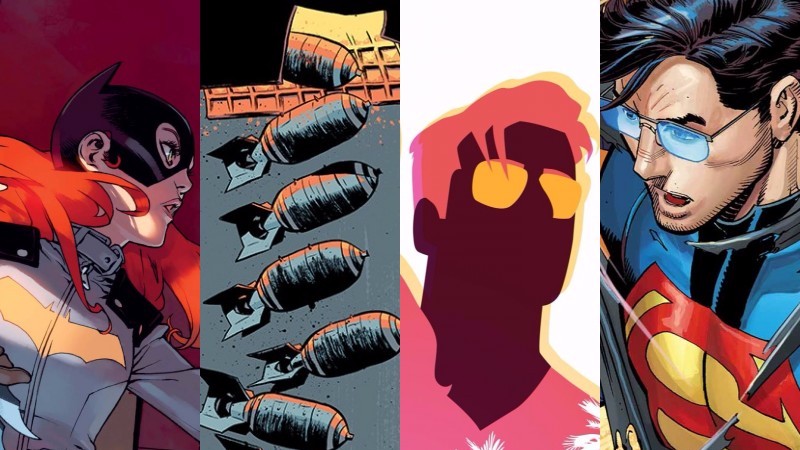
 Batgirl Annual #3
DC Comics/$4.99
Written by Cameron Stewart and Brenden Fletcher.
Art by Bengal, David Lafuente, Ming Doyle, Mingjue Helen Chen; colors by Bengal, Gabe Eltaeb, Ivan Plascencia, Mingjue Helen Chen.
MJ: Oftentimes the final week of a five-Wednesday month—and the many, many DC annuals that come with them—can signal a light week for readers, full of easily-skipped and avoidable titles. This week’s Batgirl Annual is decidedly not one of those, and even though series-regular Babs Tarr (and her beautiful and energetic art style) takes a breather on this oversized issue, co-writers Cameron Stewart and Brenden Fletcher (and of course editor-extraordinaire Mark Doyle) have assembled four incredible (and incredibly well-suited) artists to share these thirty-five pages.
Artist/colorist Bengal returns to Batgirl (his silent Endgame tie-in was beautiful and exceptionally well done), where the art is rightfully allowed to do most of the talking during his eighteen pages. That leaves suitable room for his fluid storytelling, exhilarating fight choreography, and his well-rendered, loving detail (he makes Babs’ yellow Docs a lead-in motif, including one vertical panel that follows a boot directly into a henchman’s face). The colors are subdued, especially compared to the annual’s other sections, allowing the characters to stand out from their dull warehouse-type surroundings. Bengal’s manga style makes this a lively and fast-paced read, full of expressive action and acting that ensures quick flourishes (like Barbara recognizing Dick Grayson solely by his storied, um, assets) become memorable moments.
Next, David Lafuente’s five-pager features Babs teaming up with Stephanie Brown (a Batgirl herself in a bygone era) and Lafuente’s playful style matches up perfectly with Spoiler’s goofy gregariousness. (Despite the limited space he has for a crowd scene, Lafuente adds to the background a granny reading “Mad Max: Fury Road”.) Along with his vibrantly animated faces and expressions (the abundance of smiles is refreshing) and dynamic movement, Gabe Eltaeb’s bright, bold colors help make this one of the annual’s lightest and most fun entries.
Ming Doyle’s story, featuring a Batwoman team-up, is appropriately the darkest and most dramatic of the annual. Both character and plot are extremely well-suited to Doyle’s moody aesthetic, but the amount of detail about the issue’s MacGuffin (and its villain) brings occasional over-wordiness into this section, and a few panels become overcrowded with expository word balloons. And while the plot gets, well, odd in these six pages—the Bat-ladies rescue a character from a Wicker Man-esque roasting—Batwoman’s stories have always skewed into the supernatural and bizarre. (And Doyle’s rendering of a Wicker Man looks, as one would expect, fantastic.) Colorist Ivan Plascencia helps to up the intensity with bold splashes of Batwoman’s trademark scarlet, and shimmering gradients of melty-orange framing the protagonists’ battle.
Mingjue Helen Chen jumps on for art and colors for the final chapter, returning to Gotham Academy for a Batgirl/Maps/Olive team-up that is just as entertaining and adorable as it sounds. Batgirl #35 and Gotham Academy #1 both debuted around the same time, sharing similar targets in an underserved reader demographic (and sharing Fletcher as a co-writer), so this team-up feels the most organic, considering Fletcher and Chen’s familiarity with Maps’ alma mater. Her expressions, backgrounds, and storytelling are top-notch. Her layouts, too, are gorgeous: the only panel delineations are bold white lines intersecting over stylized, painterly art that seemingly saturates the page.
Stewart and Fletcher have successfully kept the feel of their monthly series intact here, while simultaneously matching that of each of the issue’s visiting players. It’s happily unexpected to see an annual this compelling, as the typical creative change-ups are rarely of this high caliber, or done with such great care. Stewcher (hey, it’s better than Fletchwart), in tailoring this quasi-anthology to perfectly fit the acclaimed artistic talent involved, have written one of the prettiest comics you’ll see this month.
9.5 out of 10
Agree? Disagree? Which comics do YOU want us to cover this week? Let us know in the comments below.


