

By Molly Jane Kremer, Andrew Stevens, Scott Southard, and Jarrod Jones. Our Week In Review collects our thoughts on the comics that demand attention. Do you have a deep-rooted desire to know what we think about all your favorite books? Well. This is where you need to be.
 The Fade Out # 8
Image Comics/$3.50
Written by Ed Brubaker.
Art by Sean Phillips; colors by Elizabeth Breitweiser.
AS: I relish Phil Brodsky’s character. The Fade Out’s past few issues hinged on the studio security chief, and lucky for me issue #8’s opener continues that thread. In #8, Brodsky attempts to lure out the man blackmailing Victory Studio’s lecherous leader, Victory Thursby. We watch Brodsky in a hotel lobby, as he engages with the dirty work of his job with a begrudging practicality. He views his tasks with detachment, but he’s not like the polished assassins you’ll find in popular films.
Instead, Brodsky approaches his job with a clock punching mentality. His studio-endorsed sadism rarely registers as pleasure. (Though on occasion you can spot Brodsky shining a row of shark’s teeth above his cinderblock jaw.) Overall, I get the impression that Brodsky would rather recline at home bathed in blue television light, but “fucking jokers” gotta waste his time. Those traits in collection make Brodsky a formidable and frightening opponent for our drunken-writer-hero duo, Charlie Parish and Gil Mason.
Issue # 8 closes The Fade Out‘s second act on Halloween. Many narratives have produced memorable ventures into this costumed tradition, either to probe the psyche of a piece’s characters or to simply employ garish colors and common grotesquery to tantalize the audience. For the noir (or any story, really), Halloween always delivers an extra thematic layer. And given that we’re sweating far away from Halloween in a humid August, it’s safe to assume that Brubaker has deeper intentions than easy sales.
Charlie, our blackout-prone protagonist, tries desperately “to figure out who on God’s green earth Tina [is].” It’s a motivation that spurs him along most of these pages. Problem is, the answer is but a single tumbler in a complex lock that somehow involves Drake Miller. (A man that for many issues had no name, and Gil similarly chased.) As Charlie pursues answers we see him flee from his failings and wounds. Like other noir heroes, Charlie lives immune to change and growth.
Later in the issue, at a studio lot Halloween party where Charlie dons a costume that obscures his face, it becomes clear that Halloween focuses the reader on how little trust Charlie has for those around him. (If the party needed further indication of duplicity, it just happens that it’s a masquerade ball.) Anonymous and unnamed agents menace at every angle, all of whom link Brodsky, Gil, Charlie et al. in a web of tantalizing secrets. Halloween ratchets that tension up, making a feast of mood instead of action.
Dottie Quinn mistakes Charlie’s distracted demeanor at the party for love sickness, but really Charlie has plunged further into paranoid isolation. Her dialogue cleverly jabs at Charlie (homing in on his unreliable nature), while she remains completely oblivious to the plot that wraps around him. Though his paranoia costs him personally, we cheer Charlie on because that paranoia is justified. It might keep him alive long enough to find Valeria Sommer’s murderer, which is why we’re all here.
There is, however, a danger in paraphrasing character. After all, their thoughts and actions — rendered in Sean Phillips’s art, and drenched in Elizabeth Breitweiser’s gorgeous colors — all coil around the skeleton of Brubaker’s hypnotizing yarn, and they compel much more on the page, communicating to us in a subtle array of action, thought, and mood that the vivisection of criticism can sometimes fail. Despite its covers of pink splatter and sweaty faces, which promise gunplay and vicious underworlds, The Fade Out thrives as a character piece. And it strives not to extol the machinery of hard-boiled crime fiction, but instead the psychic space of those roiled in a studio murder coverup. Granted, mystery exists. We’re provided a litany of possible angles that propel Charlie (and us) across the pages of this issue. But we stay for Charlie’s thoughts, as he, like a car at night, slowly winds his way down this treacherous road.
Noir appeals to us — Ed Brubaker’s The Fade Out, especially — because any of us could fuck up this bad. We wrap ourselves up in our homes, confident we’d never betray our food processors or our precious kitty cats for a night of wanton abandon. But if we were to guzzle a half dozen bourbons and put the cerebellum guards to sleep, any of us could wake up and find the wrecking ball has come right through our living room wall.
9.5 out of 10
 We Stand On Guard #2
Image Comics/$2.99
Written by Brian K. Vaughan.
Art by Steve Skroce; Colors by Matt Hollingsworth.
SS: Brian K. Vaughan exists within the elite echelon of comic writers who see things differently. The way he approaches telling a story diverges from the functional outline that most comics follow with subtleties that hold meaning. He drops the reader squarely in the middle of a fully formed universe without introduction and allows the world to organically unfold along with the action (i.e. the opening page splash: a first person view of an American soldier’s boot splintering through a door and directly into the reader’s face). He uses real-life instances, like broken conversations or the rigidity of television news, to fill out a world that’s not entirely dissimilar to ours. He makes a fantasy so identifiable and utterly normal even when the major plot points and set pieces are nothing like the world we actually live in. BKV (Do people call him that? I call him that) is a master of introducing us to a world we don’t live in and making us believe in it anyway.
In We Stand On Guard, Vaughan is touring us through Canada, 100 years in the future. The United States has led a full assault on the country in a militarized attempt to gain more access to water (topical, eh?). It’s a view of America rarely seen so fully thought out and employed: The United States as a truly evil empire, oppressing neighboring nations and strong arming any opponents into compliance. It’s harrowing to think of what a world power could be capable of as the scarcity of natural resources becomes more and more dire. The exploration of its ruthlessness is at the heart of this book.
To combat the tyrannical Yankee forces, a group of average folks-turned-freedom fighters, calling themselves the Two-Four, have teamed together by necessity. In egalitarian fashion, each member of the group performs an equally important function and they also have equal say in the decisions made within the team (note: Les Lepage is the most charming Quebecois I’ve ever met in a comic). They’ve managed to become a relatively successful rebel group in the Northwest Territories as the United States tightens it’s grip on the province. Much of their David/Goliath struggle is amplified greatly by the tight depictions of huge mechanized military forces juxtaposed with the small group of people trying their best to stay alive. Skroce and Hollingsworth’s art functions perfectly to drive home what a daunting task it is to try and fight for one’s humanity in an escalatingly dehumanized war.
Which is where the narrative really shines, because aside from the compelling dystopian future/dictatorial government storyline, Vaughan is leading us through some very human stories. Early on, he gives us the protagonist, Amber, who is at once portrayed as a combative hero and a base level person with hopes and fears. Someone that can hunt and kill with ease but who also wants a shower after wandering the tundra for a few days. We see her as a scared child and an axiomatically stone faced soldier, but throughout all of it, she displays very deep expressions of emotion and vulnerability (a favorite moment in this issue sees Amber whispering, “fuck yes” when she is introduced to the vast cavern of the rebel base. It’s something an actual person would say). How her story conclusively plays out remains to be seen, but more than the action and events, I’m excited to see how she develops and reacts to the struggles she’s presented with. As the world grows mechanical, asphyxiating, and cold, the last light of humanity burns far brighter.
9 out of 10
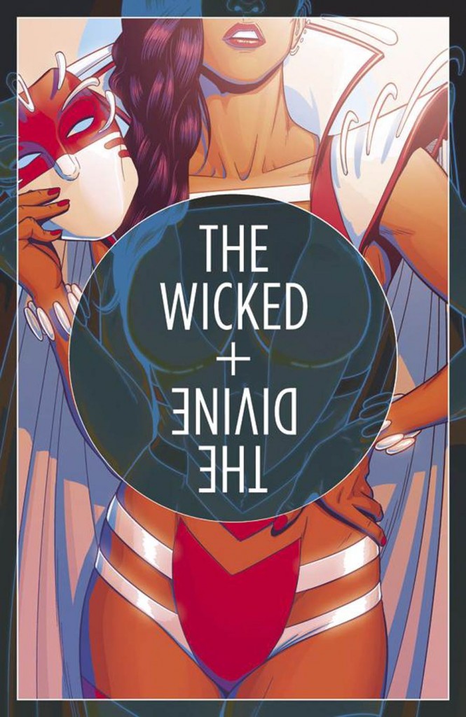 The Wicked + The Divine #13
Image Comics/$3.50
Written by Kieron Gillen.
Art by Tula Lotay, Jamie McKelvie and Matthew Wilson.
MJ: “Fucking Tara.” It’s a phrase derisively uttered by many throughout The Wicked + The Divine, referring to the only god who has remained elusive to us readers, at least until now. It turns out Tara is an amazing, compelling addition to the Pantheon, a fact that’s revealed in twenty-five gorgeous, startling pages of personal confession. At the very least, this issue is a superbly-crafted and deeply affecting single issue.
The plot of the six-issue Commercial Suicide storyline takes advantage of a new artist (and their distinct style) with each installment, focusing on one god per book. Like the first issue, this isn’t a break from the series’ overarching plot—writer Kieron Gillen skillfully continues the forward momentum—but it does wander off into its own territory more, ultimately to its great benefit. For a character who prefers to wear a mask, this is an achingly intimate portrayal of a woman caught in the limelight she never wanted, one she is only ready to escape. Gillen has, in fact, written the most intimate issue of the series here, not an easy feat for a series known for its severe emotional overtones.
Tula Lotay’s art imbues the pages with a soft loveliness that spite the occasionally harsh content. Every page is beautiful to behold, a fitting representation for a character who states, “My music, my mask, my clothes. They’re all just ways to hide. You’re always going to stare. Stare at this, not me.” Being a woman in the public eye means constant, entitled comparison to an imaginary feminine ideal, and Lotay’s lush tones and elegantly expressive faces achieve that sense of heightened allure, while putting soul and smoldering emotion behind what could, in other hands, be mere shallow appeal.
Impressionistic flourishes match the personal nature of the story; abstract brush strokes linger across panels and become more pronounced when Tara employs her godhood. Lotay takes the book from concert-hall insanity to calm streets to a quiet club flawlessly, colors shifting from vibrant neons to muted neutrals to warm reds. The last pages are filled with corals and golds, the dreamy pastel accents nearly enveloping their tangibly heartrending finale. In between, a few excruciating pages of vitriolic fake-tweets (bereft of Lotay’s art but for tiny rendered avatars) are absolutely painful to read, mostly because they could have been taken directly from the dregs of social media, at any given moment. (The amount of online vitriol we see compounds itself over the course of mere seconds. It’s a powerful, daunting sequence.)
“If life taught me anything it’s that I’m here for people’s pleasure.” Tara, while she’s obviously a fictional character, becomes an all-too-realistic depiction of how famous women (and, let’s be honest, most women in general) are forced to deal with the aggression that comes with an assumed entitlement, that it’s okay for people to judge them by their bodies and appearance. Even as a god, a pop star celebrity with multitudes of fans, Tara is ultimately powerless against a permeating, toxic misogyny that, if we’re being honest, we probably take part in every day. The Wicked + The Divine #13 gets to the heart of that eloquently, thoroughly, and hauntingly. “Fucking Tara”, indeed.
10 out of 10
 Airboy #3
Image Comics/$2.99
Written by James Robinson.
Art by Greg Hinkle.
JJ: I don’t know what kind of person James Robinson is.
I do know that he’s been through several different kinds of personal hell, most of which were likely of his own making. He’s a surprisingly candid person, I do know that; a person who’s quick to accept responsibility when he’s wrong, and someone who doesn’t shy away from the dark stuff when he speaks in interviews.
If there’s a shred of truth to be found in Airboy — and considering how open Robinson is about his history with substance abuse and interpersonal relationships, there’s no reason to believe that there isn’t — then the man has truly led a perplexing and perilous life. It’s that life that informs this, erm, “re-imagining” of a nigh-forgotten Golden Age property, one that has survived plenty of achingly dull attempts at contemporary relevance as it is. Now it is a property that’s survived long enough only to get yanked into a Kaufman-esque dark night of the soul. Airboy could be considered the comic book equivalent of a snake eating its own tail, but it’s nowhere near as dire as that. It can’t be.
Because, as a character, Airboy isn’t the focus of the book. He isn’t the character who has to endure the piercing and unforgiving gauntlet of public scrutiny to find a shred of humanity in himself. Airboy isn’t scraping the walls with his nails to reach artistic relevancy. James Robinson is. This four-issue mini-series isn’t an exploitive, wild grasp for attention. It’s a four-colored confessional, dipped in sickly teal hues.
But in order for a story like Airboy to work, it has to be held upright by a certain level of honesty. In the medium of comic books especially, when we’re privy to a debauched jaunt of hedonism the likes of which Robinson and artist Greg Hinkle put us through in issues #1 and #2, it’s easy — for me, at least — to spot a phony, someone putting on subversive airs because that sort of lifestyle is romantic to them, or worse, heroic. After a thorough scan of Airboy‘s first three issues, it’s apparent that Robinson chooses to depict the life favored by hollowed-out shitheads with a potent sincerity that could only come from experience.
That experience comes in handy for this darkly hilarious, often morbid glimpse into the creative process. Airboy wouldn’t feel as raw or honest if Robinson couldn’t get a clear look in the rearview mirror. But there’s a tremendous chasm that lies between “honest” and “brave”, and if James Robinson is half the person I think he might be, after spending so many years reading his work, it’s likely that he would prefer to reside on the side of honesty. There’s integrity to be found in that. But with it comes a level of accountability that won’t be denied, not anymore. Every decision that’s made in Airboy, no matter how profoundly ludicrous Hinkle renders it, is anchored with bouts of sobering accountability. Robinson and Hinkle’s fictional avatars may not often win against it, but their struggles with responsibility ring true.
That’s where the realism lies in this book. Hinkle and Robinson’s dedication to the details, no matter how uncomfortable or offensive they are for some, show that on the other side of life — where failure, depravity, and self-abuse are commonplace — there’s nowhere to hide. It’s not always an easy read, it’s certainly never a pleasant one, but Airboy is comics found in its purest form. In showing what kind of a person Robinson once was, we’re offered an opportunity to look at our own lives, the mistakes we’ve made, and the accountability we either embrace or ignore completely.
10 out of 10
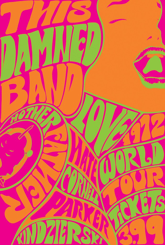 This Damned Band #1
Dark Horse Comics/$3.99
Written by Paul Cornell.
Art by Tony Parker; colors by Lovern Kindzierski.
SS: This Damned Band is a book about facades. From start to finish, it questions what’s being portrayed, what’s trying to be portrayed, the effects of this disparity, and the seemingly dangerous lines we toe when projecting versions of ourselves to the outside world. If this sounds like a lot to be contained in a first issue, well, it is. But the result contains both the good and the bad found in media, journalism, and the rock and roll lifestyle.
As the inaugural issue opens, we’re immediately presented with a documentary-style look at the 70’s rock group, Motherfather. What’s interesting right away is the fact that we’re reading a graphic depiction of a filmed documentary, an instant example of the sacrifices of authenticity we must make in the creation of such an artifact. What small human moments — the facial expressions, idle movements, twitches and tics — are we missing when we only see the still shots of Motherfather performing for a crowd? We’re shown scenes of a live show and the backstage fallout of a seemingly average (as far as average goes for international rockstars) show. We see lead singer, Justin Parish, mugging for the camera, and putting on a front as a man deep into magic, drugs, and the occult. Concurrently, the group’s architect, Clive Stanley, directs other members to remember that there’s a film crew around and to keep up appearances. This toying with public relations is paramount to the core of the comic.
There’s also the candid look at a rock and roll band with all of their excesses, their dynamically vapid relationships (within and outside of the band), and their problematic behavior (be it misogyny or sociopathy) without the context of any audible music. This, in effect, portrays the band without any of the positive, redeeming qualities (ie. art) and forces us to judge these folks strictly on their behavior outside of their profession. What makes them a worthwhile entity? Does this bunch of decadent shitheads really need to be documented or even exist? The documentary-into-comic format strips some of the variables that would otherwise be present, and gives us a straightforward look at men acting like rockstars, and what we see isn’t all that appealing.
I’d be remiss to omit any commentary on the cover of This Damned Band #1, because holy cow, is it great. Whether or not you’re into the art itself, the tri-color caricature of early 1970s psychedelia draws the eye on crowded comic shop walls. Not only is it admirably smart marketing in a time when every title (especially on smaller presses) is fighting for visibility among a sea of similarly formatted books, but the cover is also a really gorgeous tribute to the overly-commercialized stoner aesthetics of a post-hippie era.
And that’s what we’re viewing in This Damned Band: the presentation of a band as something they aren’t. It’s confusing (maybe a bit too much so) and complex, but what multi-layered story isn’t? Motherfather calculatedly depicts themselves as devil-praising spiritual transcendents (and by the end, the demonic element makes itself known) when really, they’re just a bunch of party bros trying to get drunk and get laid. The gap between the truth and the perception is the story that’s being told. It’s heavy stuff for something that starts off as innocuously as a comic book about a rock band. At least, that’s what it seems like.
8 out of 10
Agree? Disagree? Which comics do YOU want us to cover this week? Let us know in the comments below.


