

By Molly Jane Kremer, Scott Southard, and Jarrod Jones. Our Week In Review collects our thoughts on the comics that demand attention. Do you have a deep-rooted desire to know what we think about all your favorite books? Well. This is where you need to be.
 Loki: Agent of Asgard #17
Marvel Comics/$3.99
Written by Al Ewing.
Art by Lee Garbett and Antonio Fabela.
MJ: In the current age of blockbuster superhero film franchises—with Marvel and DC scattering themselves across the next few years’ summer movie slates like an overabundance of confetti—this near-saturation has had some interesting effects on the comics themselves. One of the most noticeable changes in Marvel Comics has been the attempts to make comics characters more reflective of their cinematic interpretations, and it makes sense for Marvel (and Disney) to want comics that match their multi-million dollar properties.
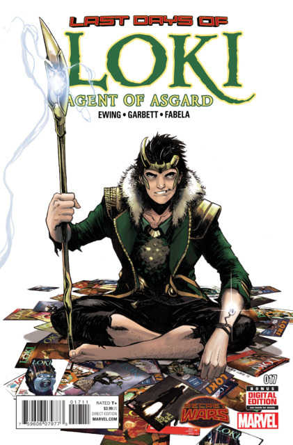
The look (and personality) of the character Loki has been one of the most glaringly obvious amendments to Marvel’s comics continuity: since Tom Hiddleston’s portrayal of the now-iconic villain (inarguably the best villain of all the Marvel films), Loki’s comics-incarnation has changed from a endearingly-precocious, well-intentioned child to a smirking and androgynous twenty-something anti-hero (a far cry from a wholly-evil hunchbacked grotesquerie underneath a horned helmet). Loki’s outright villainy has been abandoned (“Nah. No more evil. Mischief, now. That’s still got legs.”), bringing the character closer to his trickster-god roots, and allowing for a meditative consideration of mythology, storytelling, and the transformative powers of fiction.
Al Ewing touches on all these themes masterfully while also playing with the concepts of change. Frightening yet hard-sought, arduous yet inescapable; the daunting feelings of change running alongside the immense possibilities of what could be. Taking place in the void-that-was-the-Marvel-Universe occurring after Secret Wars #1, the issue somehow simultaneously functions well as a tie-in comic, as a single issue, and as a finale to the series. Ewing ensures that Loki is – as a God of Stories should be – witty, erudite, and sharply aware: the best host imaginable for the end/not-end of the world. Sophisticated similarities to Neil Gaiman’s Sandman sparkle brilliantly throughout, and some of the best multiversal constructions of Grant Morrison are brought to mind—and for more than just the occasional “breaking of the fourth wall”. (Loki jokes to the reader about “a story so big and mad and brilliant that it goes back in time and changes other stories” in a smirking aside, and it’s perfect.)
Over the course of the series, Lee Garbett’s art has evolved into gorgeously subtle expressiveness amid well laid-out pages, and with colorist Antonio Fabela he makes apt use of a whole lotta negative space in this issue. He gives the pages a well-paced flow, with top-notch design work throughout. He gives Loki a Puck-ish air and look, with deep-set darkened eyes, and a crooked, gap-toothed grin: this is the refined and regal cinematic Loki, but given a wanderer’s threadbare trousers and a haunted (and haunting) gaze—all while somehow retaining his sly, mischievous charm. Garbett has, in mastering this character, mastered his style, and I look forward to seeing his name on a new series sooner rather than later.
It’s unfortunate (and aggravating) that Loki’s popularity couldn’t sustain this very smart, consistently entertaining series, but seeing as Marvel hasn’t announced every single one of their All-New, All-Different titles yet, there is a chance a new Loki book might still be among them. Even if they do relaunch the title, they might not revisit this wonderfully literate and darkly self-aware iteration of the character: but as Loki so eloquently puts it, “We’re all going to change again. That’s just life.” These seventeen issues will remain a compellingly clever and honest series, and a superb illustration of the mythic underpinnings of superhero comics.
9.5 out of 10
 Hip Hop Family Tree #1
Fantagraphics/$3.99
Written by Ed Piskor.
Art by Ed Piskor.
SS: I’m a sucker for a good, simplified breakdown of pop-culture history. Not only do we get to see the stories behind the things we love, but the sometimes messy origins to cultural artifacts that have always seemed so polished and complete. That’s why the concept of a graphic breakdown of hip hop history has always been charming and intriguing. There’s a whole world waiting to be documented and displayed.
So when I heard that Fantagraphics was releasing Hip Hop Family Tree as a monthly comic (Fantagraphics’ first monthly!), I was kind of excited. Besides being the easiest Christmas gift to give to your roommate/cousin/Secret Santa at work, the hardcover volumes have been an interesting handicraft on comic shop shelves for a few years. A blend of stylized non-fiction and old-school music documentation isn’t seen all that often. But my enthusiasm waned quickly when I realized that the monthly issues were simply a serialization of the previously released content. Aside from the disappointment in no new material, taking another look at the beginnings of this book, as well as Ed Piskor’s depictions of the beginnings of hip hop, opened up the floor for a much more critical read of the content.
It must be mentioned that what Piskor put together was a labor of love. He has an appreciation for the biography of rap that very few others could even comprehend. Just take a look at the “Director’s Commentary” at the end of the issue. The page by page (sometimes panel by panel) breakdown of factual elements is astounding and reminiscent of From Hell’s 75 pages of footnotes. Hip Hop Family Tree is impeccably structured in displaying a nonfiction record of the blossoming world of rap music. Tack on a Silver Age graphical style and it has a sense of historical qualification that makes it believably cohesive.
But this is also where problems begin to arise. The portrayal of almost every character is caricaturistic and over the top, but not in ways that are entirely humanizing. I can never tell if the older blacksploitation-esque stylization of the comic is tongue-in-cheek or not, because sometimes it’s fun and expressive, while other times it comes off as cavalier and tone-deaf. Couple this with the fact that we’ve got a white guy writing a boat load of AAVE dialog, and the dynamics of the book begin to feel increasingly problematic (also, the suggestion that the burgeoning New York DJ scene was fueled by looting and and littered with guns seems like a dismissive and, uhh, pretty racist cherry on top of everything).
In addition to all of this, the lack of women present in Hip Hop Family Tree is symptomatic of real life hip hop’s male-dominated/misogynistic scene, but it’s also clearly a sign of authorial perspective. Which brings us to the logical conclusion that maybe having a white author tackle a project on predominantly black culture all on his own is a questionable venture from the start (even if his intentions seem to be of the best variety).
The moments where Hip Hop Family Tree really shines (and there are certainly those moments) is in the asides and the anomalies. There are small instances like the use of scribbles instead of actual letters in speech bubbles, and bigger bits, like the wonderful tangential dive into the beginnings of the Fabulous Five and the birth of the New York Graffiti scene. It’s these earnest derivations from the factual formula that give the book its pomp.
And that’s what it’s supposed to be, right? An ultra-stylized look at the dawn of an entire musical experience and a love letter to a dominant force in pop culture. It’s clear that Piskor has a bone-deep devotion to hip hop, I just don’t know if he’s the right person to author a comprehensive retrospective of the genre. Some of the depictions and descriptions would make more sense if multiple creative perspectives were available rather than filtering an entire history through a single person. Hip Hop Family Tree is a book I really want to like, but there are too many factors tugging at it to let this book to find a real rhythm.
6 out of 10
 The Disciples #3
Black Mask Studios/$3.99
Written by Steve Niles.
Art by Christopher Mitten; colors by Jay Fotos.
SS: There’s something about space horror that hits a deeper, darker core than your run-of-the-mill ghost story. The constant state of fear in the midst of interstellar nothingness can provide its own brand of terror. But this kind of storytelling takes the already ghastly prospect of the expanse of outer space and infuses it with the specter of a looming dread.
When we break it down, a big factor in upping the fear ante is the fact that a large quantity of control must be conceded in order to survive within the physical laws of space. Mobility is constricted by the confines of a shuttle or a space suit. Human contact is separated by radio signals and com-links. Fear levels rise exponentially as previously unfathomable ways to die are introduced in droves.
The Disciples does many things well, but its heaviest strength is that it lays thick that sense of existential space-doom and it never once lets up. And even though we’ve travelled with the Starship Venture long enough to get a grip on where we are and who we’re following, writer Steve Niles is still keeping the audience in the dark. The Disciples moves fast, and it’s sometimes hard to follow. Things aren’t explained, rather, they’re realized and discovered by the reader at the same pace as its characters. So as each step is taken and each new door is opened, we’re all exposed to whatever may be behind it together. This maintains a heightened level of tension from the first page to the last by keeping the audience just as lost and alone as the protagonists.
By the third issue, we’re in too deep to back out. The book opens as we follow Dagmar and Jules into the expanses of a freshly dug cosmic graveyard on Jupiter’s moon, Ganymede. Immediately, we’re confronted with the sense that there is no escape (and that single dreadful piano note begins to play rhythmically and sparse over and over in your head. You know, the one from all those spooky movie trailers). Forget whatever mission these folks had, because by this point, the story has rapidly become about survival rather than duty, and the attempt to stay alive trumps all else.
Obviously, the purgatorial nullity of space would be far less threatening without a seriously bleak portrayal of the void. Christopher Mitten and Jay Fotos present a mixture of beautifully painted landscapes and boundless structures behind purposefully crude sketches. The juxtaposition works well to emphasize the open emptiness of the galaxy and the people trying their best to keep floating within it.
The space-scapes come as close to literally exemplifying “breathtaking” as I can imagine (like, I got that quick gulp in the back of my throat when I turned the fourth page). It induces a similar feeling to pressing one’s nose against the glass from the observation deck of a skyscraper. Everything is just so vast and taking it all in at once is too much for the human brain to handle. Couple the inner-pages with the five-tone, dead-body-blue cover that exudes a sense of gripping desolation, unavoidably present and pressing. It conveys the ethereal feeling of endlessly falling down a sinkhole with no bottom, which is a pretty perfect elucidation of the series in toto.
Earlier in the series, Dagmar says she woke from a “weirdmare,” fitting because I can’t think of a better way to describe The Disciples. It’s a big, confusing mural of strange that we’re confronted with rather than introduced to. As we step further into their mission, things get more bizarre and more real. The true beauty of The Disciples rests in its haunting relatability. All humans in space are just a moment away from insignificance, and Niles and Company make sure you can feel it.
Maybe what makes the horror of space so terribly chilling is the tangibility of it. That the fabric of a space suit is all that keeps us from death. That the grit of human life teeters on such a fragile fulcrum. That there’s no distinct lines to distinguish worth from oblivion. The Disciples points these facts out on every page, and we’re forced to confront all of the terrifying truths we otherwise avoid in the safety of our terrestrial trappings.
8.5 out of 10
 Star Wars #8
Marvel Comics/$3.99
Written by Jason Aaron.
Art by Stuart Immonen, Wade von Grawbadger, and Justin Ponsor.
MJ: Ever since Marvel regained the Star Wars license and began publishing chart-topping new comics with it, the quality of the books themselves have matched the massive sales numbers (and even matched, dare I say, our ridiculously high fan-expectations). With issue eight, the book introduces its new regular art team, while flexing its narrative muscle and delving further into its own independent story—with new locales and a new, extremely intriguing character.
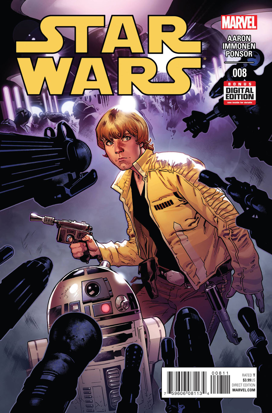
Though John Cassaday’s art (with Laura Martin’s colors) in previous issues was lovely to look at, the work of Stuart Immonen, Wade von Grawbadger and Justin Ponsor in this issue is outstanding. Every page and panel stands out: from the flawless perspective of a gorgeously rendered Star Destroyer; to the soft glow of a lightsaber – and its glossy reflection in Luke’s eyes; to the imaginative, energetic layouts throughout the entire comic. It’s impossibly gorgeous.
Immonen is also talented enough to keep the main characters’ likenesses consistent without using expressions instantly recognizable as film stills. (Because, let’s be honest, we’ve watched this trilogy so many times we remember and recognize every single one of Han Solo’s smirks. Or is that just me…?) Visually, this entire issue has an organic, warm vitality that hadn’t been achieved before in the series, and it’s stunning.
The comic seems to have reached a new level with this issue: characters go beyond planets we’ve seen before, and speak to completely new characters, who are intrinsically relevant to pasts that never saw mention in the films. Writer Jason Aaron can flex his copious storybuilding muscles more, adding new faces and places to the Star Wars mythos, weaving it all within pre-existing characters and plots (and still somehow keeping everyone’s dialogue so uncannily in-character). Newly introduced Sana Solo, spouse of Han (or maybe not), is captivating enough to make even that scoundrel nervous, and is most likely not what she seems. At the very least, she’s a woman of color in a franchise historically full to the brim with white dudes, and if her and Leia get to chatting—hey, we might even get a Bechdel pass!
With each issue an advancing step into a newly-forged extended universe, Marvel’s Star Wars continues to create exciting additions to an essential film trilogy, and with the addition of Immonen, von Grawbadger, and Ponsor, somehow its phenomenally consistent high quality has been further improved. This series proves, without a doubt, that when a studio, publisher, and creators put their minds to it and their asses behind it, tie-in comics can be just as good as (if not better than) going to the movies.
9.5 out of 10
 Archie #2
Archie Comics/$3.99
Written by Mark Waid.
Art by Fiona Staples; colors by Andre Szymanowicz and Jen Vaughn.
JJ: Don’t think for a second that I’m throwing shade at Mark Waid and Fiona Staples’ incredibly arresting Archie reboot by saying so, but I’m still working out what kind of person Archie Andrews is supposed to be in this book.
From a particular point of view, it appears that the creative team is intentionally keeping the befreckled youngster just far enough out of the reader’s grasp so he can remain the elusive Mr. Andrews of Riverdale High: that mischievous letterman who evades the advances of his would-be paramours nearly as often as he does certain doom. (I don’t know how he managed to set 31 flavors of ice cream on fire, but it’s pretty hilarious that he did.) Archie’s just as daft and prone to mayhem as he was in the years during his peak sockhop days, only now Waid’s replaced frothy milkshakes with bitchin’ guitars.
Is that the reason why we’re kept from properly defining the inner-workings of Archie’s mind? Because this is, well, an Archie comic? That simply can’t be, mostly because all the evidence I’ve found in this book points to the contrary (and I’ll get to that in a moment). As it stands today, this kid has solidified into something of a fourth wall-socking cypher, a vastly superior analogue of the hashtag milksop he used to be, but intriguing? Andrews remains anything but. (He is, however, provided moments of comedic depth; just read the crazy things Archie says to us when he finally lays eyes on Veronica Lodge: “Time stops, then lurches violently forward, then collapses, smelling of electrical fire,” he declares. But then he’s allowed to continue: “Not unlike my car.” Guh.)
Again, if this sounds like I’m simply not getting Waid & Staples’ stupendously entertaining Archie, if this eponymous spud isn’t exactly setting my world on fire, then let his comrade-in-arms and his best mechanic light the way. Because Archie #2 just might have some of the most introspective and lovely moments I’ve found in a comic book this year, and the come from, of all people, Betty Cooper and Jughead Jones.
Look at the second and third pages of the issue. In just six panels, Waid gives us a Jughead origin story that does more to make us understand Jughead friggin’ Jones than anything that has ever come before. And through the prism of Staples’ idiosyncratic work, we’re shown a boy who’s closer to becoming a man than his redheaded buddy can hope to be, all in a matter of moments. From hamburgers to apples, from riches to rags, Staples’ Jughead is a wise fellow who has developed an ability to project pride and self-sufficiency in a way that makes him a vastly more interesting character than Andrews is right now. (Can’t wait to see what Chip Zdarsky has in store for us.)
It’s a precarious thing to consider destiny in a book called Archie, especially when we’re talking about Betty Cooper. Betty’s always been depicted as the wholesome, relatable half to Archie’s amorous heart, an entity more defined by her dopey love for a guy who doesn’t deserve her than a young woman with a tangible agency. Waid toes the line between the character’s patriarchal trappings (“I feel bad for not inviting Archie…”) and providing her a formidable presence of her very own. We see her bat away the advances of a presumptuous would-be lover (“Dude, hands where I can see ’em!“) while attempting to doll herself up to appease her girlfriends. But it’s though this particularly well done sequence that Betty shows us that there’s nothing wrong with her that she can’t fix with her bare hands. Betty Cooper deserves to be a woman who lives for more than the admirations of nitwit. I hope we get to see that character flourish.
I keep fighting the impulse to use words like “depth” and “nuance” in this review. This struggle comes from the decades I’ve dismissed Archie Comics as vapid entertainment, but now I’m met with a curious thing: a book that takes this world I’ve tossed aside for so long and makes it something I can actually care about. Mark Waid and Fiona Staples have given us a book that seems to be screaming at us, “it’s okay! we’re here to show you that everything’s okay!” And while it may have a ways to go before I’m wholly convinced that Archie Andrews is a fellow worthy of anyone’s love (including mine), I’m… well. I guess what I’m trying to say is, if there had been a comic book as sweet and challenging like Archie when I was younger, I might have turned out a completely different person. Hell, this might have been a completely different world.
9 out of 10
Agree? Disagree? Which comics do YOU want us to cover this week? Let us know in the comments below.


