By Molly Jane Kremer, Scott Southard, and Jarrod Jones. Our Week In Review collects our thoughts on the comics that demand attention. Do you have a deep-rooted desire to know what we think about all your favorite books? Well. This is where you need to be.
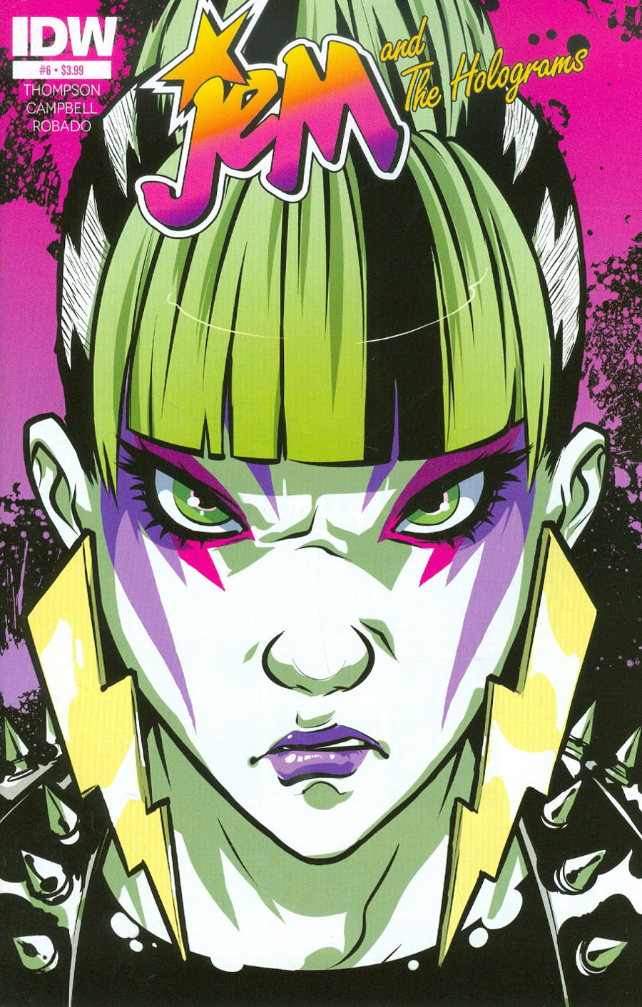 Jem and the Holograms #6
IDW/$3.99
Written by Kelly Thompson.
Art by Sophie Campbell and M. Victoria Robado.
MJ: I only recently realized how many current (and awesome) comics there are about rockstar girls and/or/in girl rock bands. Besides the mainstay Josie and the Pussycats and the various popstars within the Gillen/McKelvie opus The Wicked + The Divine, there’s Spider-Gwen drumming in the Mary Janes; Black Canary fronting, well, Black Canary; and in IDW’s glorious Jem and the Holograms, two girl bands vying for the adoration of the masses. The final chapter of Jem’s first storyline fittingly ends in a battle of the bands, and continues its focus on the Holograms’ ambitious attempts at music stardom amid their tumultuous personal lives and band rivalries.
Writer Kelly Thompson and artist Sophie Campbell are both credited with the story, and they emphasize the themes of friendship, sisterhood, following your dreams, and trusting your heart. It’s an inspiring comic (Jem even sings, “You’re gonna soar, but you gotta do more”) both in use of those topics and in its heavily lady-centric plot. The entire series so far has been a fluid exercise in acing the Bechdel Test, and Thompson and Campbell ensure even the “villains” have understandable motivations: on the final page, Pizazz’s threat of war is underlied by the gleam of angry tears in her eye.
Campbell’s art successfully does what few manage to do visually: she functionally illustrates the two bands’ music. M. Victoria Robado’s beautiful colors come heavily into play here as well, as spikey swirls of purple and lime green accented by the odd neon skull—framing the Misfits’ suitably gothy lyrics—give way to the pinks and blues of the Holograms’ inspiring melodies. (You can almost see the sparkles.) The lyrics aren’t exactly deep, but hey: it’s supposed to be pop music, and though simplistic in structure, the songs’ themes match their respective bands’ personas to a tee.
There isn’t a single page that isn’t vibrant and teeming with energy. Imaginative touches abound throughout, like each of the Misfits riding guitar-shaped motorcycles on stage for their final set, and – across the first page – each member of both bands covered in a rainbow of post-food-fight detritus. As it’s been since issue one, each and every character’s hair and attire are entirely on point, especially by the time the two bands end up on stage: Kimber’s pink locks get trimmed down to a tight mohawk, Stormer becomes an explosion of blue curls, and Pizazz shaves her head and wears buzz saw blades as earrings. (Yes, buzz saw blades as earrings, and it looks amazing.)
IDW’s Jem and the Holograms has been (oh no, I have to say it) truly outrageous ever since its first issue hit the stands back in March, and issue six is an appropriate capstone for the first storyline. The inclusion of a touching letter by Campbell at the end of the book, discussing how much the series has meant to her (and, thank goodness, promising her return after a four-issue break) brings an element of poignancy to an already triumphant conclusion.
9 out of 10
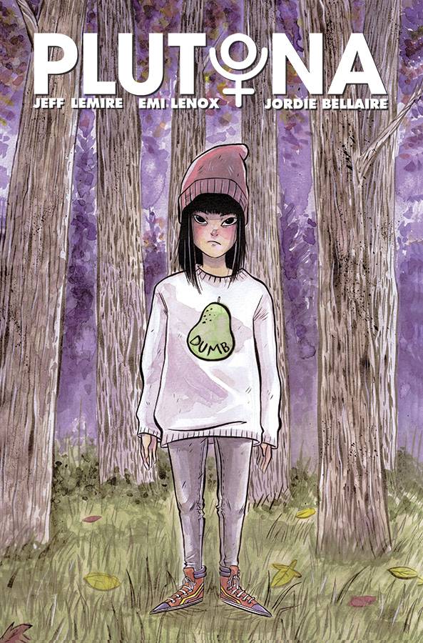 Plutona #1
Image Comics/$2.99.
Written by Jeff Lemire and Emi Lenox.
Art by Emi Lenox and Jordie Bellaire.
MJ: Every once in a while an angle on superheroes not already done to death is revealed, and Plutona is one such comic. It’s both funny and fitting that an Image Comics release would give capes-and-cowls a gentle nudge towards originality in the same way it has for every other type of sequential genre of late. Instead of focusing on superpowered people punching each other, Jeff Lemire, Emi Lenox, and Jordie Bellaire turn their focus to a group of kids, and their discovery of the death of a hero.
Since arriving in mainstream comics, Jeff Lemire has always shown amazing aptitude for writing the younger set and giving kid characters believably realistic motivations and voices, evident in his work on Sweet Tooth, Animal Man, All-New Hawkeye, and Descender. Emi Lenox is co-credited with the story as well as the line art, and has helped produce characters both fully-formed and well-rounded. Each of the kids in Plutona – all suburbanite schoolkids in a town next to Metro City and its smattering of superheroes – have distinct personalities. Occasionally some are even distinctly dislikeable too, while still remaining sympathetic: you want to hug a couple, kick a couple in the butt, or both.
It’s an excellently plotted first issue, firmly establishing all the main players and their situations, with a gripping ending that leaves the series open to immense dramatic possibility. Lenox and Bellaire begin the issue with flies buzzing on a dead body in the dim pre-dawn, and then they switch to a pastel, quiet Pacific Northwest sunrise on the following pages. Bellaire swings quickly and effortlessly between foreboding gloom and edge-of-summer brightness throughout, her colors gorgeous as usual. Lenox’s art is charming and approachable, with an underlying sensitivity and a deceptive depth.
An additional short after the comic’s main story reveals more about Plutona herself, giving her death some resonance in introducing both her mother and young daughter, and how she works at a diner in addition to serving her city as a superhero. Lemire writes and illustrates a bittersweet slice of the hero’s last day, stuffing those few poignant pages with emotion, typical with his excellent solo work.
Both Lemire and Lenox have said they didn’t conceive of Plutona as a kids book, likening it more to Japanese horror than typical all-ages fare. But like the easily comparable film Stand By Me, Plutona is full of extremely relatable characters, and thus far is a wholly realistic portrayal of that twilight-edge of youth, combined with the appeal of Lenox’s expressive art. If seven-year-olds can read and enjoy paperbacks of The Walking Dead – willingly purchased for them by verbally-warned parents, which I’ve seen happen with my own eyes – a seventh grader would be just fine with Plutona. With kids’ typical yen to reach past the oft-hollow media within their own demographic, this comic seems like an appropriate middle-schooler read, even if (or maybe especially if) it gets a little more dark and/or gruesome.
8.5 out of 10
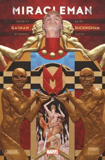 Miracleman #1
Marvel Comics/$4.99
Written by Neil Gaiman.
Art by Mark Buckingham; Colors by D’Israeli.
SS: We’re finally on our way to completing the epic that began 30 years ago. With the first three volumes of Miracleman republished by Marvel over the past year or so, we now move forward from the completed arc of Alan “Original Writer” Moore to the unfinished storyline Neil Gaiman started in 1990.
To begin, it’s quite surprising that Marvel has been able to pull this project off. The convoluted history of the rights to Miracleman is a labyrinthine “who’s who” of 80s and 90s comics, and the modest ability to reprint the old volumes is fairly astounding on it’s own accord. But reuniting the original author and artist to do a complete remastering of their original run as well as finishing the arc that they began? It’s nothing short of…(sigh)…a miracle.
So here we are, a completely remastered version of the original issue #17, re-released now as #1, on the shelves and breathtaking. I swore out loud while turning through the first five pages of the issue, each one looking more beautiful and vast than the one before. It’s a testament to Buckingham that these pages were originally laid out so impressively (the tactical use of perspective could easily induce a bout of acrophobia), but the remake is even more stunning. Placing a copy of the original work next to the one I just picked up from the shop is like sitting a Dachshund next to a St. Bernard; There’s really no comparison. In the new version, the colors pop hard (there’s a particularly delightful sequence of neon dinosaur skeletons that exhibits the contrast between the two issues well) and the darkness that always seems to play a part in Gaiman’s work makes its presence strongly felt.
And it should be noted, Gaiman approaches the dawn of the story arc in fighting form. He employs his classically beautiful storytelling and trademark floral lexicon to begin something with a very real sense of magnitude, not only in the scope of physical action but in the truth behind the story being told. We’re given earth as a utopic society. There is no war, hunger, or suffering. A time “when the mundane and the miraculous partook of each other to the advantage of both.” Miracleman is a God among men. The stakes are immediately about as high as they possibly can be.
The story is a non-starter. If this sounds harsh or insulting, it isn’t meant to. It’s just that Gaiman’s first issue literally doesn’t start anything. It’s an introduction to Miracleman and the people within the society that worships him. Along with the totemic hero, we’re introduced to the style and scale of the story we’re about to be told, and in turn, introduced to Gaiman as a young literary-minded comic writer. He channels his intentions through the indelibly quotable narrator and we see the world as Neil Gaiman sees it (or wants it to be seen). Also provided as a prologue are his original notes and script along with sketches and concept art from Buckingham. Some neat add-ons for the fans who have already gone through the material, and a great behind-the-scenes look at the making of a comic. It’s charming to see the captions and qualifications that prelude the substantive description of each page. These two had something special going.
All told, I guess it’s just refreshing to see the beginnings of such a storied author’s career. His ability to set a mood of deistic proportions is pretty unparallelled and here we can see the roots of it all on full display. More than anything, revisiting this old material primes us all to see the new content that’s coming from this venture. It’s a rare thing to let something sit for a couple decades just to pick up right where you left it. But with the history that Miracleman has, both in story and outside of it, it’s only fitting.
9.5 out of 10
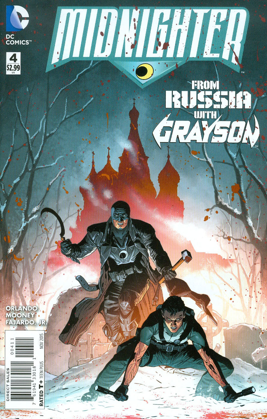 Midnighter #4
DC Comics/$2.99
Written by Steve Orlando.
Art by Stephen Mooney; colors by Romulo Fajardo, Jr.
JJ: “You people never understand what I am. The mongoose in a room full of cobras.”
That’s but one of a dozen killer lines you’ll find in Midnighter #4, an otherwise fine entry in Steve Orlando’s otherwise fantastic series featuring our favorite Wildstormer. Orlando’s strengths are on proper display here, as they have been in all previous entries of this series so far, and the mounting drama supplied by the writer have reached an innovative fever pitch. (“Humans [have been] treated with reprogrammed Martian cells, mimicking vampirism.” Are you kidding me? That’s better than awesome, that’s pure comic book bliss.) I don’t mean to lay it on so thick, but whoo — is this book fun.
This issue’s plot continues on the main story beat with little fuss: our man Midnighter strives to contain the havoc unleashed by the Pandora’s Box known only as “The God Garden” armed with a razor-sharp wit and an implausibly awesome ability to kick just about everybody’s ass. It’s uncomplicated storytelling told magnificently, and when Orlando is flanked by the book’s marquee artist, the enigmatic Aco, Midnighter is decidedly DC Comics’ ace in the hole; the most entertaining and consistently thrilling book the publisher has provided us since Grayson. If only Grifter had it this good.
So it’s fitting that issue #4 would finally, um, thrust our favorite Spyral agent against the man in black. The dichotomy between these characters is one of a well-established animosity, but it’s also one of a begrudging trust (as evidenced by M & Dick’s adorable team-up against an elite Russian torture-house). Orlando’s voice has always complimented Tim Seeley and Tom King’s work over on Grayson, and to finally see the former Nightwing kick it in M’s book is an exercise in pure wish fulfillment. For a team-up that should feel like a compulsory burden, Orlando makes the experience feel perfectly natural. That’s the good news.
The not-so-great news is that with Dick Grayson comes pinch-hitting fill-in artist Stephen Mooney.
Now, it’s not my intention to throw shade at Stephen Mooney. The man is known for delivering on a tight deadline — it’s also worth mentioning that his work conveys precisely what’s needed to keep a story moving forward, and he accomplishes that here — which is always a plus for editors and publishers looking at the bottom line. Mooney’s work on Grayson might leave me cold in most cases (his work on Grayson: Future’s End contributed to what was easily my least favorite book of last year), but here I’m finding that Midnighter #4 is Stephen Mooney as good as I’ve ever found him. His work feels looser, almost as if his time spent on Grayson fill-ins — coupled with the glory of working from a Steve Orlando script — has whipped the artist into shape, enough to kick out some of the strongest work he’s offered us yet. (Though it has to be said, there’s a strong wanting left behind by Mooney’s lack of a grasp on the human anatomy: Grayson and M strut about in towels for some Eastern Promises-style ass kicking, and somehow, you’ll wish they hadn’t.)
Mooney’s figure work makes stabs at Jock territory when Orlando’s dialogue takes the action down a notch, and then it takes a turn for the Kubertian when the fur doth fly. But seeing what’s possible from the incredible alchemy of Orlando/Aco makes any other creative team-up feel lesser by comparison. And it’s difficult to keep bouncing from Aco’s detail-oriented fight sequences to comparatively-uninspiring workhorse layouts. (Issue #2 featured equally frustrating interior art.)
I’m reminded of Midnighter’s time during the Wildstorm days, specifically during Frank Quitely’s brief run on The Authority: when the artist couldn’t possibly hit every deadline with the time provided him, other equally killer artists lined up to work overtime on fill-ins while the artist focused on putting out the best comics he possibly could. From a superficial point of view, Midnighter finds itself in a similar situation. It’s too good a series to settle for menial sequentials. For a book like this, DC would do well to roll out the red carpet for its best and brightest. That kind of worthwhile investment is what readers should expect when a comic book is this good.
7 out of 10
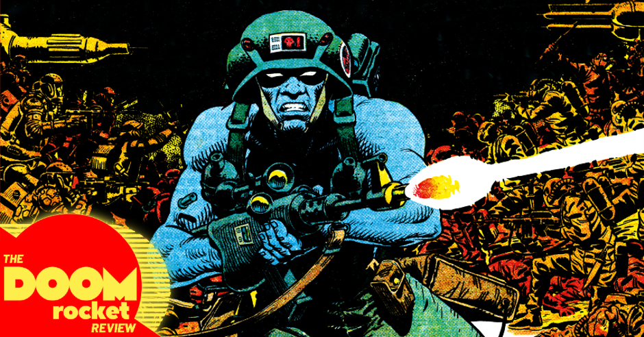
 We Stand On Guard #3
Image Comics/$2.99
Written by Brian K. Vaughan.
Art by Steve Skroce; Colors by Matt Hollingsworth.
SS: Recently, while watching pro wrestling over beers and burritos, I had a conversation with a friend about the way our generation has changed with regard to critiquing the media we consume. It seems we’ve become less interested in the actual story that’s being presented and much more interested in the machinations behind the story; Who wrote it? What were the backstage/bureaucratic structures that had to be navigated? What about the ins and outs of all the working pieces that had to fit together to create this one artifact of creative energy? In short, the meta-story has become the general object of my fascination rather than the story itself.
However! Brian K. Vaughan has garnered enough trust that We Stand On Guard allows me to sink into the writing and simply root for the survival and the success of his characters. It’s a refreshing thing to dismiss publisher politics, Twitter tension, and authorial intent in exchange for an engaging story that just lets you like it.
And boy, do I like it. The scenario Vaughan’s given us is believably dystopian. It’s a natural progression of the fears and concerns many of us hold about the current state of things in America: The militarized megapower that will do whatever it takes (and justify it with anecdotally humane evidence) in the name of self-preservation. Plopping the classic “ragtag group of freedom fighters” trope into the middle of the United States invasion works flawlessly to create empathy for anyone who’s trying to survive. He makes it easy to identify with the good guys, because they just want what we all want: to live our lives in peace.
For a series that’s had compositionally stoic (if highly militarized) covers so far, #3 goes over the top to grab your attention. Simply put: it’s a face on fire. One big screaming face, staring straight at the reader, skin melting, surrounded by flames. The new cover sits in stark contrast to the previous entries, but that seems to suit the tone of the series as it progresses. As the American assault increases in scope and aggression, things are beginning to seem bleak for our team of protagonists. The Two-Four is dying off, getting captured, splintering into a weaker and weaker version of itself as time passes. Now that the setting and characters have had a few issues to settle, We Stand On Guard has begun to twist the knife, so to speak, in our understanding and affinity for the group. They’re facing a greater emotional challenge, and each character gets a moment in the spotlight.
The United States government has been holding the leader, McFadden, in captivity, and the torture they’re inflicting (virtually simulated, but seemingly real to the victim; the logical, technological progress of American torture) is beginning to see results. This is the heart of the story, where we see America’s true villainy explained in detail rather than broadly displayed. When we contrast this villainy with the utter righteousness of McFadden’s cause, it polarizes both parties in a particularly pleasing manner. The juxtaposition is especially visible in a James Bond-ian scene where there hero and villain face off in the torture chamber, each displaying their heart of hearts in candid glory. The scene gives you that visceral hope for miraculous escape or a virtuous rescue, and when that liberation doesn’t come, it hurts all the more deeply.
I can’t give this series enough praise, as it continues to grow and work with the world that’s been constructed. Brian K. Vaughan is a thoughtful creator, and the manner in which he’s taken stereotypical archetypes and turned them into something tangible (without becoming too complex or convoluted) is impressive and enthralling. We Stand On Guard manages to be the edge of your seat thriller we all love in tandem with a harsh warning about the future of our society. It’s a commentary on the way we live and our unwillingness to change, even in the face of certain devastation. But forget all that, I just want to see where this story is going. I wanna hope the good guys come out on top.
8.5 out of 10
Agree? Disagree? Which comics do YOU want us to cover this week? Let us know in the comments below.