
By Molly Jane Kremer and Jarrod Jones. Our Week In Review serves to fill in the gaps our frequently verbose comic book coverage leaves behind. Each week, we take a brief look into the books that demand attention.
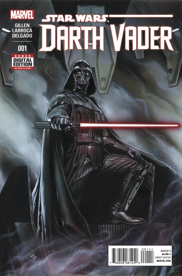 Star Wars: Darth Vader #1
Marvel/$4.99
Written by Kieron Gillen.
Art by Salvador Larroca; colors by Edgar Delgado.
JJ: It’s a fundamental truth: if you know everything about the Bogeyman, he will cease to frighten you.
Following this logic, there won’t be much argument found in saying that Star Wars: Episode I – III went and took the fright right out of Darth Vader. The aura of mystery that surrounded the most sinister man in the galaxy quickly evaporated upon the sight of 9-year-old Anakin Skywalker, a pesky, mop-topped cherub prone to squeaking “Yipee!” and other such nonsense. (Though some might say Vader’s impotence occurred when it was revealed that the Dark Lord of the Sith had – ironically enough – sired a pair of lovable, huggable twins.) Since Vader hasn’t served any fearful purpose since 1983, a question remains: does Darth Vader matter anymore?
Enter Star Wars: Darth Vader #1, by Kieron Gillen and Salvadore Larroca. The Disney acquisition of Lucasfilm meant (yay!) new Star Wars comics from Marvel, and since most of the House of Ideas’ offerings deal in events that follow A New Hope – when Vader was still a blank slate of endless fear-mongering – one would, well, hope that we’d find a Darth Vader viciously chomping at the bit to seek revenge against the rebels that shamed him, hungry, angry, and thirsting for blood. What we get instead is a leather-clad Yes Man trying to cover his ass. (Since it’s a Marvel book, it’s more than fitting to say: wotta revoltin’ development.)
Gillen’s Vader is a victim of inadequacy: not only has he suffered the indignity of allowing the Death Star to be decimated, the events of Star Wars #1 leave the purportedly monstrous Imperial shuffling his feet at the hem of Emperor Palpatine only to make excuses. (It’s a tragic thing to watch Lord Vader shrug off responsibility: “… I was not alone in my failings. The arrogance of the weapon courted disaster…”) Try applying James Earl Jones’ booming baritone to much of Vader’s dialogue in this issue, and instead you’ll hear the grating, nails-on-glass that was Hayden Christensen. (“It’s not fair!” and the like.) Incidentally, Gillen’s Vader is at his best when he’s dodging allusions to source material – a dull back and forth with Jabba the Hutt gets vastly more interesting when Vader actually gets pissed: “You called me a Jedi. You know nothing.” Tragically, there’s simply not enough here to sustain that intrigue.
Salvadore Larroca’s light-board-aided artwork grows wearying pretty damned quickly (and goes off-model more often than you’d think), but Edgar Delgado’s colors give the book a depth that matches that of Jason Aaron and John Cassaday’s Star Wars #1, which means that the team behind the new Star Wars order mean to maintain a certain amount of reverence for the films we all know and love. Darth Vader may never be scary again, but one thing’s for certain: Marvel is going to spend a hell of a lot more on black ink.
6 out of 10
Conan/Red Sonja #2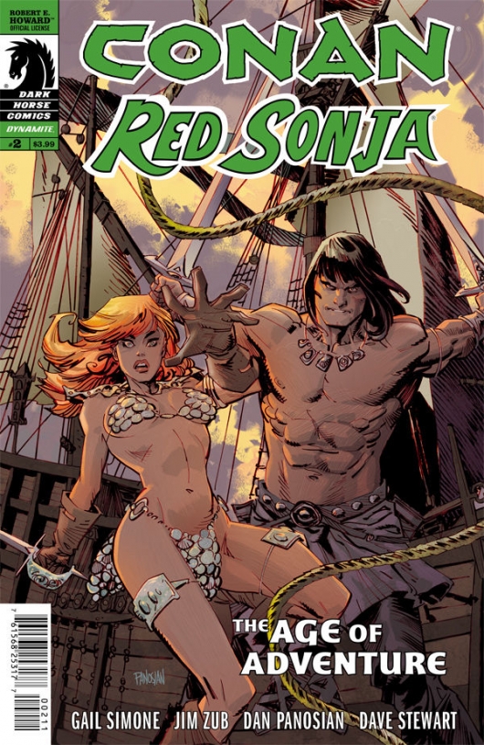
Written by Gail Simone and Jim Zub.
Art by Dan Panosian; colors by Dave Stewart.
Often in comics, team-ups – while abundant and lucrative – aren’t nearly as good as they should be. The usual, “what if so-and-so and such-and-such both fought against what’s-their-name?” often sounds better as exuberant fan-kid debate than it looks on the printed page. Thankfully, Dark Horse’s Conan/Red Sonja isn’t one of these disappointments.
Interactions between Conan and Sonja are certainly the highlight of the issue. The exaggerated, huggy friendliness between the two cocksure warriors upon reuniting is both adorable and humorous (though their respective companions don’t seem as amused). Writers Gail Simone and Jim Zub imbue this comic with the optimal amount of humor and thrill with dialogue that is both stylized and clever. They even manage to somehow improve upon the series’ first issue (which we here at DoomRocket enjoyed immensely as well).
Artist Dan Panosian’s clean inks and sharp angles again make this comic a joy to peruse, and as ever, colorist Dave Stewart’s colors match and complement the artist’s style perfectly (but do we expect anything less from the multiple Eisner Award-winner? Stewart’s work is always flawless.) Even in the midst of battle, Panosian draws our titular Barbarian with a grin on his face more often than a grimace, and it’s a smile as contagious as Thoth-Amon’s dreaded bloodroot. Expect to be wearing the same grin yourself upon reading the issue.
8.5 out of 10
 Divinity #1
Valiant/$3.99
Written by Matt Kindt.
Art by Trevor Harisine and Ryan Winn; colors by David Baron.
JJ: One does not simply wax poetic with science fiction. To do so will likely garner snide comparisons to either Issac Asimov or Stanley Kubrick (or perhaps both men at the same time – just ask Chris Nolan). For any writer of the genre, the credo is written thusly: go hard, or go away.
So writer Matt Kindt (the writer behind Dark Horse Comics’ provocative Mind MGMT) and artist Trevor Hairsine (of X-Men: Deadly Genesis) have bravely tread into the beyond and brought back Divinity, a sci-fi yarn with enough wonder adhered to its narrative that it inspires the same chills that would come with watching Tom Hanks rocket off into space in Apollo 13, accompanied by Anton Bruckner’s Symphony No. 8 dancing in the background. (Did I lose you there? Have you seen that movie? Have you heard that symphony? Read the comic and do the math!)
What’s so encouraging about Kindt and Hairsine’s opening salvo is that it works far more ably than it should: Kindt’s words become maddeningly poetic – “… It felt as inevitable as turning the next page in a book...” -but the writer makes the (primarily) captioned narrative work in a dreamlike manner that gives Divinity a feeling that the comic was “… a page from a purloined paperback science fiction novel.” That’s a gorgeous thing, and coupled with Hairsine and inker Ryan Winn’s marriage of flawless imagery, Valiant Next’s latest endeavor promises to hit harder than anything that came before it.
Divinity has many strengths working for it, so many in fact that it’s easy to overlook the few clumsy facets that come with it: David Camp looks to be the human anchor to Abram Adams’ transcendent comrade, but their introduction is sillier than what the writer might have intended (“This is how David finds his peace…” Yeah, sure, but he certainly has trouble finding suitable last words: “Crap!”). And then there’s the approach to the Soviet culture, one where most of its men and women walk about spouting propaganda while sporting names like Nikolai and Eva. (Did the Pentagon pay for this book?)
There’s not much room for characteristic depth in the first issue of Divinity. But Kindt’s words, matched with Hairsine’s visuals, give it a lyrical poignancy (two hands lovingly grip each other in one panel, the next sees Abram clasp the bolt that will keep him safe in his space-faring mission). There’s a lot of world to cover it seems, and the fact that we’re kept at arm’s length for the duration of the introduction does wave a red flag. (The limited series ends at issue #4, so there’s that.) Issue #1 feels like one hell of a trailer to something much larger, something far more magnificent. As far as premiere issues go, Divinity #1 is a tease above all others. That’s why I’m clamoring for issue #2.
8.5 out of 10
 Harley Quinn Valentine’s Day Special #1
Written by Amanda Conner and Jimmy Palmiotti.
Art by John Timms, Ben Caldwell, Aaron Campbell and Thony Silas; colors by Paul Mounts and Hi-Fi.
Though Harley Quinn’s popularity continues to grow exponentially across all of pop-culture, I can’t say I’ve enjoyed much of what DC’s done with her in the past few years. Maybe I’m showing my age in that I just can’t get into her new costume (though Amanda Conner’s roller-derby-esque takes are a major improvement over the bustier + booty shorts she sports in other appearances), or that I still hear Arleen Sorkin’s voice when I read Harley’s dialogue. She’s a difficult character to write for many reasons (Chris Sims elaborated on that more eloquently than I ever could), and lately she’s somehow become DC’s own fourth-wall-breaking Deadpool – which can be seen as good or bad.
Either way, I was pleasantly surprised by the Harley Quinn Valentine’s Day Special. With thirty-nine story pages (and only one ad! Impressive, DC), there are too many bits that are a tad too silly (a villain called “The Mighty Carp”? *sigh*), but there are some bits that are both silly and glorious. One is Harley’s dream sequence in which she’s marrying Bruce Wayne, and it’s both goofy and adorable – she fixes this flawed, however idyllic future to end in a much more pleasant kind of way than it ever could. (In it, she asks Poison Ivy to come with on their honeymoon, and with Ivy’s response – “I wouldn’t miss it for the world…” – I wonder if DC will ever do more than tease the full extent of the relationship between these two women? A girl can dream, I guess…)
The art is good – very good – and the oft-jarring nature of having four artists on one book is alleviated by having two of the artists work on dream sequences. The aforementioned Harley dream is illustrated by the great Ben Caldwell, and it’s stylish and stylized cartooning of the highest order; the Bruce Wayne dream-sequence – a strangely light-hearted one for the Bat – is illustrated by Aaron Campbell and Hi-Fi, and has a much more realistic look. Paul Mounts’ incomparably vibrant coloring also helps tie the main pages by artist John Timms into the other’s, giving everything in the issue a seamless flow. While I still miss the Harley I grew up with (and I probably always will), this Special makes my loss ache just that much less.
7.5 out of 10
Agree? Disagree? Which books are YOU reading this week? Let us know in the comments below.


