
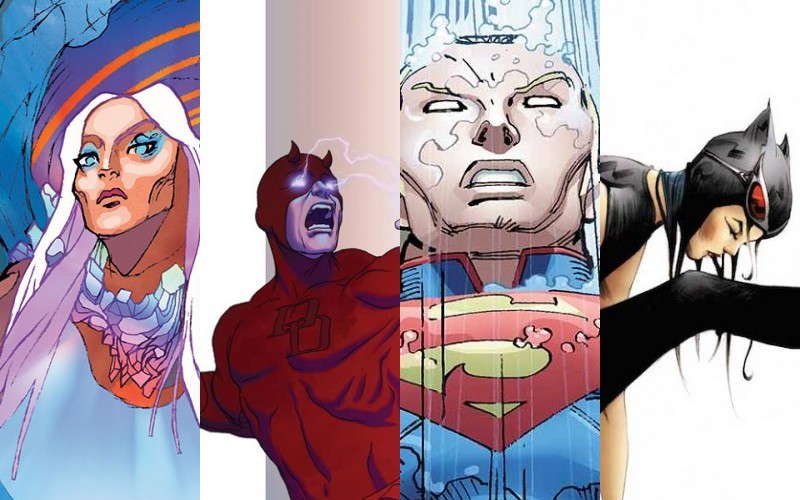
By Molly Jane Kremer and Jarrod Jones. Making sure our comic book reviews are the best they can be is something we take pretty damned seriously here at DoomRocket. Some may say too seriously, seeing as though we average only three full comic reviews a week. We all thought we could do better, so starting this week, HEY, KIDS! COMICS! will have a new feature, a small comic book roundup of the week’s releases that we’re calling – rather unceremoniously – the Week In Review. (And don’t worry. we’ll still have our full reviews each and every week.)
 Ody-C #1
Image Comics/$3.99
Written by Matt Fraction/Art by Christian Ward
MJ: A trippy, sci-fi reimagining of a gender-swapped Odyssey, Matt Fraction’s and Christian Ward’s ODY-C is mesmerizing and enveloping, and sucks you in completely (even if at times you may not completely comprehend what you’re reading or seeing). Familiarity with Homer’s the Odyssey is helpful, as the story can vary at times from complex to esoteric, but knowing the source material adds further levels to the story aside from mere comprehension.
Fraction writes the comic in dactylic hexameter – the meter both the Iliad and the Odyssey are written in – and the effect is verbally enthralling. The detail paid to the lush language makes the thought of reading it aloud come to mind more than once. The comic’s enormous foldout spread of Ward’s art depicting the aftermath (and terror) of the just-concluded war for Troiia is amazing, and his page layouts and panel structure throughout are just as jaw-dropping. This book’s high level of sci-fi-crazy is extremely well-suited to Ward’s style, and seems to stretch all of his artistic muscles. His gorgeous, hallucinatory coloring style is the icing on this kaleidoscopic cake, along with his decidedly femme-friendly design: round white starships devoid of angles, instead of the typical phallic rocketships? Perfect.
“The heaviest trip is the one back home” was the promotional tagline for the book, and ancient language rhythms contrasting with gorgeous neo-futuristic visuals and a decidedly feminist approach make for a heavy trip indeed, and trigger an urge to reread as soon as you’ve finished the last page.
9 out of 10
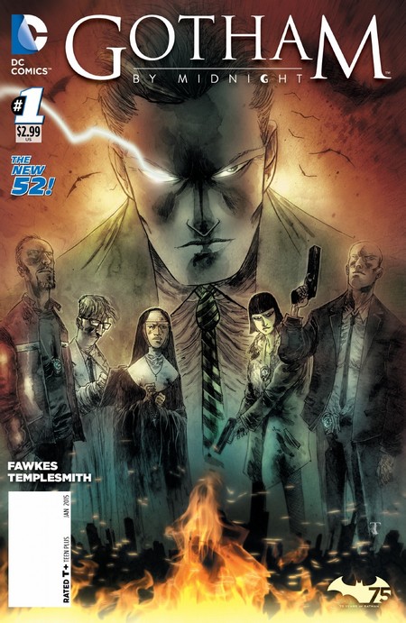 Gotham By Midnight #1
DC Comics/$2.99
Written by Ray Fawkes/Art by Ben Templesmith
JJ: An on-going, Gotham City-based horror comic? That’s a beautiful concept, one that’s such a no-brainer it’s a wonder how something similar hasn’t come along before. Blame former Vertigo editor Mark Doyle, who seems intent on further turning the world of the Batman on his big ol’ pointy ears by utilizing writer Ray Fawkes (Constantine, Justice League Dark) and artist Ben Templesmith (30 Days of Night, Wormwood) for this latest Bat-book. That’s certainly a pedigree for success, and the gentlemen’s work makes it clear that Gotham By Midnight isn’t meant to merely increase the Dark Knight’s presence on comics stands – this is a book with such a terrific premise that it can almost exist based on its own merits.
But only almost. There is much owed to the Caped Crusader within the pages of Gotham By Midnight – primarily through the events of Fawkes’ own Batman Eternal – and it feels like DC is hedging their bets by including the presence of the Batman in Gotham‘s introductory issue. That’s problematic, mostly because the book’s character introductions are made with little fanfare (a fun game is to recall any of the character’s names – that aren’t Jim Corrigan – after setting the book down), and because there is only so much story to absorb in its briskly-told 20 pages, there’s not much to assure readers that this book won’t be anything else but yet another cog in DC’s deterministic machine.
It’s fitting that Ray Fawkes chooses to implement the introduction of Gotham By Midnight through the well-worn trope of the outsider skeptic; his Sgt. Rook is an appropriate avatar for the reader, and this X-Files/Gotham Central hybrid still has more to prove to readers already overwhelmed with Gotham-based comics. If this book is going to succeed, it needs to take a page from Gotham Central – easily its closest spiritual successor – and remember to keep Batman tucked away in the shadows where he belongs. Gotham is already scary enough without him.
7 out of 10
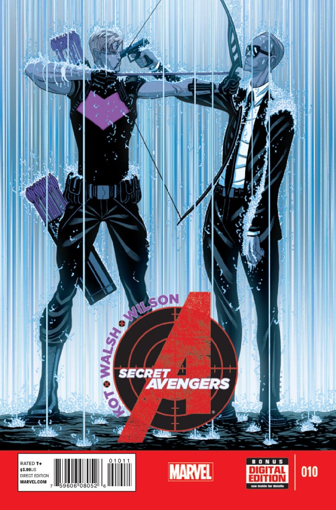 Secret Avengers #10
Marvel/$3.99
Written by Ales Kot/Art by Michael Walsh
MJ: Ales Kot’s, Michael Walsh’s, and Matthew Wilson’s Secret Avengers is now ten issues in, still working away at the story that began with it’s second and most recent relaunch… so this is certainly not the place to jump onto the series. While the over-arching plot feels as though it’s been stretched over an issue (or two) too many, the issue’s many entertaining components – and very excellent art – still make for compelling reading.
As has become standard, writer Ales Kot’s quippy dialogue and laugh-inducing mini-bios (which pop up under a character’s name whenever they first appear in an issue) are stellar. (The bio belonging to Maria Hill – which contains a plea to the reader about getting enough sleep – is particularly amusing.) Considering that nearly all of this comic’s dialogue jumps around between three two-person conversations, Kot plays to his snappy-verbal strengths.
Furthering the book’s plot might have been a better choice than more snappy back-and-forth, but thankfully artist Michael Walsh excels in making even a typical interrogation scene have resonance and tension. Matthew Wilson’s colors reliably stand out and add to that intensity, contrasting all-red panels between the beige dinginess of an interrogation room. The scenes between Coulson and Hawkeye at the end are the issue’s visual highlight, with eye-catching rain-filled panels within a limited palette of muddied greys. While the issue itself may be a slow point within the series, Secret Avengers still manages to be intelligent, absurdly humorous, and an overall enjoyable read.
7 out of 10
 Superman #36
DC Comics/$3.99
Written by Geoff Johns/Art by John Romita, Jr. and Klaus Janson
JJ: Geoff Johns and John Romita’s dreary Men of Tomorrow saga stretches on into its fifth chapter, treading water nearly as often as it tries the reader’s patience. By repeating itself for no discernible reason other than to stretch out this marquee run as far as it can go, Superman #36 feels like an episodic lull in Johns’ greater scheme. For a story about a man faster than a speeding bullet, the last thing Men of Tomorrow needs to be is lead-footed.
Issue #36 doesn’t begin right after the events of last month’s installment so much as it overlaps them, making the slow crawl of Ulysses’ hidden agenda creep ever more sluggishly towards its last page cliffhanger. By the time we’ve reached John Romita’s gorgeous double-page splash on pages four and five, we’re all but caught up with issue #35, and a third of the $3.99 book is all but finished. Those wide-screen theatrics are what propel Superman #36 (and Men of Tomorrow as a whole), but what we’re being propelled towards isn’t a satisfying – or even exciting – chapter in a larger story, it’s another aggravating “To Be Continued…” It wants to finish with an exclamation point, but instead it ends with an ellipsis.
With two other blasé Superman epics in the can (the easily forgettable Superman: Doomed and the hopefully forgettable Superman Unchained), Men of Tomorrow has an opportunity to pull out ahead and become the preeminent Superman tale of the New52, but it can’t seem to help itself from stuttering all over the place. It’s admirable for Johns and Romita to be taking this much risk with Superman – especially after the last three regrettable years of New52 nonsense – but if Johns truly wants to have the Man of Steel “enter the unknown” (as he’s brazenly stated before), he can’t simply throw the hero into the fray, he has to convince us that we want to follow him.
6.5 out of 10
 Superior Iron Man #2
Marvel/$3.99
Written by Tom Taylor/Art by Yildiray Cinar
JJ: The primary sell of Superior Iron Man is that we have to accept that billionaire/playboy/common-variety yahoo Tony Stark is even more shallow and loathsome than some have already come to accept him. The sell isn’t a hard one – especially after the events of the still-very recent Axis debacle – and the new series featuring ol’ Shellhead even goes so far as to defiantly boast the descriptor Superior, carrying with it all the implications that title should suggest.
Problem is, Tony Stark is still Tony Stark. There’s no Doctor Octopus swimming around the Silver Slickster’s brilliant cranium, so why is Tony behaving so badly? Writer Tom Taylor wisely puts San Francisco’s other resident superhero, Daredevil, on the case, leading to a confrontation that is as impressively engaging as it is laughably disproportionate. Taylor’s melodrama – when it takes time to explore its space – feels full and realized, like any good saga residing within the Marvel Universe should. But there exist a few narrative stumbling blocks that are attributed more to Taylor’s apparent enthusiasm than any real narrative fumbling. Some building blocks fall away (like when Matt Murdock abruptly crashes a Stark shin-dig), but the foundation remains nice and solid.
Yildiray Cinar’s artwork is consistent and fluid enough (he draws a damn good Daredevil), and things only get squidgy when Taylor’s action takes a time-out. But when there’s action, Cinar delivers. His Tony Stark – retrofitted in his polished, somehow even more phallic Iron Man armor – is the chump-tastic asshole Superior needs him to be. And as long as Iron Man remains Superior, being an asshole is what the reader won’t only expect, it’s what we’ll demand.
7.5 out of 10
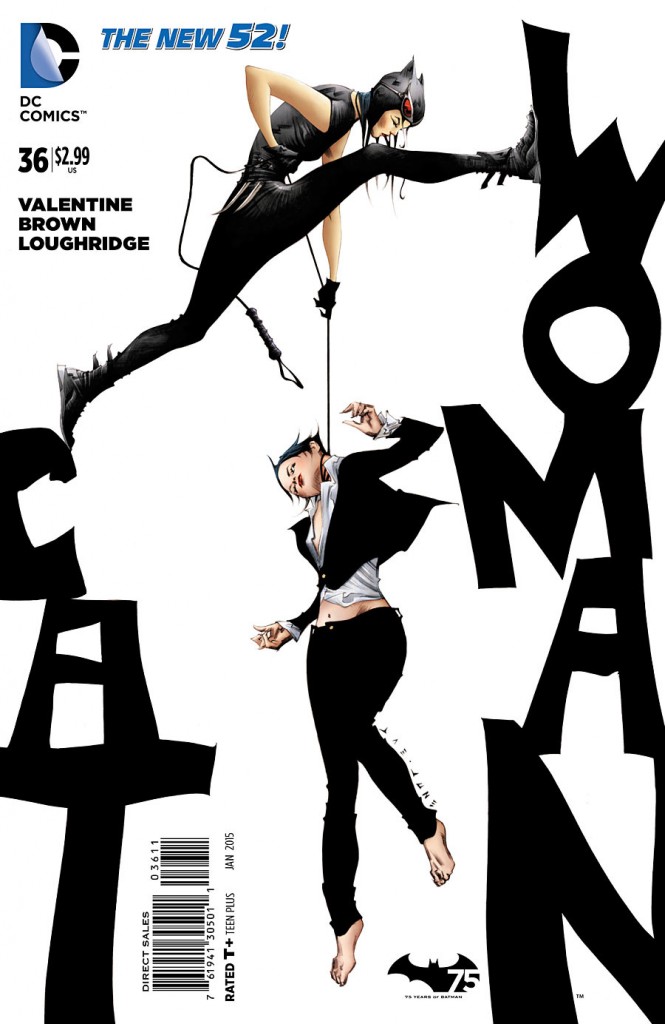 Catwoman #36
DC Comics/$2.99
Written by Genevieve Valentine/Art by Garry Brown
Last month’s issue of Catwoman was a masterly exercise in the art of the relaunch, seeing Selina Kyle leave behind her life as the infamous cat thief and become a femme-capo dei capi over all of Gotham’s organized crime. And while that premise is impetus enough to drive the book well into the future, this month’s issue has sadly seen a noticeable dip in quality, encumbering the overall story with unnecessary baggage and overwrought, mediocre dialogue.
This issue sees more plotlines and twists spinning out from the main arc: as new rivals bid for power, there’s dissention in Selina’s ranks, and adding to all of that there is someone slinking about Gotham’s rooftops, claiming to be Catwoman. Cramming in this much story makes it read as fractured and imbalanced, and while writer (and novelist) Genevieve Valentine’s narration can read beautifully, the dialogue approaches the verbose at times, and what might read wonderfully in a novel just ends up coming off as clunky on a comic page.
The art remains mostly consistent, if less rendered and more rushed than last issue. The architecture and the shadowplay are still well-utilized, but when given nothing to illustrate but meandering conversation, there’s only so much the art team can do. Artist Garry Brown is finally given room to stretch his chops in a well-drawn fight scene between Selina and the other “Catwoman”, with the backdrop of Gotham City’s skyline glowing behind them. It’s a gorgeous few pages, and Lee Loughridge’s coloring really shines. Highpoints as good as that keep one hopeful that the next issue or two can get over this stumbling block and readjust back to the taut intensity of issue #35.
6.5 out of 10
Agree? Disagree? What comics would you like us to cover in the future? Let us know in the comments section below.


