

By Molly Jane Kremer, Arpad Okay, Clyde Hall, Mickey Rivera, and Jarrod Jones. Undercover is our opportunity to lovingly gaze upon gorgeous works from magnificent artists. Each week, we single out the most striking covers that grace comic book stands and gush all over them.

The Archies #2, by Fiona Staples. (Archie Comics)
CH: The reimagining of Archie and friends owes much to the talent of artist Fiona Staples. Somehow, she manages to stay visually true to their traditional incarnations (the #s in Archie’s ginger locks, the practical cuteness of Betty) while adding a distinctive modern flair. Her involvement in the relaunch of Riverdale contributed to the success of what’s developed since.
So it’s especially nice to see her back with a variant cover for The Archies #2. “Sugar Sugar” was a childhood fixture on my stereo and in my Saturday morning cartoon viewing, and the artist has tapped joyfully into that groovy era. Placing the band on a rolling, psychedelic music staff makes for a delightful, unusual configuration that works. Combined with the starry night background, Staples’ signature sharp angles, and an inverted Jughead on drums, her cover draws you right in. Just like a good rock and roll ballad.

Mister Miracle #4, by Nick Derington. (DC Comics)
AOK: I was struck by two sets of feels regarding Nick Derington’s fourth cover for Mister Miracle. The first was over his deep understanding of what makes Jack Kirby tick. As I’ve said in the past, Derington grasps iconic Kirby, breaks his influence down into elements, and reconstructs them into modern art that showcases their essence. Beyond the primary colors and odd geometrics, ancient angles in costumes that communicate something more godlike than superhero, in addition to a healthy appreciation for broad-faced women in capes, one of the key points of how Kirby reshaped comic books was the inclusion of depth. The man knew how to move the action out of the panel and into the space in front of you and here, in a cheeky, deceptively simple way, is Derington’s take. Barda’s fist. In your face.
Second is that Derigton is just a ding-dang talented artist completely in his own right. His clear lines excite. His quiet compositions fill up the page with the subtle balance brought by the right amount of simplicity. It’s not easy to produce art so large and smooth and have it be so serious and sophisticated. I love Barda’s eyes. Her scales and circles. The black of her hair. Most of all, what this cover communicates. You don’t have to know her to know what she’s all about. Stunning, powerful, and elegant.
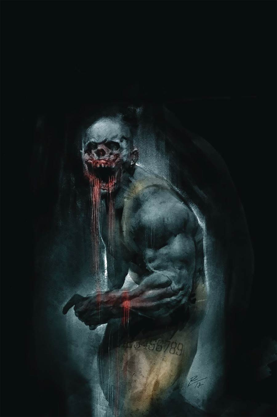
Harbinger Renegade #0, by Roberto de la Torre. (Valiant)
MR: Roberto de la Torre is responsible for the nightmare that is Cover B of Harbinger Renegade #0. This is hardly just a zombie. It’s a zombie who’s been working out, with deltoid muscles bigger than his own head. Besides the obvious — the darkness of his gaping maw, the sharp hollows of his empty eye sockets, and the strands of bloody gore hanging from his jaws and arm — lovers of detail should take note that this undead hunk is wearing overalls and totally pulling it off. I hope de la Torre’s Frazetta-style horror-piece turns some heads and figures into the paralyzed sleep hallucinations of at least a few comic shop browsers.


Runaways #3, by Kris Anka, Matt Wilson, and Kevin Wada. (Marvel Comics)
MJ: Once again, the one-two punch of Kevin Wada and Kris Anka (plus Matt Wilson of course) on covers for Runaways #3 leaves me breathless.
Two things stick out about Kris Anka and Matt Wilson’s cover. First, Wilson’s crazy gorgeous kaleidoscope of colors saturate everything. You can almost see glitter sparkling in those dreamy pastels. Second: Anka’s flawless rendering of Karolina’s flawless outfit, centered on the page. From her white cutout romper to her floral choker, matching earrings and necklace, and lace-up sandals, you can see that Anka’s grasp on detail is immaculate. Details like this can be an essential aspect of characterization for an artist with this sharp of an eye. Plus, look at all those perfectly rendered and angled hands! Old Lace’s dino-claw is even in there. That’s what we call impressive.
I’m already a sucker for interconnected sets of covers (look up the recent Black Panther McKelvie and Frison connecting cover sets if you want to make your eyes real happy), and Kevin Wada’s talent at doing fashion-spread style is on full display here. This month’s issue sees Runaways’ Karolina and Molly striking a pose. Karolina looks primed for a photo set in Vogue here; her smoldering stare and popped hip overshadows the melty rainbow gleam that’s begun to spread up from her left hand (and all over the background). Molly is her goofy, kid self, Wada capturing her silliness and youth. It’s all good. It’s all perfect.

New Super-Man #17, by Bernard Chang. (DC Comics)
JJ: Kenan Kong would rock a Justice League membership. He’s the kind of new blood a team as lauded as the League really needs. Here’s a new Trinity, if you’ll indulge me: New Super-Man, Cyborg, Donna Troy. *whistles* Now that‘s a team book I’d buy the heck out of.
Kenan wears iconography well, as evinced by Bernard Chang’s variant to New Super-Man #17. Chang’s rainbow-hued interpretation of Neoclassicism explores the new vibrancy of DC Rebirth by depicting its core three heroes standing victorious over some nondescript field of battle. Wonder Woman hoists her blade high, Superman plants a flag, Batman’s fists unclench just so. And then there’s Kenan, having a well-earned sit. His body language is infinitely more relaxed than his legendary contemporaries, but his duds are just as super, his deeds likely the epitome of derring-do — if that cloud of smoke and debris is any indication.
The Hero of Now sits with his phone out, a look of general nonchalance across his face. Perhaps it’s for the Ultimate Selfie he’s about to take. The battle is won. What’s doing on Instagram.

Mister Miracle #4, by Mitch Gerads. (DC Comics)
AOK: This Mitch Gerads Milton Glaser Mister Miracle Bob Dylan tribute absolutely does it for me. It is unmistakably inspired by the Glaser poster that came with Dylan’s Greatest Hits record, cutout silhouette and magical rainbow hair pasta, and yet Gerads has made it his own enough — made it Miracle enough — that one could doubt for just a moment. The silhouette wears a mask. Bubbles, squiggles, drips and angles complicate things. The colors are on-brand instead of the spectrum. But don’t get it twisted. The glitch in the Baby Teeth says it all about both.
How Tom King and Gerads have talked about their intentions for both the series and Scott Free — juxtaposing in Dylan makes total sense. Mister Miracle is about restlessness, about embracing much-needed change even when it isn’t easy. Glaser and Dylan is often considered as Bob at his most culturally impactful, yet Sean Wilentz said that Dylan wasn’t born from a void, that “it’s dangerous to limit any artist to a particular period.” Mister Miracle reflects this, too: best thought of as the thing itself, the context in which it is released, and the legacy from which it came.
And that’s it! Don’t forget to share your favorite covers from this week in the comments section below.


