
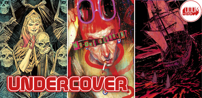
By Arpad Okay, Clyde Hall, Jami Jones, Sara Mitchell, and Jarrod Jones. Undercover is our opportunity to lovingly gaze upon gorgeous works from magnificent artists. From Martin Simmonds’ ‘Punks Not Dead’ #5 to Bilquis Evely’s eerie take on ‘Harley Quinn’, here’s what we’re loving this week.

Punks Not Dead #5 by Martin Simmonds. (Black Crown/IDW Publishing)
AOK: Martin Simmonds is doing an amazing job of rewinding the tape. The bits and pieces are once-evergreen, now-vintage notes that play a three-chord tune that thrashes. This could be 70s ZigZag: the anarchy A, the ransom note censor box à la Jamie Reid, mod button badges.
Beyond music culture, this cover is a throwback to venerated comics. The scribble scrabble of color, etched out crawling tentacles, paint splatter, the lace of cigarette smoke, the paper cut-out blocks of Cardin coat collar, chaos and clarity between image and title, this could be 90s Vertigo: Invisibles, Shade, Mercy.
Even the trade dressing recalls the rags of yesteryear. 2000 AD around the thousandth program, the infrequent yet inspired Vertigo sidebar. Like Jarrod said last month, there’s an endless charm (“maximum slay”) in knowing who printed your book from across a room, and God save those Black Crown mad geniuses for crediting the entire creative team in the corner box.

Harley Quinn #44 by Bilquis Evely and Mat Lopes. (DC Comics)
SM: Harley, Harley, Harley. You mischievous minx. You fox in the hen house. You girl in reaper’s clothing. Where are you taking me? And why does it feel so good?
Like a moth to the flame I am drawn into the soft glowing center of this cover. Harley Quinn is a beacon guiding me home, and she’s the light before the teeth of an angler fish. She’s warm and seductive in the middle of something sharp and cold. She’s my dangerous leader. I am sucked in. Instantly, I’m under the impression that I also have a hood on. It’s pulled around my eyes like blinders, and I’ve forgotten about the darkness that surrounds me. All I see is Harley Quinn letting me in. Like a child falling into a drawing with Mary Poppins, I too have fallen into this cover.
There are two ingredients at work here that have cast this spell over me. First, there’s the beautiful glow. If your eyes aren’t literally twinkling with stars right now, your screen is broken and you need a new phone. Second, as if the coloring wasn’t hypnotizing enough, check the hexagonal pattern created by the precisely placed hoods. They’re an assembly of honeycombs — a hive in disguise. The pattern bounces your eyes around like a pinball, but the coloring will always bring you back in. To the center. To Harley. The Queen Bee radiating.

Cable #158 by Daniel Warren Johnson and Mike Spicer. (Marvel Comics)
CH: In the early days of RPG mayhem, there was a tome much-feared by dungeon-divers known as Grimtooth’s Traps. The sadistic and ruthless host character shared his secrets for TPKs and preying upon the avarice, foolishness, and pride of player characters. The game aid was also stuffed full of humorous illustrations of the snares, and of the unwise party members trying to cope with the predicaments in which they found themselves. Those images looked much like the cover to Cable #158, as provided by Daniel Warren Johnson and Mike Spicer.
There’s also a Sergio Aragonés spirit at work here, with Cable and company battling a tendril (or firehose, or mechanized stalk, or mutant vine) on three levels of a dusky, disused, subterranean complex. Groo would look right at home fighting beside these X-Mendicants.
It would have served as a fine interior splash, but the audacity of using it as the cover compliments the struggle of former X-Force members Shatterstar, Feral, Warpath, Boom-Boom, Domino, Cable, and Cannonball against one-time nemesis Stryfe. Each member’s attempt to free themselves, whether with blade or bullet, appears for naught while also reminding us of their distinct personalities. And just like Grimtooth, their plight nudges a barbarous little bit of jollification from us as we watch them cope with this slice of their Labyrinth.
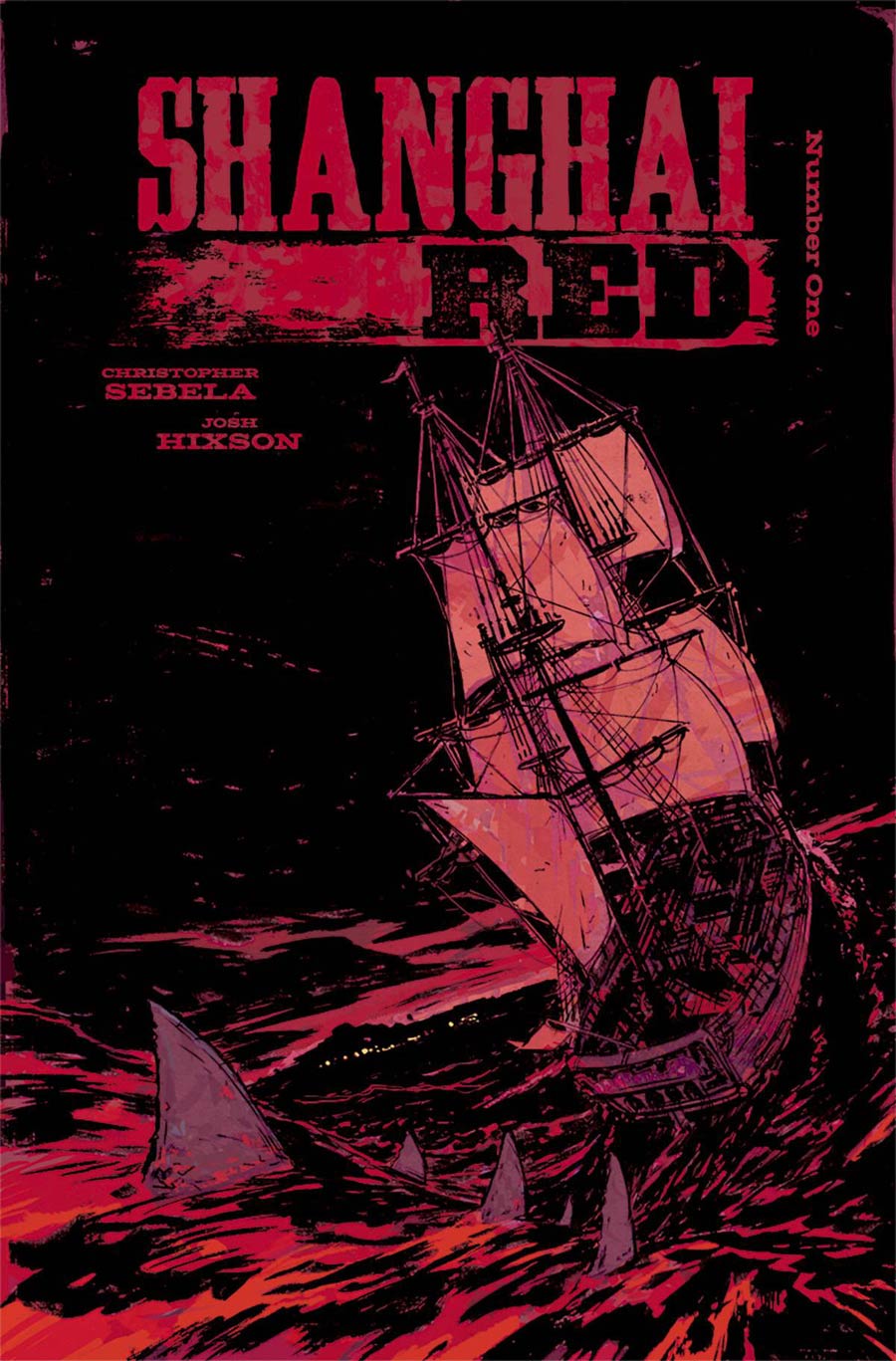
Shanghai Red #1 by Joshua Hixson. (Image Comics)
JJ: Hot-blooded vengeance, that’s what colors Shanghai Red. The primal need to break free from oppression, the berserk rage that comes with it, the chilling quiet afterwards. Making oppressors hurt — really, really hurt — brings bloody satisfaction. It also brings damnation. With a story that borrows from history and taps into our visceral desire to see justice done, Shanghai Red #1 is a debut that wants to pull you in. Its cover does the job magnificently.
Joshua Hixson conjures an image that conveys all the turbulence that comes before, during, and after an act of revenge. It’s a visual throwback to those notorious EC pulps, smeared in a stain of red and black that would make Marie Severin proud. Blood’s in the water and predators skim the surface, stalking the wake of a vessel that carries both the dying and the dead.
And there! Off the port side, land. A city brimming with people sleeping through the night, blissfully unaware of the silent hell just miles from their homes. Somebody put these people on this ship, made this horror possible in the first place. And when this tub docks, retribution will be swift. But for now, as the ship endures rolling waves and sharks move ever closer to the fresh kill, all is quiet.

Aquaman #37 by Joshua Middleton. (DC Comics)
JamiJ: Joshua Middleton brings depth and determination to this week’s cover to Aquaman #37. The artist has handled variant duties on Aquaman, but with this issue he brought a style more evocative of his recent Batgirl covers; his focus on the characters, a stark background behind them, Middleton uses the empty space to tell a story.
Here Middleton has captured the demeanor of Rebirth Aquaman. He’s decided to step back into the role of Atlantean protector, sans crown. He’s joined by Dolphin, his recent partner-in-revolution, who’s convinced Arthur that it is possible to fight for your people without ruling them.
Middleton’s use of lighting gives the cover movement. The duo’s hair is pushed back by their momentum through the waters, purpose painted on their stoic faces. Both characters appear to glow on the page; Middleton’s colors are strong but slightly washed out, giving the illusion that we are peering under the waves to catch a glimpse of these heroes. A story is told through this simplicity. Middleton trusts in the strength of his work, and in our understanding of it, to convey a tale of power, redemption, and hope.
Don’t forget to share your favorite covers from this week in the comments section below. Best response wins a pack of DoomRocket stickers!


