

By Molly Jane Kremer, Andrew Stevens, Scott Southard, and Jarrod Jones. Our Week In Review collects our thoughts on the comics that demand attention. Do you have a deep-rooted desire to know what we think about all your favorite books? Well. This is where you need to be.
 Black Canary #4
DC Comics/$2.99
Written by Brenden Fletcher.
Art by Pia Guerra and Lee Loughridge.
MJ: It’s typically a let-down when a comic that was previously rocking your proverbial socks suddenly has (gasp) a fill-in artist’s name on the cover. Annie Wu’s art on the first three issues of Black Canary was utterly killer, a step up from her already eye-grabbing work on Hawkeye last year—few replacing her could have managed anything past disappointing. Instead, enter Pia Guerra: the Eisner and Harvey Award winning artist and co-creator of the Vertigo series Y: The Last Man… and, thank the gods above, Black Canary’s special guest artist both this month and the next.
Guerra’s gorgeous art has been mostly absent from comic pages since Y ended in 2008, and it’s a pleasant surprise to have her back at DC. Her organic and soulful art seems an obvious choice for the music-centric but action-filled series. Ditto, a character who speaks not a word, communicates every emotion completely thanks to Guerra’s fine expressions. The action sequences are well-choreographed, and her storytelling abilities enable a natural flow throughout the issue, despite numerous shifts in location and narrative perspective. Lee Loughridge’s colors stand out beautifully as well, especially during the muted and slightly sepia-toned flashback sequences: when the emotion or action intensifies in the telling, panels reflectively deepen or brighten from their purposefully desaturated hues.
Writer Brenden Fletcher utilizes the change in artist to emphasize the issue’s focus-switch to Bo Maeve, Dinah’s frontwoman-predecessor, and all the determination, narcissism, ambition, and jealousies that come with her. While he establishes her villainy in no uncertain terms, Fletcher ensures she remains complex and compelling, a newly integral part of Black Canary. The book’s light sense of humor remains blessedly intact, especially in Bo’s droll narration: she actually tells Ditto, “Okay, so, wavy flashback flashback flashback…” to begin, well, you can guess what.
Even with this month’s altered artist credits, Black Canary continues to be one of the most consistently sharp, energetic, and entertaining new series of the DC You titles. Music and musicians are featured prominently in so many high-quality/hugely popular comics lately: The Wicked + The Divine, Spider-Gwen, Jem and the Holograms, and Phonogram all heavily emphasize the importance of music in characters’ (and consequently, readers’) everyday lives. Rock music (or its ideal, at least) lends nothing more than liveliness, passion, and honesty, and Black Canary revels in all three. The entire series’ aggregate talent is only further accentuated by the stellar guest vocals (both on and behind the page): this issue is undoubtedly a must-listen. Erm, I mean, must-read.
8.5 out of 10
 Prez #4
Written by Mark Russell.
Art by Dominike Stanton; colors by Mark Morales and Sean Parsons.
DC Comics/$2.99
SS: I’d like to start things off by stating the obvious: I love Prez. It’s a fun, smart, and positively-charged entity. More than all of that, it maintains a sense of social responsibility and takes every chance it gets to cut down the artifices of modern day political bureaucracy, nepotism, and privilege. As a critique of modern American government, it shares similarities to HBO’s Veep: while we’re provided a multitude of obvious untruths, the overlaying concept of the show is that every single government official is just a human being with hopes, fears, family, pets, a Twitter account, and a full life to balance.
Similarly in Prez, we see how certain flaws are built into the system via an in-depth look at the complete ineptitude of the instated politicians found within the show. Their inability to govern in a practical or benevolent manner is only overshadowed by a nigh omnipresent white male dominance (and incompetence). It’s a refreshing perspective that does something important for Prez‘s readership: it allows us all to remember that there is absolutely nothing special about the people that we elect. The (generally white male) people who make the decisions regarding our daily lives and the future of our country aren’t any different than the rest of us.
Mark Russell has been doing a bunch of interesting work with this book, and more than anything, I’m glad that DC is giving him the space to do it. I have such a hard time giving a damn about the overarching events and the dire seriousness that seems to plague the Big Two. I want some fun and I want some innovation. And that’s what Prez gives us: fun. It’s a refreshing oasis found in the (mostly) humorless desert that is the publisher’s superhero landscape.
And while Prez hands us some heady political concepts to kick around, it’s also a simple callback to our visceral preteen dreams. There’s a dopamine button in my brain that gets pushed each time I pick up Prez, and it’s the same one that got pushed when I watched Richie Rich and Blank Check as a kid. The same concepts in those movies apply here, and Russell takes great care to explore the idea of a no-strings-attached ascension to authority — where one has a chance to philanthropically affect the world — in notable ways.
In the newest issue, we see Beth Ross settling into her role with a fair amount of confidence and disdain for the system, but more than anything else, I’m enthralled by the view of the legislative terrain that this comic book provides. The idea of hiring your old fast food boss as Chief of Staff or being just as frustrated with the mass media circuit even though you’re the President of the United States of America adds a perspective that’s rarely made available to us. It makes politics seem a little more conceivable and the hope for progress a little more possible.
8 out of 10
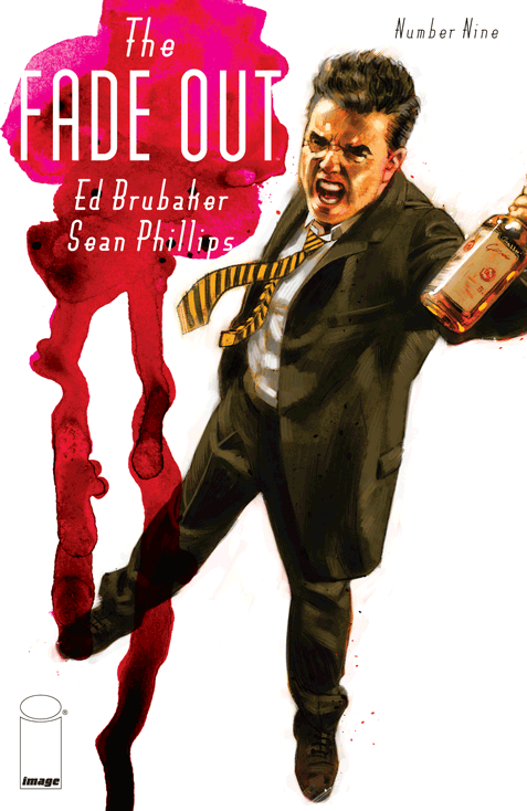 The Fade Out #9
Image Comics/$3.50
Written by Ed Brubaker.
Art by Sean Phillips.
Colored by Elizabeth Breitweiser.
AS: In case it wasn’t already abundantly clear, Ed Brubaker takes care in this issue to inform us in The Fade Out‘s back pages that we’re reading a “serialized novel.” That proclamation confirms the pace, depth, and overarching plot that we’ve been following with greater and greater excitement for the past year. The Fade Out #9 pushes us off the precipice that our heroes teetered over for the past three issues, revealing the intent Brubaker and his team have had in mind since the start.
Sean Phillips and Elizabeth Breitweiser speed us through a beautiful, era-specific California gauntlet — deserted beaches, well-guarded studio buildings, cookie-cutter suburban homes, dreary apartments — and in each panel, Phillips and Breitweiser enliven the backdrop into a character itself—a witness that silently absorbs all this dread. But no matter which space Charlie & Co. inhabit, a mood of dark inevitability ebbs from the walls and floor, evident even in the slanted light shining through closed blinds. Halloween, a holiday we’ve been in since last issue, emphasizes the concept of unmasking, as we plunge deeper into our characters’ pasts, and the revelations that illuminate their motivations and position them toward greater action.
The Fade Out traffics in the noir formula, which means Brubaker gave himself the tall order of remaining within the boundaries of such expectations while pressing on into the borderlands; a space where he can stretch the formula out, make it new, and yet still satisfy the expectations of the genre. Not an easy feat. A lazy reader might say that Brubaker shoved a lot of backstory into this issue. But, if you go back and look through the past eight issues, all that is revealed within these pages has already been teased, all mentions properly obscured as any good mystery ought. That’s the payout this month. What lied beneath — what Charlie and Gil blocked out with alcohol — finally bubbles up, clearly and plainly stated in the voice of our nameless narrator.
With issue # 9 I found that, for the very first time, I wondered who it is that tells us this story. The narrator sticks close to Charlie and Gil, and obviously knows their secrets. Perhaps Brubaker narrates it, his eye on the past, sympathetic to these two men, but I like to think that it’s Charlie and Gil—the two writers, already at their end, looking back at all the choices that led them down the dark cavern we know they’re destined for, desperate for some answer of where they might have chosen differently, shored against their ruins.
9 out of 10
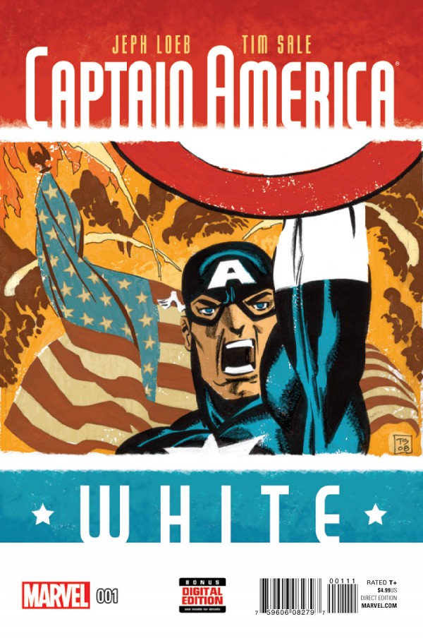 Captain America: White #1
Marvel Comics/$4.99
Written by Jeph Loeb.
Art by Tim Sale; colors by Dave Stewart.
SS: Remember that time when you really wanted to know what was going on in Steve Rogers’ head, in the days when he was trouncing Nazis all through Europe, high-fiving buddies in the trenches, and jumping over tanks on his motorcycle, all while saying the Pledge of Allegiance? Remember that? Yeah, me either, but now every star-spangled thought Captain America ever had is here, served up in the most racist-sounding Loeb and Sale joint to date. (Don’t say it out loud: “Captain America: White #1.”)
The idea behind Captain America: White is to dig beneath the pomp of the original catch-phrasey do-gooder meat of ’40s comics to explore the human emotions and interpersonal relationships that Steve Rogers would experience as a superhuman in the midst of a world-enveloping war. It’s a concept that I never clamored for, but it piqued my interest when it was announced. Then I read it, and… what’s the opposite of “piquing interest”?
Through the entirety of the first issue, Loeb and Sale straddle a line between clever throwbacks and lazy retro pandering. I get that the cover is supposed to be a naive Golden Age take on today’s Captain, but the anatomy is off just enough to make it look like a 6th grader spent a ton of time on their art project. On the other hand, the inside title page is sleek and classy, harkening back to a time of earnest advertising with simple tricolor blocks and playbill-style lettering (naming Loeb and Sale as “Storytellers” is a nice touch as well).
Sale continues the heavy-handed black marker style that’s seemed to polarize audiences for a while. I could generally go either way, but occasionally there’s an exceptionally shadow-filled panel where the marker lines show as in a coloring book, and it comes off looking unfinished when it wasn’t intended to. It’s nitpicky, and the raw style is pretty cool for the most part, but now and then, the suspension of disbelief is unintentionally broken.
Aside from the art though, there is a heavy narrative imbalance throughout this book as well. We watch Captain America and Bucky smile and dance-fight their way through a battalion of German soldiers, complete with old-timey joke banter as if World War II was a simple task at hand for the day. However, the running monolog through the issue is Steve Rogers wrestling with the consequences of war and the permanence of death. I suppose that we’re working toward a convergence of these two modes of thought (and two methods of comic presentation), but right now I’m just not seeing it. But as we know, these “Color” projects tend to be pieces with a larger scope and a wider arc, so I’m trying my best see how the book balances itself out. (However, with this first issue, Rogers yells “BUCKY!” — be it in caution, joy, or fear — enough times that it already feels sitcom-level repetitive.)
Ultimately, I love the idea of bringing humanity and personal realism to WWII-era Captain America. The Golden Age told stories the way they needed to be told at the time, but they also became the roots for the characters we know and love today. To retroactively transpose the depth of human emotion and thought that present-day Steve Rogers has onto his past self is a potentially fruitful concept. Right now, with issue #1, it reads more like director’s commentary over an early film rather than true narration of one’s innermost emotions.
I’d like to hope that Loeb & Sale can find the balance between nostalgia for the past and the realism that modernity demands. Then maybe when Captain America and Bucky juggle some grenades while reciting the Bill of Rights next to a line of Wehrmacht prisoners, we might be able to confuse it as a triumph for good.
6 out of 10
 Tokyo Ghost #1
Image Comics/$3.99
Written by Rick Remender.
Art by Sean Murphy; Colors by Matt Hollingsworth.
SS: It’s a strange thing to watch the evolution of modern technology. The machines we’ve built are now bigger parts of our lives, dictating the way we live. How we spend our waking life has increasingly changed, as we spend face-time with screens of one sort or another, and an increasingly exponential trajectory has been set. Distinguishing the virtual world from our “real life” is becoming an obsolete concept, and as we begin to examine whether we should keep integrating computers into our lives, a more pressing question has developed: how should it be done?
Enter Tokyo Ghost #1. A standard cautionary tale concerning the future, with a setting that follows traditions laid out by other thoughtful sci-fi tales (think Deus Ex and Blade Runner), and like its forebearers, introduces a heavy element of humanity into the mix just to show us what we’re in danger of losing. Tokyo Ghost doesn’t fuss with convention, and instead of employing superficial quantities of innovation, it serves us high quality classical storytelling.
The first issue is titled “This One Last Job,” and the historical implications buried in that concept have me grinning like an idiot, just waiting for Arnold, Stallone, or hell, even Danny Glover to grimly holster their handgun or grab the wheel once more before retirement or redemption find them. Opening the inaugural issue of a comic with a splash of a fat-treaded, Akira-esque motorcycle and a panoramic view of a dystopic metropolis is a great way to make people like me to take a book like this seriously: it’s flashy, brutal, and pretty terrifying, but isn’t that the future in a nutshell? But more than anything, the title is a way to set the tone for the series. Tokyo Ghost takes classic action templates and gritty techno-futures and distills them into something refreshing and mindful.
Led Dent (best NFL linebacker name ever?) and Debbie Decay (best rock star name ever?) are lovers trying their best to navigate a world that seems to have forgotten them along with rest of humankind. Their relationship mimics a load of relationships we see today, with Dent a kindhearted but internet-addicted brute and Debbie doing all she can to hold the relationship together while attempting to escape their zombified techno-scape (2089 A.D. Los Angeles).
What’s most exciting is that the groundwork is laid in such a manner that we can expect Remender and Murphy to explore some weighty topics surrounding the human condition. We have some flawed, but likeable, characters here that reflect societal issues rather than benevolently transcend them, and that makes the commentary all the more meaningful. Much of the setting and interaction is purposefully on the nose; when Remender is working through the concepts of addiction and technology, it’s always with a fixed purpose.
Obviously, the dissonance between reality and technologically created fantasy is both frightening and stark, but the blurring of those lines is also an idea that needs to be observed and addressed in tandem. Maybe what Tokyo Ghost does best is illustrate the fact that today’s technological advancement is happening right in front of us while simultaneously maintaining itself as an abstract concept. Both of these things can be paradoxically true, but what’s most important is that we need to remain conscious of the way humanity evolves while “progress” happens. How can we remain who we are when everything about us is changing?
9 out of 10
Sex Criminals #12
Image Comics/$3.50
Written by Matt Fraction.
Art by Chip Zdarsky.
JJ: I often wonder what dinner with Matt Fraction and Chip Zdarsky would be like. Not frequently, like when I’m on the train and my mind has a moment to wander, or if I happen to be in a grocery store and I find a coupon telling me I can buy “Chips Ahoy! at a fraction of the cost”. It’s not anything like that. (I’m lying; it’s kind of like that.)
But when I pick up each successive (and successively bug-fuck) issue of Sex Criminals, I just have to know what level of transcendent, Eyes Wide Shut kinda chit-chat is getting passed back and forth when loaded barbs like “your assholes will adorn my thunderous cock like jewelry!” can manifest onto the comics page. Because, let’s face it, folks; that kinda stuff doesn’t come from a vacuum.
And then I think about the stuff people talk about with each other once pretension and fear are tossed out of the window, like when you discover that that person you’ve been talking to for a little bit turns out to be into both Blonde Redhead and oops! extended, ceaseless foreplay. It’s like hitting the jackpot; all of a sudden you can discuss literally anything you want without the specter of shame looming behind you, intent on ruining your life just because you’re into whatever it is you’re into. That level of acceptance and comfort is what I find when I read Sex Criminals. It’s like my private ticket to a mental wonderland, where my imagination is matched with others who share my goofy-ass sense of humor and penchant for puns, but who also take human sexuality and the freedom to express it as seriously as a goddamned heart attack.
So when I’m minding my biz and reading Sex Criminals, and all of a sudden I’m met with a floating, betentacled… let’s call it a “sensual Sērāmūn” (what did Fraction call it? A “cum angel?” Or was it a “semen demon”?), I can’t be shocked; nor do I blush when I witness a certain character suffer a shitty dream because of a festering, projected inadequacy. Because if I’ve come to understand fellows like Matt Fraction or Chip Zdarsky, or the thousands of people who proudly read Sex Criminals, I know that we’re all on the same page. We share the awkward experience of ourselves through this vibrant, funny, and culturally important book. So I chill out and go with it.
And what’s so interesting about the latest issue of Sex Criminals is that it feels as though the series has moved beyond its initial concept of a viral dick joke (though it still feels the need to instigate iTunes on its front cover) and has confidently straddled the barrier between the absurd and the earnest. When it appears as though we’ve reached the nadir of next-level zaniness (“Octopussy… meet schocktopussy!“), the following page — just five panels later — we’re provided a sobering and unflinching lecture on patriarchal “normalcy” and sexual “deviancy”. With issue #12, Fraction & Zdarsky have successfully delivered a concoction of comic book goofery and pertinent human vitality. It’s the Penthouse forum as envisioned by Kurt Vonnegut.
So, yeah. Good on you, Matt and Chip. And Spencer and Thomas and Lauren and Drew. And good on you, Image Comics, for daring to put a book as important as Sex Criminals in my hands. Because as we find in the issue’s inside front cover, “this book is dedicated to a higher ideal: fart boob dick.” And it totally is. Tee-hee.
9 out of 10


