

By Scott Southard, Stefania Rudd, and Jarrod Jones. Our Week In Review collects our thoughts on the comics that demand attention. Do you have a deep-rooted desire to know what we think about all your favorite books? Well. This is where you need to be.
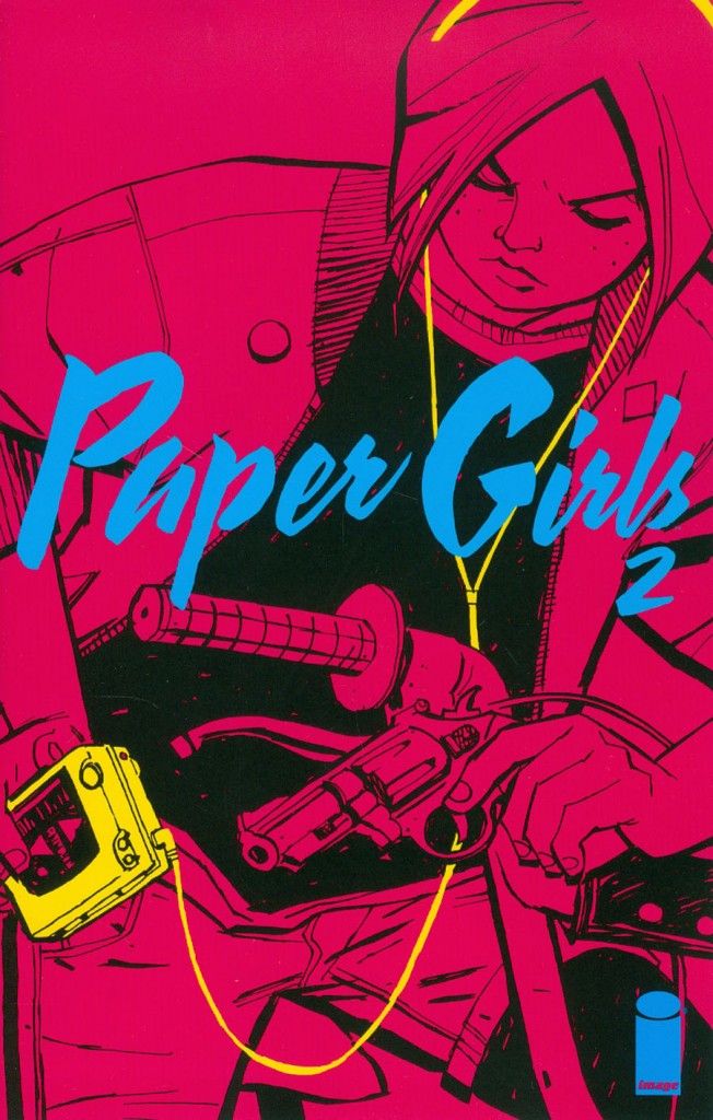 Paper Girls #2
Image Comics/$3.99
Written by Brian K. Vaughan.
Art by Cliff Chiang; colors by Matt Wilson.
JJ: For one reason or another, Sean Astin keeps threatening to make that sequel to The Goonies no one is really hankering for. Considering that the apex of our Eighties nostalgia is behind us, had Astin somehow convinced Richard Donner, Josh Brolin, et al. to contribute their talents to such a project, maybe ten years ago would have been a fine time to execute it. But that shouldn’t suggest that the door on Eighties throwbacks has been closed entirely, especially when Brian K. Vaughan, Cliff Chiang, and Matt Wilson have provided us a proper Goonies spiritual successor in Paper Girls.
Awash in neon pinks, faded denim, and Appetite for Destruction, Paper Girls is everything J.J. Abrams’ Super 8 could never be: a refreshing and engaging take on the worlds Spielberg and Bogdanovich offered us so many years ago. (Mask even gets a fist-pumping shoutout.) We all love Stand By Me, but so many attempts to recapture that devil-may-care-because-my-stepdad-don’t magic found in such films has the annoying echo of a phony Hollywood monolith wrapped around it. With Image Comics’ latest, that magic isn’t so much contained but unleashed from creators at the top of their game. Paper Girls is Vaughan and Chiang’s childhood angst given tangible form.
It’s the creative synergy between Vaughan, Chiang, and Wilson that makes this series feel more sincere than any other tin-eared attempt to recapture the former glory of the “hardscrabble youth” subgenre. Here, there’s not one self-referential nod that removes us from enjoying the book (there is, however, that curious piece of contemporary Apple tech in Erin’s possession); all the “Bush in ’88” yard signs and Air Jordan hightops are kept firmly — and thankfully — in the issue’s periphery. Chiang is artist enough to know that nuance ought to be the order of the day, and Vaughan is certainly writer enough to know when to give a narrative flourish an expert precision. That gives the bigger, splashier moments (like the mid-issue double-paged whammy) added punch, never mind that it also gives Matt Wilson — one of comics’ most incredible colorists — an opportunity to go absolutely berserk.
Because these creators are operating at the highest echelon of their talents, we are privileged to discover that Paper Girls has aching drama to offer within its neon-soaked covers. In the span of five pages, Vaughan, Chiang, and Wilson provide us a cliffhanger with enough emotional turmoil attached to it that we’re left with a tremulous quake, even if we don’t know exactly why just yet. That’s the qualifier I look for in top-notch comics; the feelings come even when I’m not aware of where they’re coming from. That’s what makes comics transcendent.
10 out of 10
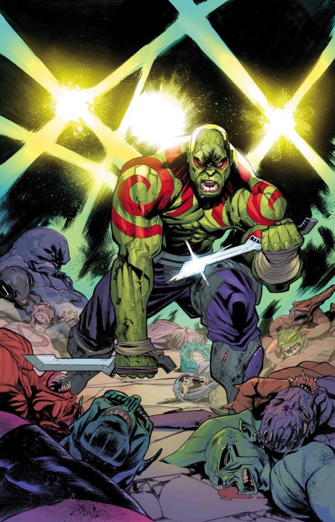 Drax #1
Marvel Comics/$3.99
Written by CM Punk and Cullen Bunn
Art by Scott Hepburn; Colors by Matt Milla
SS: So here we are, nearing the epicenter of the Marvel/WWE Inception-esque wormhole that has been the Guardians franchise for the past few years. And Drax #1, written by a former wrestler about the character portrayed in film by another former wrestler, is much less confusing, and far more fun than it would seem. And of course the inaugural issue opens with a good ol’ fashioned “It’s clobberin’ time!”
For the uninitiated, the series is being co-helmed by the famed brat/previous heavyweight champ/current UFC incubate, CM Punk, who not so long ago borrowed it for his ring entrance as a nod to his love of comics. But now the tables have been turned, and his palpable love for comics is now on full display.
There’s something cute about the clumsy earnestness of a writer’s first comic (yes, I know he’s dabbled before), and you can almost watch Punk’s writing process in action. Some of Drax‘s playful dialogue is clearly culled from the Deadpool 101 school of thought, but there are moments of metatextual maneuvers that really break the mold (an especially self-aware “ThanosThanosThanos…” comes to mind) to shine as their own little enjoyable entities.
But these moments aren’t plentiful, and many of them are a simulacrum of the things superheroes have been doing for decades. There isn’t a load of inventive storytelling occurring in Drax #1. There’s a basic tale of revenge that’s maneuvered clumsily without much inspired nuance.
There’s something to be said for the art direction of the comic. Pages go by without dialogue, and are expertly communicative through the lumberingly oafy Drax and the book’s waterfall of onomatopoeias. On a microscopic level, the gymnastic contortions Scott Hepburn does with Drax’s face are over the top and and generally delightful. With the majority of his emotions ranging from primal anger to slouching grumpiness, Drax has quickly proven himself as a deep mine for comedy.
Overall, the series seems to be a solid first effort from a long time devotee to the medium. It’s not quite the rebellious anti-comic some thought it would be, but it’s laid the foundation to be an enjoyable romp of vengeance from an absolutely justifiable property. A worthwhile purchase from the Best in the World.
7 out of 10
 Howard the Duck #1
Marvel/$4.99
Written by Chip Zdarsky
Art by Joe Quinones
SR: He’s baaaaack! Nope, no need to adjust your eyes; there is, in fact, an all-new #1 plastered over Howard the Duck. Writer Chip Zdarsky and artist Joe Quinones are here to carry on as if nothing has happened—which really, nothing has–and that’s as honest an approach to Marvel’s All-New initiative as we’re likely to get. Howard might be All-New, but I’m glad to tell you he’s anything but All-Different.
Zdarsky writes Howard with a level of earnest authenticity that makes this book a pleasure to read. The dialogue between Howard and Tara has the kind of rapport you would have with your friends; here, we watch the duo dish out playful quips towards each other that feel both amusing and natural. and their mastery of humor also extends to the indelible editor’s notes scattered throughout the story, which takes the opportunity to call out Zdarsky and Quinones whenever possible.
The well-done artwork by Quinones helped set the tone beautifully. (The panel where Howard and Tara stand in silence looking at each other is striking due to the use of white space.) There is also great use of movement and sound effects in the panels (like when Howard is “flying,” and the fight sequence with Titania that extends over four pages). Quinones’ Howard is over feeling like an outsider in a strange land, and his facial (beakal?) expressions convey this brilliantly. And even though Howard is set in his somber ways and is ready to go home, his road trip buddy isn’t too pleased with the idea of him leaving. (Especially when she discovers their drive to Florida isn’t to pal around the Magic Kingdom, but to get him back through a swamp portal. How fun would that have been though? A montage in mouse ears and the awkwardness when meeting Donald? Okay, maybe that’ll be the angle for my Howard the Duck fan fic, “Duck Pants, Duck No Pants, Goose!”) When this much propulsive fun abounds, I’m positive that we’ll have plenty of chances to see their friendship strengthen as this series progresses.
So Howard is stuck with us for a little while longer (for better, for worse). Which means things will never get boring—well, not while he’s resting his tail feathers on our planet, anyway. As Marvel tries to fool us with the #1 on the cover, it’s easy enough to overlook it. We know we are in good hands with Zdarsky and Quinones at the helm, reminding us that when it comes to our favorite duck, the more things change, the more they stay the same.
9 out of 10
 James Bond #1
Dynamite/$3.99
Written by Warren Ellis.
Art by Jason Masters;colors by Guy Major.
JJ: Having already devoted over 700 words to our stalwart English spy this past week, I’ve exhausted all the Bondian cliches in my critic’s bag of tricks. Turns out, after reading Warren Ellis and Jason Master’s rather sobering James Bond #1 from Dynamite, I won’t need to desecrate the still-warm grave of SPECTRE in order to retrieve them.
Because James Bond #1 intrigued me in a way that Sam Mendes’ latest simply couldn’t. Gone are the eye-rolling theatrics conveyed through tired computer-generated effects; Dynamite’s James Bond spins a grounded 007 yarn knowing it can rely on its reader’s diligent patience. (Something Hollywood doesn’t take for granted nearly as often as it should.) Here, Ellis takes the world-famous 00 agent and makes him every inch the blunt instrument he was in Ian Fleming’s riotously entertaining novels, “Thunderball”, “Casino Royale” (and my personal, all-time favorite), “From Russia, With Love”. This is the Bond as I’ve always known him in the written word: a resourceful man with secrets, split-knuckles, a staggering hangover, and a tailored suit he had to learn to wear properly through trial and error. (He insists on a leather holster for the field, because “A hard holster would spoil the line of my suit.” Priceless.)
You know the formula by now: a stirring opening action sequence, followed swiftly by a brisk wooing session between 007 and Moneypenny, then a stiff debriefing in M’s office. This debut issue follows that formula as closely as it can — though there is a peculiar crack den sequence in Brixton that will likely reveal its purpose in future issues — but the proceedings become surprisingly rigid before long, even with Jason Masters’ appropriately slick renderings: Bond’s Quartermaster displays a rather antediluvian approach to the assassin’s Walther P99 (“… a gun for ladies…”), and M informs James that Moneypenny’s job is “much more important” than his; the implication being that a woman’s duty would otherwise be beneath a man’s. For all that James Bond #1 gets right — and as much as we can all enjoy the Connery era as an aged trifle — there’s enough holding it back from being the top-notch debut it could have been.
It would appear that Ellis understands the world’s shifting attitudes (and rapidly dwindling tolerance) towards sexism — Moneypenny can be seen cleaning her weapon instead of typing away on a keyboard — but instead of eschewing this franchise’s notoriously tiresome (not to mention actionable) sexist antics entirely, he depicts his MI6 as a groaning monolith with nary a female face to be seen. (I spotted only two women in the agency’s commissary, so there’s definitely a lot more work to be done.) Considering Bond’s, erm, “relationships” with women, I’m hoping like hell that Ellis takes this opportunity to subvert the fossilized tropes of the Sixties’ to make our 007 a truly relevant icon of our time. Not doing so would be a more precarious trap for this series than anything Ernst Blofeld could ever conjure.
7 out of 10
Agree? Disagree? What books are YOU reading this week? We want to know! Tell us about those feelings of yours in the comments section below.


