
By Scott Southard, Arpad Lep, and Jarrod Jones. Our Week In Review collects our thoughts on the comics that demand attention. Do you have a deep-rooted desire to know what we think about all your favorite books? Well. This is where you need to be.
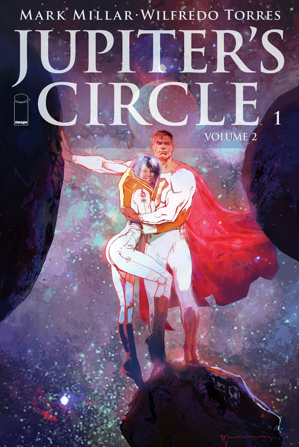 Jupiter’s Circle #2
Image Comics/$3.50
Written by Mark Millar.
Art by Wilfredo Torres; colors by Ive Svorcina.
JJ: You know it’s been a long time since a Superman comic wasn’t ashamed of being a Superman comic when you begin to accept that the paler analogues are doing it better anyway. Date night with the Man of Steel? That’s strictly Silver Age, Pops. And yet, Jupiter’s Circle doesn’t blush at the depiction of it.
Not that Mark Millar has ever been known to shy away from the tough stuff. Engaging the reader with his unblinking interpretations of the hardened, ugly world around us has always been the writer’s forte, but what makes his consistently spectacular Jupiter’s Circle so indelible is that he approaches concepts that are generally regarded as stodgy (or worse, passe) with the same brio. Yes, this book has gone to dark places. But that darkness is contrasted with dizzying moments of pure comic book serendipity. Millar’s titanic strength comes from the fact that he can make even our parent’s square date night feel incredibly captivating. And that’s what the first issue of Circle‘s second volume has done. It’s made the unexceptional exceptional. (What’s more, if I may be candid for a moment, it makes me want to be a better boyfriend.)
Of course, that’s easy to do when “date night” involves sharing Russian caviar on the surface of Europa. (That’s Jupiter‘s Europa, mind.) And Wilfredo Torres beautifully captures the moments between absorbing the majesty of outer space and recognizing the peril that comes with doing so. (“The air should be fine if you stay in the bubble,” Sheldon reminds us.) Whether we’re floating among the stars or walking the unforgiving streets of Manhattan, the artist’s expert craft continues to provide this issue a nuance that’s rarely afforded in typical superhero fare.
But Jupiter’s Circle is far from typical superhero fare. Every moment contained within this book is a loving reminder of what’s still possible in a superhero story. When we drop all pretense and let the heroes live as they rightfully should. It reminds us what’s possible when a superman is allowed to be a superman.
9 out of 10
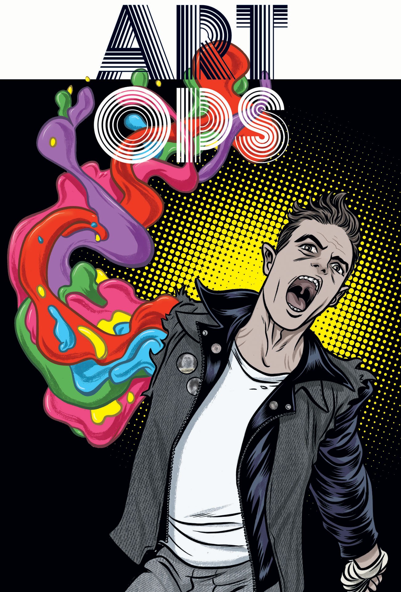 Art Ops #2
Vertigo Comics/$3.99
Written by Shaun Simon.
Art by Mike Allred & Matt Brundage; Colors by Laura Allred.
SS: The merging of mediums is an ambitious and daunting expedition. It requires the inescapable compromises of conformation and highlights the inherent restrictions of each craft involved. The obvious end goal is to transcend all form and end up with a product that’s enhanced by the multitude contributing facets.
Most of the time, these attempts fall short. Such is the case with Vertigo’s theoretically exceptional Art Ops. While the first issue was a moderate disappointment, I had high hopes that #2 would clean things up and establish the series as a fun romp through not only fine art but the towering barriers of entry that boxes it into its own, incestuous multi-million dollar microcosm. Unfortunately, Art Ops continues to scrape the surface of many aspects of the art world without delving any deeper into any single one of them. We’re left with a concept that hasn’t been fully developed.
As protagonist Reggie Riot roams around the greater New York City area, the scope of art that is alive and sentient is massive. Everything from music videos to ancient paintings to desk-carved graffiti is fluid and conscious, and this elevates the scale of potential players in each scene. But still, I feel like I’m left waiting. I’m waiting for more cameos and nods to classic pieces. Where’s Picasso’s Old Guitarist or Duchamp’s Nude Descending Stairs? (Can you imagine an anthropomorphised Fountain?) I want to see the American Gothic couple complaining about city grime or the hullaballoo of being scurried around in the real world. There’s a mammoth array of content to work with and we’re only seeing The Mona Lisa (maybe we’ll finally get that Duchamp with an L.H.O.O.Q. joke at some point) and Michaelangelo’s David as a tiny sliver of the most obvious choices.
Technicolor panels show off some undeniably fun uses of art in motion, with blobs of rainbow splattering around the pages, but for a comic about fine art, there are times when the work isn’t as tight as it could be. Odd discolorations and some sloppy line work occasionally blur some of the action together, but it’s never completely broken or unsightly. Much of it is pretty, and it’s clear the team loves drawing the cyborg hero, The Body; every panel he appears in is pristine. If only the rest of the issue was as sharp and clean.
The heart of Art Ops’ problem is its inability to get going. Concepts are being forcefully introduced at a confusingly rapid pace. All of the possible “what ifs” that arise around the idea of living art are being addressed at lightning speed, and the pacing of the story is suffering because of it. This is also hampering character development, with so many of the new faces being unintriguing or off-putting. As we move through the second issue, however, a concrete antagonist is introduced. The geometrically fragmented art villain, Scarlett, plays like a less nuanced Harley Quinn, loaded with oversized weaponry and plenty of inappropriate quips (a “grow some balls” directed at David is a personal favorite). As the series progresses, her character shows promise to be a solid foil for the Gen-X embodiment that is Reggie.
Art Ops is not the ascendent work of fiction it could have been. It is not a praiseworthy comic nor is it a sublime work of fine art. What it is, however, is a conceptually brilliant love letter to all things creative. While the execution might be lacking, the attempt at a mashup is admirable, and I hope that this work’s shortcomings don’t stop visionaries from taking similar risks in the future.
6 out of 10
 Moon Girl and Devil Dinosaur #1
Marvel Comics/$3.99
Written by Brandon Montclare & Amy Reeder.
Art by Natacha Bustos; colors by Tamra Bonvillain.
AL: Young Lunella Lafayette is an outsider, too smart for her own good. Like Franklin Richards smart. Scary smart. But instead of having the Baxter Building at her disposal, Moon Girl has to deal with public school and nicknames and parents who are trying their best to raise a normal kid.
Lunella is the best thing about Moon Girl and Devil Dinosaur and it does right to stay with her for the bulk of the issue. She is a total science nerd and she is of that special age where she knows everything, more than anybody, but on the way out of her mouth sometimes everything comes out completely wrong. Been there, right? And, like us, Moon Girl yearns for great things. Her smarts, her industry and her determination guide her on the path of her dreams, away from the everyday, towards something bigger.
Bigger as in Clifford the Big Red Dinosaur. Moon Girl discovers a forgotten artifact, the Nightstone, tied to a war between two clans of ancient ape-men. Blood crazed Killer-Folk and peaceful Small-Folk. Moon-Boy is the only member of the Small-Folk who dares to stand against the Killers, but standing with him is the prehistoric powerhouse, Devil Dinosaur. The aesthetic shift between a girl who knows enough about evolution to correct her teachers on their outdated phraseology and an ape-boy who rides a giant red dinosaur is a little jarring. One world is bleeding edge, the other is kitschy Hanna-Barbera fantasy. However, any inconsistencies are going to have to resolve themselves quickly, as the Nightstone allows pseudoscience to trample its way into the modern world.
Moon Girl and Devil Dinosaur is dynamic and charming. A great read for young people who hide how smart they are from the world. All the junior Dr. Sattlers and Dr. Grants out there. It is carefree without being empty. A quirky take on classic kids comics. Particularly noteworthy is the fantastic Lisa Frank palette used by the comic’s colorist, Tamra Bonvillain. The colors are pure magic, making the pages simultaneously dreamy and crisp. Devil Dinosaur may be classic Kirby, but Moon Girl is strictly Cartoon Network. It’s a generation gap book. Great for fans of the Bronze Age who want some Night Nurse in their Spider-Man, great for new readers who grew up with Usagi Tsukino instead of Adam Strange.
7 out of 10
 Ringside #1
Image Comics/$3.99
Written by Joe Keatinge.
Art by Nick Barber; colors by Simon Gough.
SS: We all know the best comics are the ones that take superhuman characters and allow us to see the humanity inside of them. Concurrently, professional wrestling has toed the same lines for the same length of collective history with godlike characters acting out morality plays in front of live audiences. Ringside does its best to combine the two parallel art forms and provides us with the extraordinary displays of the basic humanity we need.
The crux of Ringside plays with some of the same ideas as Aronofsky’s The Wrestler, and in turn, any ol’ story of human obsolescence; this one just happens to be similarly grounded within the squared circle. But as the story progresses, we begin to get a wider view a the man under the mask and his fully realized life outside the ring.
Ringside follows Dan “The Minotaur” Knossos and, through him, gives us a look at the inner workings of professional wrestling. The book assumes the reader has a rudimentary knowledge of how the business currently works, with heavy leanings toward insider lingo and nonchalant references to power structures and independent circuits. It’s not necessary (as the story quickly moves out of the ring and into “real life”), but my love of wrestling directly enhanced the enjoyment I’ve gotten out of Ringside.
The art throughout is a very balanced utilitarian style that accomplishes everything it needs to without being particularly showy. However, the title page is especially breathtaking (akin to the cover): a ground level shot of a wrestling ring, wrestler frozen in air, mid-moonsault, flashbulbs scattered throughout the crowd, and an American flag on full display. There is glory, humanity, and mortality on full display, and “RINGSIDE” plastered across the spread. Magnificently sublime.
I think it’s important to highlight the lengthy interview that acts as a placeholder for the forthcoming letters column. The interview follows creators Keatinge and Barber as they breathlessly discuss their love of wrestling and the creative process behind Ringside. It’s a detailed look into the minds behind the comic, but also details a deep love of sports entertainment and the people behind the performance. More than anything, it’s nice to know that the creators of the comic care deeply about the content.
Ringside uses its themes as a tool for storytelling rather than an inconsequential facet of the narrative. The backdrop for (what appears to be) the beginning of Dan Knossos’ story serves as a method for fleshing out his character and providing opportunities to organically further the plot. It’s a refreshingly full-bodied experience that’s got me more intrigued than a babyface shoot promo and more invested than a Streak vs. Career match. If Keatinge and Barber keep the momentum going, there’s no ceiling to limit how high Ringside can go.
9 out of 10
 The Unbeatable Squirrel Girl #2
Marvel Comics/ $3.99
Written by Ryan North.
Art by Erica Henderson; colors by Rico Renzi.
AL: Doreen Green, also known as the Unbeatable Squirrel Girl, often finds herself representing the growing divide in superhero comics. Marvel has been taking on a broader range of artists and storytellers to tell a more diverse set of stories, and Squirrel Girl is one of those outsider tales. The writing and the artwork are heavily influenced by small press comics and not typical superhero fare, which has lead to an unfortunate common complaint: why doesn’t Doreen Green look like a girl?
First off, no. Those standards aren’t just outdated, they’re moronic. Stop.
Second, this issue continues its tradition of acknowledging the hype that surrounds it with a wink and a smirk before knocking it flat on its butt. In this issue, Doreen Green plays dress up. The most beautiful way I can imagine to silently address the people who criticize her asexuality is to put her in a half-dozen different iconic ladies’ outfits (and drag). Plus, when you only have visuals to sell a time travel story, fashion is a genius angle to come from. Everything about Squirrel Girl is witty, sharp, multifaceted. After a lengthy discussion about the dangers of time travel’s butterfly effect, Doreen throws a gunman through the widow of Café Papillon. (That is how you lance time travel, folks.) I realize that there actually is a Howard the Duck comic right now, but Doreen really can Duck with the best of ‘em.
So, the Unbeatable Squirrel Girl is thrown back in time. Nancy Whitehead to the rescue! Both of the girls are highly analytical. Both see a problem and ask, how do I fix it? And both go about problem solving in different ways. Once Doreen realizes she isn’t the only modern-day expat in the 60s, she decides to find the travelers’ common thread. Nancy tracks down heroes from the present who have the necessary experience that is demanded of temporal displacement.
Time travel is a tricky threat. Being in the 60’s isn’t going to kill Dor. She could keep on living until she gets back to the present. When the problem is the way of the world, you have to fight the cause and not the effects. But what is the cause? Signs point to a villain sending her back in time, but Unbeatable Squirrel Girl keeps me expecting the unexpected. Trouble in the present or a need for heroes in the past; no matter where we find her, I am confident that Doreen Green will never give up.
8 out of 10
Agree? Disagree? What books are YOU reading this week? We want to know! Tell us about those feelings of yours in the comments section below.


