


By Molly Jane Kremer, Scott Southard, Stefania Rudd, and Brandy Dykhuizen. Our Week In Review collects our thoughts on the comics that demand attention. Do you have a deep-rooted desire to know what we think about all your favorite books? Well. This is where you need to be.
 Dreaming Eagles #2
AfterShock Comics/$3.99
Written by Garth Ennis.
Art by Simon Coleby; colors by John Kalisz.
Letters by Rob Steen.
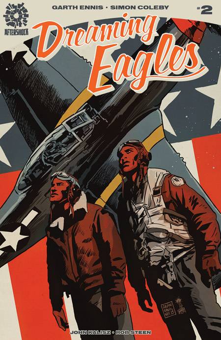
BD: I’m geekily enamored with Garth Ennis’ habit of prefacing each issue with quotes from historical speeches or works of literature. The first issue of Dreaming Eagles paid homage to The Gettysburg Address, and here in issue #2 we’re treated to a full, beautiful poem – “Sunward I’ve Climbed”, by John Gillespie Magee, Jr. Depicting the rare beauty found in rolling between sun and cloud, this poem describes a singular breed of optimism – an ability within these soldiers to take orders that will likely result in death, and somehow turn them into a moment of quiet reflection.
Simon Coleby’s depiction of flight — in sweeping, tumbling loops during training and rigid, dramatic dives in combat — pay respects to Magee’s poem, and also to the story of our hero, Reggie. Coleby then throws us back to Earth and forces us to listen when we’re being spoken to – Ennis’ characters are drawn by Coleby to be viewed from a slightly lower angle, making no mistake as to where our place is among these war heroes. Through this conceit, we know we are amongst giants.
There is a fascinating and important story to tell here, and one that has been overlooked and relegated to “footnote” status for far too long. However, the second issue of Dreaming Eagles is hugely expository, weighted heavily by its history. Reggie is a character comfortable atop his soapbox, and we cheer him on to share his message, through which he may finally connect with his son. This heightened attention to period detail operates as a stark contrast to Eagles‘ first issue, with its visceral humanity and singularity of story. While this particular issue may not keep you in rapt attention, it will give you a front-row seat to view Magee’s “sun-split clouds” and “footless halls of air,” which is, as you can imagine, more than enough.
7 out of 10
 Ringside #3
Image Comics/$3.99
Written by Joe Keatinge.
Art by Nick Barber; colors by Simon Gough.
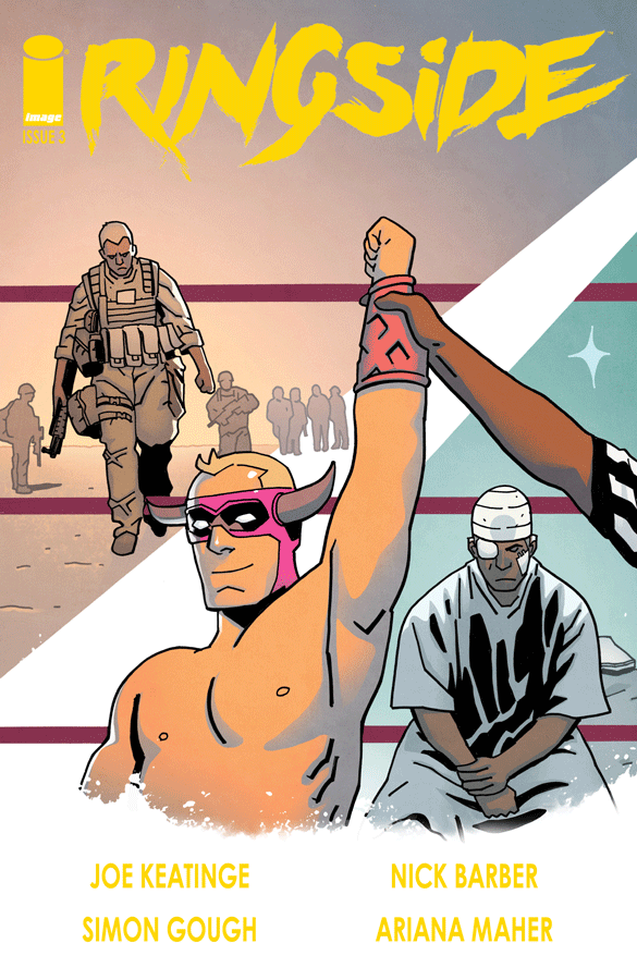
SS: It’s a shame that Ringside isn’t blowing up the scene. I’ve been pulling for this series since it was announced, but since then it’s struggled to find its stride, to apply a method of storytelling that fits both the characters and its subject matter. The gears have been ably set in place, and yet they still can’t turn without grinding.
There isn’t anything particularly wrong about Ringside. It has a classically loveable, down-on-your-luck protagonist, a supporting cast that would fit within any decent indie film, and its background and setting is vivid enough to be believable. And yet, perhaps that’s the problem. Maybe Ringside just took the Image formula and transposed it into the world of wrestling without adding enough structural charisma to bolster its own story.
The plot in issue #3 continues to plod along, but we’re no closer to being swept away by the narrative. The tale of a has-been is always a solid storytelling device, but I’m finding the supporting characters much more interesting than the story of Danny K.’s middle-aged redemption. I’ve seen plenty of movies that concerned themselves with that “one last mission”, and that’s not a strong enough scenario to hold this series together. This is especially true when we’re getting glimpses of a much more compelling secondary plot involving a young star flirting with complacency and a growing comfort with mediocrity.
Comics about real life drama are plentiful. It’s not enough anymore to tell a story about a midlife crisis and expect the audience to love it. We need more than off-hand comments about low bank accounts, professional dissatisfaction, and non-linear relationships. We need to be able to consider a living world and the characters within them unfettered by artifice.
I feel like this review is tinged with more harsh criticism than anything else, but it’s important to clarify that I’m not offended, angry, or disdainful toward Ringside. I think the general frustration is simply the result of my own high expectations not being met. This series could be a real contender, but instead, Ringside seems to be an exercise in recognizable tropes rather than the true innovation I’m still hoping it will be.
6 out of 10
 Black Magick #4
Written by Greg Rucka.
Art by Nicola Scott; Color assists by Chiara Arena.
Letters by Jodi Wynne.
MJ: Greg Rucka and Nicola Scott are creating one of Image Comics’ strongest titles right now in Black Magic, and every issue serves to mount its tension with care and craft. Rucka knows exactly how to pace this witchy, smart police procedural; there’s a creeping dread in this book that’s been building inch by inch since it debuted.
I can’t say enough about Nicola Scott’s amazing art, or the beautiful grey-wash colors assisted by Chiara Arena. Scott’s emotive faces are an enormous part of why this book connects with the reader so completely. She also gives each character’s face unique features, and makes each distinctly recognizable. Some otherwise truly amazing artists still draw the same ding-dang face for every female and/or male character. Scott decidedly avoids this, and that only adds to the book’s visual realism. From numerous panels featuring a bloated, vomit-inducingly gross corpse, to a page or two in Alex’s kiddo-filled classroom, it’s some of the most lifelike stuff you’ll find in any comic. It’s surreal.
Scott manipulates her visuals to make a scene noisy or still, and her establishing shots, both exterior and interior, are consistently perfect. Out of one of those silent-as-the-grave sequences, Scott gets to add a hefty creep factor to this third issue’s final two pages, which the near-lack of color definitely favors and emphasizes. The tiny tinges of color peppered throughout the book only illustrate points where actual “magic” occurs. It’s an extremely effective way to subtly spotlight its workings. And it’s here where Jodi Wynne’s lettering changes slightly too: similar to the small pops of color when magic is afoot, word bubbles switch to a black background with small, lower-case white font when spells are spoken.
The dialogue matches the realism of Scott’s pages, and much of it gives the impression that we’re reading a straight-faced cop drama: various bits of cop lingo, with almost excessive profanity peppered liberally here and there, evoke a reserved, almost detached, way of discussing feelings and fears. As a whole, it’s just a part of how this story is a gorgeous entity in which one could easily lose themselves. Required reading.
8.5 out of 10
 Jem and the Holograms #11
IDW/$3.99
Written by Kelly Thompson.
Art by Sophie Campbell; colors by M. Victoria Robado.
Letters by Shawn Lee.
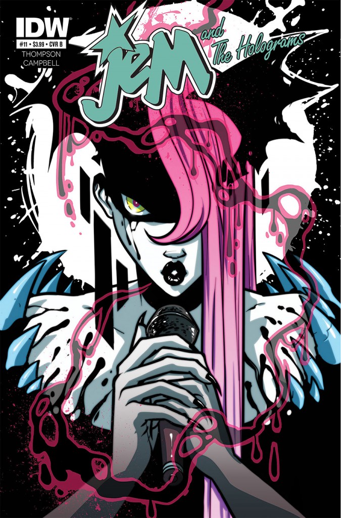
SR: Jem and the Holograms is strutting into a new story arc, tantalizingly titled Dark Jem. And if the cover art (all seven versions of it, with some very cool detailing done in a black matte finish) is any indication, we are going to join our ladies on quite a journey. The creative team of Kelly Thompson, Sophie Campbell (who returns after a four issue hiatus), and M. Victoria Robado start this story off with strong themes of self-discovery, identity, and loyalty.
We begin the story with our glam teens engaging in an accusatory argument, with each of the Holograms imparting their own advice in the hopes of smoothing things over. Ultimately, it comes down to Jerrica dropping some truth: “You’re in this together and all you have are each other.” Foreshadowing? You bet! We also check in with the Misfits, who remain with a still-recovering Pizzazz after a car accident. With her ability to sing currently gone, the others are put into a spot where they need to find a new singer for their tour or there will come a breach of contract. So, as you can imagine, their professional feelings are as jumbled as their loyalty.
Although similar plot devices have been used in past issues to move along the story or provide exposition—I’m looking at you, “let’s throw a party”—Thompson’s writing remains clear and concise, as she moves from Holograms to Misfits and back again in a storyline that curves and weaves throughout the book. She does a great job with the back and forths between characters, as well as developing relationships through casual conversations and artful reveals.
Campbell’s artwork, combined with Robado’s coloring, simply pops from the page, bringing it all to life. I could spend hours just going through each panel taking in all the details, from patterns on clothing to the provocative tattoos. The overall look of each character also speaks volumes as to who they are and how they represent themselves. It’s those details that make this series so much fun. Also, I genuinely appreciate the variety of shapes and sizes in which both women and men are depicted. It’s great to have a subtle body-positive message done so naturally in a book. I’ll be interested in seeing how this arc unfolds in the near future. My gut tells me as the bigger picture is revealed the more we readers will be excited by its direction.
7.5 out of 10
 Victorie City #1
IDW/$3.99
Written by Keith Carmack.
Art by Vincent Nappi.
Letters by Jessi Adrignola.
SS: When I was in 7th grade, I started a band with friends called Caution 16. We played songs about crushes we had, awkwardly swore as much as possible, and made bad fart jokes. This also happened to be the year that Blink 182 came out with their massive hit record, Enema of the State. As much as we liked to think we were original and hilarious, it didn’t take long for us to look back and see that we were a deluded and weak rip-off of a band we loved. But these things happen in 7th grade. We all went on to live better lives because of it.
I think most people have stories like this. Emulating your heroes is a perfectly acceptable tool for adolescents — or anyone in any age, really — to figure out the world. It only becomes problematic when that emulation turns into real art, and that real art turns into art that you sell to make a living. Then it’s just sad.
Victorie City is the obvious product of a deep-rooted love of Se7en, Fight Club, and Batman. The passion for dark noir, brutal murder, and a bit of a mystery is clear, but it’s also evident that chasing that dogged, emphysemic dragon has turned into an effort for the sake of itself rather than tasteful homage or a thoughtful addition to the genre.
The brand new series shows its hand immediately by trying to be edgy, but there’s not much edge or purpose behind its aggressive language and look (the latter of which I admittedly like in the toned down sequences). The ultra-brutal opening scene is devoid of any stakes, and the antagonist doesn’t even seem to have a purpose for any of these well-structured murders.
I’m not one to condemn glorified violence. I love a good fountain of blood (I might argue that Rambo 4 is the best of them all), but when an objective is completely missing, I immediately lose all interest in viewing a masturbatory parade of blood and other viscera. It’s neither subversive nor thrilling. Just an empty series of frustratingly bland tropes and cries for attention.
Vincent Nappi’s neat, scattered charcoal drawing style, starkly contrasts with the spastic matte letters, but as soon as the scene’s intensity ramps up, the style becomes evocative of an angrily-scrawled high school notebook, with fist-scribbled lines and spattered onomatopoeias that overembellish the action and consequently diminish any horror or thrill the page previously had. To accentuate this, Nappi and the rest of the creative team decide emulate certain pages from Grant Morrison and Dave McKean’s Arkham Asylum in moments of narrative crisis. When that isn’t enough, they tap into the almost iconic plight of Jim Gordon in Frank Miller’s Batman: Year One. It’s infuriating to see the explicit copy/paste of techniques used to great effect in Batman’s world transplanted into a lesser universe.
Victorie City is the comic book equivalent of someone calling themselves sick, twisted, and demented. Not only does it ring false, it makes you pity whoever is making these claims about themselves. If nothing else, Victorie City is consistent. Every aspect of the book falls in line with the ethos of trying too hard to prove a point no one thought was very interesting in the first place.
3 out of 10
Agree? Disagree? What books are YOU reading this week? We want to know! Tell us about those feelings of yours in the comments section below.


