

by Arpad Okay, Kate Kowalski, and Jarrod Jones. They arrived to face a void of endless canvas armed only with a stylus and the will to create. They warred, they danced, they won; their creative accomplishments thrilled us during a year of unease, and we are forever grateful. These are the best artists of 2020.

Cyril Pedrosa. (‘The Golden Age’, written with Roxanne Moreil, translated by Montana Kane, First Second) In the artwork of Cyril Pedrosa, line and color and texture are all one. His pen nib scratches pure color, cutting forms into being, filling The Golden Age with forests and maidens and murders that skate into existence on ice. One pictures a phoenix feather quill that never dribbles around the inkpot. Cel paintings from The Sword in the Stone, retro postwar storybook style. Dangerous men. Oblique prophecy. A princess on the run, on a quest, a seer for the war to come. Every centimeter of every page is a dance between the striking, musical gestures of the characters and layers upon layers of ornately detailed medieval environments.
It would overwhelm if it all wasn’t so magnificently managed; it still does. Some artists are busy. Pedrosa is filigree. The palette for the book is also unlike anything in decades. Ancient animation yes, but printmaking, where the story will lapse into reverie the art will look like a relief print of marbled colors on slate. Pinks, purples, and blues dominate—in other hands a well-tread signifier of a princess story, but Pedrosa is different, painting courtly intrigue and visions of fire in the tones of exotic fruit, sweet, of the earth, and ripe, or as the sun colors the clouds at the break of dawn. The Golden Age is impossibly beautiful, a lush vision of fairytale fantasy greater than its forebears. — AOK

Katie Skelly. (‘Maids’, Fantagraphics Books) Maids continues to haunt. The thickly painted walls of that dreamhouse and the serene masks of the inhabits within contain some serious dread. Katie Skelly has tapped into something with her cheeky gore. (How can a disembodied eyeball on the floor be so… cute?) The sheer contrast of her chic, paper doll style with the psychological horror present in this book is unnerving, lingering. That Skelly face, sweetly streaked with lipstick—or something far more sinister—is striking and iconic.
Her array of pinups across Instagram evoke the same sensation as Barbie in her various careers—that same face living many, many lives—albeit her dolls are lustier, a little French, and tend to be more violent. Girls just wanna have fun and sometimes that’s as a bank robber, dominatrix, or vampire. There’s something decisive and confident in the colorblocking and heavy lines, not to mention those somehow knowing expressions. Skelly has nailed glam and, when she feels like it, terror. — KK

Anand RK, John Pearson & Aditya Bidikar. (‘Blue in Green’, written by Ram V, design by Tom Muller, Image Comics) From the dire uncertainty of today to the faded Kodachrome quality of 1967’s New York City, Anand RK, John Pearson and Aditya Bidikar take us on a Dantesque journey in Blue in Green. Flip through its pages and you might start thinking this jazzy croon of a horror book looked like it was crafted in 1987 under the careful eye of Karen Berger—with its untamed panel lines, heinously rendered demons, floating symbols and indecipherable runes fluttering in the margins of its pages, Blue in Green certainly does.
What Anand, John and Aditya accomplished together (with writer Ram V, enveloped in gorgeous trade design by Tom Muller) evokes the bygone experimental era of pre-Vertigo DC, an inspired approach for a book that attempts to navigate the unreliable spectrum of memory and sets its mood to the split-second shifts of improvisational jazz. Page layouts shift and churn as Blue in Green‘s Erik Dieter falls further and further into a mystery that wants to swallow him whole. As each exquisite page turns, that warm, captivating mental fog that can only come from good art lets you fall with him. — JJ

Núria Martínez. (‘Outspace’, ShortBox) The lines made by Núria Martínez are a wiggle crumble oscillation I find totally compelling. Not a tremor but straight lines going slightly fractal. The absence of smooth surfaces in Outspace a fresh break in a universe made out of bubbles and curves. When you play the Western game, the horses are ducks and they look more like molecules. Martínez’s talent isn’t static, just moving further away from anatomical accuracy and closer to a freedom that is fun and expressionist. Everything from comic book shops in real life to inventory screens in-game are a cute, colorful mosaic of simple shapes and quirky imagination. The style seems simple, but Martínez is an evocative and complex visual storyteller.
The color choices in Outspace are also basic at a glace but subtly sophisticated in their use. The noise of gradient printer dots are a compliment to the wiggle pleasure of the linework, taken to the next stage of nearsighted delight. The assembly of shapes and colors into people and things seamlessly blends into the arrangement of panels and gutters, the layouts. Outspace, about the highs and lows of space dating via video games, is designed to tell the story immersing the reader. The story is art, icons, menus, and the user interface of tech in the book. The typical panel by panel storytelling disappears to become an infographic read without sequence. Martínez draws outsider aspirations and intellectual inspiration in Outspace, a harbinger of the shape of comics to come. — AOK

Daniel Warren Johnson & Mike Spicer. (‘Wonder Woman: Dead Earth’, DC) Daniel Warren Johnson and Mike Spicer are a team unparalleled. Manga movement unleashed upon American superhero comics—we’ve seen that before, never quite like this. Wonder Woman: Dead Earth is a shimmering stampede, utter pandemonium; the bracelets came off, the warheads dropped out of the stratosphere, and Johnson & Spicer broke ground on a level so great it can only be called profound.
The superficial gloss of DC super-bouts is gone in Wonder Woman: Dead Earth. War is hell. Violence isn’t heroic, but horrific, ugly, and Johnson doesn’t let you forget it. The catharsis of a well-thrown punch is dampened by the squidge of tears that come from the closed eyes of she who threw it. A stark realization of forgotten atrocities is met with a putrid wash of vomit, courtesy of Spicer. Shit gets raw in Dead Earth. This art team ain’t afraid of it, either.
But amid fallouts both emotional and nuclear comes a dream. Represented by the scratches on the face of she who pushes onward, depicted plainly by a first step up after falling to her knees. Mountains crack in this book. Leviathans are torn open by Kryptonian bones and the marble of Amazonian muscle. The earth changes. For the better? Perhaps, but it’s not for us to know when we read Wonder Woman: Dead Earth. Here you’ll find the struggle for renewal, for change, and that little thing we cling onto when the fires rage outside. It’s called hope. — JJ

John Pham. (‘J&K’, Fantagraphics Books) Cute as a vessel for sadness. Sweet as a conduit for tragedy. John Pham’s art is a mall on the far side of the graveyard, where Sesame Street dead ends. J&K uses a sugar cookie aesthetic for some heavy downer shit. Pham’s hipster vintage world is winsome and crushing and lavishly colored. Risograph print textures and effects, philosophical guidance. Each panel is a whole project. The colors are rainbow sherbet, somewhere between Easter and flavors of Kool-Aid, all applied with the satisfying distortion of offset printing, where no color is alone, all is dots and always blending. It’s a slice of cake. Unicorn droppings. Yeah, there’s gross-out aplenty in J&K, though it doesn’t go against the grain. Things look cartoony and act that way. The two amicable losers with crap jobs, bad habits, odd friends, fart jokes, none of this contradicts the gentle darkness that Pham’s art habitates. Roger Hargreaves’ Little Miss Helpful but her face is melting drips of candle wax (it’s acne pus, actually) like something from Fort Thunder or Highwater Books. All that beauty and emotion made seemingly simple by the art style is powerfully charged by its concentration and discipline. Reading J&K wrecked me as much as looking at it fills me with bliss. Beyond the book—inside it—Pham designed stickers, cards, a poster, a magazine, a tiny vinyl record that plays! Pham’s interest in art as production goes beyond loving print to loving stuff and making stuff worth loving. — AOK

Erica Henderson. (‘Dracula, Motherf**ker!’ Image Comics) We are treated to a tasty visual morsel in the opening pages of Dracula, Motherf**cker! with a direct reference to Klimt and a glimpse of his signature dreamy gold backdrops as the titular vamp skulks through Vienna. Erica Henderson had fun depicting Dracula and his vampire squad and it shows. The colors! Henderson really gets some mileage out of chartreuse. Blue and red, warm and cool, are repeatedly thrown together to heighten this lightning bolt of a tale. Her linework in one moment can be sharp, focused—in the next, streaky and dynamic, a hologram out of focus.
The scenery, the outfits, the expressions are hyper stylized, fitting for this psychedelic neo noir. The many-eyed bestial true forms of the master of darkness and his brides are insane in the best way possible. The character designs have some strong Japanese folklore vibes, like bursting and unhinged Miyazaki demons. Henderson’s work here is in conversation with so many other works of art, fashion, and film—and that’s what makes it so fun, so frenetic, so electrifying. — KK
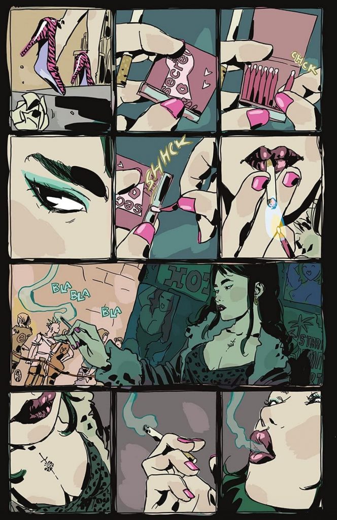
Maria Llovet. (‘Loud’, Black Mask Studios; ‘Faithless II’, BOOM! Studios) Too many of you slept on Loud. A swift, nasty bit of sequential business from Maria Llovet that boasts an aesthetic so on-point it will make you sweat, I promise you. Set during one fateful neon night of wanton abandon, Loud tosses us in a sea of dangerous pretty people and every vice known to man, locks us in, forbids the very thought of “tomorrow”—largely because some of the glitterati of Loud will never make it that far.
I’ve said it before and it bears repeating: If Tony Scott, rest his soul, had produced a nightclub comic about assassin lovers and vampire fuckboys, this could have been it. Blood is currency in Loud, and like drugs, like sex, it tempts all without prejudice. This book is rife with club dandies overcome with bloodlust, with waitresses beyond the point of “over it”, shithead business types looking to score… whatever—Llovet observes all and doesn’t blink.
She also doesn’t bother with language in Loud. Here, the PA pulsates a rhythmic trance so overwhelming that all we have to go on in terms of story is body language, panel layouts, what’s shown, what won’t be. Luckily, Llovet speaks in storyboards, is fluent in the language of film, puts her cinematographic powers to work on the page, and the results are arresting. As we work our way through the night’s haze of decadence and sin, Chanel and Crepax, Llovet drops one shock on us after the other. It’s a maze of horrors set to a rousing, thundering beat, one you won’t ever once consider putting down. — JJ

Artyom Trakhanov. (‘First Knife’, written by Simon Roy and Daniel Benson, colors by Jason Wordie, letters by Hassan Otsmane-Elhaou, Image Comics) Artyom Trakhanov’s artwork for First Knife hits like an antique woodcut. The high relief simplicity is ornate, lines that flow freely and pool into shadow. The black cuts the page something dramatic but slight. Hellboy with restraint, the stark straight lines all bending to the pre-code animation music of conductor Trakhanov. His style evokes the European greats like Frederik Peeters and Kerascoët more than the air of Gronch most direct market stories like this aspire toward. A soldier’s tale. Trakhanov brings a respect for the civilian over the industrialized, the society, and the earth. Animals and landscapes are just as crucial to First Knife as warriors and robots. The lives of side characters of no real consequence are given equal time and grace, as much style as the violence. Love the giant geese. The seabirds that are hardly more than a scribble. The action whips, but First Knife sees more beauty in tranquility than conflict. That said, the ancient killer robot reboot in a semi-recovered post-apocalypse conqueror tribe is not an angel of peace. One of the protagonists is melting through half the book, that’s something I can’t say I’ve seen before. There are aliens, too, that look like furniture escaped from Dr. Strange’s sitting room. Supplemental materials and additional imagery that inspires. A document of future past. The details that Trakahnov sees and shows us are extraordinary, as is his talent. — AOK

Martin Simmonds. (‘The Department of Truth’, written by James Tynion IV, lettered by Aditya Bidikar, Image Comics) The truth is out there, and often it’s a pretty mundane thing. That’s why conspiracies are so attractive to people; they offer an explanation to life’s various mysteries and frustrations that’s a shade more frightening, and far deadlier, than anything we can see with our waking eyes. In The Department of Truth, the truth changes, becomes things it couldn’t, or shouldn’t, in a sane world.
Martin Simmonds doesn’t draw sane worlds. He likes his worlds strange, a bit off, broken and elusive and dangerous. Even still, led by the warped imagination of James Tynion IV and backed by a innovative (and, at times, demonic) prowess of Aditya Bidikar, Simmonds has his work cut out for him. His highest-profile comics job yet has landed more eyes on Martin than ever before, but he remains dauntless in his panel layouts and character renderings even as Tynion gleefully tosses him ever deeper down the dank rabbit hole of fake news and social distress.
Along his descent, Simmonds plucks from the darkness a frightfully thrilling assortment of tricks and treats. He imbues this sordid mind-bender with the hues of redacted ink smears, omitted Zapruder frames, bureaucratic red tape, even the blacks and blues from the bruised and bloodied mug of Uncle Sam. The research put into this work would be impressive on its own, but the way Simmonds implements it in The Department of Truth is itself a work of art: We behold in his panels the broken state of our contemporary lives, strewn about in small jigsaw pieces that, when assembled, betray the entirety of our hideous and shocking American nightmare. — JJ
Who was your favorite artist this year? Let us know in the comments section below.
More from the 2020 YEAR IN REVIEW:
These are the best comics of the year
These are the best covers of the year


