
by Molly Jane Kremer, Brandy Dykhuizen, Clyde Hall, Lauren Fernandes, Kate Kowalski, and Jarrod Jones. Undercover is our opportunity to lovingly gaze upon gorgeous works from magnificent artists. This week, we revisit the 18 most striking, beautiful, odd, and otherwise terrific covers that graced comic book stands in the year 2020.

Daphne Byrne #1 by Piotr Jabłoński. (Hill House Comics/DC)
CH: The DC Black Label gets another entry via Joe Hill’s Hill House Comics, and artist Piotr Jabłoński applies his skills reworking a character created by Hill’s father: The eerie entity looming behind young Daphne is a ringer for Reggie Nadler’s Barlow, the vampire character in the 1979 television adaptation of Salem’s Lot.
It’s a not-so-subtle nod to a quaintly subdued debut. There’s more nuance than ghastliness inside, while Jabłoński treats us to sinister dreamery delivered with tactile layers. Crinkling like a shifted shroud, ‘Brother’ manifests shadowy limbs to literally grip Daphne. The cover becomes a parallel to the gripping dread set to befall Daphne and her household.
In contrast are nightfallen fields, the dark dress balanced against textured surfaces. Gently framing the lace collar while also exposing and enhancing its pattern. These contrasts finally come to a conjoined roost; two very different beings sharing a soul. One an insightful and intelligent young woman. The other, a vile and scheming Thing at crossed purposes and dueling for dominance.

‘Jim Henson’s Storyteller: Ghosts’ #2 by Michael Walsh. (Archaia/BOOM! Studios)
LF: Simplicity should never be underrated for either its beauty or its ability to communicate. This is a truth Michael Walsh masterfully plays with on this Storyteller variant. There’s a lot to love here. The framing silhouette of scraggly, spooky trees holds the image of moon and a woman’s face and spine like a chalice—the only acceptable occult symbol to tie into a cover that just radiates black magic.
Her hair, wild and witchy in the wind, looks like ethereal tentacles seeking purpose. The blue flames orbiting her spine, her heart, and her dripping guts casts the quintessential campfire scary story onto her face. I half expect to see a group of children sitting on sleeping bags, gathered around her and roasting marshmallows, daring one another to tell the scariest story. All testing their mettle to see how far their bravery will take them.
She is beautiful, captivating in the otherworldly glow of the flame. She has also done something terribly, terribly wrong. She went too far. Walsh leaves space in the cover for us. You can almost imagine disembodied hands, either reaching toward you and grasping for help, or reaching up to the sky, calling her magic, reveling in her fate.

‘Catwoman 80th Anniversary Special’ #1 by Joëlle Jones. (DC)
JJ: Joëlle Jones doesn’t slay. She decimates. Leaves all who view her craft lying flat on the ground, pondering every moment of their lives and how every single one of them led to this one staggering instant, where their eyes chanced to see the newest Jones piece and now all they have left is the quest to seek out the next. As for her work on Catwoman, Jones has accomplished a character-defining run that has already cozied up to the works of the greatest in the comics field. All that’s left is to indulge in a victory vamp, and Jones’ rendition of Selina doesn’t disappoint.
Electricity. Vinyl. Selina slips into both and appears euphoric in the doing. Smoke surrounds her jade eyes, broadcasting daggers to those who dare meet her gaze. Entranced? Good. Now make sure your wallet’s still there, champ.
Jones’ version of vinyl is an oil slick pouring over shapes of onyx. Perfect for a slinky cat burglar who shares no equal. No matter where you store your wares—the Musée du Louvre, Fort Knox, some deep subterranean lair or some nosebleed-inducing penthouse guarded by a dragon—Selina Kyle will slip in and out with your wealth before your lawyers realize just how destitute you’ve become. Worse still, she’ll have also absconded with your heart. You’re not getting any of it back.

Lois Lane #10 by Tula Lotay. (DC)
JJ: Lois Lane’s hit a wall.
Stuck by writer’s block, our intrepid reporter shifts her gaze outside for another scan of the Metropolis skyline. Home, where the stories tend to pop, spill, explode at a second’s notice. She’s working on a story now, a real messy one, and the damn thing’s giving her a proper fight. The words just aren’t fitting on the page. The details are a jumble. Perry’s deadline is forcing her shoulders down towards the floor. Pressure. It’s murder on the posture. So Lois Lane pauses, reflects.
Chances a glimpse.
Tula Lotay’s variant for Lois Lane #10 is a second in the life of the greatest fictional journalist ever created. A second, that fleeting instant, when inspiration hits and the endorphins begin to fire. By pure serendipity Lois spots a blur of primary color and Lotay freezes time. The blues of the Metropolis sky seem to deepen, but the red that flashes across Lois’ face… that’s passion, the same passion she’s always had, the passion for seeing justice done. Lotay freezes this instant when Lois Lane reignites that fire inside, just before she turns back to her laptop and topples yet another wall.

Basketful of Heads #7 by Gabriel Rodriguez. (Hill House Comics/DC)
LF: June Branch has something on her mind.
In this variant cover for the seventh issue of Basketful of Heads, Gabriel Rodriguez displays the tidbits of thought that cross the mind of a woman pushed to violence. His cover is a literal showing of the odd alliterations our brains make (“Lovely Liam, Lying Liam”), the strange lists we form (“Things I Can Decapitate, Things I Can’t Decapitate”), the anxious topics our minds circle around obsessively (“Hate.”) Rodriguez lays it all across her head, shrouding her hair and face with blood as though it were a veil.
June Branch has several things on her mind.
But from the look on her face (if you could somehow ignore the blood) she looks like she could be waiting in line at her favorite ice cream shop. Her chin is up, nevermind the blood trickling down it, ready to drip onto her raincoat. There is just the quirk of a smile playing on her lips. Her eyes are alight… if you ignore the blood-red center of her pupil. But you can’t ignore it. Despite the chaos of the bloodied words floating across her head, my eye continuously travels back to June’s.
The saying is that “the eyes are the windows to the soul.” Rodriguez sucks you into June Branch’s soul, and leaves you wondering what’s left of it.

The Ludocrats #1 by Jamie McKelvie. (Image Comics)
JJ: Jamie McKelvie’s knack for the symmetrical cannot be overstated. His portrait covers for the dearly departed The Wicked + The Divine were stately club shots of the immaculately beautiful, symmetrical to the point of cosmic improbability.
McKelvie’s gone akimbo with his variant for The Ludocrats #1. Facial symmetry remains intact, yes, but venture outwards to the weird, wild mystique that surrounds his subject. It’s all boutique pastels and Patrick Nagel geometry, punctuated by a raygun from Michael Allred’s arsenal of fun and a literal wrench thrown into the works. And his style has suffered not at all for it.
While his devotion to detail has endured this deviancy McKelvie’s line feels looser here, still disciplined but… rebellious? Contradiction permeates this piece, and I’m getting drunk just trying to soak it all in. His subject’s hair defies explanation and the wine’s going everywhere when it shouldn’t. Gravity is at odds with rationality. A delirious bon-bon emulsified in qualified cool, I respect it.

Tartarus #1 by Johnnie Christmas. (Image Comics)
BD: Confidence, poise, tenacity, elan… while they skirt the edges, none of these words comes close to describing what’s staring back at us from the cover of Tartarus #3. We’d need to visit a few different languages to truly do this image justice, but that’s Johnnie Christmas, innit? Sometimes you just have to sit back and listen to his art.
The ancient and the futuristic combine frequently on Tartarus, and here is no exception. We see a breastplate with ornate, Viking-esque metalwork (a lovely shape, though it could be problematic in battle), with space-age white-hot glowing dragons wrapped around the shoulders. What’s timeless, though, is the woman who would just as soon eat you up and spit you back out as look at you. Vulnerable but unafraid, terrifying yet alluring—is that wink an invitation or a warning that she knows something we don’t? Either way, I’m here for it.
Wonder Woman: Dead Earth #3 by Daniel Warren Johnson. (DC/DC Black Label)
LF: Sometimes art imitates life.
Daniel Warren Johnson’s variant for Wonder Woman: Dead Earth #3 is one such instance. Warren gives us a Wonder Woman on her knees, frustrated and lassoed in her own construct. In the tension of her fingers, clawed, grasping, we see the frustration and bitterness of every woman. In her clenched jaw, flexed arm muscles, we see resistance. In fact, the whole image is a pool of tension, of resistance, that we step into. It tastes like bitterness, like desperation, like despair. There is a hint of hopelessness, and you can see it in Diana’s eyes. She’s wondering if she should give up. If there is a point in continuing to fight, when all of the bad seems to be slowly eroding the good. The good, it seems, is turning to nothing. To dust, or a memory.
Why go on?
That is what Diana wonders, starting at her useless hands, at her skinned knees, at the ash-covered ground.
What Daniel Warren Johnson doesn’t show us, is that she will get up. She will rise, and do what she must, for the sake of the world. It’s who she is, and that may be a part of her frustration.
But it’s what makes her someone we aspire to be. And this moment of utter vulnerability from her connects us to this timeless hero in a way we desperately need these days. Even when we feel hopeless, we must go on. We must resist.

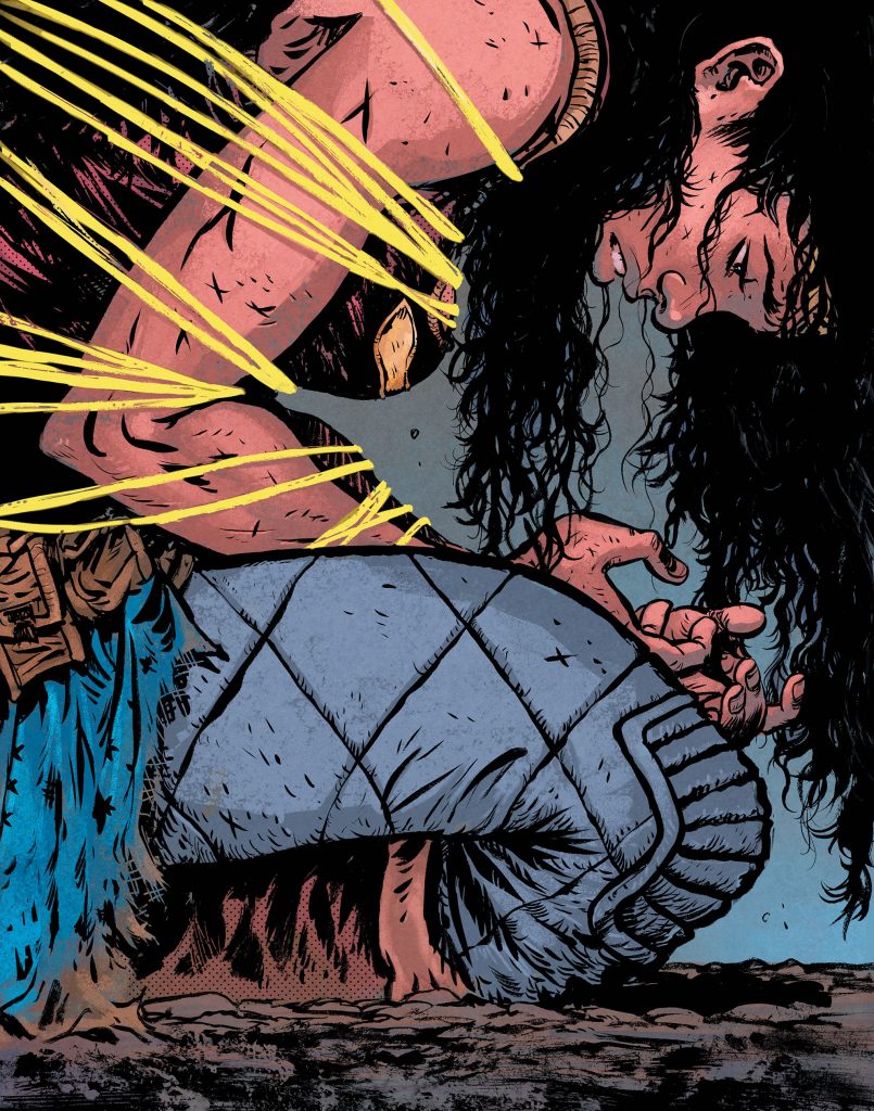
Killadelphia #6 by Jae Lee & June Chung. (Image Comics)
JJ: Through the shadows, they stalk. Vampires live amongst us in Rodney Barnes, Jason Shawn Alexander & Luis NCT’s Killadelphia, and they’ve dug up all sorts of raw, hideous American history from the deep, dark grave where some would like to see it stay buried. It’s a fascinating, often horrifying, frequently satisfying comic series from a team operating at the height of their powers. It’s only fitting such prestige should have an equally amazing cover to cap off its first colossal run.
Issue #6 sees an absolutely stunning variant from the impossibly-good Jae Lee & June Chung artistic team. Their subject: Abigail Adams, former first lady and looming threat to humanity’s future.
Abigail has adapted to the times. Immortality has hardened her resolve and eroded her soul, her hands lethal talons fit for ripping. Chung seeps a faint rot into her porcelain features. Burdened by her president husband no more, Abigail is free to explore her various appetites and ambitions. Fresh drink streaming down her chin and tears spilling from her charcoal-smoked eyes, Abigail dreams of a future of blood, fury, sacrifice, and power. It is horrible, unfathomable, beautiful.

The Batman’s Grave #7 by Frank Quitely. (DC)
CH: He may have wonderful toys, but tech and armor do not the Batman make.
Bruce Wayne is not a chiropteran demigod despite what some insist. Mad computing power and Bat-Exoskeletons don’t secure the W.G.D. honorific. It’s earned by placing himself in the victim’s position and studying the scene, the crime, the violence, from their perspective.
Quitely captures the vulnerability with a grim and determined Batman, one cloaked and cowled in fabric. Supported not by a Batwing or a burgeoning utility belt but by empathic powers of observation. By being willing. Willing to stand against the evil mankind does, a flawed mortal barrier between the innocent and the predators.
Quitely’s Dark Knight reveals our arbiter intimately. The untended stubble, the haphazard mask repair, the rends in his mantle. Batman isn’t unscathed, but he is uncowed. Still determined. Still focused on delivering justice. This is The Batman criminals fear, not the shock-and-awe tech one. His terrible visage haunts the Gotham city rooftops of their nightmares. The man who won’t quit, who pursues despite the cost; the one who always keeps coming.
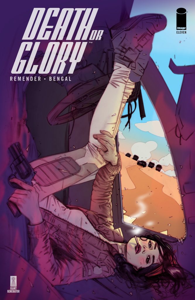
Death or Glory #9 by Tula Lotay. (Image Comics)
KK: At first glance, Glory’s sprawling pose across this cover calls to mind an evocative fold-out page in the middle of a stolen magazine. It’s plain to see however, this gal isn’t spreading out for anyone’s gratification but her own. She’s at once relaxed, leaning back and enjoying her cigarette. She stares back defiantly, no sense of fear or urgency in her eyes. Yet, she clutches her revolver tightly amongst the shards of window glass as a horde of fast approaching cars kicks up dust over the horizon. This Glory’s got the getup and the devil-may-care vibe of a James Dean or Marlon Brando cruising the open road, but her world’s been thrown off kilter and her finger is on the trigger.
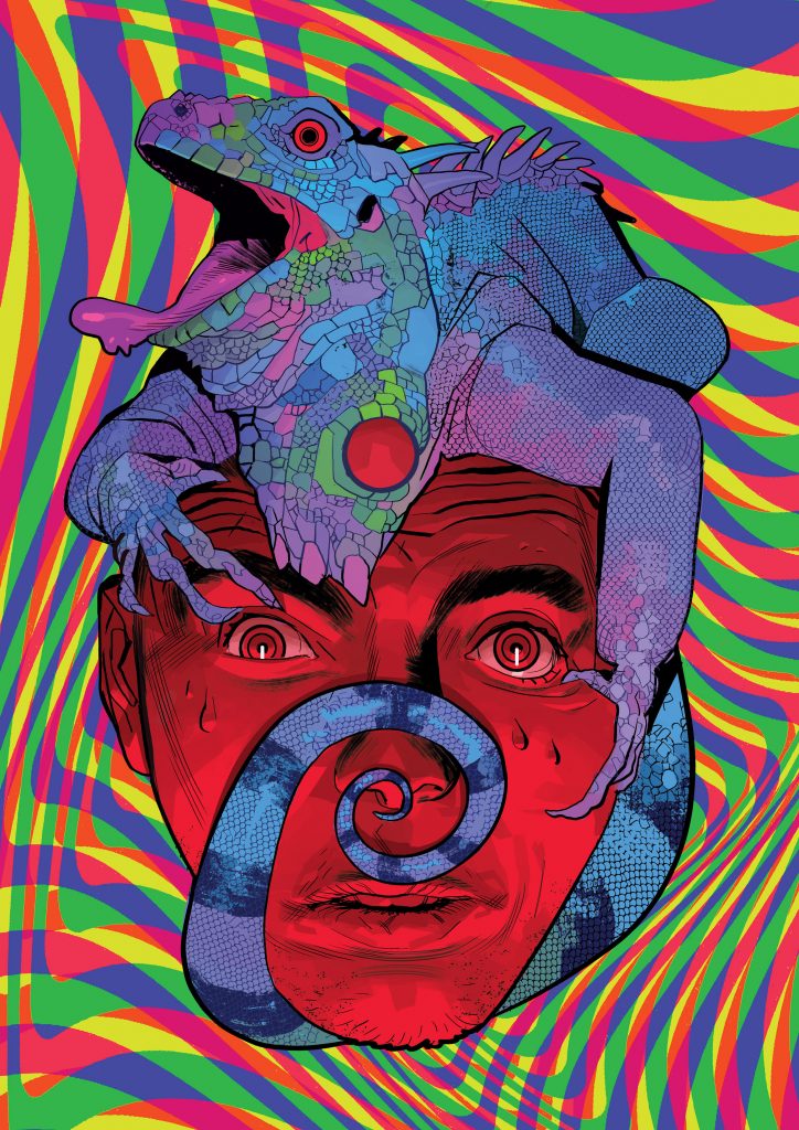
King of Nowhere #4 by Lorenzo De Felici. (BOOM! Studios)
CH: Lorenzo De Felici submitted multiple variant covers for BOOM! Studios’ King of Nowhere #4, but I’m glad they chose this one. Law enforcement-noshing giant iguanas and psychedelia embody the surrealism of this series, and De Felici’s eye-opening imagery taps the long-standing bad trip/reptilian connection.
If you’re following the title, you know the kind of messed up mind voyage protagonist Denis is on. De Felici’s iguana harkens to other pop culture altered states of consciousness, from Stacy Keach’s baked DEA agent toking with an iguana in 1981’s Nice Dreams to Hunter S. Thompson’s hallucinogenic Lizard Lounge in Fear and Loathing in Las Vegas.
Those were clearly representations of better-life-through-chemistry experiences overdone and meandered down the rowdy way. But Denis doesn’t wake hungover. Nor does he pass out and undergo reality reframing. All of which makes him question how real his ‘visions’ are.
As in De Felici’s image, the hero desperately requires a blink for realigning his sensors. The world of Nowhere, like his iguana jockey, doesn’t give him that chance. The composition, hypnotic swirly eyes to reptilian French kiss, similarly captures our attention with kaleidoscopic colors. Denis’s predicament, held in thrall by a world stunningly weird but simultaneously wondrous and unescapable, becomes our vicarious position.
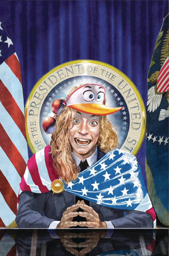
Billionaire Island #5 by Steve Pugh. (AHOY Comics)
JJ: The president is a dunce. Also, this cover is hilarious. (*three-point throw, bank, fist pump* Yesss.) In Billionaire Island, the most wealthy thing in the world is a dog and it really looks like Kid Rock is the leader of the free world. (After all, why not?) But for the cover to the latest issue of Mark Russell & Pugh’s riotous first arc, AHOY taps the breaks. Pugh doesn’t get to flex his caricature muscles for Macomb County’s Darling for the cover. But he goes for broke anyway, maximizing the daffiness of this looney world by rendering this fictional Commander-in-Chief to look like a maximum dingus.
How does such a nimrod get elected to the highest office in the land? By appealing to the lowest common denominator, natch. Wrapped in the stars and stripes—a violation of the Flag Act, sure, as if it mattered—a patriotic babe swaddled in canned virtue addresses his nation with righteous platitudes and laughably empty rhetoric. (Monosyllabic, so as not to mystify the herd or trip up the orator.) The quacky visor and dangling aviators are clutch, compounding the surreality of this, erm, “unlikely” situation. But it’s the expression Pugh paints on this dope that makes the cover feel like a proper entry port towards hell.

Wonder Woman #760 by Joshua Middleton. (DC)
JJ: The tiara rests on her forehead like it was always meant to be there, a symbol of strength and unity, power and patience. It was, it is; after all, this is Diana of Themyscira, hero, Justice Leaguer, Wonder Woman, icon.
Joshua Middleton’s latest slate of variant art pieces have most recently blessed the covers of Wonder Woman, and they’ve been as varied and striking as you’d imagine them to be, considering the artist in question. For issue #760 Middleton goes for broke, aims for the Met Collection, absolutely gets there. It’s a ludicrously regal example of the power of iconography, that such an image could reach out to the eyes scanning a comics stand, pull them close, introduce them to the adventures and messages contained within. It’s a perfect cover, yes, but so, so much more.
It’s beautiful like fine art, pop-infused like a million-dollar ad campaign, inspiring to some, impactful to all. Middleton positions his subject in a power stance, provocative (note the twist of the hand holding the sword) but welcoming (the grip on the shield is loose). This Wonder Woman is prepared for battle but ready for peace; the language of the pose says precisely this.
Then there’s the expression. Move past those otherworldly cheekbones and dwell on the eyes. On this face those eyes glint with the memory of endless war, the tranquility of ancient wisdom, the determination of a diplomat undeterred. Bronze symbolizes strength, and she has it, haloed around her face with a sense of divinity and reverence. Middleton didn’t have to go this hard in the paint for a comic book cover, but he did. This one’s for the ages.
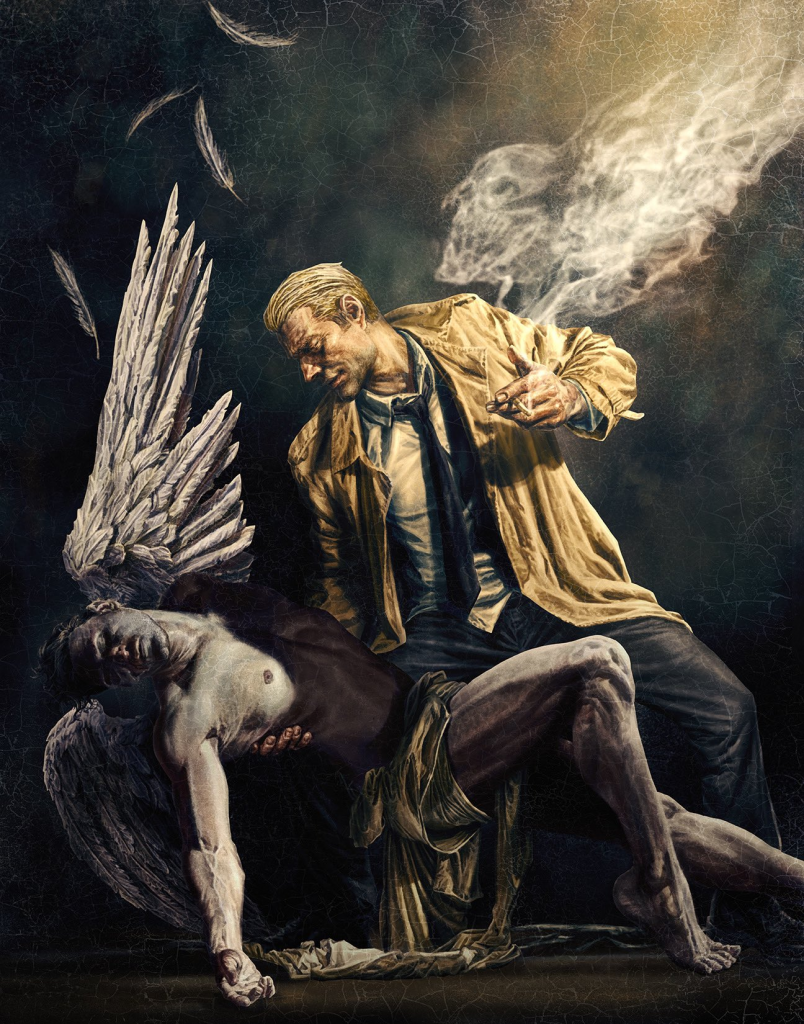
Hellblazer: Rise and Fall #1 by Lee Bermejo. (DC Black Label/DC)
MJ: Often when we read the grimy exploits of John Constantine the Hellblazer, we can expect to see him treading through the muck and the mire with demons of all description. “Hell” is in the comic’s title, after all. Lee Bermejo’s variant cover for Hellblazer: Rise and Fall #1 takes a left turn from those assumptions and instead depicts our intrepid Constantine associating with the loftiest of all creations, cradling a fallen angel.
The attention to detail in Bermejo’s work is always mind-boggling, most recently on display in his series of variants for Detective Comics. Here we see it in the delicate creasing and draping of John’s trench and the angel’s raiment, now dragging on the ground. We see it in the fine, almost touchable feathers of plumage drifting downward like damned snowflakes. Drifting up instead, we see it in the delicate tracings of John’s cigarette smoke, outlining a faint and fitting memento mori. We can trace the deep lines in Constantine’s worn face (visible consequences to smoking like a chimney) and see his thick workman’s fingers grasping the obligatory cigarette, held as gracefully and as casually as John holds this angel in his arms.
Bermejo’s eye for detail here is matched by his art history knowledge, and we can see an homage to Jacques-Louis David’s Death of Marat in the angel’s slumped posture and limp arm. More recognizable is the visual similarity to the Pietà: Constantine contemplates the angel’s corpse the way we often see classical depictions of Mary mourning her son on her lap, and Bermejo’s strict attention to the angel’s musculature and anatomy would make even perfectionist Michelangelo proud.
The barely-noticeable network of craquelure near the top of the piece reinforces the sense of aged antiquity, and the contrasting light and darkness calls to mind the shadows and illuminations of Caravaggio’s greatest works. Bermejo is a modern master; his art constantly inspiring. This cover is a revelation.

John Constantine: Hellblazer #12 by John Paul Leon. (DC Black Label/DC)
JJ: John’s feeling what we’re feeling, in that reliably extra Constantine way.
Yeah, John Constantine: Hellblazer has come to an end, much earlier for those of us who loved the series and those exceptional creators who made it happen for 12 absolutely majestic months. (Si Spurrier, Aaron Campbell, Matías Bergara, Jordie Bellaire et al., we here at DoomRocket salute you.) Hellblazer‘s cover artist, John Paul Leon, clearly swept up in this last-issue moment, decided to amp up the ennui us readers have been contending with since the issue dropped in November.
The drama, the anguish, it is much. Ur-Shakespearean. Biblical. In short, Constantine. Adrift in a void of his own making, John’s many dalliances with powers-one-must-never-fuck-with has resulted in entropy and all is dark.
Not all. John Paul Leon knows how to manipulate shape and shadow, and for this final issue of John Constantine: Hellblazer he puts his many skills to work. Dripping down Constantine’s de-trenchcoated arms we observe what can only be surmised as blood, draining from a deed most foul towards the onyx infinity beyond. The pain on John’s face is a portrait of agony, beyond the like that come with hangovers following a night drinking with demons or the regret that results from double-timing an especially formidable magician boy-or-girlfriend.
John hurts because we hurt. Only more. Taking the brunt for us mortal types, that’s why we’ll always love him.

The Immortal Hulk #41 by Alex Ross. (Marvel)
CH: Without Santa, visible snow, or carolers, Alex Ross provides a joyful, untraditional holiday season cover for Immortal Hulk #41. It’s fitting; 2020’s been an ongoing departure from our usual sleigh ride ‘round the sun. The interior story mirrors Ross’s approach, revisiting one of the Marvel Universe’s longest-running feuds in a Hulk vs. Thing battle unlike any previous.
The cover reflects the heart within Al Ewing’s story, and it is a heart three sizes larger than one could expect, with observations on faith and a timely reference to the Book of Job. That last one is not where we normally seek festive parallels, but then what makes the Ross cover any more tailored to holiday celebration?
His very style rouses nostalgic feels, and those fuel the tank of most festivals. For many, Ross is the Norman Rockwell of Pop Culture, but this cover has a more Richard Sargent spirit. Like Sargent, Ross leaves some comedic elements to the imagination. We don’t know what the waitress is saying to these two unusual travelers taking shelter in her diner, but we imagine everything from a brassy observation on Hulk’s enjoyment of the beans, to a friendly reminder on keeping things peaceable so the diner’s insurance rates remain manageable. The emerald giant’s expression and Ben’s clear concern over how his frenemy might respond inspire smiles.
Those shoppers pausing outside might as easily be taking in a Macy’s Christmas window display, though they exhibit an elevated sense of trepidation. The humor found in everyday, or in this case Marvel Universe New York City, circumstances comes through; without booths designed by Stark Industries, the seating exhibits stress marks from behemoth overload. Hulk’s trouser seams are also overburdened, gapped in several places. Maybe their server’s pointing out that no shirt and no shoes may be overlooked, but no pants is a problem.
Circumstantial, you say? Grasping for a holiday theme where one barely exists, you accuse? Not at all, because there is no better yuletide gift this year than Ross’s charming, heartfelt rendition of our ever-lovin’ blue-eyed Thing and his perpetual sparring partner, the Incredible Hulk.

Lonely Receiver #3 by Jen Hickman. (AfterShock Comics)
JJ: Jen Hickman has tapped into something quite undefinable with their work on Lonely Receiver. The digital romance thriller from AfterShock has explored the corners of our living spaces that we usually walk past every single day until that one terrible moment when our heart breaks. When wistful reveries of the way we were take the place of daily (and healthy) human interaction. Life in the future of Lonely Receiver is a mess like the lives we lead today, and I’m quite addicted to it.
See, in Lonely Receiver, love can arrive digitally, too. Not in that familiar, cathartic, quickly forgotten way—but that once-in-a-lifetime kind of mushy stuff that makes up the majority of our hopes and dreams. Yeah. Love via app. But don’t judge. In the sterility of Lonely Receiver, you take love where it comes.
Like life, digital romance fades. Lonely Receiver is a break-up book. But Hickman has found exquisite ways to convey the way we daydream when our heart aches, the most indelible presentation they’ve provided yet being this cover to Lonely Receiver #3. Lost in a sea of dreams we remember our first kiss, our last one and all the ones in-between, on and on into a warm oblivion of isolation and regret. And hope.
Don’t forget to share your favorite covers, from this year, from any year, in the comments section below! Thanks for reading!
More from the 2020 YEAR IN REVIEW:
These were the best interviews we gave in 2020
These are the best writers of the year


