
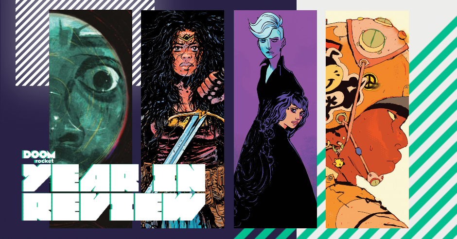
by Arpad Okay, Kate Kowalski, and Jarrod Jones. These are the ongoings, minis, and OGNs that saved us, made things better, and represented the absolute best that comics could be in 2020.

Ex.Mag Volume One: “Cyberpunk: Full Metal Dreamland”. (Wren McDonald, Patrick Crotty, Sophia Foster-Dimino, Jonathan Djob Nkondo, Mushbuh, Freddy Carrasco, Giannis Milogiannis, Tonči Zonjić, Jane Mai, Wren McDonald, Kelly K, Connor Willumsen, Aseyn, Peow Studios) Gleefully weird and dead serious. Conflicting spirits don’t undermine each other in the first volume of Peow Studios’ ambitious anthology series Ex.Mag. Cyberpunk is about a dozen creators, about 200 pages, printed in black and green, a pulp paper pocket volume of ephemeral perfection. Heartfelt at its most processed, human at its basest. Full Metal Dreamland will delight and challenge science fiction fans, but comic readers of all stripes who are interested in the scope of the medium’s future would benefit from checking out an issue of Ex.Mag. A wide range of stories, content, looks, maybe all born from the same intention, but grown into a wild bouquet. Though I suppose that’s how it works with art movements, the avant-garde starts out looking like a band of misfits.
The cyberpunk thread that binds the book is loving the look of the hardware but having the heart to question its method of manufacture and consumption. The cyberpunk genre would just be horror if the protagonists weren’t all drugged-out nihilists. Well, Ex.Mag goes there all the same. Genuinely disquieting stories. We determine a group is acceptably other and then we indulge in their destruction. We’ll let our children be turned into fire trucks just so we can afford a nicer condo. That job at Best Buy won’t last forever if the dolphin finds and kills you. They are stories without redemption, presented in a broader range of art styles than you might expect from a niche genre. Aesthetics that stick to the pillars of cyberpunkery beside art that looks like it escaped from the computers and model kit catalogs of the 80s beside the balloon art indie style of the North American small press. Every look is a hit; each story a sock to the gut. — AOK
A Gift for a Ghost. (Borja González, Abrams ComicArts) There’s a sort of expansive feeling when you’re young during those summers in between your high school years, when you feel like you have the rest of your life ahead of you and you can do anything and be anyone while being destined for really nothing at all. An ill-spent freedom idling in parking lots and spending coin from your part-time job on iced coffees and mystery weed.
Borja González captures this feeling, as strong an undercurrent of youth in 2016 as it was apparently in 1856. Those two years intersect as a 19th century teen with Mary Shelley sensibilities lends song lyrics to a 20th century all girl punk band. A golden cat slips between times, happening at once and yet over a century apart. A bright butterfly flits amongst monochrome mossy gray panels, a motif of the lack of knowledge we all have about our own ultimate impact on this world.
González is a master of body language. These girls have no faces, but their shoulders, head tilts, and movements are so expressive, so authentically felt. There is a universality in the silent and lonely moments that sit and stretch. Staring up at the night sky, skinny dipping secretly, walking home alone with a single ice cream scoop—they feel so brief but also eternal. This book, for maybe just a bit, reminded me of the possibilities and the secrets the universe might still tightly keep. — KK

Come Home, Indio. (Jim Terry, Street Noise Books) Jim Terry, one of this generation’s great unsung cartoonists, has one hell of a story to share with Come Home, Indio. It’s his story, his life, presented in a gorgeous graphic memoir that sometimes dwells in life’s darker moments but doesn’t forget the beautiful ones. Those little moments where the non-stop tumult of family and personal struggle are finally quiet long enough that we can actually think. Reflect.
Memory is both friend and foe in Come Home, Indio. Jim constructs intense private battles against devils of varying power; you can almost feel what Jim felt when he laid certain lines down, understand which artistic hero he was channeling in the moment—his gifts a tribute to the works of Wrightson and Eisner, his father, his mother, every person who, whether they did so directly or not, made Jim into the man he is today.
“How did he keep it together?” you wonder as you read some of this. Then, suddenly and completely, comes the first of several hammerstrokes contained within Come Home, Indio: He didn’t. You haven’t. We won’t. Not every day. And that’s okay. “That’s how you fight fear,” Jim reflects at a later point in his story, where the real world came crashing in and stirred him into action, his only weapons compassion, empathy, love.
Jim’s truths are our truths. A young man seeks refuge from the hurt of the world in dweeby things and often fails. He watches marathons of horror movies and rifles through entire volumes of comic books, not fully grasping how his many agonies are changing him as each Sisyphean day goes by. And, when he’s grown, what triumphs come, if they come at all, are small. Until they’re not anymore. Until those small, seemingly insignificant victories coalesce into a triumph that’s bigger than us, that moves earth, that changes everything. Even after years of believing with our entire being that this would never be possible. That’s life. — JJ
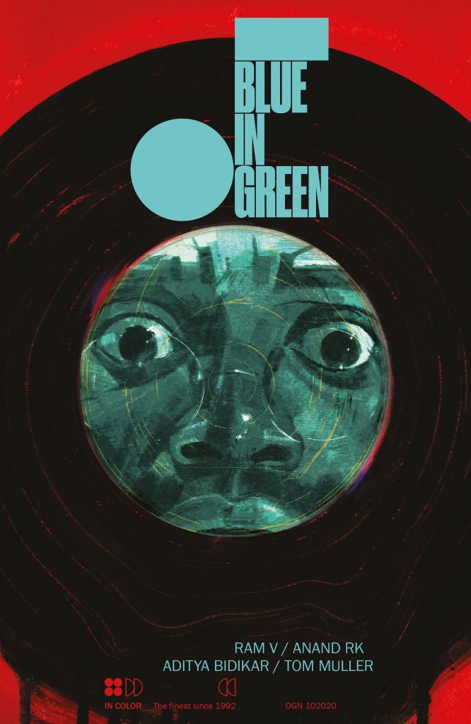
Blue in Green. (Ram V, Anand RK, John Pearson, Aditya Bidikar, Tom Muller, Image Comics) Drop the needle and watch it scratch, tear, rend. This one cuts deep. Blue in Green is a collaborative effort, the results of a band of talent coming together to riff on the comics form and finding daring new ways to alter it, even perfect it in places.
Naturally, it’s driven by jazz. The power it holds, a dark, dangerous, glorious and terrible thing to behold. Entire myths have been built around the talent of certain musicians; we ask whether they sold their souls in some unspeakable pact in order to reach that untouchable strata, to simply reach, never quite convinced they made it to these untold echelons despite their sacrifices.
A comment on craft, the elusive muse, honing our natural talents and perfecting them, failing to find where we excel and instead dwelling on our failures, Blue in Green burns into your senses. Anand RK lept into the void with Dave McKean where mysterious symbols and base desires thrive and guided Ram V’s story to places most sinister. That story, about Erik Dieter, his saxophone, and the lies whispered in his ear, come with a tremendous price.
Blue in Green is about sacrifice, what we give up in order to pursue what is often unattainable. Set to a rhythm familiar to those of us who ever sought a deeper meaning to things where there might actually be none. — JJ

Becoming Horses. (Disa Wallander, Drawn & Quarterly) Disa Wallander’s Becoming Horses is an abstract exploration of emotional bliss. The pursuit of art is the pursuit of freedom from the shackles of time. Creating, collecting, reacting, and being are all encountered and contemplated on a long, weird walk and talk between a few friends. What even is a horse? Anything or anyone (spoiler alert). Becoming Horses does away with the idea that what makes us feel alive can be limited by the superficial. Wallander does the nigh-impossible job of saying that art is capable of being anything and everything and then going on to provide definitions. Observe the imperfect, restless world through art eyes. Confused? Not a coincidence. The storytelling is straightforward, one strange philosophical encounter after the next, one part paced and deliberate in a way that evokes Jules Feiffer, one part razor wit that reminds me of SuperMutant Magic Academy, the careless sunshine look and radical philosophy of Moominvalley, the active pursuit of passion’s source like in Why Art?
Becoming Horses’ adventurers go beyond drawings, exploring a meta-world of objects and arrangements. They share their story with flower petals and precious stones, they turn into the sparkling surface silver prism that is the back of a sticker. There are not a lot of pages you can open to in the book where it looks like a comic. That’s good, right? A scribble of digital ink contemplates a ceramic statue made of them while the statue plays the sphinx. It is a rare thing to find a book so inexplicable yet approachable. As personal and unfathomable as a primary school art teacher’s desk drawer. Low key relatable. Sweetly blissy. Becoming Horses is a singular book. — AOK

Lonely Receiver. (Zac Thompson, Jen Hickman, Simon Bowland, AfterShock Comics) It’s frustrating to write about how good a book is when you don’t yet know how it will end, but Lonely Reciever is just that good. A psychological techno-romantic thriller of isolation and regret that represents every ugly thought we’ve ever had when we were at our lowest, told during a year when our lowest came often.
Zac Thompson and Jen Hickman tap into the aspects of our modern life we’d prefer to sweep under the rug and stick it right in our faces. These little devices, which are so goddamned helpful and convenient, are changing us. Changing the way we think about other people, about ourselves. Didn’t recieve a text immediately after sending one? Burn it all down. Why aren’t they paying attention to us? Don’t they know we’re reaching out them? Don’t they know how much of ourselves it takes to even do that? Fuck them. Fuck everything.
These are the thoughts that cloud our better judgment. In Lonely Receiver, these are those thoughts enhanced, weaponized, presented in a future shock of loneliness and wanting that’s only far too recognizable to our present moment. They become the reasons why we close ourselves off to one another, and in Lonely Receiver, they become the motives behind fury and violence. It’s okay if all this makes you feel weird, sad, seen. Thompson & Hickman are innovating. It’s only natural that we feel frightened. — JJ

Coffin Bound. (Dan Watters, Dani, Brad Simpson, Aditya Bidikar, Emma Price, Image Comics) Raw, uncompromising, poetic and downright gnarly, Coffin Bound does not play around. Two years running and this is still one of my favorite comics. That’s all right with me. Creative momentum like this is a rare thing, a comic like this even rarer—Coffin Bound is a book to be treasured, and yes, to be feared.
The scorched-desert and seamy nightclub aesthetic of its first volume has given way to the flinch-inducing blues and purples of bruises. Its vistas are confining boxes: drug dens, boxing rings, church pews, stairwells. Later, in what might be the single best issue of comics I read all year, its visuals twist and mutate into a dual-edged apotheosis of black, white, and blood.
Coffin Bound is unique in the way it pulls you from one shock to the next. Dani’s rust-and-bone grindhouse allure plays tricks with your eyes while Dan Watters puts poetry in the mouths of monsters and angels alike. The dissonance between the beauty of what is said and the horrors of what is seen in Coffin Bound is the secret formula that makes this wonder work. Robert Frost hammering out the screenplay for The Texas Chainsaw Massacre. It’s glorious. — JJ

A Map to the Sun. (Sloane Leong, Aditya Bidikar, First Second) Real characters. Real problems. The girls of A Map to the Sun might look like they live in a fantasy given the book’s psychedelic candy-coloring, but the challenges that Sloane Leong pits them against are as concrete as the ones facing her readers. No magic or weapon or supernatural force will save them from our relentless world. Resolution isn’t guaranteed. The dance of the basketball court is their escape, the slam of the surf. It’s a story centered on sports to illustrate the personal balance one has to strike between freedom and structure. Anyone can play. Winning takes teamwork takes discipline. A Map to the Sun is a rough read because sports teams aren’t the only ones trying to beat the rookie team: life plays dirty and there are no time outs. The blend of cold reality and inner turmoil that drives the story comes through in Leong’s art, her intellectual and emotional layouts, expressive and controlled linework, dreams coming true, dreams getting crushed, the dreams themselves told without eyes. A story the reader is told.
Emotionally, no aspect of the book is more affective and beguiling than the color. The constant flux and heavy saturation of colors are both visually peerless. Aditya Bidikar’s colors for the lettering are equally vivid and daring, more of an inspired reaction than a compliment to Leong’s bold decisions. The lettering itself is formal, simple, old school indie, the tails long and winding, a touch of handmade intention. His work fits perfectly. Obscurity is allowed. Pages come dark as plums, the line art swallowed in hue. Taken as a whole, A Map to the Sun is as potent a thrill as flipping open the top of a box of a hundred crayons. No other book looks like this. A Map to the Sun says there are no rules. Not for being young. Not for writing a book for young people. A challenge to the reader to decide what comes next. — AOK

November. (Matt Fraction, Elsa Charretier, Matt Hollingsworth, Kurt Ankeny, Image Comics.) The creators behind November are the A-Team, heavy-hitters all, the top hands on deck. Each beat and each pen stroke delivers. Fraction’s braided narrative is communicated through Charretier’s linework rife with emotion, Hollingsworth’s surreal color palette, and topped by Ankeny’s diverse yet personal lettering styles. They all contribute such weight to this timely piece and make it something truly special and important.
The three released volumes are consistently breathtaking—breathtaking in the sense that you’re getting punched in the gut panel after panel. The story is brutal, dark, gritty—the polar opposite of a fairy tale. We are transported through fantastical coloring, gracious linework, and exciting lettering back into the depths of our own kind of shitty reality. But this is good. We need art like this to lend a scope into the troubles of the times, at once removed but also intensely penetrating. — KK

Wonder Woman: Dead Earth. (Daniel Warren Johnson, Mike Spicer, Rus Wooton, DC) Maybe I’m speaking for myself here, but I’m gonna go for it anyway: this generation of superhero comics readers are absolutely starving for the mighty new tomes that have the power to finally, at long last, supplant persistent bookshelf mainstays like Watchmen and Dark Knight Returns. DC’s Black Label line was created, it seems, to meet that simple demand. You know. No big. But they pulled it off, they really pulled it off, and all they had to do was pair Daniel Warren Johnson, Mike Spicer, and Rus Wooton with Diana of Themyscira.
Not the first pairing of creator and character I would have thought of, either. That’s what makes it so genius. Johnson’s manic power, the way he blocks a fight, the way his frenetic layouts guide the eye along any absurd skirmish he feels like conjuring in the moment—it all works so damn well in Wonder Woman: Dead Earth. The energy in this book practically vibrates off the page. It inspires in the reader a feeling of awe. Sheer awe.
Yes, Wonder Woman: Dead Earth goes big. It brings in vibrant, hungry voices, applies them to DC’s storied icons, takes them to new, frightening places and decimates expectations. More importantly, it’s powered by a dream of a better tomorrow, despite the fact that the world is presently on fire. Dead Earth is the climax of every dystopia you’ve ever read, the final fight, the rousing battle cry that makes us mortal types daydream of what wonders could possibly come next. Wonder Woman: Dead Earth was exactly the kind of comic this generation needed, and it arrived at the exact moment we needed it. Long may it reign. — JJ
What were your favorite comics of 2020? Let us know in the comments section below.
More from the 2020 YEAR IN REVIEW:
These are the best covers of the year
These are the best artists of the year


