
By Molly Jane Kremer, Kyle G. King, and Jarrod Jones. Our Week In Review serves to fill in the gaps our frequently verbose comic book coverage leaves behind. Each week, we take a brief look into the books that demand attention.
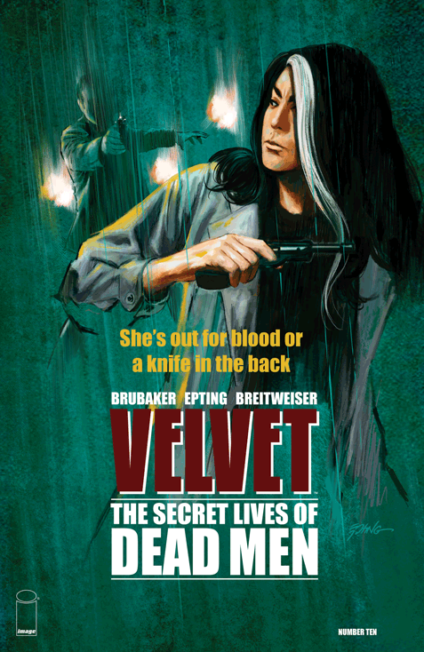 Velvet #10
Image/$3.50
Written by Ed Brubaker.
Art by Steve Epting; colors by Elizabeth Breitweiser.
JJ: “There’s a moment just at the edge of consciousness… where you find a different point of view… where you can circle your problems… almost endlessly… until you eyes finally open.“
The havoc that is Velvet Templeton’s life doesn’t always offer much time for reflection. That can become problematic, especially for a person whose perilous line of work — one that’s immersed in espionage and all the deception and intrigue that comes with it — often requires a considerable amount of clarity. In Ed Brubaker, Steve Epting, and Elizabeth Breitweiser’s sumptuous Velvet, the recurring exasperation that comes with following Velvet’s bullet-dodging lifestyle means that finding a moment for our eponymous heroine to consider her next critical move is few and far between.
Maybe that’s why Velvet has one hell of a filthy mouth. Just when a crucial piece of her puzzle begins to materialize behind those lethal, dark eyes, a crew of French police pop in with their SP 2022s out with apprehension on their minds. That feeling of unrelenting pursuit would make every single one of us spew a steady stream of expletives, especially when we’re faced with the gauntlet Brubaker and Epting set before our favorite secret agent in Image Comics’ latest installment of Velvet.
Sharp, swift, and scintillating, the opening chapter to the fifth part of The Secret Lives of Dead Men finds Templeton at a frustrating impasse, one that requires the quick thinking we’ve come to rely on from Velvet to help her see this particular hiccup through (though in the ensuing skirmish she finds room to doubt her own abilities: “… have I gotten that slow?” Of course, the answer is no.). As ever, artist Steve Epting’s muscular inks give his fluid pencils the necessary gravity to convey just how much a sudden boot to the face would actually hurt. (And given Velvet’s justified haste, it would likely hurt quite a fucking bit.) Elizabeth Breitweiser’s colors give an immersive depth to Epting’s artwork; she supplies Velvet with a vital widescreen feel by muting her recognizably vivacious flourishes (widely enjoyed in The Fade Out) to aid Brubaker and Epting in getting right into the thick of the matter. With Breitweiser’s aid, Velvet is a spy saga that hurts. In all the right ways.
With a stunner of a twist ending, Velvet continues its relentless march towards what promises to be one hell of a reckoning. And as it thunders along, one thing is abundantly clear: things are about to get real dicey very quickly, so Velvet may want to thank her creators for giving her those fleeting (and violent) seconds for reflection. She’s going to need them.
9 out of 10
 Black Widow #17
Marvel/$3.99
Written by Nathan Edmondson.
Art by Phil Noto.
KGK: Natasha Romanova and I have very similar tastes in men — altruistic and rough around the edges, a simple enough formula to keep me satisfied and starry-eyed alongside her stories; but rewardingly Nathan Edmondson and artist Phil Noto continue to take these beautiful and damaged people to higher levels in their latest issue of Black Widow’s stand alone book.
In its opening scene, a sunset against a sailboat date with Matt Murdock keeps Natasha’s heart and Noto’s colors warm and cozy: what starts as beautiful full panel landscapes with dancing sunlight oranges, appropriately and literally burns away to succeeding scenes of cold abandonment. Natasha is inter-dimensionally abducted by a herald for Chaos, a shadowy organization interested in recruiting her “unique skill set” for their unseen yet seemingly benevolent agenda. As the pair jump from place and time to place and time, Edmundson and Noto keep the pace slow and the frames tight, which adds a rich cinematic quality that accompanies the jump-cut layouts from panel to panel. Noto ensures the issue is a visually pleasing experience for readers but Edmundson still shrewdly moves the chess pieces across the board in order to move the story along.
What doesn’t fit in issue #17 (aside from Widow’s baggy pants) are the artistic deviations from close-ups and details. Noto casts beautiful stern lines that play well on Widow’s trademark scowl, but while the first page is a beautiful full panel wide shot, every mid shot that follows contains a flat background with zero details that could otherwise support the story. It doesn’t accumulate enough to subtract quality from the story, but the team proves they can manage other small details effectively (like the distance Matt and Natasha sit from each other panel to panel).
It’s encouraging to see Widow get her own book along the lines of “what Avengers do when they’re not fighting Chitauri,” and Edmondson and Noto are taking her to the heights we all know she can reach. It’s a beautiful time in comics for female characters to take the center stage in a male-dominated hero media. Widow has got the goods to deliver consistently compelling stories and Marvel has the ability push them; all we as readers have to do is simply buy the books that respect them.
7.5 out of 10
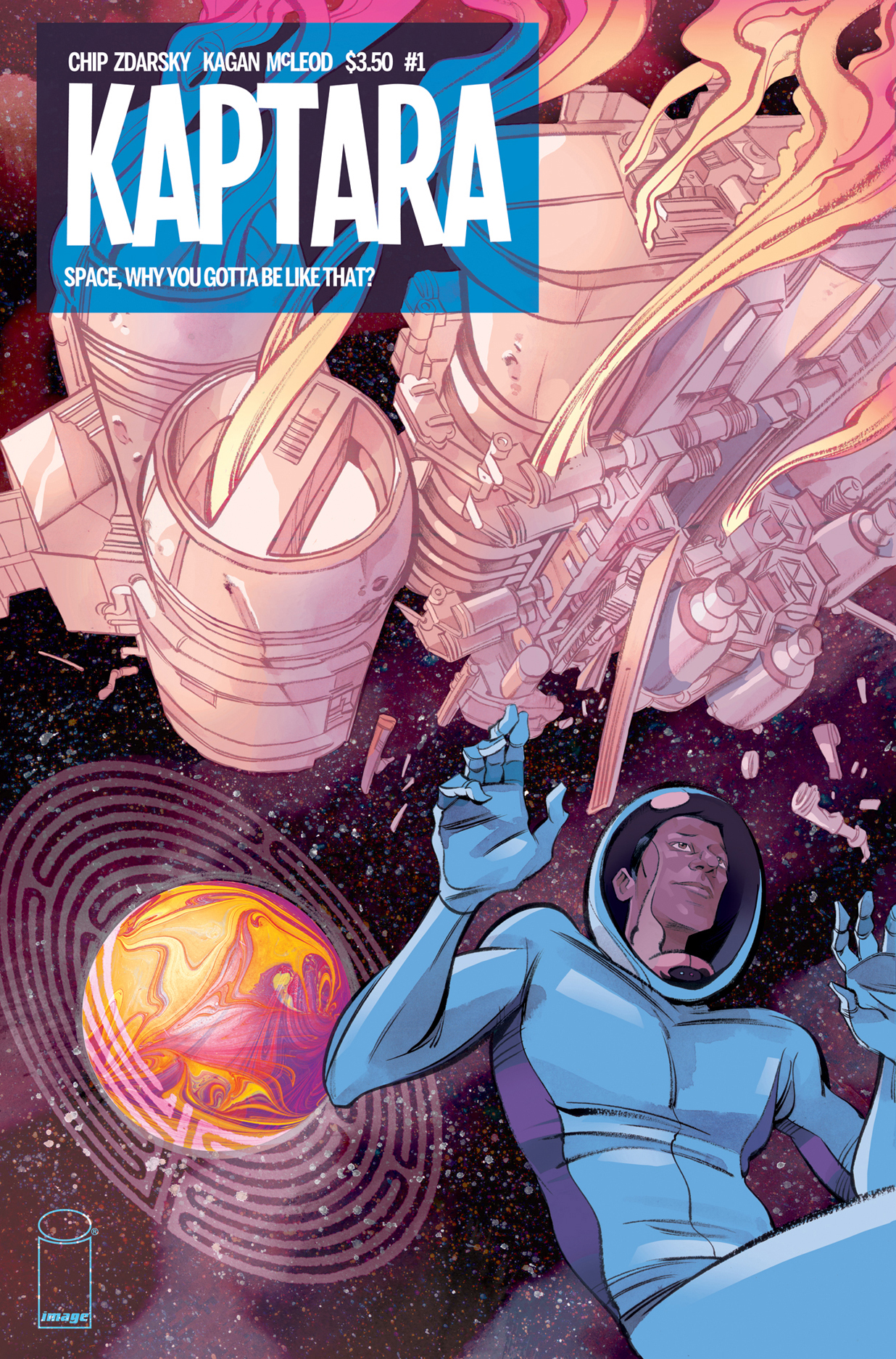 Kaptara #1
Image Comics/$3.50
Written by Chip Zdarsky.
Art by Kagen McLeod; color assists by Becka Kinzie.
MJ: Ever since the groundbreaking success of Saga (and maybe even a little bit before) Image’s roster has been slowly filling with space-centric drama. Though an overabundance of sci-fi certainly isn’t a bad thing, we don’t need all of them to be of the grungy, dark and post-apocalyptic, oh-so-serious sort. Thankfully, we now have the light-hearted contrast of Kaptara #1’s thirty-two pages to cleanse the palate and bring a fresh dose of humor to the oft-somber genre.
Chip Zdarsky is no stranger to the funny stuff: he’s half of the team behind the hilarious Sex Criminals, and writes Marvel’s excellent new Howard the Duck, and now this collaboration with artist Kagan McLeod (of Infinite Kung Fu fame) has resulted in a clever and character-driven comic, with echoes of both Masters of the Universe and John Carter of Mars. Zdarsky’s dialogue is witty, his characterization spot-on, and the effortlessness of his and McLeod’s collaboration is obvious throughout. The art is gorgeous, and his action sequences are filled with dynamic movement, with emotive faces and expressive bodies. The colors too, with assists by Becka Kinzie, are beautiful. Sometimes more painterly, sometimes with a more mottled, splattery effect, the colors are soft and dreamy pastels, lush and evocative of the fantasy world on which our characters find themselves stranded.
Zdarsky has referred to Kaptara as Gay Saga, and it’s quite a joy to see the casual way main character Keith’s sexuality is referred to in the comic: it’s not played as a novelty, it’s simply who he is. I look forward to seeing his romantic adventures depicted in the same relaxed and unceremonious manner. Balancing on a fine line, simultaneously goofy, violent, funny and endearing, Kaptara is science fiction/fantasy that doesn’t take itself too seriously, cementing its story with believable and engaging characters. (One of which is named Skullthor — how can you go wrong?)
8.5 out of 10
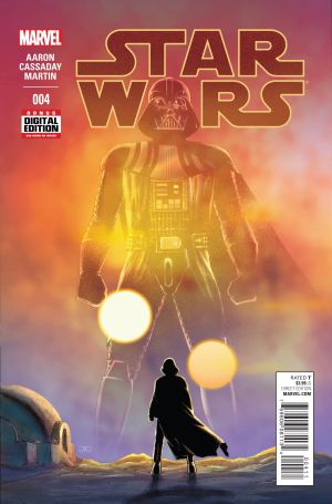 Star Wars #4
Marvel Comics/$3.99
Written by Jason Aaron.
Art by John Cassaday; colors by Laura Martin.
JJ: When you think about it, Jason Aaron is the perfect choice for Star Wars: the manner in which he approaches the cosmic is no less savvy than how he approaches the regal — just take a look at all the magnificent work he’s done over in Thor and you’ll know this to be true.
Marvel’s reacquired Star Wars property has thus far been a mixed bag of quality (Darth Vader and Princess Leia have both failed to get our hearts beating, though we’re holding out a new hope for the upcoming Lando), but its flagship title, Star Wars, has been a consistently exhilarating exercise in crafting a well-orchestrated adventure magazine. A large part of that credit goes to Aaron, whose aforementioned work on Thor burned so hot you could almost hear the Kirby Krackle; and since this is the guy who can make leaps between Asgard and Midgard feel like a bus ride to Target, his transition to a galaxy far, far away feels almost like a foregone conclusion.
How Aaron projects his vision of Darth Vader is so pitch-perfect, you’d swear that Lawrence Kasdan was whispering in his ear. And the one moment of melancholy he holds in store for the Dark Lord of the Sith (during an appropriately debauched outing with Jabba the Hutt) is muted but strong, and holds more drama in its single panel than all the issues of Star Wars: Darth Vader have in full. Aaron is simply too good at his job.
And his collaborator, John Cassaday, has shown that he’s been up to the task of making Star Wars look and feel like… well… Star Wars, and the work that he’s done with colorist Laura Martin (whose name was noticeably absent from this year’s Eisner nominations) has provided Marvel’s enterprise with both the pomp and the sincerity that should come from a book adorned with the title to one of the most beloved franchises in film history. Because of Cassaday and Martin’s integrity as a team, the book never once delves into the unfortunate fan-fic territory that other Star Wars books are quickly resorting to. Even when Cassaday begins to steer off model, Martin’s hues keep the book firmly in place.
But still. There’s a homey, familiar quality to Cassaday’s work, one that has already cemented itself as the signature style to Marvel’s Imperial endeavors. Once the artist moves along in order to make way for Star Wars’ next artistic team, there’s going to be a few pangs of melancholy. Because this book has been so damned consistent, there’s going to be some difficulty in accepting change.
8.5 out of 10
Agree? Disagree? Which books did YOU read this week? Let us know in the comments below.


