By Molly Jane Kremer, Scott Southard, Stefania Rudd, and Jarrod Jones. Our Week In Review collects our thoughts on the comics that demand attention. Do you have a deep-rooted desire to know what we think about all your favorite books? Well. This is where you need to be.
Image Comics/$2.99
Written By Eric Stephenson.
Art by Simon Gane; colors by Jordie Bellaire.
SR: “The more I see, the more I know. The more I know, the less I understand.”—Paul Weller
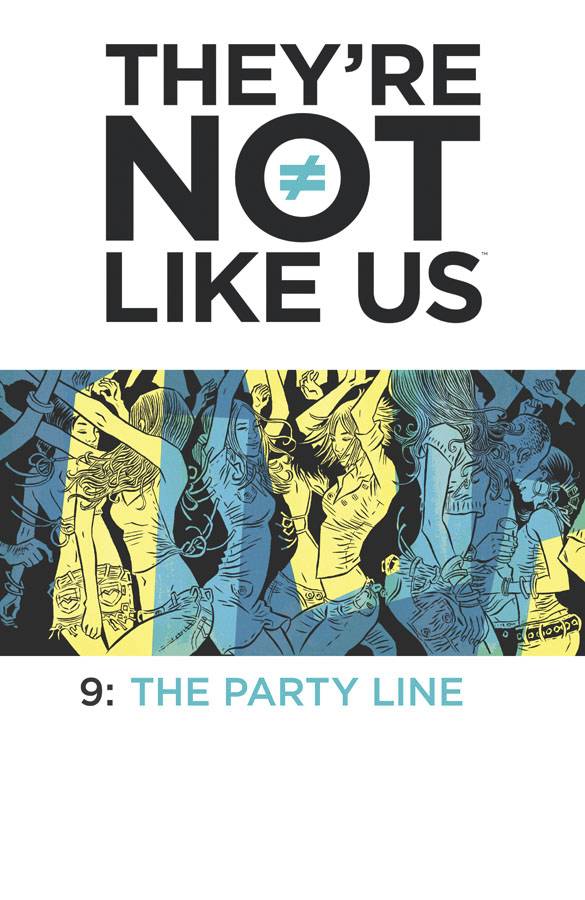
The quote on the back cover of issue #9 comes from Paul Weller’s song “The Changingman,” a song that fits perfectly with the mood and overall tone of this issue. Seriously, Google the song and read the lyrics. “What I can’t be today, I can be tomorrow.” Hello? Are you getting this? We all know that music plays an integral part of this series. I won’t beat you over the head with it too.
At the start of the issue, we see Syd/Tabitha and the gang taking some much needed time for themselves at a club in Oakland. After becoming free of The Voice, it’s nice to see them interact as normally as they can, given what they’ve all been through together. Can we talk about the first two pages? No dialogue, just the visual of a dancefloor where we spot Syd & Co. moving to the music (and getting checked out by dudes). With yellows and blues (and overlapping greens) setting the room in motion, we then notice, at the bottom right of the second page… an ominous splash of red. Perhaps a warning? *sigh* Yes.
When a stranger is making small talk with Danny at the bar, it isn’t innocent flirting, he senses danger. At that point he gets freaked out and tries to gather the group out of there. It’s too late. Thinking the police that have caught up with them, they are met not only with the uniformed men, but with a group that seem to be in cahoots with them. Who are they? We don’t know at this point, but it should be interesting to see how this all develops. We leave at the height of the action when we are taken to the final pages that focus on The Voice and Maisie, who we haven’t seen since they burned down the old house, doing what they seem to do best—starting over.
In issue #9 we continue the second story arc by introducing a new threat that gives us a cliffhanger. Stephenson’s solid dialogue continues to be substantial without getting too wordy: it’s intentional, well thought out, and I appreciate the humor he interjects throughout the issue. (That bit with the Stephen Hawking line? Perfect.) Simon Gane’s artwork and Jordie Bellaire’s coloring are just as integral to telling this story as the dialogue. (Did I mention that club sequence? Completely worthy of your gaze.) Everything about They’re Not Like Us #9, from the level of detail, the expressive facial tics, and perfectly conveyed body language help move the story along while also providing clues as to what’s around the corner. This series continues to be one to look forward to each month.
8 out of 10
DC Comics/$3.99
Written by Gene Luen Yang.
Art by Howard Porter; colors by Hi-Fi.
JJ: Y’know. I often think about what keeps me reading Superman.
It’s no big secret, really. Just ask anyone and they’ll tell you: I’m a tremendous fan of the Man of Steel, not just because of who he is, or what he’s been, but why he is. I speculate about the character’s future when I’m pouring drafts for strangers on the weekends. I think about him when I see something happening that’s wrong. Superman’s so embedded in my DNA, that no matter how bad his book gets, I won’t give this book up. I can’t.
That might explain why I keep reading it. (My perseverance generally comes from saying to myself, “I made it through the Electric Blue saga, and the New 52 Perez/Jurgens/Lobdell debacle.” And then repeating again and again, “I can do this.”)
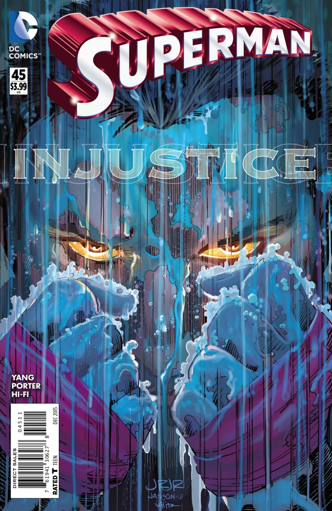
When I read through the scattershot works of the “Truth” storyline trudging through the last few months of Superman (and when I need a refreshing burst of energy, I pick up Action Comics), I search for the propulsive momentum that typically drives a long-running crossover like this only to find none. The “Big Moment” has come and gone (and to little fanfare, I might add), and the roads our newly-outed Man of Steel is currently navigating are perplexing, to say the least. (Super-Fight Club? Ick.) What’s worse is that I’m not sure who’s to blame for this book: the contemporary look and attitude of Superman (re: a t-shirted blank slate) has manifested from the ruinous havoc that was the New 52; that’s no fault of writer Gene Luen Yang. And I certainly don’t envy the editorial mandates that have likely been foisted upon him. But what I’m reading in the pages of Superman these days doesn’t smack of a Superman tale worthy of our praise. Right now, it scarcely registers as fanfic.
Howard Porter’s solid fill-in for series regular John Romita, Jr. inspires in me only a spike of interest for this series, and most of of his chunky linework seems to only work overtime to make sense of what the hell is supposed to be going on half the time. (Yet the man still knows how to make Superman move; one particular panel has Porter shoving him right into the reader’s face as our eponymous hero leaps into the air to great effect.) The comings and goings of Clark Kent’s seemingly ceaseless back-and-forth with villain HORDR_ROOT attempts to connect with feats that would otherwise astonish; instead the book continues its long, wearisome slog towards whatever end Greg Pak, Yang, and group editor Eddie Berganza have okayed with the higher-ups.
You’ll find all my problems with this book summed up rather succinctly with a panel in the middle of the issue, where we find Superman thinking to himself, “I’m gonna stay in this t-shirt so you know who’s coming after you, HORDR_ROOT. So you know who’s taking you down.”
That’s a handy thing that you’re reminding us, Clark. Because right now I have no idea who you’re supposed to be.
4 out of 10
Image Comics/$3.99
Written by Matt Fraction.
Art by Christian Ward.
MJ: ODY-C, Matt Fraction and Christian Ward’s gender-bent, sci-fi reimagining of The Odyssey has been excellent from the very start, but exceptionally good scripts paired with phenomenal art have a tendency of doing that.
Switching genders has allowed for much of the sexual violence inherent in ODY-C’s source material to be avoided, but this arc diverges from Homer’s epic with references to Sheherezade and the One Thousand and One Nights, and the result is the most horrific and affecting issue of the series to date.
ODY-C has the most consistently gorgeous art of any comic being published. Ward renders two truly sexy pages that remain inclusive, respectful, diverse, and, well… really, really hot, with deep scarlets and muted blues imbuing snapshots fit for our orgiastic pleasure. The content swiftly exchanges that passion into a bloody murderous rampage (for pages and pages), upon the kings’ Hyrar and Zhaman’s discovery of their spouses’ infidelity. Ward builds the intensity here from nine-panel pages to sixteen, then to thirty or so, each a tiny portrait of pain and brutality. Various body parts fly, each panel with a single, silent focus on the carnage beside splashes of blood and surrounding flora.
The story is being told separately as a tale to both Ene and He by different characters, which allow us to be slightly removed from the abhorrence, giving it the feel of a cruel fable (or perhaps a cautionary tale). ODY-C #8, like The Wicked + the Divine #13 before it, uses finely-wrought fiction to skillfully place a glaring light on violence against women, taking a historic view while emphasizing its relevance today. Fraction gives it massive emotional resonance, and his thoughtful afterword greatly assists in processing the incredible violence and raw emotion. This is a comic that will echo in your mind long after you’ve finished its last page.
9.5 out of 10
DC Comics/$2.99
Written by Ray Fawkes.
Art by Juan Ferreyra.
SS: Gotham By Midnight has hit its stride. While the religio-horror smorgasbord has had a solid run within the Gotham cannon for a while, it’s never quite felt like a primetime entity. And really, it will always be on the sidelines when stacked against the big names of DC, but that doesn’t mean we don’t have a totally compelling and capable series on our hands. In fact, without being chained to the convoluted mythology of a storied hero (but still benefitting from the lore of said universe), Gotham by Midnight blossoms in the margins of the Dark Knight’s domain.
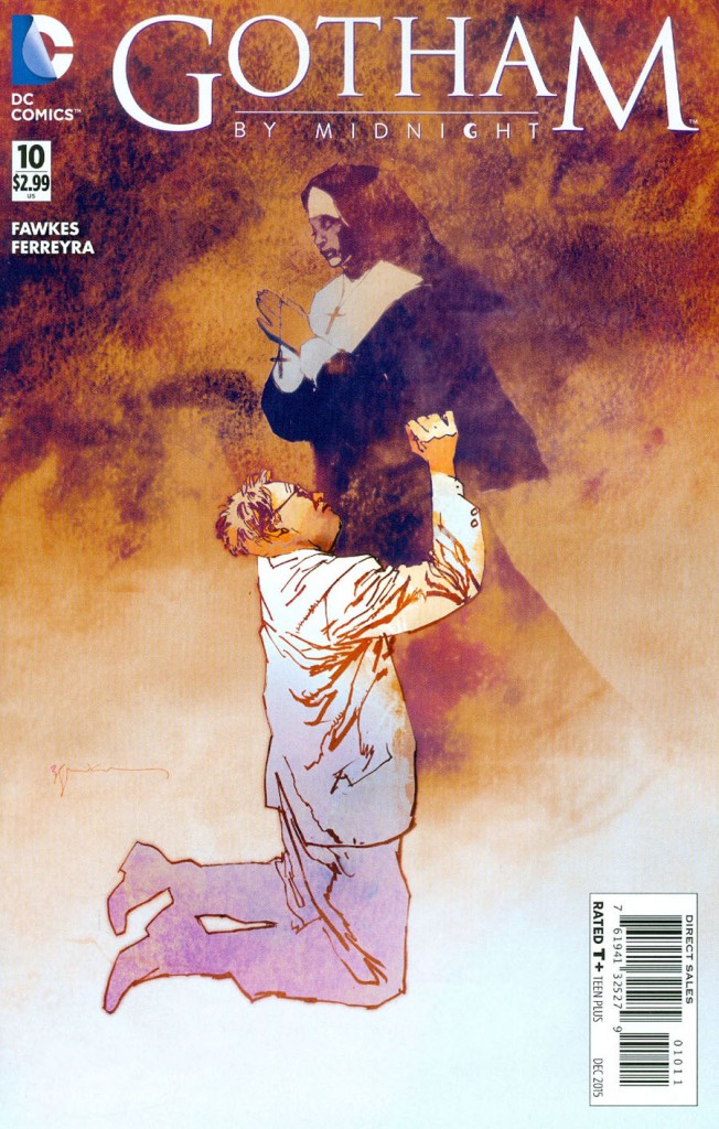
Now that Fawkes has us invested in the wellbeing of the folks over in the Midnight Shift, he’s begun to rapidly dismantle the entire crew. It’s a narrative tactic that’s not only classically clever but also oddly satisfying: Jim Corrigan and Lisa Drake’s blistering escape from police custody is not only a thrill, it moves the plot (and relationship between the two lead characters) forward organically. And watching Dr. Tarr’s enthusiasm as he explores the black flowers phenomena (and the death of Sister Justine) without having to hold the alpha-umbrella of Corrigan and Drake’s command is both adorable and believable.
The thick-colored cartoon art style lends itself well to a series that rests on high levels of tension and exaggerated human expression. In a particularly well-realized scene, Ferreyra uses some inventive panel placement to produce a stellar car chase: the whirling action lines instill a very real sense of speed, and the quick shots of gear-shifting and wheel-spinning would make Vin Diesel smirk and nod approvingly. Oftentimes, dynamic movement and comics don’t mix well, but Ferreyra makes all of the action sequences readable and coherent.
With the series reaching its untimely end, Fawkes has forged an unforgettable path through Gotham’s mythos. As soon as he acquired our attention and trust, he went and blew it all up (quite literally) in this month’s compelling and meaningful cliffhanger. Gotham City is enormously fertile ground for stories about good and evil, and it’s a shame that the majority of the sagas located in this foreboding city focus on but a fraction of the potential folklore. Gotham By Midnight breaks away from that mold while constructing its own powerful legacy. This book has flourished into a harrowing perfection.
8 out of 10
Marvel Comics/$3.99
Written by Marguerite Bennett.
Art by Kim Jacinto & Israel Silva, and Stephanie Hans.
MJ: Just when we thought Marvel’s All-New All-Different initiative wasn’t offering much in the way of “new” or “different”, the new Angela: Queen of Hel #1 is stuffed full of action, passion, and surprises. While not as wittily self-referential as the excellent Secret Wars 1602 miniseries, Queen of Hel shares its dry sense of humor (also present in the first Angela series, co-written by Kieron Gillen). Now solo writing these characters in-universe – all of whom she’s already played a huge part in developing – Marguerite Bennett’s wry, at times insightful, dialogue often takes turns into the lyrical (Sera’s line, “where they called me by another name” is especially perceptive and moving). She’s given Angela an epic feel with a dark and romantic beating heart.
Stephanie Hans’ gorgeous nine pages in the center of the book are, art-wise, the book’s highlight. Like the preceding series and the tie-in miniseries, Hans beautifully illustrates an interlude story-within-a-story. Her painterly style is (as always) extremely well-suited for Angela’s fantasy setting; she intuitively communicates the intense emotions Bennett has woven into the script. The main story’s pages, drawn by Kim Jacinto and colored by Israel Silva, are sadly unexceptional. Though nothing stands out as overtly offensive, their style brings to mind the era Angela originally sprang from, with excessive and unnecessary linework and sharply contrasted, unrefined colors, only serving to make the line art appear more imprecise.
Angela and Sera’s relationship is brought to the forefront in this issue, and it is firmly, visually established that the two are indeed a couple (despite Marvel Editor-In-Chief Axel Alonso’s refusal to speak its name). Previous issues have strongly hinted at their relationship status, but this issue removes all question from the equation. We get two big-time smooches: one of which takes up an entire page. Sera provides the narration, which helps to smooth the transition between a few (sometimes jarring) time jumps. Even though half of the comic’s art leaves some to be desired, Bennett has given the series a fast-paced, enjoyable, and incredibly readable first issue.
7 out of 10
DC Comics/$3.99
Written by Lee Bermejo.
Art by Jorge Corona.
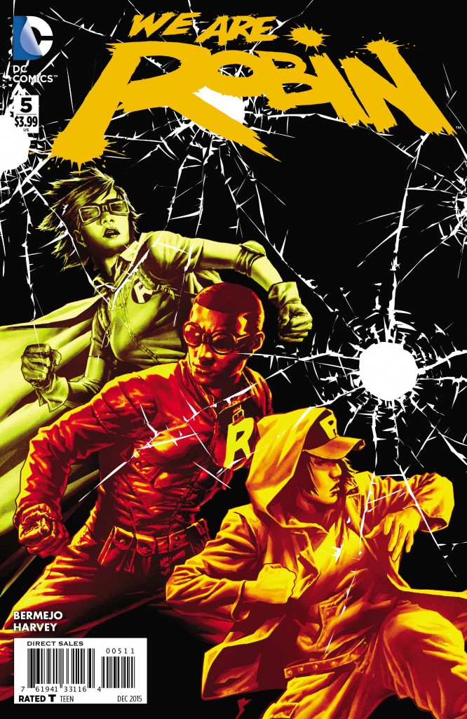
SR: I always like books that can corral a bunch of teens into fighting crime, each coming into the fold for their own reasons while showcasing their personalities, one of which you can hopefully relate to. Which is probably why I like We Are Robin #5 so much: the pace of the series’ overall storyline quickens its pace, not through tons of action, but through introspection and conversations. We get much needed insight into more of the characters, as well as how The Nest will be there to provide for the team. (There’s even a pretty big reveal as to its true identity at the very end.)
As we continue to learn more about the Robins individually we understand The Nest when he says they all have something to contribute to the team. They have a skill set to deal with the injustices around them in their personal lives, so why not take that to the streets of Gotham?
In this issue, we learn a lot about Izzy’s rough life with her gang-banger brother and how she has worked hard to not follow in his path, although he threatens (verbally and physically) to pull her into his world. She wants a place to belong, but knows that a life of crime is not the way, making her motive for being a Robin clearer. (We also learn that Dre’s father has mob ties, which Duke has a hard time reconciling.) I’m sure in time more will be revealed, but in the meantime hotheads and hurt feelings run rampant.
The writing from Lee Bermejo is great and he really knows how to put the Robins through the emotional ringer. Corona is back on the artwork with colorists who make the story move right off the page. You can also get a sense of the characters through the artwork like when you feel the pain in Izzy’s face and sense the frustration in Dre’s. All of it flows nicely together. The future of Gotham will always be up in the air, but with this plucky armada of red, yellow, and green, it will continue to be that much safer.
8 out of 10
Agree? Disagree? What books are YOU reading this week? We want to know! Tell us about those feelings of yours in the comments section below.

